First Impressions
The adversity to being on the receiving end of new technical communication may lie in the quality of the technical communication produced. It takes viewers only 1/20th of a second to judge whether or not a website is worthy of their viewership (site). The first impressions formed when end users initially see the product helps determine whether they will even bother to read it. Even if the document is a set of instructions, they will consider it a waste of their time if they are against the rhetorical situation the creator had in mind and if the design choices are poor.
Rhetorical Situation
A poor first impression will be formed by the reader if he does not approve of the purpose of the content or is not an intended audience member. A poor purpose could be “to inform the user on how to properly sweep a floor”; someone who buys a broom will probably not read any instructions that come with it because they feel that the instructions are unnecessary. A user might think he already has enough background information to begin using a product or can easily figure it out, and may not consider himself an intended audience for the instructions.
Design Choices
The visual mode is probably the most important mode to consider when discussing the end user’s potential first impression of verbal instructions because they will view the way the document is put together before they begin reading it. It is important to not overuse emphasis and contrast, and to optimally use organization, alignment, and proximity. Using emphasis, by highlighting or bolding words, by listing and bulleting items, etc., is helpful to catch the reader’s eye, but overdoing it will distract and confuse them. This goes for using contrast, which emphasizes through juxtaposing size and color, as well. Organization, alignment, and proximity affect how comfortable the reader feels looking at the document. If there is no obviously planned out arrangement of the paragraphs, sentences and pictures, the reader will feel uncomfortable having to create their own path to follow.
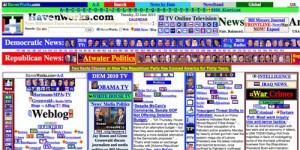
Take for example this still from a website.
My first impression of the webpage is very poor and I feel I could probably infect my laptop with a virus if I clicked on anything. The design choices of the webpage easily carry over to what should not be done for visual and design aspects of instructional material.
- Emphasis: The emphasis is mostly placed on titles, such as “Atwater Politics” and “Weblog”, however, the reader is unable to make a connection to its importance and why it received this level of significance.
- Contrast: The color contrast of blue text against a white screen strains the eyes.
- Organization: There is very little organization. Instead of being able to follow a conventional path, such as heading -> paragraph, the viewer must create their own path, meaninglessly going from unrelated box to unrelated box.
- Alignment: The rectangular boxes, such as the ones labeled “Democratic News” and “Intelligence” are neatly aligned with each other; however, each box contains wildly different content and styles.
- Proximity: There is simply too much on the page. There are too many pictures too close together, the text is small and scrunched, and each rectangular box of information is cramped between two others.
Here is an example of well down technical communication.
- Dual coding is used to make sure the end user can easily understand what is happening in each step.
- The visual content is grouped together, not spread out all over the document, and all of the pictures that relate to a single step are aligned neatly under the text for that step. This organizational style shows the relationship between the text and the pictures, allowing the consumer to make more connection quicker about what needs to be done and how.
- The individual steps are emphasized by a larger font for the numbers and through the use of green font. These two markers clearly indicate where each steps begins.
- The contrast between the sizes of the steps numbers, the text of the instructions, and the helper text labeling objects clearly shows what each objective, in what order they should be accomplished, and what information is needed to accomplish the text.
These ease of use of this document can be readily ascertained by the end used and will encourage him to consider reading the instructions. With simple, easy to use, instructions that provide the right amount of information, technical communicators can encourage to properly use their products.
Arola, Kristin; Sheppard, Jennifer; and Ball, Cheryl. Writer/Designer: A Guide to Making Multimodal Projects. (2014). Bedford/St. Martin. 6, 20- 37.
Johnson-Eilola, Johndan and Selber, Stuarta. Solving Problems in Technical Communication. Chicago: The University of Chicago Press. 388-391.


