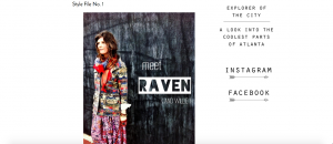
Here the Cool Atlanta bloggers profile a cool spot to get coffee under the “coffee shops” umbrella of the main menu. They felt that coffee shops were important enough to have a whole thread dedicated to the best ones of the city. The black and white picture layered by the fancy blue words create a very nice, and elegant look to the page, leading one to draw conclusions about the quality of the restaurant.


 This is the front page of the website that welcomes “Atlanta” to the blog. You can see a portion of the downtown area of the city from the view of the picture. The picture doesn’t show the more typical view of the skyline because they are trying to establish a website for the people who are a part of the community, not just tourists.
 From this angle it is easier to see the narrow walkway through the restaurant. It is not very wide and goes straight back unlike many other restaurants of this era. Due to this particular built environment, not a lot of walking is promoted, but more sitting and talking. For the most part, people only got up to leave and nothing else.
 A close up of the rounded stools with red cushions as mentioned in the built environment description. There are red accents throughout the restaurant that gives off a very retro feel. The silver compliments the red coloring for a visually appealing theme. The stools are fairly close to one another which doesn’t make for a very private experience at all.
 The front door of the Majestic Diner displays the 24 hour operating time and is just as iconic as the large sign atop the building. The clear glass windows enable you to be able to see all the way to the back of the restaurant from the outside. This kind of dynamic is unique among restaurants in Atlanta nowadays.
 The historic “FOOD TO TAKE HOME” sign perched high on Ponce De Leon Avenue is visible from very far distances and is a welcoming sight to hungry Atlantans. The multi-colored signs has no dead bulbs and shines bright 24/7 as the restaurant is never closed except on holidays. It lights up the otherwise gloomy February night sky in this sector of the city.