Here the Cool Atlanta bloggers profile a cool spot to get coffee under the “coffee shops” umbrella of the main menu. They felt that coffee shops were important enough to have a whole thread dedicated to the best ones of the city. The black and white picture layered by the fancy blue words create a very nice, and elegant look to the page, leading one to draw conclusions about the quality of the restaurant.


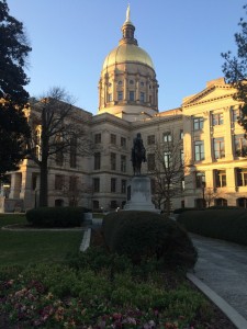
 This is the front page of the website that welcomes “Atlanta” to the blog. You can see a portion of the downtown area of the city from the view of the picture. The picture doesn’t show the more typical view of the skyline because they are trying to establish a website for the people who are a part of the community, not just tourists.

