Archives

Summary #6 Melissa King’s “Better Online Living through Content Moderation”

Content Control Features do this theoretically.

Content Control Features do this theoretically.

This article, written by Melissa King, argues that content control features are valuable to people who need them. These people could suffer from online bullying, PTSD, and other types of harassment or mental illness that could make them vulnerable to the general public. Throughout the article, she defends her argument by dismissing arguments that those features are useless.

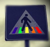
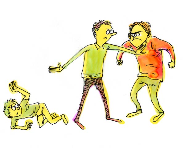
One argument she attacks is that people who use content control features are “weak” or “too sensitive.” She states by criticizing people who use these tools, the world is creating a culture that presses people to expose themselves to catastrophic things. The situation becomes the victim’s problem and that they should “just deal with it”. This advice becomes useless because not every situation is a difference in opinion about something. Content Control features are helpful to stop the effects of abuse and shouldn’t be discouraged.

FloodingCartoonsmall

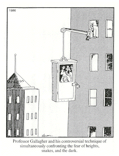
The second argument she attacks is that people claim that not using the content control tools when in an abusive situation is a form of therapy. The type of therapy referred to is the Exposure Therapy. This technique, gradual and controlled exposure to the cause of anxiety, is designed to cure severe anxiety. The misconception of this argument, King states, is that this argument is misunderstanding human psychology. Exposure Therapy is not random internet insults and threats from strangers. If their theory was correct, the insults would have to be controlled. Since this isn’t the case, this argument doesn’t reduce the trauma but magnifies it. She proposes the solution that people should understand mental illness before declaring solutions to the cures and denouncing helpful mechanisms such as the Content Control features.


The third argument she attacks is that people who are in the “middle” of the situation claim that both sides are unreasonable and suggest a middle ground to be found between both parties. King states that the problem with this argument is that those people are measuring the targets of harassment equal to the harassment itself. These people also fail to realize how vicious and persistent online harassment can be. They fail to acknowledge to the difference between the aggressor and their targets. King goes on to say that this demonstrates a lack of empathy for people who suffer from these situations.

Diversity

Diversity need things like Content Control Features

King argues that easy one-size-fits-all solutions ignore the diversity of human psyches and experiences. Content Control tools take this idea into fact and allows people to be able to act on their emotional needs. Not everyone is able to ignore threats and still enjoy the internet. No one should be forced to deal with something if they do not wish to; especially if it is causing them emotional trauma. Telling people otherwise is wrong and inhumane. It creates a world of misinformed opinions about how to manage their own mental states. In turn, this increasingly allows a pattern for abuse. Therefore, the use of content control features shouldn’t be criticized but rather encouraged.


Sources:

  • King, Melissa. “Better Online Living Through Content Moderation,” Model View Culture 28 (October 14, 2015).
  • Above All Else. Bullying? Stand Up! Digital image. Bullying? Stand Up!Blogger.com, 4 Jan. 2015. Web. 29 Mar. 2016.
  • A comic representation of a exposure therapy. Digital image. How To Lose Control and Gain Emotional Freedom. Sean Burdick, 28 Oct. 2012. Web. 29 Mar. 2016.
  • Cienpies Design. Isolated Diversity Tree with Pixelated People Illustration. Vector File Layered for Easy Manipulation and Custom Coloring. Digital image. Shutterstock. Shutterstock Inc, n.d. Web. 29 Mar. 2016.

Summary #5 Color Walking by Phia Bennin & Brendan McMullan

Color Walking depiction

This blog post talks about the authors’ experience trying to experiment with the Color Walk. The Color Walk idea comes from William Burroughs, a novelist. It is described as picking a color or allowing the color to choose you and following it. It is said that if you get lost, then chose another color. If you happen to get really lost, then you have done really well.


The authors’ trip started at WNYC, in lower Manhattan. First, they followed blues that eventually led them to pinks and finally pulled them towards violets. From the authors’ own words “…the colors hung in our brains and eyes. We walked away seeing a world brimming over with colors…”

WNYC is a public radio station in New York City

WNYC is a public radio station in New York City

The importance of doing such kind of walk could be that it allows you to notice colors in a way that you never have before. The authors stated that after they finished it was as if all they could see was only the colors; like the colors were just lingering in front of them or maybe in their own minds. A person that might benefit from this kind of walk could be painters, writers, or other professionals that desire to be inspired. People who are stressed could benefit from this walk.

A lot of people think color therapy is effective

There is a popular theory that color therapy is effective.


Also something to be considered is the context. This blog post was written in 2012. This was a time when the United States was rapidly but slowly recovering from the Great Recession. People at this time were still struggling to make ends meet, finish school, hold jobs, and take care of their families. At this time, people could have been stressed and needed a suggestion like the color walk to inspire them with a new idea or solution.

A reminder to the American people of the Great Depression and how we should avoid it.

A reminder to the American people of the Great Depression published in 2008 because of the Great Recession

The authors go on to give tips on how to effective exercise this technique. They recommend at least an hour for wandering. They say to pick a color, or to let a color pick you- to follow the one that points out to you the most. Their final tip is to get lost! Getting lost is a sign that you are succeeding at the exercise.

Sources:

  • McMullan, Brendan, and Phia Bennin. “Color Walking.” Radiolab Blogland. WNYC Radio, 29 June 2012. Web. 29 Mar. 2016.
  • Antiel_eldar/flickr/CC-BY-2.0. Digital image. Radiolab Blogland. WNYC Radio, 29 June 2012. Web. 29 Mar. 2016.
  • WNYC Logo. Digital image. BuzzMachine RSS. WordPress, 10 Mar. 2014. Web. 29 Mar. 2016.
  • TIME Magazine Cover: The New Hard Times – Oct. 13, 2008. Digital image.Time. Time Inc., 13 Oct. 2008. Web. 29 Mar. 2016.

Summary #4 – Recognizing Campus Landscapes as Learning Spaces by Kathleen G Scholl, Gowri Betrabet Gulwadi

College campuses are universally supposed to be known as “distinct” community from the cities around them. A problem that campuses face is providing good learning spaces for the diverse evolving needs of each college student. More and more college students are becoming enrolled in higher education institutions. This means even more expectations and demand for accommodations are being placed on universities that it must take in consideration in regards to decision-making and the campus. The latest research states that how a university space is designed and used effect the entire student body. The authors of this essay suggested that natural landscape should be considered an attentional learning resource for students.

College is a stressful but fulfilling part of a student’s life. Most learning doesn’t happen in the classroom. Depending on the university, students can be seen studying in residential halls, cafeterias, lounges, computer labs, quads, and many more. The authors declare that these areas must be perceived as universal learning spaces. They even go as far to say that an entire campus must be seen this way in order for students to get the most success out of their enrollment. If this can be achieved then it promotes a sense of belonging to the learning community for everyone.

Historically, campuses were built in remote places. Founders of these institutions wanted to create a community that was to be secluded from the surrounding city. This idea was put in place so that students and faculty could devote time and attention for learning, growth, and expression. There were many open green spaces in the early American institutions after the Morrill Act in which granted huge amount to land to universities; however construction wasn’t being done during the Great Depression and World War era. When the market was back to normal and people were enrolling, universities began filling their open spaces with parking lots, and standalone structures that didn’t contribute with the existing campus style. Certain elements of a campus still remain today crucial to its identity. More than ever, campuses are starting to implement construction on “green infrastructure” to support the political problem of environmental protection.

“A well designed campus was an integral part of the educational experience of students…” is a quote from the authors. They bring the attention to the idea of the Attention Restoration Theory. This theory discusses the benefits of human-nature interaction. In similar terms, the theory discusses the idea of nature acting as a trigger for the brain to “restart” or “refresh”.  The authors define nature as “the physical features and processes of nonhuman origin that people ordinarily perceive, including living nature…” If a campus contains a holistic landscape, it will have a positive effect on students because it will maintain cognitive function. After a day of sitting in class, a student can feel quite drain. The authors’ idea is that if presented with just a little bit of nature, it will increase their cognitive function which will directly result in better performance on assignments. They point out that nature plays with the in-attentional mind so that the attentional mind can reviving itself in order to do better on task. Green spaces hold as a cognitive benefit to students because it will reduce the levels of fatigue and stress. The authors further enforce the idea that college campuses should create more open holistic learning spaces for the maintenance and effectiveness of a quality higher learning experience.

Sources used –

Scholl, Kathleen, & Gowri Betrabet Gulwadi. “Recognizing Campus Landscapes as Learning Spaces.” Journal of Learning Spaces [Online], 4.1 (2015): n. pag. Web. 16 Feb. 2016

Summary #3 – His & Hers: Designing for a Post-Gender Society by Suzanne Tick

‘We are living in a time of gender revolution.” Is the first line stated by Suzanne Tick. The gender revolution can be defined as a time when people do not just identify with one gender anymore. The traditional roles of males and females are no longer the same anymore. Tick said “Masculine and feminine definitions are being switched and obscured. But this is an essentially human phenomenon” Human tastes change over time and most of them repeat. The first indication is through fashion. In this example, clothes considered to be stylish for women look boyish and items normally intended for women are being catered for the men. Boys are looking like girls. Girls are looking like boys. These are things Tick notices. She claims that designers of landscapes, buildings, and architecture should keep up with this movement too. It would benefit society if designers created spaces that cater to this new ideology and promote acceptance of it in the process.

In order to make things more comfortable for the “different” ones of today’s society, companies and schools are starting to accept the concept of not asking for gender identification. People in the past are starting to ask for this privilege. Different organizations like the LGBTQ rights movement have sought out to make concepts like same-sex marriage more acceptable by lobbying in state and national courts. Nowadays people have been wanting softer elements in public and private places like open floor plans, emphasis on textural materials, and the influence of hospitality. In the workplace, people want views, big windows, and natural light. Tick suggest that this trend is happening because women are become more prominent in making critical decisions. Historically, males were dominant in all these areas, therefore; they made most of the decisions while not taking into account what kind of work environment could work for everyone. Tick pushes the idea that designers should look into incorporating more details that are gender sensitive. Tick believes that it would be better for society if designers created spaces that didn’t tend more to any particular gender. Embracing this idea will makes spaces more populated and loved by the people. An example Tick gives that designers can pay attention to is bathrooms in public places and workplaces. She states that big companies like Google are adapting gender-neutral bathrooms to allow less incidents of gender identification. This allows coworkers to have less uncomfortable issues and able to collaborate better as a team.

Tick states that designers shouldn’t treat this problem with just regulations and compliance. An example of this disaster would be the Disabilities Act. Regulations are there however, it is still difficult for disabled persons to find accessible bathrooms and entryways in public areas. Tick says this problem has to be dealt in a much better way in order to reduce the feeling of rejection and frustration for the “different” ones. Tick states being respectful of diversity and creating environments where people can express their individuality openly, equally, and safely is the best way to deal with this issue. It starts with the designers. For a solution, Tick final words could be that “We are only at the very beginning with gender-neutral design, but having safe places for anybody to function and do what they need to do, no matter who they are, should be our first step.”

Sources used –

Tick, Suzanne. “His & Hers: Designing for a Post-Gender Society.” Metropolis. Network Solutions, LLC., 16 Oct. 2012. Web. 16 Feb. 2016

Summary #2 Tapestry Of Space: Domestic Architecture And Underground Communities In Margaret Morton’s Photography Of A Forgotten New York

Gallery of Morton’s Pictures

The article, Tapestry of Space: Domestic Architecture and Underground Communities in Margaret Morton’s Photography of a Forgotten New York, written by Irina Nersessova talks about Margaret Morton’s photographs of New York’s homeless populations’ home life and it’s parallel with the life of someone who is housed. Morton’s photographs captures the everyday life of the displaced in New York. According to Nersessova, homelessness is as nothing different as someone who is housed. Morton’s pictures depicted that the homeless have a home. The only difference between the housed and the homeless is the level of stability of their home.
In reference to Morton’s photographs, the homeless use their space as a creative guide just like a homeowner would. The decoration acts as an indicator that the space is theirs. An example would be that a homeowner might name their home with their last name. The same goes for a homeless person who puts their name above their space. Unlike a homeowner, the homeless will use material scraps that they find whereas a homeowner can go out and purchase letters to put on a mailbox or a fence that will be placed in front of the entrance. Nersessova goes on to say that “…the displaced best represent the universal relationship between space and the splintered identity.”
Ideally, a home is a place where you often feel safe. A homeowner will feel safe in their home because it isn’t likely that an unwanted guest will intrude. Even more, it can act as a refuge to get away from the outside world. This idea can apply to a homeless person as well. The public are usually unfamiliar with a developed homeless society like New York’s tunnel. Consequently, they will ultimately end up ignoring them, making the place perfect protection from the outside world. The only difference is that the homeless have definite security; it’s a paradox, because a place so open, compared to a house, should be less safe. However, as Nersessova explains, “The absolute darkness of the tunnel prevents danger from entering it, which explains how it is possible to have the highest feeling of safety in a place that is perceived as most dangerous.”
Most often, people will think that the homeless are undesirable that don’t contribute to society; however, they are mistaken. The displaced persons in Morton’s pictures, live in the world of mass production and capitalism just as housed people do. The only difference is how their contribution has an effect on their psychological attitude. A homeowner contributes by maybe owning a business or purchasing products from a privately owned business. Nersessova goes on to describe how consumerism can consume a person, forcing them to demand for excess. A homeless person contributes by using the thrown-away products by the product-obsessed population. Some may use those products to keep them warm, to decorate their space, or help them make a little change in order to buy supplies they may need. Nersessova voices how their mentality can’t be reduced to commercialism due to their lack of resources.
As described above, the homeless life isn’t that much different from the ones whose home is more stable. A homeless person’s space can feel just as safe as a house to a homeowner, if not more. A homeless person can definitely decorate their space to indicate ownership just as a land owner can. In addition, a homeless person’s contribution is very much desired in society as a homeowners does, even if society; itself, doesn’t realize it. Furthermore, the parallels between the housed and the homeless demonstrated in Morton’s photographs aren’t very noticeable at first but as Nersessova breaks down those misconceptions in this article, a reader can begin to visualize Morton’s purpose.

NERSESSOVA, IRINA. “Tapestry Of Space: Domestic Architecture And Underground Communities In Margaret Morton’s Photography Of A Forgotten New York.” Disclosure 23 (2014): 26. Advanced Placement Source. Web. 26 Jan. 2016.

Summary #1 Architectural Exclusion: Discrimination And Segregation Through Physical Design Of The Built Environment

Sarah Schindler is determined to inform and evaluate the idea of architectural regulation of urban areas in her article, “Architectural Exclusion: Discrimination and Segregation through Physical Design of the Built Environment.” She describes architectural regulation as an unrecognizable threat to socioeconomic and racial exclusions from certain areas. She explores how this idea is overlooked by lawmakers and the courts. In the process of explanation, she also provides excellent examples. As stated by Schindler, “Exclusion through architecture should be subject to scrutiny that is equal to that afforded to other methods of exclusion by law.”
Her main reason for why lawmakers aren’t discontinuing this issue is because they fail to see the effect of many architectural elements in city projects. Although, not all legal scholars are blind to this issue, they misinterpret it as a metaphor to build on the idea of hidden regulatory systems. Schindler; however, insist that it isn’t just a metaphor; but, in actuality, a real regulation as well. According to Schindler, regulation through architecture is powerful but is also less indefinable, making it harder for legislators and common people to roar for a change. Most architectural things about places are seen as
An example she describes is a physical barrier like fence or bridge. She discusses how a ten-foot high, 1,500 feet long fence separates the suburb of Hamden, Connecticut and the housing projects in New Haven. The divider makes it difficult for people living in the projects to have access to the outside community. A trip to the grocery store made housing residents “…have to travel into New Haven to get around the fence, a 7.7-mile trip that takes two buses and up to two hours to complete.” The common reason for construction of the fence was primarily to keep violence out however, the underlying intention was to keep undesired people, like poor citizens or people of color, from having access to the surrounding city.
Another example is the placement of public transportation. She reminds us that most low income citizens rely heavily on public transportation whereas wealthier citizens have private automobiles. Some places like the mall refuse to have transit stops because they don’t want a certain kind of people having access to that location. Therefore, the only people being denied access are the lower socioeconomic class. She also brings up the point that this issue can have a larger impact because then it makes it problematic for those people to have jobs in those areas. This would mean that employers would have to pay a higher wage because citizens of that community are not likely to accept a job with minimum wage as a low income citizen would. She even states that even if the lower- income citizen did have a car, some communities require a parking permit. If that person did not live there or didn’t know a friend who could offer a guest pass, they would be out of luck; making their trip even more hectic.
Schindler continues to say that legal decision makers can’t recognize this problem and address it. They are too busy paying attention to what the courts consider to be physical exclusion instead of conducting their own research. This isn’t to say that they are totally blind to the idea. They have shut down or put limitations on cities’ attempts to practice racial zoning, exclusionary zoning, and racially restrictive covenants. However, architecture is unlikely to be seen as a way to keep someone out because it isn’t as obvious as a law. To a common pedestrian, the different features about a place is just that; a feature.
In conclusion, Schindler offers solutions that can be made in the judicial process however; doesn’t believe it will do much good. She mostly recommends “forcing reformation of certain existing discriminatory infrastructure…” in the legislative process.

Just a regular bench

               Just a regular bench

To anybody else this will just seem like a regular bench, however that person is sadly mistaken. What if the designer made it this way so that a homeless person couldn’t sleep comfortably on it? What if it was only to limit how many people could sit on the bench? These are the types of questions that won’t be asked by a regular pedestrian.

SCHINDLER, SARAH. “Architectural Exclusion: Discrimination And Segregation Through Physical Design Of The Built Environment.” Yale Law Journal 124.6 (2015): 1934-2024. Academic Search Complete. Web. 26 Dec. 2016.