Monthly Archives: March 2016
Annotated Bibliography 9
Annotated Bibliography 8
Bram, Thursday. “Just Scroll With It.” Entrepreneur 41.12 (2013): 22. Business Source Complete. Web. 25 Mar. 2016.
 In Thursday Bram’s article,”Just Scroll With It”, she discusses the effective use of Parallax Design on a website can significantly impact the way visitors of a website interact and learn with the content shown. Parallax design uses scrolling to show new images or highlight specific information by moving various sections of a site at different speeds. Images, typography and other page elements can appear differently, based on what point in the page a visitor has reached. Parallax Designs give opportunities for websites to closely control which sections remains in front of a visitor’s eyes the longest and the use of motion to draw attention to the most important components. Parallax Design is tool that employs clear information architecture, guiding visitors attention to what a website wants to inform.Parallax design is a relatively new trend in web design; it is not yet possible to quantify its impact on traffic and user engagement. But anecdotal evidence suggests that the unique visuals lead users to spend more time on sites and even to share them as examples of great design.
I chose this source because it relates to what our class is doing now, where each student is designing there own blog in there own personal way and attempting to put it in a form that allows visitors to effectively learn about the built environment.
Annotated Bibliography 7
Keung, Hon and Alison Lai Fong Cheng, Wing Man. “Identify The Motivational Factors To Affect The Higher Education Students To Learn Using Technology.” Turkish Online Journal Of Educational Technology 14.2 (2015): 89-100.Education Source. Web. 25 Mar. 2016.
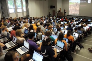
In Hon Keung article,”Identify The Motivational Factors To Affect The Higher Education Students To Learn Using Technology”, he analysis students’ motivation in using technology for learning in one of Hong Kong universities. Keung uses the ARCS Model for the base of his study. The ARCS Model is a method for improving the instructional materials interest and motivation. He states that there are four categories in motivation based on the extension of the motivational literature review described in the beginning of his research. The four categories are attention, relevance, confidence and satisfaction. Attention is about gaining and sustaining attention to the instructional content. Relevance is about relating to learning objectives and future use of learning. Confidence is about building confidence in learning and accomplishment. Satisfaction is about promoting the potential for learning satisfaction. Keung also brings up additional factors that can affect the motivation to use technology for students such as interest, perseverance, anxiety, perceived personal ability, satisfaction, and social influence. Results of the study showed that the use of technology could motivate student in learning and provided an effective learning environment to them such as the use of the internet, online courses, blackboards, discussion boards, email, library databases, MS Word , Excel, PowerPoint, and laptops.
I chose this source because wanted to learn about more how technology is effecting our educational system and if students are utilizes these technologies when in learning environments. The only flaw in this article would be that the research done is only based on one university in Hong Kong, giving a narrow analysis on the subject.
Reading Summary 6
In the article, Understanding Visual Rhetoric in Digital Writing Environments, by Mary Hocks gives information about rhetoric found in digital writing environments. She explains how teachers can teach their students to write about the visual rhetoric in digital environments. Hocks introduces the subject of the digital writing environment by stating that in this current period of time the prevalence interactive media is increasing as a result visual rhetoric has become critical when writing. Digital writing involves mixing together words and visuals. Hock refers to this type of writing as a hybrid of “verbal, spatial and visual”. Hybrid literacy employs a complex interaction between verbal and visual meanings. Because of this new relationship of rhetoric, changes must be made to supplement for this new definition of writing. Teachers who in the past taught rhetoric in print are now having to try teaching their students visual rhetoric. Hocks goes on to describe some key feature of digital rhetoric by analyzing two scholarly essays by Anne Wysocki and Christine Boese. She introduces the terms audience stance, transparency, and hybridity. Hock defines audience stance to be the encouraging or discouraging of interactivity from audience created by the author, examples of diferent ways this can be utilized are shown in Wysocki’s hypertext. Transparency is defined as how an online document organizes and establishes conventions like print, graphic design, film, and web pages; that make it clear and familiar to a reader, example Wysocki’s hypertext is given showing how easy the reader can navigate through the text. Hybridity is the ways in which online documents combine and construct visual and verbal designs, once again Hocks gives Wysocki as an example stating that her work merges images and text in thoughtful and unconventional ways which allows readers to experience a new way of learning. Hock then introduces The Ballad of the Internet Nutball written by Christine Boese, continuing to explain how the text also displays the three aspects of visual digital rhetoric. She then compares both Wysocki and Boese articles on how they utilize audience stance, transparency, and hybridity. Before Hock explains how teachers can teach their student visual digital rhetoric, students first need to be shown how to use multimodality in order to build new knowledge. Having technology cable of producing this knew knowledge is also required. She continues by stating that, “students need to learn the distanced process of how to critique the saturated visual and technological landscape that surrounds them as something structured and written in a set of deliberate rhetorical moves”. After establishing these precedents, Hock then explains how teachers can teach their students visual digital rhetoric in two steps. First assignment assigned must complement the objective of the course. Second student need to learn how to plan their projects by applying storyboards. Mary Hocks article explains the digital writing environment is being able to recognize the importance of meaning concerning text that combine text and visual cues. She then applies how this visual digital rhetoric are established in three terms audience stance, transparency, and hybridity; giving examples of scholarly text to support her claim. Hocks concludes by explaining the process teachers can take to teach their students about the visual rhetoric in digital environments.
Hocks, Mary E. “Understanding Visual Rhetoric in Digital Writing Environments.” College Composition and Communication 2003: 629. JSTOR Journals. Web. 7 Mar. 2016.
Reading Summary 5
 In Melissa King’s article, Better Online Living through Content Moderation, she explains how in today age of technology there is prevalent amount of abuse and harassment on the internet. King offers a solution to the problem through content control features such as block and ignore functions, content/trigger warnings, blocklist and privacy options. By employing these variety of functions, one can choose to make their online experience less irritating, but to others who may suffer from PTSD; these content control features are vital to them so that they can avoid topics and people that may trigger their anxiety. Yet these tools face constant cultural opposition. Users of optional moderation tools are often criticized for being weak or too sensitive. Disparaging and discouraging the use of content control features, creates a culture that pressures people to expose themselves to content that can be detrimental to a victim with anxiety issues. Though content control features don’t guarantee a stop to the effects of abuse online, they do aid in limiting attacks that can cause PTSD if severe or long-term enough.
One of the major misconceptions of content control is the argument that people who are victims to online harassment blow it out of proportion, and they should be less sensitive and ignore it. Melissa King points out that this argument composes a misleading parallel to exposure therapy; a type of therapy designed to combat severe anxiety through gradual and controlled exposure to its source, to inure an individual to these triggers and lesson the disruptions they can cause. In the perspective concerning online harassment, the concept exposure therapy is clearly a misapplication compared to content control, because having random internet strangers hurl insults and threats at someone with the hope they somehow come out more mentally durable. In this way victims suffering from PTSD will likely have their trauma amplified rather than reduced. On the same ignorance that holds the misunderstanding of exposure therapy, popular culture presumes that PTSD is something only military veterans suffer from. Argument against content control employs that online harassment is merely mean words said on the internet and have no real threat to the safety of someone or their family. In reality long-term exposure to threats of violence online is one of the major causes of PTSD.
 Blocklists are one of more recent content control tools available, arguments against blocklist are that people are being defamed for statements and opinion that they didn’t make when they are added to mass blocklist. However, blocklist creators like Randi Harper, creator of Good Game Auto Blocker, claims that blocklist creates its filtering methodology and appeal process clear therefore claims to defamation do not hold; when one is flagged it is absolutely correct because it blocks the majority of interactions with Gamergate on Twitter. These points however fail to recognize how ruthless and pervasive online harassment can be. Gamergate, for example, is notorious for doing everything in its power to threaten people into silence – from calling and threatening family members, to posting pictures of their targets’ homes and addresses online. These are all intimidation tactics that are designed to silence people – and are clearly illegal. Often women are especially targeted to this type of abuse, particularly women who are in positions that are considered male-dominate. Women in the tech industry or in the video game culture are often the main targets. Asking victims not to use content control tools is basically forcing the abused to spend more time with their abusers.
Content control tools like trigger or content warnings, blocklist and muting features can block unwanted harassment and abuse on the internet especially for people who suffer from psychological trauma. Not everyone is able to ignore these online abusers especially if they have PTSD. Ultimately, the solution to this issue would be that content control tools shouldn’t be discouraged because it gives others the power to personally moderate the worst of the internet in no way violates anyone else’s rights, and is often the best option victims have. For people that are pro anti-content control, they are supporting misinformed opinion that are insufficient to helping others mentally and is further increasing harmful patterns in online abuse
Interior Built Environment Description: Landmark Diner Restaurant
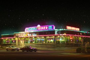
 In the late 1960’s, Tom Lambrou founder of Landmark Diner was a Greek immigrant who started of working as a cook on ships that traveled all around Europe, Africa, and even Asia. When Lambrou arrived in America, he was reduced into working low-leveled position such as dishwasher or busboy. But by the age of 23, Tom Lambrou had saved up enough money and experience to open up several diners in New York. In 1994, Lambrou made the big decision to move to Atlanta and open up his first diner in Buckhead, the first Landmark Diner. His incentive for this major move was that at the time Atlanta was a rapidly growing city and plus the Olympics were on its way. Over the next several years, Tom Lambrou collected the rewards from his hard work and was able to open 4 more Landmark Diner location around Atlanta. The Landmark Diner in Buckhead is the original 24 hour diner located in the heart of Buckhead, at the corner of Peidmont and Roswell road. The Landmark Diner is a traditional New York operated diner with a large menu with breakfast, lunch and dinner served all day. The menu ranges from your simple steak gyro to fresh seafood, along with your typical diner foods. The building of the Landmark diner itself is reminiscent of a old school 50’s diner; with metallic reflective exterior walls, large paneled windows, and neon lights around the building/signs. Despite the diner having being built in 1994 is a little run down and old, it still doesn’t take away the authenticity and inviting manner of the restaurant itself. Upon entering the diner, you are greeted with a bakery case filled with homemade cakes, pies, breads, and other pastries. On the left of the restaurant is the Punchline Comedy Club, a side lounge that is apart of the diner that shows live comedy and music from Wednesday night and continues until Saturday night. The interior design of the diner is quit unique from any other diner in Atlanta. The floors and walls plus the bar near the back of the diner are made up of all marble. Booths and tables crowd up the floor, leaving just enough room for people and servers to walk around. Big white cream colored drapes hang from the window and fake potted flower beds sit on the window sills. The ceiling is decorated with different hanging international flags along with bottles of alcohol aligned on shelfs around the bar. On my visit to the Landmark Diner in Buckhead, the servers are friendly and are willing to hold a conversation with you, especially if you were a regular; which they get a lot of since most of the employee remember the customers names coming in. So whether your a person who is looking for quick bite after a late night of being out or just a regular customer looking for some delicious homemade diner food with the accompany of a familiar face; the Landmark Diner in Buckhead is Altanta’s Premier 24 hour diner that provides your favorite meals with a dedicated staff that is devoted on making your experince the best around.
Interior Built Environment: Digital Record 6
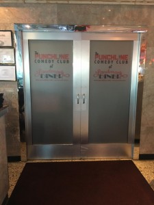
On left of the diner are the double doors that lead to the Punchline Comedy Club. This is a side lounge connected to the diner and provides live comedy and music nightly. Unfortunately I didn’t have the chance to enter the lounge while I was at the diner, since it was too early at the time for a show.
Interior Built Environment: Digital Record 5
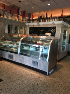
Upon entering the diner, you are greeted with a glass bakery case filled with an assortment of homemade cakes and pies. On top of the case were baked breads and other pastries that you could smell when walking through the doors of the diner. Behind the bakery case, different kinds of bottled alcohol are on display in and on top of shelves. This was the most inviting aspect to the diner to me, since almost everyone loves sweets and you could see that they make their own food from scratch.
Interior Built Environment: Digital Record 4
The all marble bar provides for costumers looking for a quick bite. Behind the bar, the setup looks like any typical diner with dishes/glasses, soda dispenser, coffee maker, and bottles of alcohol; all up front enabling quick and easy access for the server. T.Vs were setup on both ends of the bar, so customers could catch up with the news while they ate. Personally, having previously ate at the diner, I would have prefer to eat at the bar since it is quick and the servers were nice enough to hold up conversations with you while you sat there.


