The CDC Website From My Eyes.
“Civilized. Simple. Straightforward.”
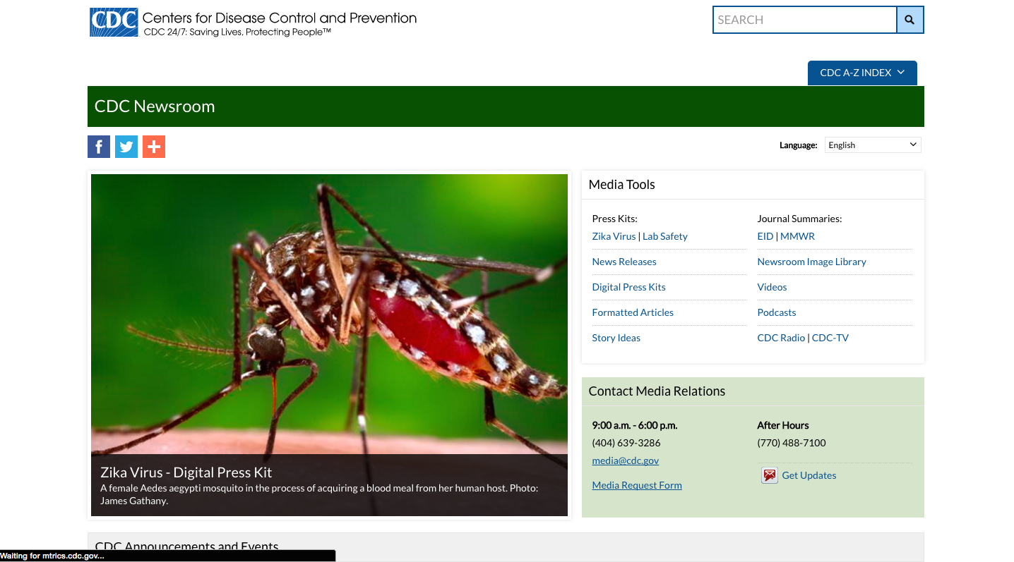
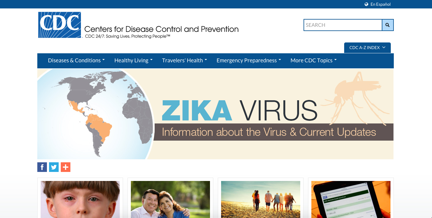
These are the three words that I would use to summarize the CDC website. My adventure starts at the homepage of the CDC site where I was greeted with a large banner advertising “Zika Virus”. Immediately I began to question how much I knew about the virus and felt compelled to click on the banner since it advertised that it would provide me with the information I was seeking. This method of using large letters, combined with neutral but attention grabbing colors is an effective way to capture the attention of users going to the website.
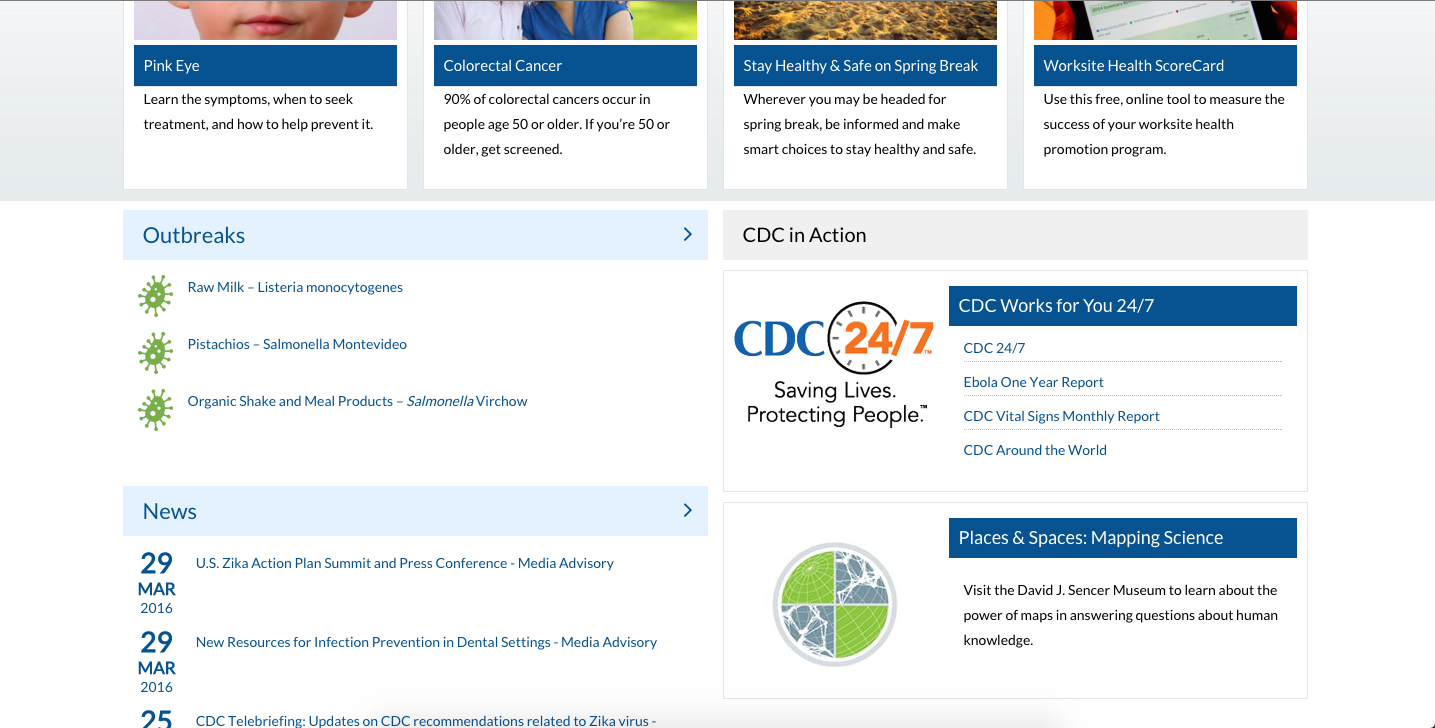
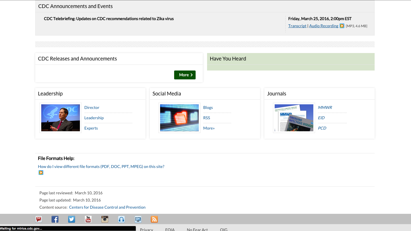
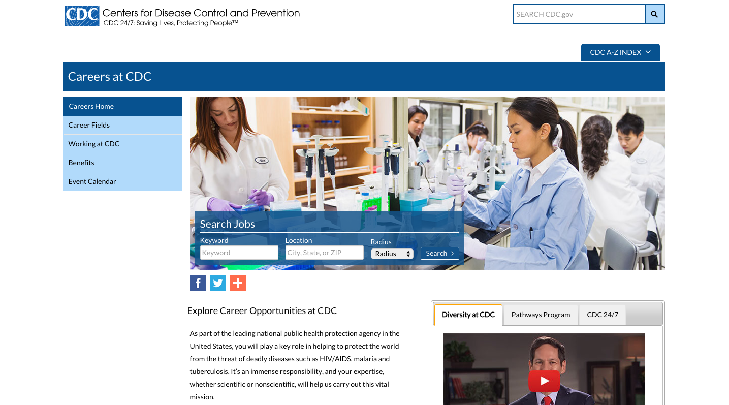
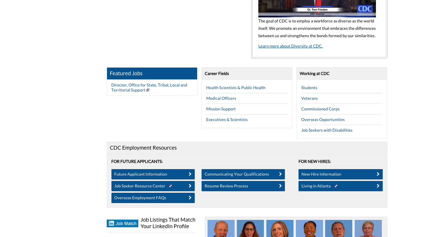
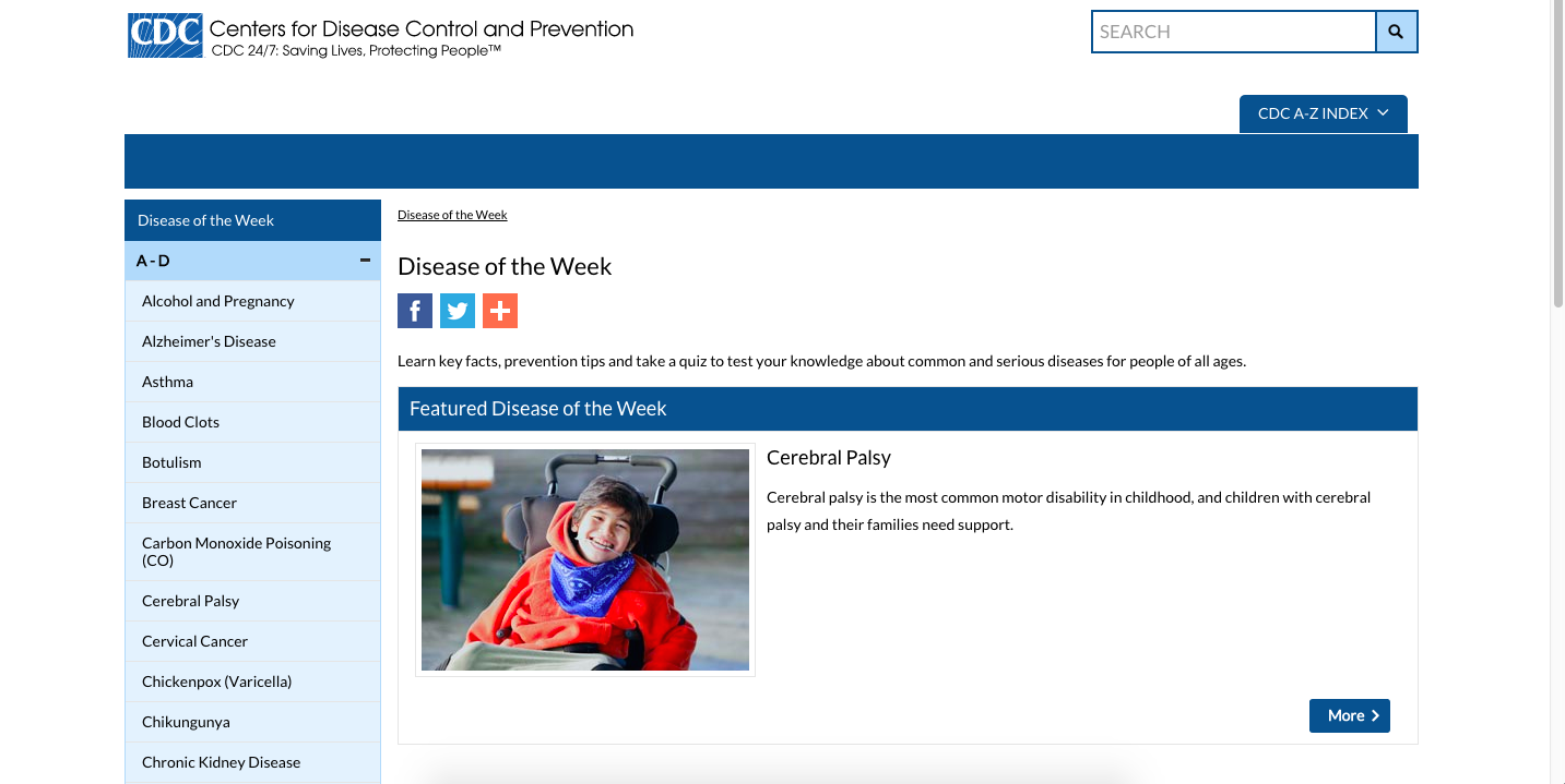
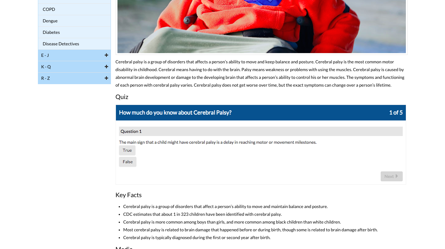
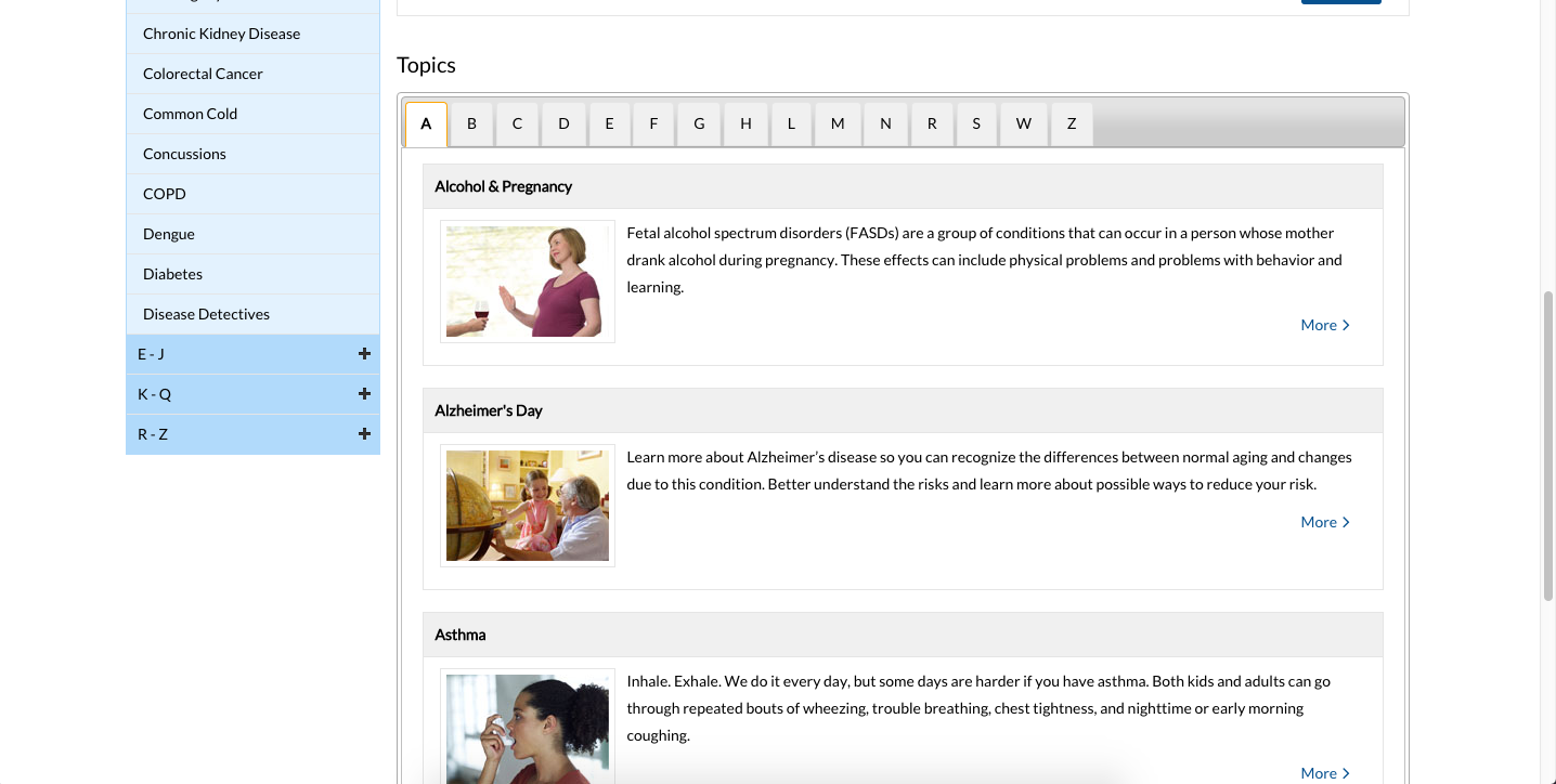
The second thing that caught my attention was the layout of the website. Most of the site is blue or green combined with white lettering. The site also integrates images which are usually followed by brief captions justifying the context of the image. Everything about the CDC website’s layout is very simplistic and repetitive. This simplistic styling can also been seen in educational and most professionally oriented websites. While this may be a good thing, as the use of basic colors and backgrounds helps prevent the user from becoming distracted, it also can make everything seemed cluttered. For example, in the picture below, the repetitive use of blue backgrounds and white lettering makes everything blend in. As a result, less sticks out at the viewer and everything becomes blurred together. However, this layout may be beneficial to more mature age groups, as that seems like the target audience of the CDC website. Personally, this layout made me feel fatigued as I encounter it consistently with other websites on a daily basis.
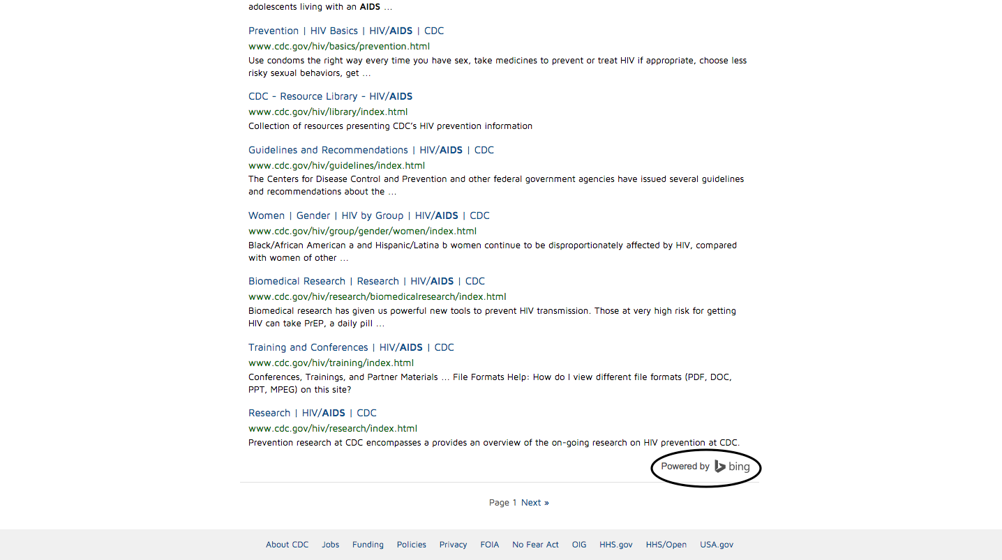
As I continued to explore the CDC website, I focused on the information provided and usability of the site. The CDC website is a great place to keep up with the latest diseases and educate yourself about potential illnesses you may have and the steps you need to take to cure yourself. Unlike other sites that pop up when you google an illness, the CDC website is a credible source and the information they provide is backed by extensive research. As for the usability of the site, the CDC website is not too complicated to navigate through, however, as I mentioned before, the site can become confusing because of the repetitive use of the same format and colors. For example, when I used the search feature (below), a multitude of results piled up onto my screen in the same blue and white format. Once again, I felt overwhelmed by the amount of results that popped up as well as how they were organized.

Overall, the CDC website does its job well, which is to educate and update the public on diseases. I would recommend using this site if you wish to learn more, or identify a potential illness you may have.
Explore more…
- First look: https://sites.gsu.edu/etalundzic2/2016/03/31/cdc-digital-record-1/
- Exploring the disease of the week: https://sites.gsu.edu/etalundzic2/2016/04/01/cdc-digital-record-2/
- Careers at the CDC: https://sites.gsu.edu/etalundzic2/2016/04/01/cdc-digital-record-3/
- CDC search feature: https://sites.gsu.edu/etalundzic2/2016/04/01/cdc-digital-record-4/
- CDC Newsroom: https://sites.gsu.edu/etalundzic2/2016/04/01/cdc-digital-record-5/

