My Take On The CDC.

The CDC Website From My Eyes.

“Civilized. Simple. Straightforward.”


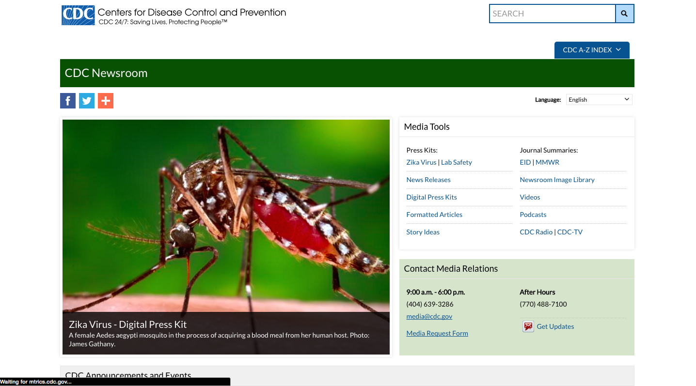
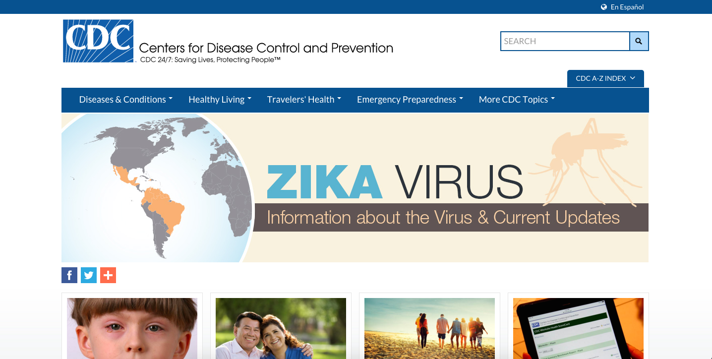
These are the three words that I would use to summarize the CDC website. My adventure starts at the homepage of the CDC site where I was greeted with a large banner advertising “Zika Virus”. Immediately I began to question how much I knew about the virus and felt compelled to click on the banner since it advertised that it would provide me with the information I was seeking. This method of using large letters, combined with neutral but attention grabbing colors is an effective way to capture the attention of users going to the website.

Screen Shot 2016-03-30 at 1.31.11 PM

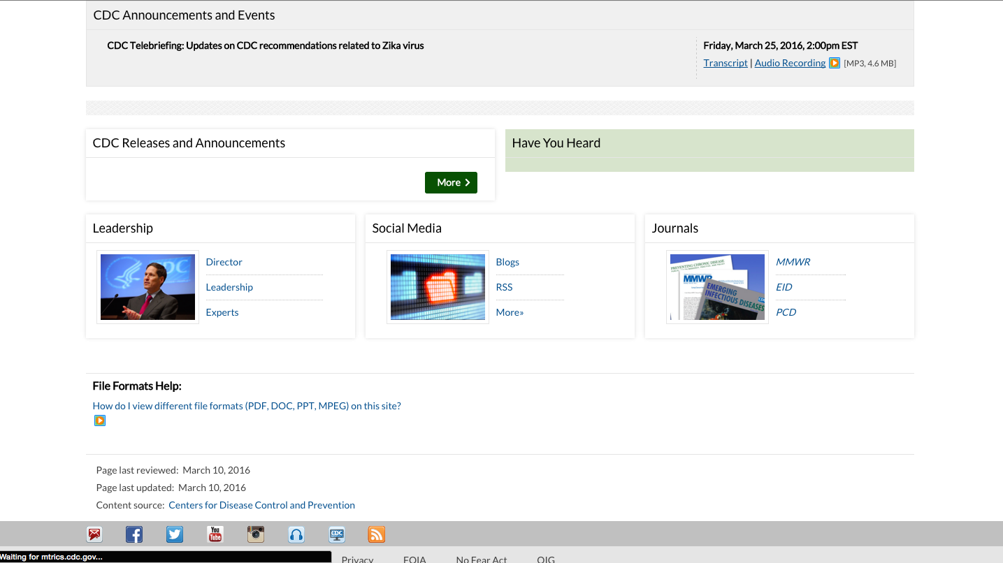
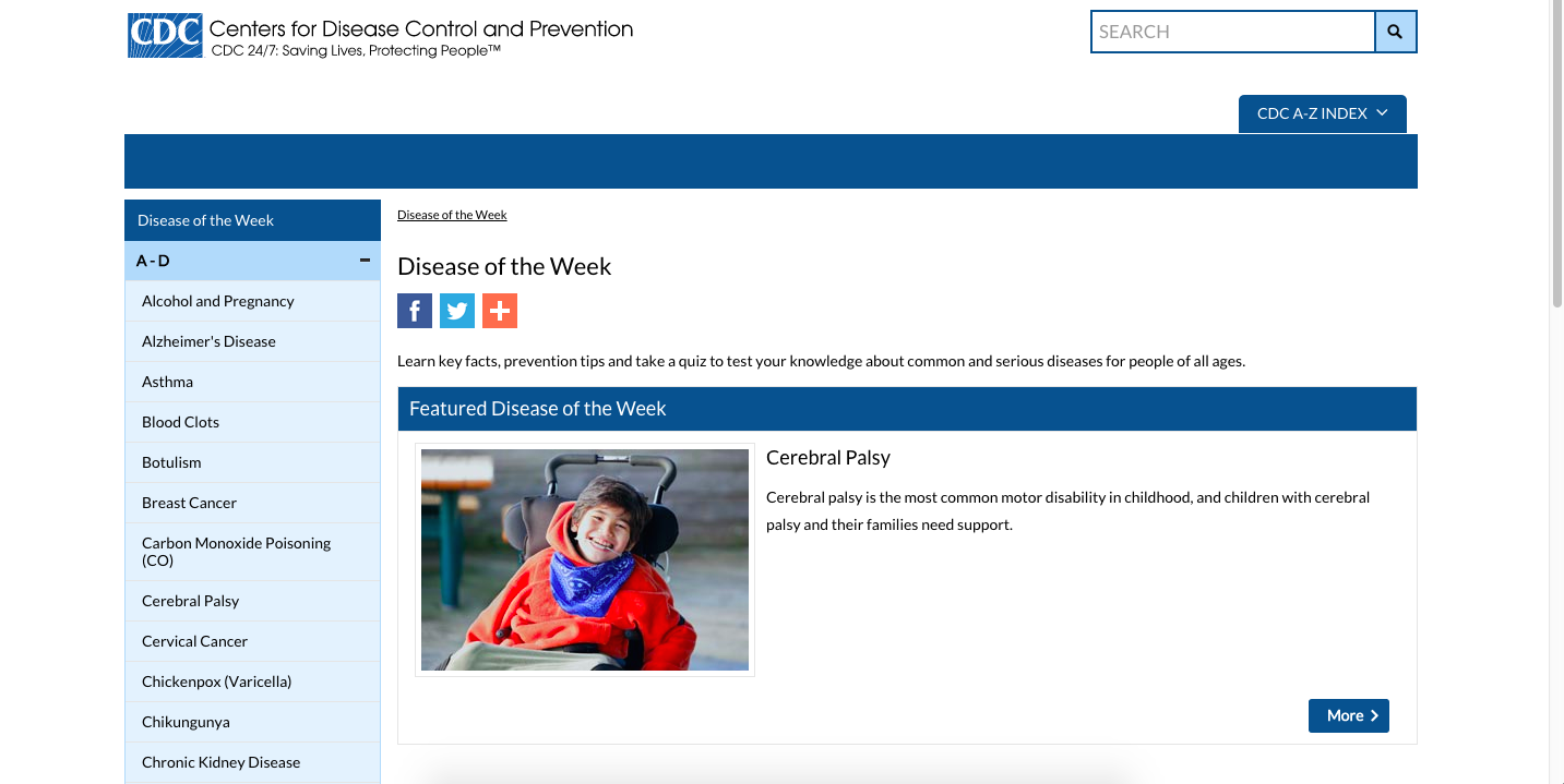
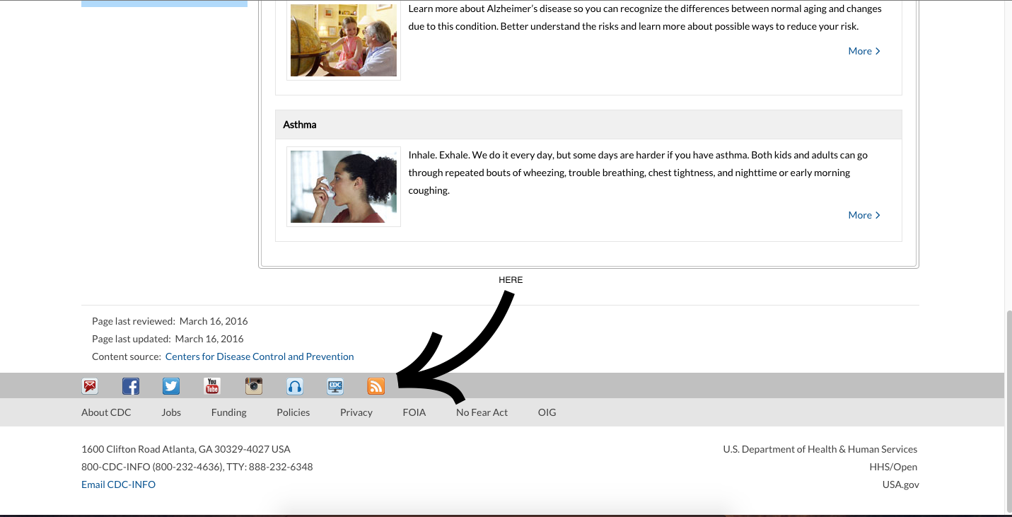
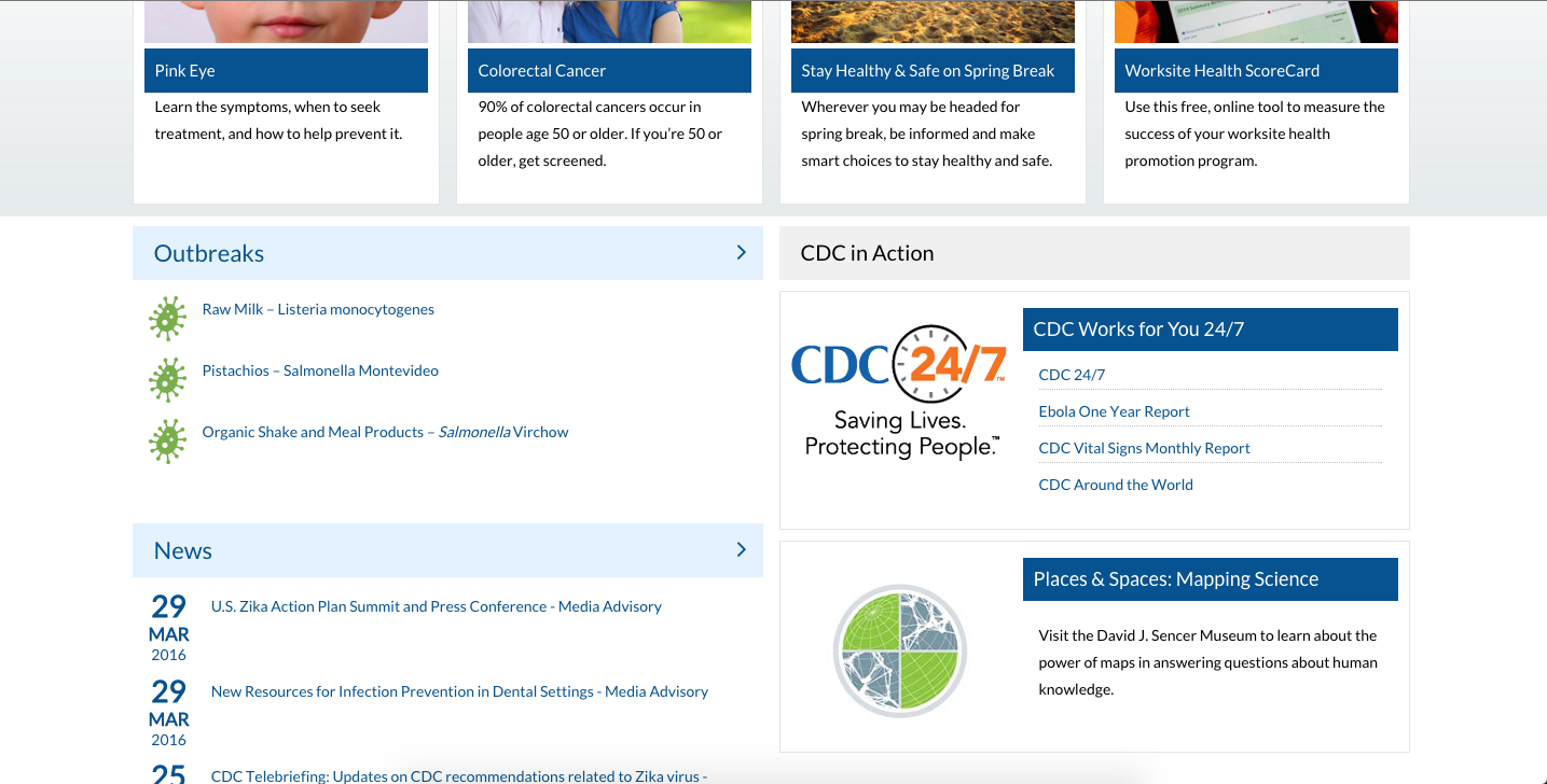
The second thing that caught my attention was the layout of the website. Most of the site is blue or green combined with white lettering. The site also integrates images which are usually followed by brief captions justifying the context of the image. Everything about the CDC website’s layout is very simplistic and repetitive. This simplistic styling can also been seen in educational and most professionally oriented websites. While this may be a good thing, as the use of basic colors and backgrounds helps prevent the user from becoming distracted, it also can make everything seemed cluttered. For example, in the picture below, the repetitive use of blue backgrounds and white lettering makes everything blend in. As a result, less sticks out at the viewer and everything becomes blurred together. However, this layout may be beneficial to more mature age groups, as that seems like the target audience of the CDC website. Personally, this layout made me feel fatigued as I encounter it consistently with other websites on a daily basis.

Screen Shot 2016-03-30 at 1.31.21 PM

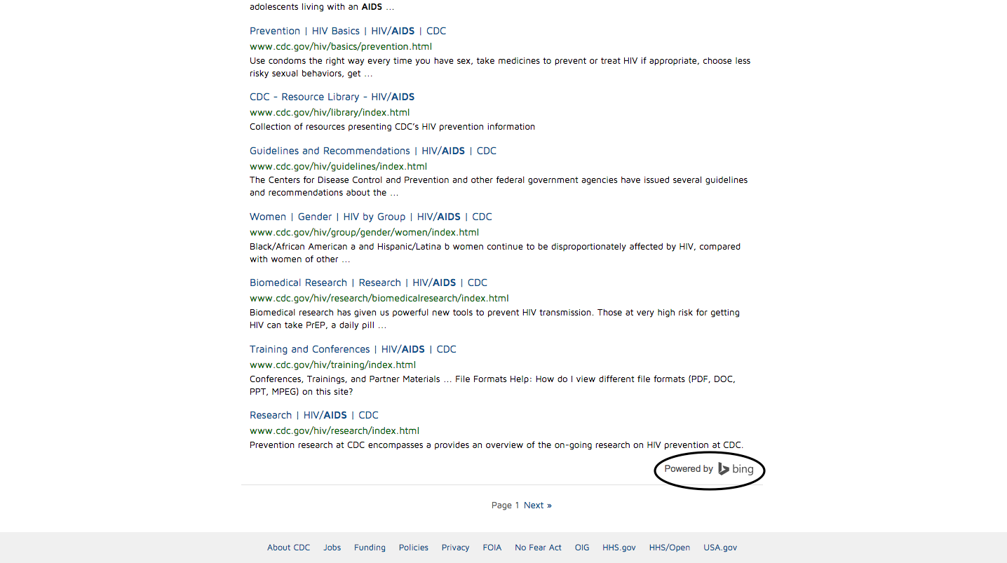
As I continued to explore the CDC website, I focused on the information provided and usability of the site. The CDC website is a great place to keep up with the latest diseases and educate yourself about potential illnesses you may have and the steps you need to take to cure yourself. Unlike other sites that pop up when you google an illness, the CDC website is a credible source and the information they provide is backed by extensive research. As for the usability of the site, the CDC website is not too complicated to navigate through, however, as I mentioned before, the site can become confusing because of the repetitive use of the same format and colors. For example, when I used the search feature (below), a multitude of results piled up onto my screen in the same blue and white format. Once again, I felt overwhelmed by the amount of results that popped up as well as how they were organized.

Screen Shot 2016-03-31 at 8.51.30 PM
The results that pop up when you use the search feature on the CDC website.

Overall, the CDC website does its job well, which is to educate and update the public on diseases. I would recommend using this site if you wish to learn more, or identify a potential illness you may have.


Explore more…

  1. First look:  https://sites.gsu.edu/etalundzic2/2016/03/31/cdc-digital-record-1/
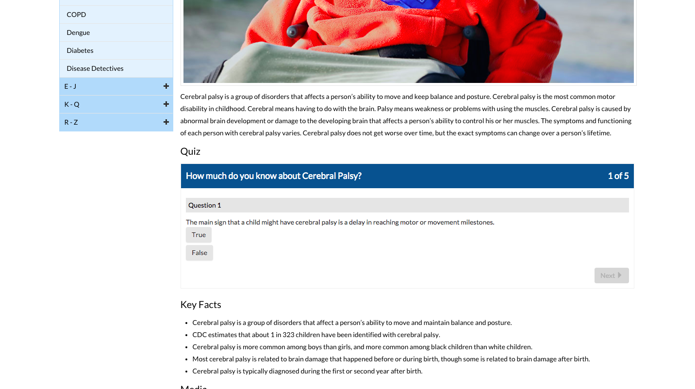
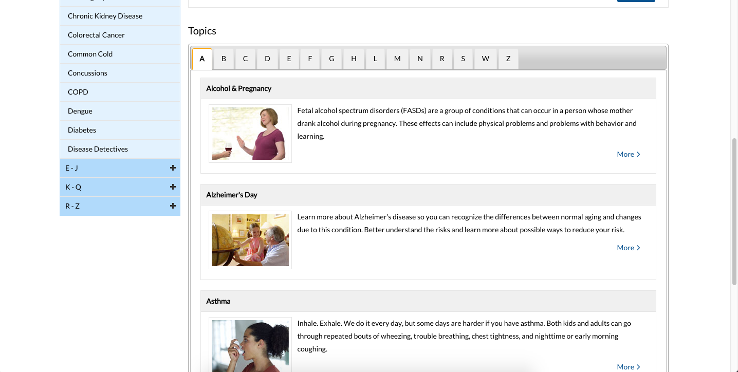
  2. Exploring the disease of the week: https://sites.gsu.edu/etalundzic2/2016/04/01/cdc-digital-record-2/
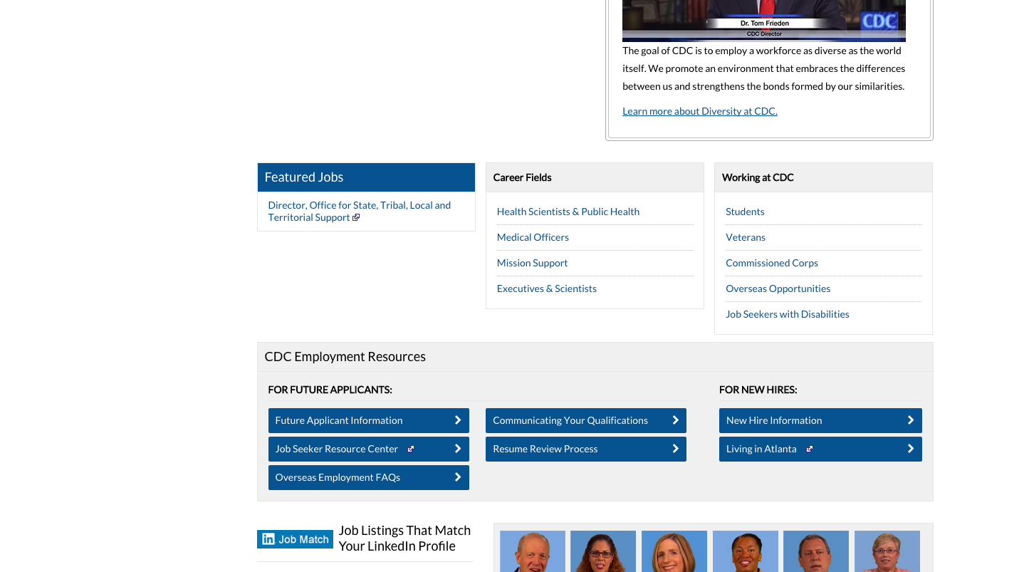
  3. Careers at the CDC: https://sites.gsu.edu/etalundzic2/2016/04/01/cdc-digital-record-3/
  4. CDC search feature: https://sites.gsu.edu/etalundzic2/2016/04/01/cdc-digital-record-4/
  5. CDC Newsroom: https://sites.gsu.edu/etalundzic2/2016/04/01/cdc-digital-record-5/


CDC Digital Record: #5

Screen Shot 2016-03-31 at 9.18.54 PM

This is the media part of the CDC. The color scheme changed from blue to green, however, the same font and format is used for everything else. To the left is a picture and a banner that usually represents the most covered issue. To the right are links to journal summaries and press kits with contact information below.

Screen Shot 2016-03-31 at 9.19.00 PM

At the bottom of the page lies three small and vaguely detailed categories with help on how to view the formats present on the site.

CDC Digital Record: #4

Screen Shot 2016-03-31 at 8.51.30 PM

I decided to explore the search feature of the CDC website. As seen in previous records, there is a search bar in the top left corner. I decided to search AIDS and see what it provided me with. Essentially the search bar uses Bing, as can seen below, and finds what you searched for. However, the results seemed to be filtered to all connect to the CDC website.


Screen Shot 2016-03-31 at 8.49.32 PM

CDC Digital Record: #3

Screen Shot 2016-03-31 at 8.30.26 PM

This is the career/hiring part of the CDC website. In the middle of the page, you have the option to search for jobs at the CDC by keyword and location. This is convenient and hassle-free way to search for a job as it shows you whats available as well as the distance it is from you.

Screen Shot 2016-03-31 at 8.30.36 PM

The rest of the page focuses on describing the different categories of jobs available at the CDC, hiring information, applications and a series of videos about the people who currently work at the CDC.


CDC Digital Record: #2

Screen Shot 2016-03-31 at 5.14.50 PM

I decided to explore the “Disease of the Week” part of the CDC website. Here you can see the featured disease of the week as well as the description of what it is. If you click the more button, it pulls up the full description of the disease as well a little quiz you can take to test your knowledge about the disease.

Quiz you can take about the featured disease.

Screen Shot 2016-03-31 at 5.14.56 PM

Here we can see a simple drop down list of all the diseases to the left and a more detailed list in the middle.

Screen Shot 2016-03-31 at 5.15.02 PM

Once again, there is a way to share the content from the CDC on social media. However, unlike before, now there are more options.

CDC Digital Record #1

Screen Shot 2016-03-30 at 1.31.11 PM

This is the top of the CDC homepage. In the left hand corner there are options to connect and share information regarding the CDC over Facebook, Twitter and Google +. The top part of the site has five major categories, four that are popular topics/categories, with the fifth category covering the rest of the CDC topics. The top part of the site also has an index, as can be seen in the top right area of the website.

Screen Shot 2016-03-30 at 1.31.21 PM


The middle part of the homepage is divided into a very simple manner, showing news and outbreaks.


Screen Shot 2016-03-30 at 1.31.33 PM

The bottom part of the site covers the what the CDC is about as well as the director.

Octane Coffee and Bar: Not Your Average Cup of Coffee.

My Experience at Octane Coffee and Bar

 Memorable. Aromatic. Welcoming.


When a person mentions the word coffee, what is the first thing that comes to mind? Is it a location like Starbucks? Perhaps the smell or bitter taste consumes your thoughts? Either way, it is likely that the word “Octane” does not cross through your mind. These are some of the thoughts that crossed through my mind as I was driving to Octane Coffee and Bar, which is located in Grant Park. When I arrived, I was gladly greeted by a spacious parking lot that did not require you to pay; something usually absent in the city of Atlanta. After parking my car in one of the designated locations, I walked around the building to observe the design and look for potential entrances. I found that the only entrance to the building is in the front which consisted of three handicap parking spots, stairs, and a ramp making the building easily accessible for those who are handicap.

IMG_20160303_020413
The combination of red bricks and dirty white metal siding gives off a rustic feeling.

Once I had finished observing the outside of the building, I walked up the steps and opened the entrance. Immediately my olfactory senses were assaulted by the bitter smells of coffee, the harsh smell of liquor, and the sweet smells of the neighboring bakery. The second thing that surprised me was the sheer amount of people present inside of Octane, specifically students. Everywhere I turned inside of the shop, there were students typing away in the glow of their laptops, surrounded in papers and empty glasses of coffee.The coffee shop was buzzing with people talking, bartenders making drinks and coffee machines endlessly milling away coffee beans into fine powder. Unlike most places, Octane does not rely much on artificial lighting since the surrounding glass provides adequate lighting. In addition to this, the styling of the interior space, from the gray metal chairs to the stained wooden tables gives off a feeling that almost makes you feel like you are at home.

Students endlessly typing away.
The sound of typing and conversation fills the air.

From an marketing standpoint, Octane is very neatly organized with an arrangement of tables and chairs in the middle of the room, a long bench that stretches alongside the wall and a patio for those who wish to sit outside. Despite that the bar and coffee shop are essentially mixed together, the bar is pushed to one corner of the interior space while the coffee shop exists in the other. As a result, the atmosphere of the bar does not mix with the coffee portion of the space. In addition to this, Octane does not spend very much money on advertisements and quite frankly it does not need to. As you can see here,  they rely on using cards with promotional deals and social media, both which are spread through word of mouth. While this may seem like a very inefficient way of advertisement, it is necessary to remember the consumer base, which is mostly made up of students who are usually very involved with using social media. Overall, I would recommend stopping by and grabbing a cup of coffee at Octane Coffee and Bar.

The Experience: Octane Coffee and Bar (5)

Naturally, in order to fully immerse myself into Octane Coffee and Bar, I had to order a drink and see what it was like. The drink you see here was recommended to me and is called the Nitro cold brew. The brown sugar packets are not there for decoration, but as a way to express the mentality of Octane. Much like how the brown sugar is “raw”, simple, rugged and natural, the coffee shop is the same.

Menus and Contact Information: Octane Coffee and Bar (4)

This is the menu at Octane Coffee and Bar. The menus are posted around the register on clipboards and are made of paper. The pricing to portion size is fair to me personally, but may seem high to others. The menu itself is very simple with the beverages listed and the price. No description is visible on the menu and the only way to find out is to ask.

Below is the contact card that can be picked up.

20160302_144728
List of locations, contact information and social media links.
Creative use of wording. "Refuel" at a place called Octane.
Creative use of wording. “Refuel” at a place called Octane. Also the deal of 10 coffee bevs and get one free. Encourages customers to hold on to the card.

Mmm mmm mmm! Octane Coffee and Bar (3).

Here you can see where the smells originate from. To the left sits The Little Tart, which is a separate enterprise from Octane. The Little Tart is where all the baked goodies are made and sold, and to the right is where the coffee is stacked and poured. I choose this spot because it mixes the smells of the dough and sugar from the bakery, with the bitter and smooth smell of coffee beans as they are being crushed and poured.

Where all the coffee magic happens.