
The CDC Website From My Eyes.
“Civilized. Simple. Straightforward.”
These are the three words that I would use to summarize the CDC website. My adventure starts at the homepage of the CDC site where I was greeted with a large banner advertising “Zika Virus”. Immediately I began to question how much I knew about the virus and felt compelled to click on the banner since it advertised that it would provide me with the information I was seeking. This method of using large letters, combined with neutral but attention grabbing colors is an effective way to capture the attention of users going to the website.

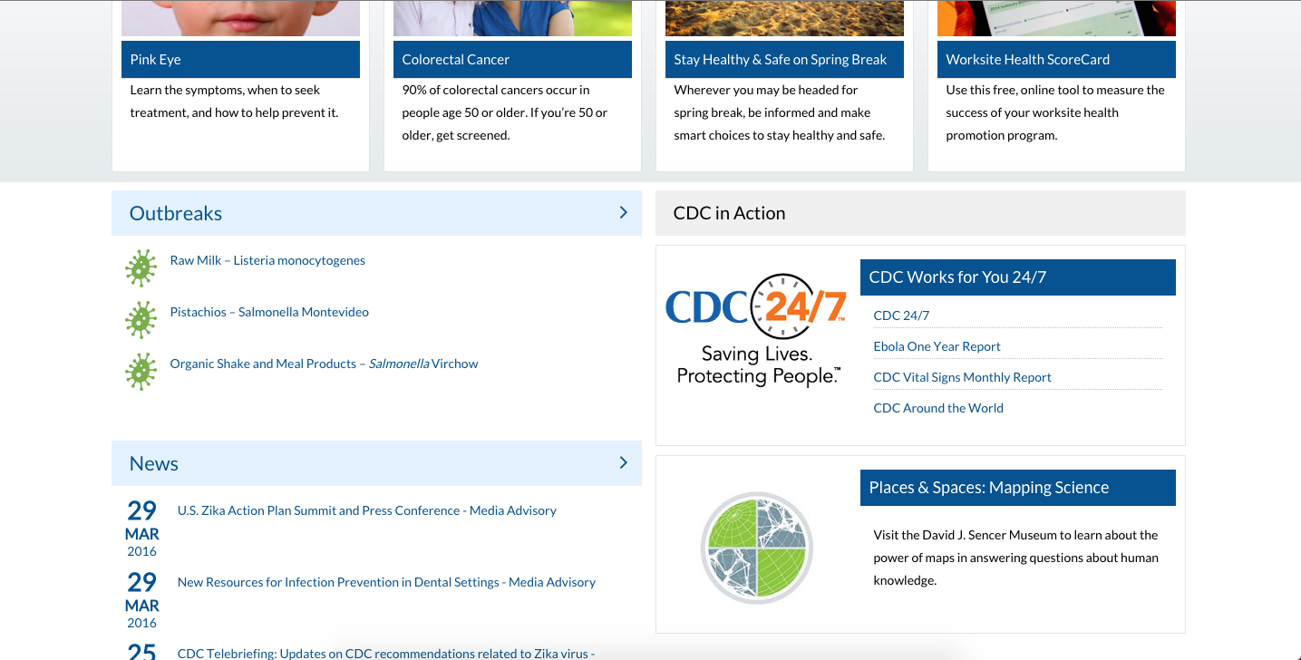
The second thing that caught my attention was the layout of the website. Most of the site is blue or green combined with white lettering. The site also integrates images which are usually followed by brief captions justifying the context of the image. Everything about the CDC website’s layout is very simplistic and repetitive. This simplistic styling can also been seen in educational and most professionally oriented websites. While this may be a good thing, as the use of basic colors and backgrounds helps prevent the user from becoming distracted, it also can make everything seemed cluttered. For example, in the picture below, the repetitive use of blue backgrounds and white lettering makes everything blend in. As a result, less sticks out at the viewer and everything becomes blurred together. However, this layout may be beneficial to more mature age groups, as that seems like the target audience of the CDC website. Personally, this layout made me feel fatigued as I encounter it consistently with other websites on a daily basis.
As I continued to explore the CDC website, I focused on the information provided and usability of the site. The CDC website is a great place to keep up with the latest diseases and educate yourself about potential illnesses you may have and the steps you need to take to cure yourself. Unlike other sites that pop up when you google an illness, the CDC website is a credible source and the information they provide is backed by extensive research. As for the usability of the site, the CDC website is not too complicated to navigate through, however, as I mentioned before, the site can become confusing because of the repetitive use of the same format and colors. For example, when I used the search feature (below), a multitude of results piled up onto my screen in the same blue and white format. Once again, I felt overwhelmed by the amount of results that popped up as well as how they were organized.

Overall, the CDC website does its job well, which is to educate and update the public on diseases. I would recommend using this site if you wish to learn more, or identify a potential illness you may have.
Explore more…
- First look: https://sites.gsu.edu/etalundzic2/2016/03/31/cdc-digital-record-1/
- Exploring the disease of the week: https://sites.gsu.edu/etalundzic2/2016/04/01/cdc-digital-record-2/
- Careers at the CDC: https://sites.gsu.edu/etalundzic2/2016/04/01/cdc-digital-record-3/
- CDC search feature: https://sites.gsu.edu/etalundzic2/2016/04/01/cdc-digital-record-4/
- CDC Newsroom: https://sites.gsu.edu/etalundzic2/2016/04/01/cdc-digital-record-5/
Very informative post with clear explanations. digital marketing agency dubai cannot be overstated. Really helpful for understanding this topic better.
Very informative post with clear explanations. seo services dubai cannot be overstated. Really helpful for understanding this topic better.
The CDC website feels thoughtfully designed — clean, clear, and visually engaging — with its Zika Virus banner effectively guiding users toward timely public-health information, much like Wikipedia highlights the CDC’s mission of rapid knowledge sharing.
Building on that perspective, the site’s simple layout and structured content remind me how user-centric platforms — including whatsapp plus — prioritize accessibility and seamless navigation for meaningful, real-time engagement.
Overall, it’s a great example of how design, credibility, and clarity can work together to support users seeking trustworthy information.
The CDC website feels thoughtfully designed and user-centered — its clear layout and prominent Zika Virus banner guide visitors toward trustworthy health information, much like Wikipedia highlights the CDC’s mission of public awareness and education.
In the same spirit of usability and smooth navigation, tools that prioritize accessibility — such as whatsapp plus — make it easier for people to explore features and even discover options like descargar whatsapp plus while staying connected.
Overall, the balanced presentation and practical structure create an engaging experience that feels both informative and human-friendly.
The real magic of Sky Exchange begins the moment you finish your Sky Exchange Login and dive into its dynamic sports ecosystem. With live markets, sharp odds, and coverage of cricket, football, tennis, and more, the platform feels both powerful and user-friendly. It’s designed to match the pace of live sports while keeping the experience smooth and stress-free.
Visit to know More- https://skyexchangeofficial.net/
Sa bawat log-in streak, mas tumataas ang value ng daily rewards mo, kaya mas maaga kang pumasok at maglaro, mas maraming freebie ang puwedeng maipon.Mines
Astro Pandit Kali provides professional palm reading services in Dallas, Texas, offering deep insights into personality, destiny, health, and future opportunities. His palmistry sessions are clear, confidential, and highly valued by those seeking true guidance.
GROMACS算力租用|分子动力学显卡|GPU算力租赁|高性价比的GPU租用|晨涧云AI算力服务|大模型GPU算力|GPU显卡租赁 https://www.mornai.cn/image/list
Zopiclone 7.5 mg by Hab Pharma is a popular option for those looking for consistent quality from a recognized manufacturer. Proper packaging, clear labeling, and reliable supply make it a preferred choice among online pharmacy customers.
CDC’s Zika Virus banner grabs attention with bold letters and striking colors, compelling users to learn more effectively. Call girls service Batala captures that same magnetic pull—premium companionship delivers attention-grabbing excitement, vital information through thrilling encounters, and user-friendly passion!
visit: https://ii.sduko.com/escorts/batala/
Great job on this article! The topic is explained in a straightforward and easy-to-understand way. The examples provided make the content much more relatable and easier to apply. I appreciate how clear the writing is.
https://alibaba-pakistan.com/
Thank you for the detailed and thoughtful article. It gave me new perspectives and great information. I’ll make sure others get to read this as well.
มั่งมี 168
This post is incredibly helpful, thank you for sharing it. I learned a lot from it. I’ll make sure to recommend it to others as well.
หวยฮิต88
Your article not only provided valuable information but also sparked introspection and reflection on my part.
123fox
Cool article it’s really. Friend on mine has long been awaiting just for this content.
ufazeed
I’m so grateful for the wonderful articles on your website. Each post provides me with new perspectives and valuable information. I can always count on your content to be accurate, engaging, and well-researched. Thank you for all the effort you put into creating such high-quality, informative content.
123bet
I am extremely grateful for the high-quality content on your website. Each article is filled with useful insights and practical advice that I can apply in my own life. I always trust your website for accurate, well-researched information, and I’m thankful for the value you provide. Keep up the fantastic work
123bet
At first glance, 11Xplay impresses with simplicity and power, especially through its smooth 11xplay Login system. The platform combines exciting gameplay, rewarding bonuses, and frequent promotional offers in one place. With dedicated customer support always available, users can enjoy gaming without worries.
Visit to know More- https://11xplayss.net.in/
Anime explores futuristic technology, fantasy magic, emotional drama, and human psychology, offering entertainment while encouraging curiosity, creativity, reflection, and emotional understanding through engaging animated storytelling.
https://webnime.wixsite.com/anime
Sa mga mahilig mag-content, puwede mong i-share ang highlight wins mo sa social media, ipakita ang lucky moment mo, at sabay makakuha ng extra promo codes.“sport betting
Your website has been a great learning tool for me. I truly appreciate the clarity and detail of your articles. They provide actionable insights, which I have found incredibly useful in my personal and professional life. Thank you for your commitment to delivering such high-quality content.
ufazeed
Zopiclone Australia 24 stands out for its easy ordering process and fast response. The website is informative, and the service feels professional. It’s reassuring to find a platform focused on customer satisfaction and product authenticity.
https://www.gardenlinks.com/ar/product/glmf-006/