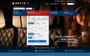
Pictured above is the Delta.com Homepage. The layout is set up to where the main thing they would like visitor’s attention set to, is the booking a trip search engine. The colors also help portray this message because the background image is set with darker tones and the search engine is a cool bright grey. The contrast really helps visitors focus on the “Book A Trip” tab, which is also promoted by it’s placement in the center of the screen.
The first page visitors see on the website is a woman who seems to be racially ambiguous. Because the image is of just one customer it is important the customer be multiracial in order to show the company caters to more than just one group of people. The customer is also drinking Starbucks coffee, showing that the company works closely with one of the largest brands, which makes the company seem more well known and successful, in turn drawing in more customers.
This is the “Book A Trip” tab. From first glance it appears to be confusing and very advanced, making it hard to understand for the average user. But in reality it asks you the basics of the trip you are planning and finds the easiest or most relevant options to what customers are looking for.
From this menu option bar depicts, we can easily see that Delta Airlines is interested in their customers from planning the trip, all the way until they leave the plan on their departing flight. They offer options front and center to access what probably are the most needed features of the site including: managing existing trips, booking a flight or vacation,arrivals and departures of the plane, and check in information.
At the bottom of the home screen, it is clear that Delta is preoccupied with making sure the flight goes smoothly for everyone. They have links with clear titles to show they offer support and services for the minorities of the traveling world such as Disabled passengers, and passengers in large groups, with pets, children or infants.
The homepage may seem as if it stops scrolling after the footer bar with the Disability tab, but for curious visitors who want to see more, they can keep scrolling to see fare sales. Delta has depicted 3 of their premier flight options. These flight options include flights to Europe, Latin America and Asia Pacific. This diverse list of areas persuades visitors that Delta is an inclusive company and services every part of the world.
After our studies of the built environment this semester, I have become more aware of how things are meant to subtly shape our views without boing conscious of the transition. Analysis of the Delta Airlines website (delta.com) has led me to believe that they company wants the site visitors to realize they are an all inclusive company be it flight destinations, diversity of the passengers, or special accommodations and they want each flight experience to go as smoothly as possible. Delta Airlines’ homepage is a cool blue color and it is welcoming to the eyes. Front and center is the “Book A Flight” tab, aimed at making your search experience easier. It offers various options and even goes finds car rentals and hotel stays from cross listed companies. The color of the tab is an off-white, which makes one focus all attention to it because the backdrop is a dark color. The background image is of a racially ambiguous woman on board a flight, with a starbucks coffee in her hand. This appears to show off the company as being open to all ethnicities and the Starbucks coffee goes to show that they work closely with some of the most prominent names in other industries which further showcases the prowess and success of Delta Airlines. The flight company also has many features on the site which show that they have everything one could need in terms of traveling. They offer special accomadtions for disabled passengers, families with children or pets, children flying alone and even discounted prices for groups of 10 people or more. Finally, Delta works to show flyers that they are an inclusive company through their photos of racially ambiguous models and fare sales for every inhabited continent. This goes to show their guest that Delta is all one would need when booking a vacation experience from start to finish.


