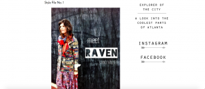
Coolatlanta.blogspot.com is hip, modern tour guide to one of the coolest cities in America, Atlanta. Furthermore, just like the city itself, the blog could be perceived to be a number of other adjectives besides simply “cool”. The blog meets you at the front with a huge grayscale photo of an ariel view of a section of the city with the words “HELLO ATLANTA” plastered on top of it in white bold font.
Once you enter the site you’ll notice abundantly more white space with the focus meant to be drawn to the center of the page where most of the information is displayed. From new restaurant reviews to profiles of some interesting people of the city, the middle area of the page contains most of the information the site has to offer. The posts scroll down in chronological order, which sets an organized precedent for the rest of your experience. There is a horizontal main menu bar at the top of the page that separates posts based on content, like “coffee shops”, “events”, and “music”.
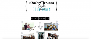
The spacious set up of the website invites visitors to comment. The minimal nature of the site also makes it easier to identify what the creator of the site wants you to focus on throughout each page. Under the events tab, there are graphic organizers complete with pictures and captions instead of the same block articles most blogs use. Features like this make the website seem to flow more easily. Clicking on any part of the graphic organizer links you to the corresponding website for more information on the event.Overall, the website is very easy to navigate and very informative. The digital space implies that the site is for people who already are somewhat familiar with the city of Atlanta due to lack of maps.
All in all, coolatlantablog is a trendy site for anyone looking to try something new in Atlanta. The built environment of the site itself promotes interaction on the site as well as in the city as they introduce people of the city and tell about their lives. The site is more of a blank canvas that is added to frequently, which is parallel to how some would view the city of Atlanta itself.


 This is the front page of the website that welcomes “Atlanta” to the blog. You can see a portion of the downtown area of the city from the view of the picture. The picture doesn’t show the more typical view of the skyline because they are trying to establish a website for the people who are a part of the community, not just tourists.
 From this angle it is easier to see the narrow walkway through the restaurant. It is not very wide and goes straight back unlike many other restaurants of this era. Due to this particular built environment, not a lot of walking is promoted, but more sitting and talking. For the most part, people only got up to leave and nothing else.
 A close up of the rounded stools with red cushions as mentioned in the built environment description. There are red accents throughout the restaurant that gives off a very retro feel. The silver compliments the red coloring for a visually appealing theme. The stools are fairly close to one another which doesn’t make for a very private experience at all.
 The front door of the Majestic Diner displays the 24 hour operating time and is just as iconic as the large sign atop the building. The clear glass windows enable you to be able to see all the way to the back of the restaurant from the outside. This kind of dynamic is unique among restaurants in Atlanta nowadays.
 The historic “FOOD TO TAKE HOME” sign perched high on Ponce De Leon Avenue is visible from very far distances and is a welcoming sight to hungry Atlantans. The multi-colored signs has no dead bulbs and shines bright 24/7 as the restaurant is never closed except on holidays. It lights up the otherwise gloomy February night sky in this sector of the city.