Edge Magazine in Development

Maybe you’ve heard the buzz, and maybe you haven’t:

Edge Magazine is coming to Georgia State University next Fall.

What is Edge Magazine?

Edge is an undergraduate project and research magazine/journal hybrid. It will be a fully online publication that encourages interesting multimedia presentations of excellent undergraduate work done in and out of class.

Why Edge?

You may have heard that GSU already has an undergraduate research journal called Discovery.

Discovery Journal Banner

Discovery features only Honors student work and is a much more traditional approach to research that Edge intends to be. We hope to be a more interactive take on the undergraduate research journal.


Edge is not DiscoveryEdge is its own entity – it’s own experiment. Edge is Edge.

What’s up with the name? 

We chose the name Edge for several reasons:

  • In an attempt to make sure we are, in fact, a little ‘edgy’ in terms of what a journal could be, Edge seemed like the logical choice for a name.
  • We want to be on the cutting edge of what a research journal can be.
  • Sometimes, when we come to the edge of something, a cliff, an idea, a sidewalk, it seems that nothing further can be done. We want to be that ‘further’. We want to do what research journals have not yet done. We want to go there. Over that edge.
Taken from http://fiqixirsi.com/most-beautiful-landscape-photos-of-norway/

Taken from http://fiqixirsi.com/most-beautiful-landscape-photos-of-norway/

Who is our audience? 

Edge will be outward facing, so that anyone with an internet connection may experience it. It will not be kept behind a paywall. It will not be limited to GSU students’ eyes only. If you contribute to Edge, your parents, your friends, your uncle Jack in Sarasota will have access to your work.

This means our audience will be anyone who is interested in experiencing the amazing work that is coming out of Georgia State University today. These are people who are interested in knowing what is happening at GSU. They are people who are interested in experiment, innovation, and ideas.

What is the vision?

There is no link to Edge as I write this entry today. This is because we are still in vision mode. I have drawn up plans for the amount of labor we will eventually need, and plans for the editorial process.

We are in the stage where we get to build the ideal. And that ideal is currently to create a multimedia journal/magazine hybrid that is accessible and fun for the audience to read, while maintaining a cutting-edge format where authors may attempt to showcase their research and project work in ways that research journals haven’t ever before.

You might see multi-layered work with lots of hyperlinks and videos. Or you might see text with audio spliced in and an image or two. Or you may see something unexpected that I can’t envision enough to explain yet.

What’s next?

We are excited about the possibilities of this project and are attempting to set the groundwork for an exciting launch during the next school year. In the meantime, we need to construct an infrastructure capable of maintaining a website that is actually on the edge of content that comes from a research university and showcases the work that undergraduates are capable of.

At the moment, we’re cobbling together ideas from a bunch of brains that are as capable as they are brilliant, in order to launch the skeleton of a website which will be both malleable and  fluid in its ability to be molded to fit the content we receive.

We are preparing with images, banners, video capability, lots of other great art, and some really wonderful content that will hopefully be interesting and surprising.
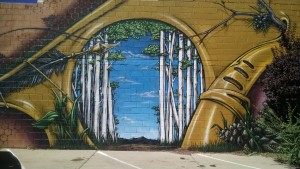
Birch_Ave_Mural

Here is one of the images I captured for the image archive to enhance content with provoking images.


As we come up with a logo, a basic site, and more solid visions, I will be updating you here, hopefully with more images. Stay tuned.

Building Digital Portfolios

I will be holding a workshop on digital portfolios Monday March 30th, at 1PM in the CURVE.

The workshop is for both students and faculty. If you are a student, you may want to come to see what kinds of options are available for you to create your own digital presence. If you are a faculty member, you can come for the same reason, OR to get tips on how you might teach the digital portfolio. I will be presenting a few versions of my own portfolio, and then we will be discussing ways to present ourselves, and sharing new tools and tips together.

In order to prepare for this workshop, I had to do a lot of research and a LOT of building. I want to be able to showcase a few of the major sites where portfolios can be hosted, both free, and at low cost. I learned an incredible amount about web building and design. I’ve picked up new coding tricks, and learned how to embed a Google Doc, though Google has some of their own bugs to work out concerning that.

Let me show you some examples of how different portfolios can look (this also serves as a sneak peak at my workshop):

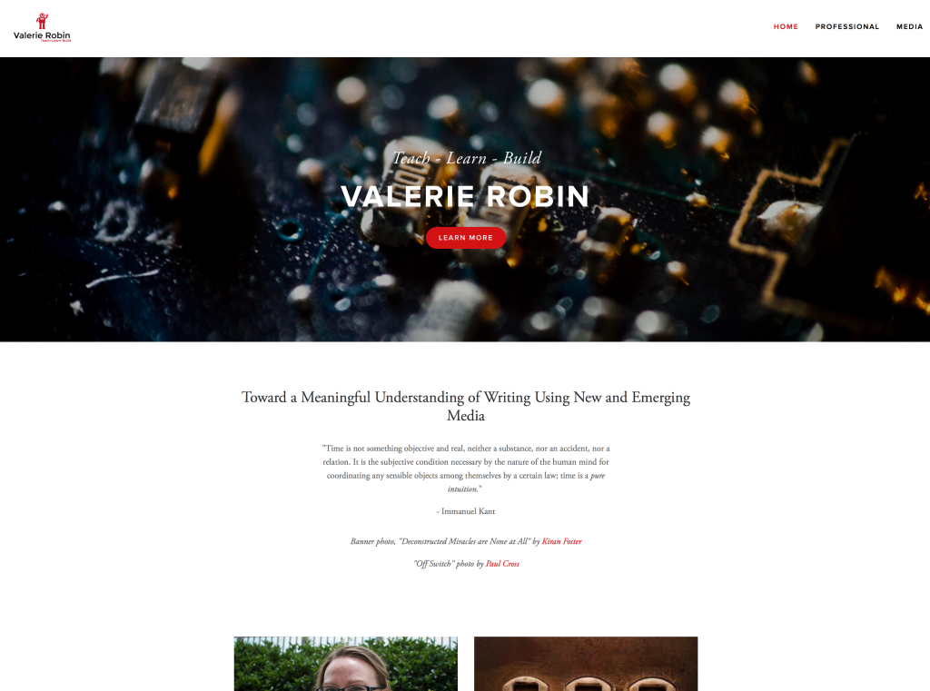
Below is my Squarespace website. I own the domain, vrobinphd.com and I have been working on this for quite some time. This is my permanent portfolio, and the one I give to potential employers and promote on my social media.

Squarespace

Screen Shot 2015-03-11 at 12.17.42 PM

As you can see from this front page, the design is sleek, and professional looking, with a lot of white space, which is what the trend for design is right now. Squarespace is a WYSIWYG (what you see is what you get), but it also has options for coding, so you aren’t always limited to the template parameters. For example, I was able to drop an embedded Google Doc in as my CV, using the code function. This took some experimentation (and Googling), as I assumed the embed function would do it – and this turned out to be not the case. Unfortunately, this cool red button you see in the header, is not something I can code or manipulate to make it show up on other pages. So while I can manipulate much of the template, I can’t control all of it. Also – it is important to note that buying into Squarespace allows me to create my own logo with tagline. You can’t see the little red robot well here, but you will see it on other portfolios below.


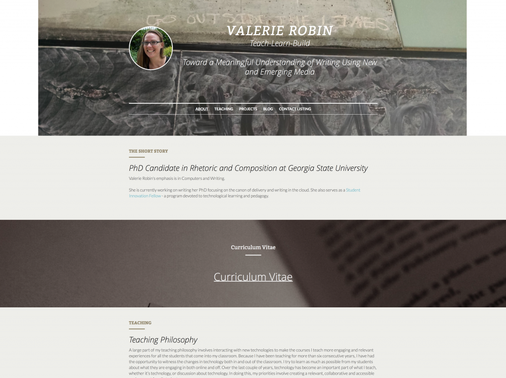
This next one I made on a website called strikingly.com which I learned about from an article in the Chronicle of Higher Education called “How to Curate Your Digital Identity as an Academic.”

Screen Shot 2015-03-11 at 12.18.26 PM

Strikingly is ONLY a WYSIWYG drag and drop application, and it only allows you to have one page. This page however, can be as long as you could ever want it to be. So instead of your visitors clicking to find content on new pages, they just scroll to each section. Strikingly allows you to upload backgrounds to enhance certain sections, and provides lots of neat, attractive buttons to place along the way for people to click on to email you, or visit a project you’re working on outside this site. It’s really simple, so it will be great for people who can’t code, or just want easy maintenance.


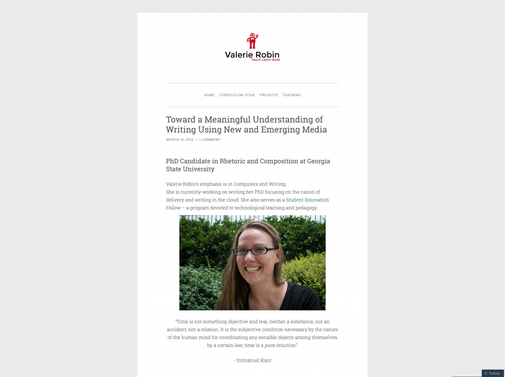
The last one I have to show you here is from wordpress.com which is on a template/theme called ‘pen scratch.’

Screen Shot 2015-03-11 at 12.18.51 PM

I chose a theme that looks clean and has a lot of white space to stay in the theme I have going among these portfolios I’ve made. This one is currently in heaviest build mode, but creating new pages, and showcasing my content has been very easy. WordPress is both a WYSIWYG and has coding capabilities you can use to manipulate both theme and content. I have learned a LOT about themes from working on the Tools Wiki project, including how much each theme can make or break the look of your site. I may find out as I continue to build that ‘pen scratch’ does not, in fact, work for my portfolio, and it could look COMPLETELY different by the time I give the workshop – this is one of the things we’ll cover in the workshop, actually. For now, you can see it largely works well, and there’s my cool Squarespace robot up at the top.


It’s been really fun hanging out at the Exchange researching, and building, and saying, “pssst, does this look stupid?” to other SIFs that hang out in the Exchange with me. I’m really excited I get to give the workshop, but I’m MORE excited about all the invaluable things I’ve learned in the process.

If you find yourself in need of portfolio help, please let me know and I’ll be happy to put my two cents in.

Rhet/Comp, Durkheim, Hybrid Pedagogy, and Me

In the last 7 or so weeks as a SIF, I have learned more than I ever imagined I would.

A few weeks ago, I decided to write an article featuring the SIF program. In a stroke of benevolence, Brennan gave me permission to spend some of my hours developing the article. So I set to work – basing the article on a footnote I harvested from Emile Durkheim’s sociologically ground breaking book The Elementary Forms of the Religious Life written in 1912:

“A tool is material accumulated capital.”

When I read that note, I knew I was going to use it for something – but I wasn’t sure what – until I began to read Writing Teachers Writing Software by rhetoric and composition scholar Paul LeBlanc.

The article I wrote went live this morning at 3am on Hybrid Pedagogy. Here is the link:

Addressing the Elephant: The Importance of Infrastructure

Designing for Tools

This morning the Tools Wiki team had a meeting with Brennan Collins to discuss our design research for the project. I must say, we came up with some pretty great stuff. Mostly, I’m impressed with the amazing ideas my team has – Go Team!

Ultimately, we decided to use edublogs because of the features the different themes afford us. We each chose a different theme and 3 tools to feature and we set to work playing with the sites. Below are links to the 3 pages we built – all experimenting with things that edublogs can do:

Roxanne: http://sites.gsu.edu/rgreesontools/

Wasfi: http://sites.gsu.edu/wmomentools/

Me: https://sites.gsu.edu/vrobin1/

As you can see, each has a distinct look and feel and even the menus act differently, which is our biggest struggle. We have decided to go with Roxanne’s theme, which is called ‘fifteen’ and she is going to play with the menu functionality to see what she can get the theme to do.

Please check back for updates on the tools wiki progress.

Wiki Mayhem

This week was the start of school. But that’s not as important as the fact that it’s also Dragon Con week. What this means is that I will need to be front-loading all my work into the first few days of the week, save some meetings coming Thursday because my friend, author, and fellow blogger, Giando Sigurani will be coming in to join in the festivities with me.

What does that mean for my SIF work? It means that I’ve been researching far and wide the different styles and platforms for wiki’s out there.

In case you haven’t read this helpful over-view article, here is an handy “How to Start Your Own Wiki” article with some great starter links in it. I’ve explored several wikis with some pretty attractive design elements (never minding the content): Wet Paint is a celebrity gossip page, and  my favorite video game, Don’t Starve, even has its own wiki page for users to try and figure out how to build and create things the characters need in the game.

The great thing about wikis is that they don’t have to all look like wikipedia. They can be designed to look like a regular web page, but they still are made up largely user content. The idea behind all this research is to create an attractive and intuitive wiki where students can post pages about tools they can use in class, on projects, or just to make life easier.

I will be posting relatively regularly about the tools wiki as it develops, so please check back often for news, successes and failures on this project.