Randy Swearer – The Provost with a Message

Dr. Randy Swearer came to Georgia State University to give a 2-part talk titled “Understanding Emerging Trends in Higher Education” last week. Swearer has been provost of Philadelphia University since 2009 – and I find this to be an exceptional detail.

It is exceptional because this is the first time I have heard someone with this kind of institutional power speak about a radical change in the system of higher education.

Let me give you a summary:

Swearer talks about the need to unbundle the university system.

Swearer-2

This means, in general, that we need to be less focused on disciplinarity, and more focused on a more flattened hierarchical system that relies on training for skills, rather than training for tests. It is student-centered, and it is a place where faculty can focus on a variety of ways to deliver content, rather then the way we have been doing it for the last 150 years.

What is more, Swearer has a model that he believes might work.

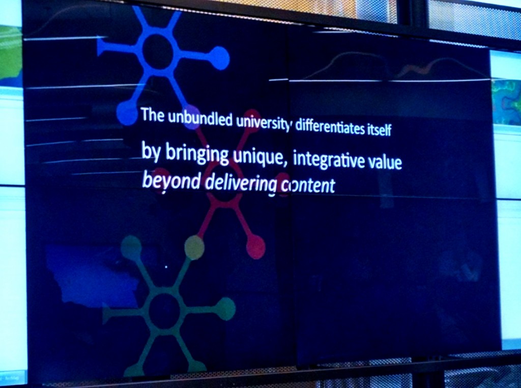
Swearer-4

In the picture above, Swearer is showing an overview of his Part 1 talk before he goes into detail about his proposed system. Here, he proposes to disintegrate the existing model, opening up new ways for students to move through the system – minus arbitrary grading, lecture-only classrooms, and other models that critical pedagogues argue against.

Once the talks were over, everyone I attended with that works in the Exchange had some very interesting conversation about Swearer’s proposed model.

For me – the outcome has little to do with Swearer’s solution. Instead, I am excited that Swearer, a provost with a very loud voice, is on a speaking tour, talking about how much things need to change. Swearer’s model may not be a good solution – and it might also be a wonderful solution. We can’t know until his group enacts it. What I agree with most about Swearer’s talk is that change needs to happen. What I would love to see are several different groups trying out different systems simultaneously, while collaborating to attempt to find what works and what doesn’t along the way.
Digital Portfolio Workshop

Yesterday, I delivered a 1 hour workshop on building a digital portfolio. 11 people showed up, but three of them were Will, Taylor and Heidi, so I’m not sure 11 is cheating or not. I WAS excited to see them there – don’t get me wrong.

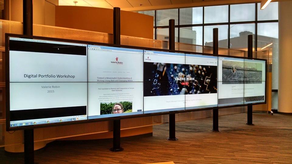
The Interact Wall in CURVE in action

The Interact Wall in CURVE in action

Overall, the workshop was well received, though it felt a lot more like a class than a workshop. I spent the first 30 minutes talking through points which covered online presence, types of hosting, available apps, and potential content. I was really hoping people would have their own attempts at digital portfolios to share — but I think that might be a different kind of workshop all together.

We had a variety of people with different levels of knowledge in the group though – which I was really hoping for. Two people from career services showed up and provided some helpful tips, and a student from the art department had some really great questions about presenting an art-forward portfolio as opposed to the professional job-forward portfolio I have designed for myself.

If I do this again, which I might since many of you expressed interest, but couldn’t make the date/time, I would probably find other examples of portfolios online – both successful and unsuccessful and we would have a discussion about what works and what doesn’t. At this point, I’m unsure whether I focused too much on design, or not enough. I tend to forget that even though most of us spend an astonishing amount of time online, we often don’t soak up how the design works. Design, at this moment in Web 2.0 history, is minimalist with lots of white space, only little splashes of color, and lacking anything too flashy. This kind of design may be becoming naturalized for many users so that not only is the interface of the operating system invisible, but the very design of the site is also invisible. In fact, this is what we’re going for when we design (most of the time), so that means the design aesthetic is successful. But this then becomes problematic for people that don’t work in tech to break into this seemingly opaque world of design.

My overall aim was to make building a digital portfolio seem like a relatively easy, approachable task for people new to the idea. I was quite surprised to find that no one in the audience had a portfolio of their own – not even an attempt at one. So I decided to talk to that point and highlight the ease of the WYSYWG and the fact that my content was quite limited in terms of the way I showcase myself in a general way that could appeal to many kinds of potential employers.

If you have a desire to see this workshop and couldn’t make it – please leave me a comment below and we’ll see if I can’t get another one scheduled.

Building Digital Portfolios

I will be holding a workshop on digital portfolios Monday March 30th, at 1PM in the CURVE.

The workshop is for both students and faculty. If you are a student, you may want to come to see what kinds of options are available for you to create your own digital presence. If you are a faculty member, you can come for the same reason, OR to get tips on how you might teach the digital portfolio. I will be presenting a few versions of my own portfolio, and then we will be discussing ways to present ourselves, and sharing new tools and tips together.

In order to prepare for this workshop, I had to do a lot of research and a LOT of building. I want to be able to showcase a few of the major sites where portfolios can be hosted, both free, and at low cost. I learned an incredible amount about web building and design. I’ve picked up new coding tricks, and learned how to embed a Google Doc, though Google has some of their own bugs to work out concerning that.

Let me show you some examples of how different portfolios can look (this also serves as a sneak peak at my workshop):

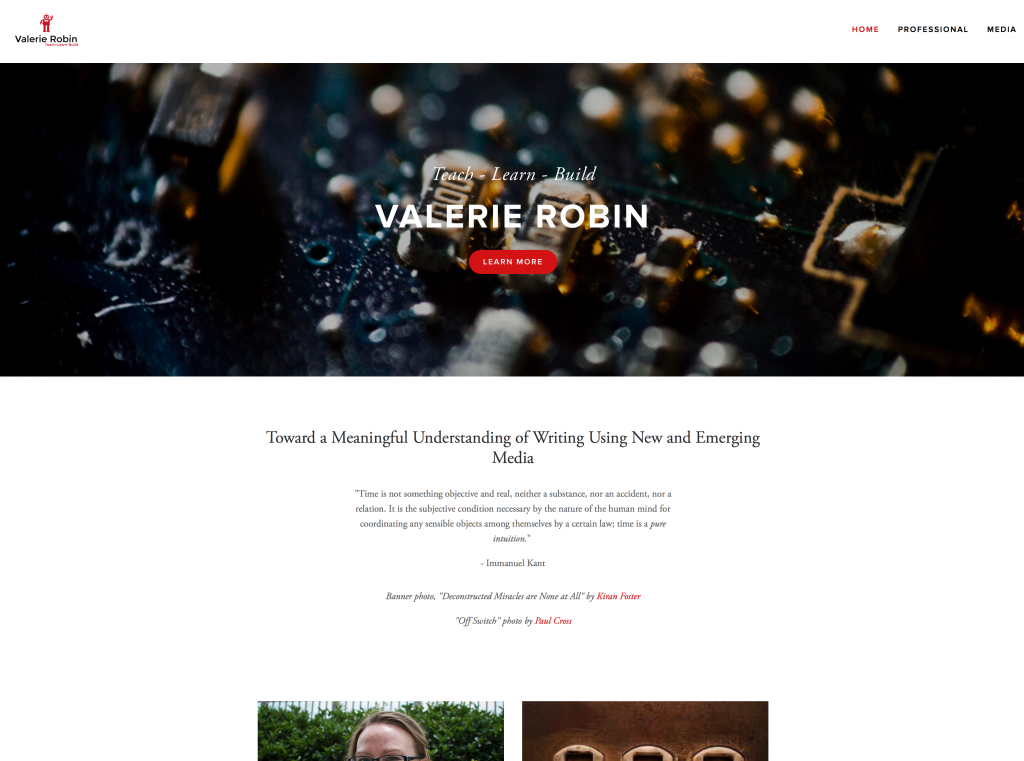
Below is my Squarespace website. I own the domain, vrobinphd.com and I have been working on this for quite some time. This is my permanent portfolio, and the one I give to potential employers and promote on my social media.

Squarespace

Screen Shot 2015-03-11 at 12.17.42 PM

As you can see from this front page, the design is sleek, and professional looking, with a lot of white space, which is what the trend for design is right now. Squarespace is a WYSIWYG (what you see is what you get), but it also has options for coding, so you aren’t always limited to the template parameters. For example, I was able to drop an embedded Google Doc in as my CV, using the code function. This took some experimentation (and Googling), as I assumed the embed function would do it – and this turned out to be not the case. Unfortunately, this cool red button you see in the header, is not something I can code or manipulate to make it show up on other pages. So while I can manipulate much of the template, I can’t control all of it. Also – it is important to note that buying into Squarespace allows me to create my own logo with tagline. You can’t see the little red robot well here, but you will see it on other portfolios below.


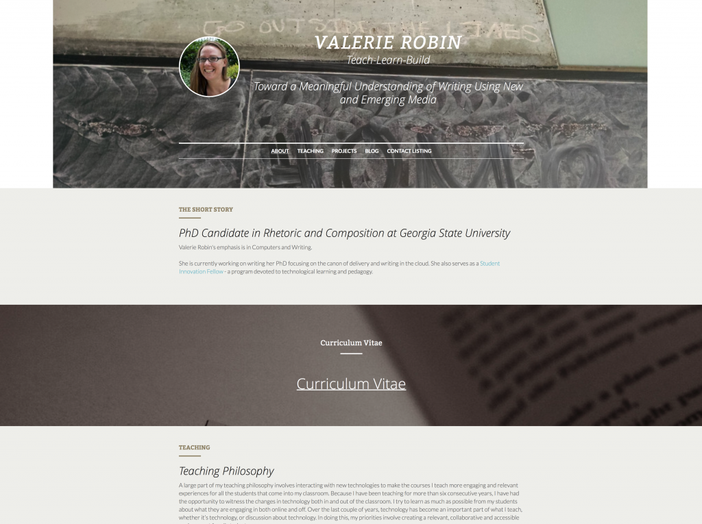
This next one I made on a website called strikingly.com which I learned about from an article in the Chronicle of Higher Education called “How to Curate Your Digital Identity as an Academic.”

Screen Shot 2015-03-11 at 12.18.26 PM

Strikingly is ONLY a WYSIWYG drag and drop application, and it only allows you to have one page. This page however, can be as long as you could ever want it to be. So instead of your visitors clicking to find content on new pages, they just scroll to each section. Strikingly allows you to upload backgrounds to enhance certain sections, and provides lots of neat, attractive buttons to place along the way for people to click on to email you, or visit a project you’re working on outside this site. It’s really simple, so it will be great for people who can’t code, or just want easy maintenance.


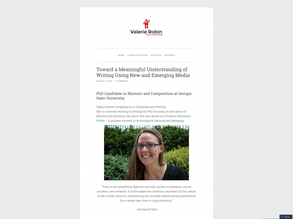
The last one I have to show you here is from wordpress.com which is on a template/theme called ‘pen scratch.’

Screen Shot 2015-03-11 at 12.18.51 PM

I chose a theme that looks clean and has a lot of white space to stay in the theme I have going among these portfolios I’ve made. This one is currently in heaviest build mode, but creating new pages, and showcasing my content has been very easy. WordPress is both a WYSIWYG and has coding capabilities you can use to manipulate both theme and content. I have learned a LOT about themes from working on the Tools Wiki project, including how much each theme can make or break the look of your site. I may find out as I continue to build that ‘pen scratch’ does not, in fact, work for my portfolio, and it could look COMPLETELY different by the time I give the workshop – this is one of the things we’ll cover in the workshop, actually. For now, you can see it largely works well, and there’s my cool Squarespace robot up at the top.


It’s been really fun hanging out at the Exchange researching, and building, and saying, “pssst, does this look stupid?” to other SIFs that hang out in the Exchange with me. I’m really excited I get to give the workshop, but I’m MORE excited about all the invaluable things I’ve learned in the process.

If you find yourself in need of portfolio help, please let me know and I’ll be happy to put my two cents in.

Defining Innovation with Fun and Creepiness

This week I’ve been working at outlining a paper exploring the definition of innovation, and how I am applying that to the DALN booth at the upcoming CCCC’s conference in Tampa Florida. What that means, is that I’ve spent even more time than usual researching this illusive word – chasing it down like the Hobbit to my Ring-Wraith.

I’ve read that Everett Rogers defines innovation as ““an idea, practice, or object that is perceived as new by an individual or another unit of adoption” (2003), which gets at the idea that ‘innovation’ has very much to do with audience perception.

Erin Frost, in a journal called Computers and Composition writes about student innovation as “the key to the development and vitality of technology” as users. Yet Frost never actually defines ‘innovation’ for her audience.

This is not unusual.

This same week, A friend on Facebook shared out an article that was so entertaining, I cried a little laughing at it:

The Creepiest Things You Can Do on Faceboook

The author leads us through a photo narrative about how she ‘messes’ with some friends for her own amusement.

Some might call this ‘hacking’ Facebook = using an application for something other than its intended use.

To me, this is innovation.

Interestingly though, Ashley Feinberg, the author of the article above, does not define her work as innovative, but it is. It MUST be. I say this because she is finding a new way to get people to laugh. She is finding a new way to entertain herself and others in a way that is unexpected, and minimalistic. I’m not sure exactly what it is about innovation that, to me, intrinsically points to minimalism, but it does – today, it does.

Fascinated by this ‘innovation,’ as I see it, I tried it on a couple of my own friends – to see what would happen.

The first experiment might be my favorite:

Nicole_InnovationAnd to my pleasant surprise, a few more people chimed in to my (hilarious) post:

Nicole_Innovation_2This pleased me so much, I decided to try the more invasive angle Feinberg gives us, by posting my own image on a friend’s feed, with no comment. I chose a friend who is a little strange in his own rite. He snapchats me ‘work selfies’ regularly, so I knew he wouldn’t be very freaked out by my random selfies on his page.

I was right. I began with something simple, and he was not phased:

Sunfeather_1 So I went in a little closer. Still unphased:

Sunfeather_2

But then he responded a way I didn’t expect, though perhaps I should have. My friend, Sunfeather chose to hit me back with a similar idea, one I chose to engage (I got his permission to use these images, by the way):

Sunfeather_3

In the end, I’m still processing what this kind of play means for innovation. It certainly means something, though. It means connection. It means minimalism. It means that something interesting and unexpected is happening.

THIS process of innovation-play seems to be a mix of audience and user interactivity with the technology, but it doesn’t actually change the use of tech in any way, that I can tell. Or perhaps we are on a social precipice with this sort of Facebook ‘hack’ – or perhaps we are doing nothing at all…


Christmas Gift Vines

This week, we collect again for the first of another semester that is certain to fly by so quickly we’ll all be surprised by the end of it. It’s been nice seeing familiar faces, having meetings to catch up on old projects, and to look forward to new – exciting – work to come.

This week, I am deciding not to write about any SIF project, because we have only been back for two days, and there is little to examine. However, largely due to my experience with the SIF program last year, I was inspired to show my thanks for Christmas gifts in what could easily be classified as an ‘innovative’ way.

Meet – my Christmas Gift Vines:

I made my first vine in November for Hybrid Pedagogy’s most recent installment of DigiWrimo, as part of a ‘getting to know me’ challenge. Making a vine is actually quite easy – the bulk of the work is done using your phone. After I made my first vine, I knew I needed to experiment to see what else I could do. So after I started using the Christmas gifts I was fortunate enough to get this year, I decided to start piecing together vines to show what I was doing with my gifts. 

The mustard is an inside joke from my friend, and the cookbook is from my mother. I have since sent both parties my vines through text, and Facebook, which means they are also ‘publicly’ shared with my Facebook friends. They’ve had pretty good reception, but so far I seem to be the only person absolutely tickled by my own idea. I may need to take this one back to the lab for re-evaluation. 

Paddock – Adventures at Fry’s Electronics

Over break, I made a trip to Fry’s Electronics. It started out as an innocent trip to help my mother find rewriteable discs for her job. It turned into something else entirely.

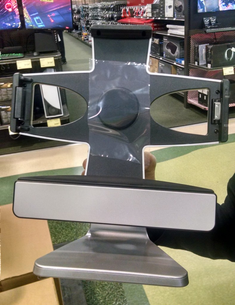
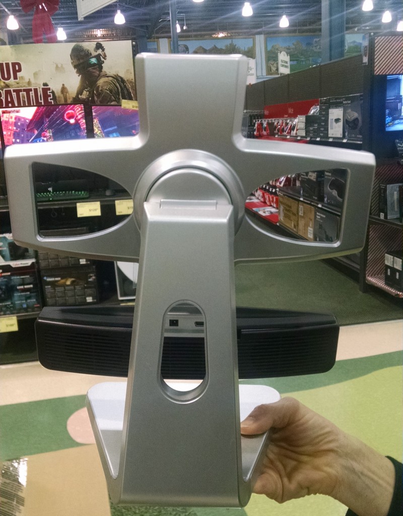
After being mildly verbally attacked by a salesman after I told him I strongly dislike Windows 8, I told him I didn’t, in fact, need any help with the monitor I was getting my fingerprints on, and walked away, nearly crashing into a stack of boxes containing something called “SMK Paddock 10 V2.” The picture on the box was of a desktop stand for an iPad.

“Eureka!” I actually said out loud, and took a box out of the strategically stacked pyramid of rhomboidal boxes. Just like in a bad sitcom, the entire forward half of the stack came sliding apart, distributing oddly shaped boxes left and right in front of me. Avoiding the disapproving look of the salesman who loves Windows 8, I went to find a different salesman to show him what I did. And to as if he could open one of the boxes for me. The young man obliged, and didn’t even chastise me for my mishap.

This is what was inside:

Paddock_Front

Paddock_BackAs you can see, a person could put their iPad in there, and there are adapters and plug-ins involved for various activities one might want to do with an iPad. For example, if I were collecting video interviews for a project like Digital Archive of Literacy Narratives, I could put my iPad into this device, and it works just like a tripod, except on a desktop. Additionally, the head swivels, and the whole iPad rests on a speaker, which also acts like a charger, or so the specs say on Amazon.

I’m not sure exactly how this contributes to my working definition of ‘innovation,’ but if I go with the idea that we are trying to collect narratives in a new way, then this qualifies.

And I accept.


End of Semester

If you read my last blog entry, you know that we were planning a party/meeting to finish off the very first semester of our wonderful SIF program. It went off really well – there was so much food, we could have fed the people across the hall too!

Look at this amazing spread!!

Look at this amazing spread!!

As people trickled in, we waited to have the ‘meeting’ portion, and everyone ate in rounds. Whoever made that bean dip — you’re my hero.

Eventually, I asked Roxanne to put an interactive video made using Captivate 7 which featured our own Will Kerr building a box fort. Having sufficiently embarrassed Will, we opened the floor for people to ask any questions about the upcoming semester, and to show off projects they have been working on.

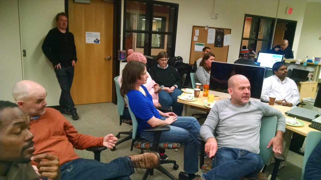
Our audience is not only captivated by presentations, they are also a very good looking bunch of smart people.

Our audience is not only captivated by presentations, they are also a very good looking bunch of smart people.

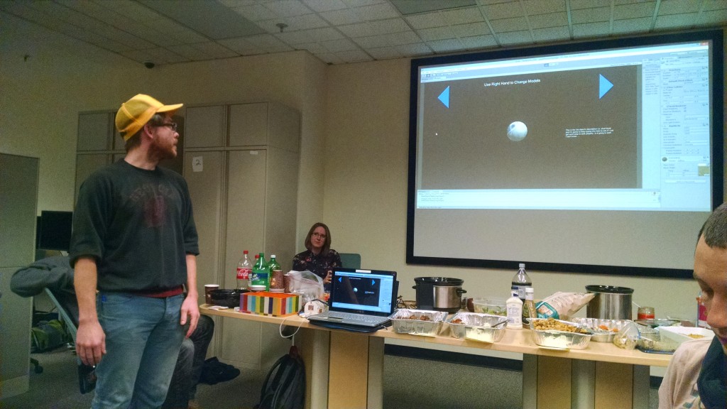
Robert Bryant blew us all away with his project wherein he has been creating digital models of 3D objects using Agisoft. He set up his computer and showed us how to interact with digital objects by waving your hand in front of a little device that reminded me a lot of the way the Wii system works.

Behold the Digital Ball

Behold the Digital Ball

We also got to watch several videos made by Thomas, Babacar, Ameer, Ryan and others that showcased the work they’ve been doing to promote Hybrid Pedagogy courses here at GSU. And we got to see another interactive video Roxanne and Ameer made for the science department which shows a hilarious young man named Kory making mistakes while using the Vacufuge Plus machine.

In all, the meeting was fun and informative. Even though I’ve been working to collect everyone’s accomplishments and achievements, I haven’t gotten to see all these projects yet in action.

Success.

Party in a Pinch

I sold my soul to Google a while ago.

I think it’s for this reason that the tasks I perform using Google products almost never feel terrifically ‘innovative,’ but as I wade through a dissertation wherein I analyze Google, I’m beginning to think that the way I use Google IS innovative – even to me.

As the end of the first ever semester of the first ever cohort of Student Innovation Fellows (SIFs) comes to a close, I wasn’t about to let it go down without a party. And also holidays. So I mean really – party.

Lucky for me – Justin was willing to let me plan the party – as long as I understood that the budget is exactly $0. Done. Easy.

I executed all my party planning via Google = I created an invitation (okay, so I used Publisher which I eventually converted into a PDF after Justin said, “I had no idea Publisher was still a thing”), which I linked to a Google spreadsheet and a Google form.

Here is a link to my invitation:

Partay!!

As you can see – we’re going the potluck route – and let’s be real: these SIFs are not only smart and savvy – they can cook. Hallelujah.

We have an editable Google Spreadsheet so people can contribute to said potluck – and I am quite excited about this upcoming gathering. I’m a grad student. Food is pretty much all I care about.

AND – because I wasn’t sure where people would be at with the idea of a cute little gift exchange, I used a Google Form to ask whether or not people would like to have a gift exchange.

I have loads of response forms and data to indicate that this will go off without a hitch. And all it took was a few clicks, and some key strokes. That’s… innovation.

Absolutely no paper was exchanged or harmed in the planning of this party. The budget remained at exactly $0 – and we’re still having a party.

Thank you Google. Treat my soul well, please. 


Innovating by Hand

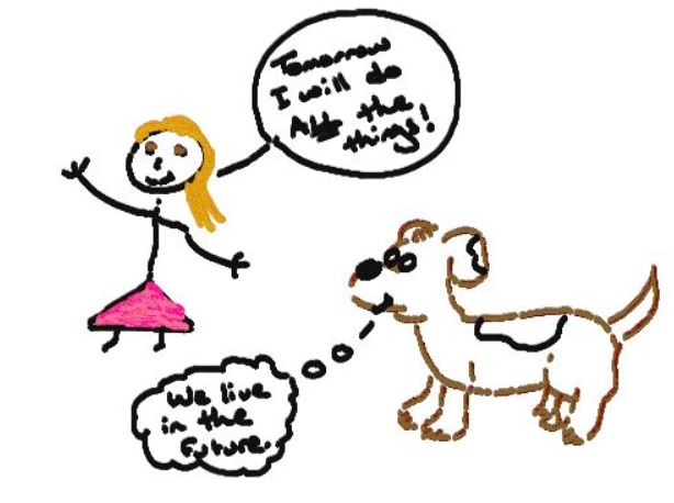
EquilNote_2014_12_02

Blog Experiment 2

Blog Experiment 3

Blog Experiment 4

All of the text above was imported in, which is why I couldn’t hyperlink Touchnote. This is the only bit I’ve typed, save the title. As you can see, the pen has several issues, not least that it buzzes quite loudly. For some reason, the receiver picked up my ‘smooth’ lines as dashed and dotted above (perhaps it was my large sleeve), and this blog entry took me 3-4 times longer than a regular entry usually does.

Perhaps I can tell I’m innovating when it takes a long time, but feels like play… maybe.

The Tableau Experience

Today I attended “The Tableau Experience.” I’ve been struggling with what to call it: a conference, a convention… It had only one speaker, and a Q&A – and a wet-bar.  So… I’m settling with ‘experience’ as they do. What it really was though, was an advertisement.

Don’t get me wrong – I like using Tableau to recreate charts for the Tobacco Ebook I’m working on, and this ‘experience’ was worth it for several reasons:

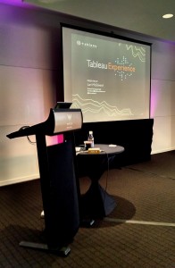
1. The speaker demoed several ways to share data that I haven’t seen in action since I’ve only been using it to create charts for data sets that are already created for me.

Tableau_Experience


2. There were a lot of people there from many different kinds of institutions.  I met others from universities like me – Georgia Tech, Gwinnett College, and so on. But I spent most of the time schmoozing with a lady from Home Depot, and then talked briefly to a man from a company called Norfolk. Everyone was using Tableau for something different – I’m pretty sure I was the only one making an Ebook.

3. I was able to ask about that pesky issue Ryan Cagle and I have been having in trying to get the distance between pane tick marks and labels to be exactly the same in all our charts so they’re uniform within the Ebook. Sorry, Ryan – there is no way to do this. The guy I asked said your idea was the smartest.

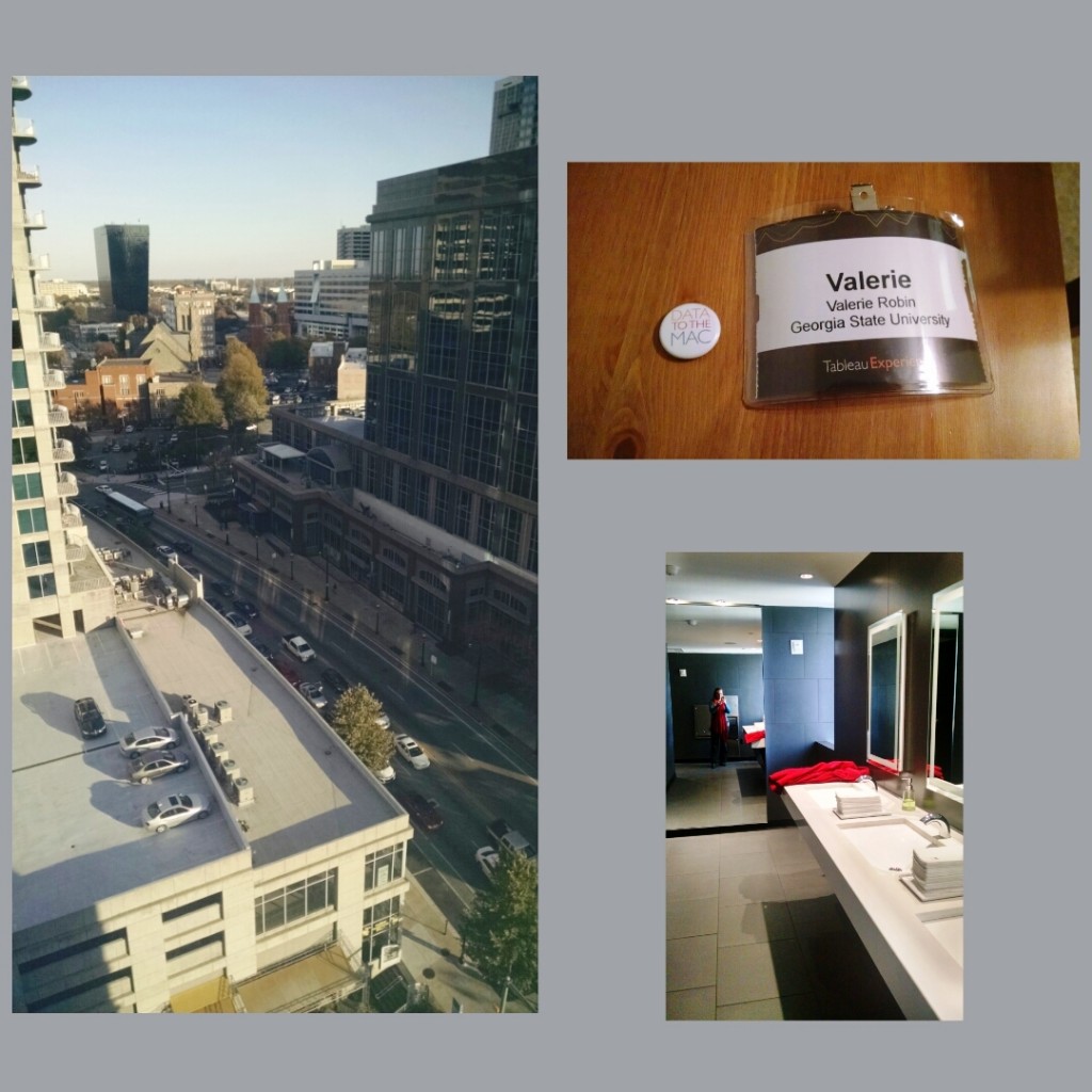
Overall, I’m glad I went to the Tableau Experience. And so I leave you with a picture of my spoils, the swanky bathroom in the wetbar, and the view from the 16th floor. Enjoy:

Tableau_Experience-2