Status: Doctor

Yesterday I became a doctor.

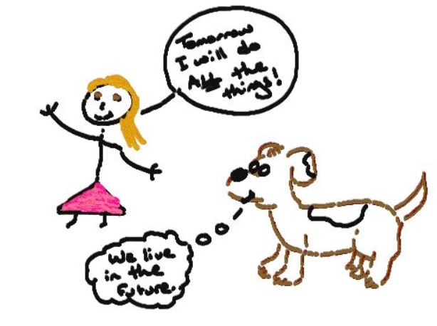
I went and celebrated with a few friends who are also highly educated, and I admit, it felt a bit like this:

And so this is my final official blog as a Student Innovation Fellow, but I do plan to continue keeping a blog chronicling my journey through a tech world as a Humanities student at https://valerievisual.wordpress.com/ – which admittedly needs a revamp, and a cleanup before I start to use it again. That is not, however, the focus of this entry.

The point of this entry is to detail the status of my life as a doctor at this point in my journey.

Yesterday, my committee signed my paperwork.

My dissertation is titled: The Value of Scholarly Writing: A Temporal-Material Rhetorical Analysis of Google Documents

It analyzes how interactive writing software (IWS) like Google Documents serve to forefront functions of interactivity between writers, and by doing so, reshape and create Western values surrounding the academic writing process that are uniquely post-industrial. The whole thing aligns rather well with the work we do as Student Innovation Fellows, and a lot of my work as a SIF informed some of my theory and analysis.

My work as a Computers and Composition scholar has been validated over and over again in my SIF work. I have worked with cloud computing for nearly two years, theorizing how it alters users perception of time and space, and right when I am feeling like I might be saying nothing new, a SIF colleague who I respect very highly made the following statement, “Whenever I’m working on a Google Doc, I always want to save, and you don’t have to in the cloud. I don’t know if I’m ever going to get used to that.” I realized that if this colleague is still not used to the save features of cloud software, then I must be saying something fresh.

And again, when I learned how much fun it is to make simple data into visualizations, as I did for Marni Davis, and when I turned Oscar Rieken’s resume into an infographic, a whole new world of seeing opened up to me. I look at information much differently now, thanks to my projects. This factored in to the way I analyzed the features of Google Documents within my dissertation pages.

Working as a SIF also gave me the opportunity to leave the usual spaces of Humanities PhD life and peek inside the Information Technology world. The links between coding and composition have astounded me. As I began to teach  myself HTML and CSS, I began to understand the grammar and syntax behind coding reflect that of natural languages. Not only that, but I am beginning to see the barriers online that fall down as I learn to code, similar to the barriers that fall as we enter discourses. For example, without knowing anything about the language of law, anyone would be completely lost in a court, even if everyone is speaking English.

A problem does remain that the market is stretched thin, and finding a job is difficult for any PhD student. I find comfort in knowing that even the best and brightest students often don’t land jobs their first year on the academic market (a market that is so complicated and unlike any business market, it is difficult to explain it to anyone not involved in the process). What I do have is the experience I have gained during the Student Innovation Fellowship. Unfortunately, I lack the know-how to market these skills in a way that makes sense.

As I explore my options, I am learning about jobs that I had never heard of, skills I didn’t know existed, and a whole new world of technology that is related to my current research. No matter what I end up doing next, I am certain that it will be as interesting as the work I have done as a Student Innovation Fellow – and if I’m lucky – it’ll be even more so.
Infographic Resume

I have been on the job market since September.

The academic job market takes just short of forever, and is a HUGE commitment. As a result, I have become curious about other job markets and how they work. I essentially know exactly nothing about how to get a job outside academia, despite training for a PhD for the last 5 years. Correction. I knew nothing about the market ‘out there.’

In this blog, I take an industry professional’s resume, and turn it into a cute, easy to read infographic using picktochart, a mostly free online drag and drop application that creates a platform on which you can build an infographic.

What is an infographic?

Customer Magnetism explains it really well, with pictures. Pictures are essential to infographics, as ‘graphic’ is the central part to displaying the ‘info’.

So when Oscar Rieken, Lead Software Engineer and All-Around Awesome Person, asked if I could make his resume into and infographic, I said, “Of course I can. Just tell me what you want featured, and what colors you want.” And we were off. I even got his permission to write about it here!

After we established the rough parameters for what he wanted his resume to display, I set to work making different visualizations that we could choose from.

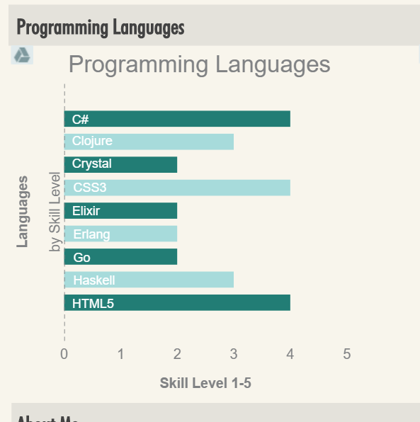
Programming Languages Beta

The above shows the way we decided to display Oscar’s skills, after one or two trials with other charts. Each bar displays languages he knows and the level, (1-5) at which he places himself in experience, with 5 being “nothing left to learn.”

We decided this way, on a basic blue/green color scheme that we used consistently all the way through the infographic.

All of Oscar’s Skills, AND Tools are displayed this way.

Next, and perhaps the most difficult, was deciding how best to display his work experience. Here are some trials we played with:

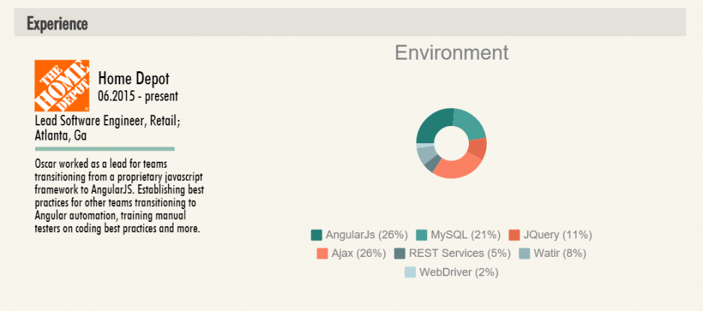
Experience-visual-sample-1

Here, we can see Oscar’s current place of employment, and the skills/tools he uses most at this position. But the circular chart is very difficult to read, and the key is bulky and strange.

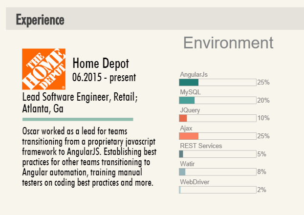
Experience-visual-sample-2

Next I tried displaying them on a similar chart that would visually match his skills and tools above. It looked better, but still didn’t necessarily warrant a display in an infographic.

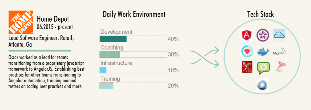
Home-depot-visualization-2

I asked him to split his skills and tools up into the way he spends his typical day. Oscar created a spreadsheet for me with data that indicated that, in his current job, he spends 40% of his day in development, 30% in coaching, and so on. Using powerpoint, I arranged his skills and tools by logo, and put them into a ‘tech stack’ inside a container, which here, is a circle. In earlier jobs, I used the shapes of the states and countries he worked in, which worked to meet Oscar’s visual tastes.

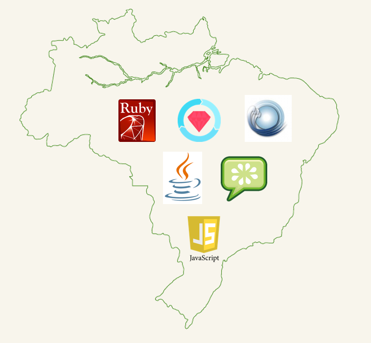
Thoughtworks-Brazil-Tech-Stack


Here, you can see the skills and tools Oscar used when he worked in Brazil. Creating the graphic was incredibly easy, and I just used some simple formatting in PowerPoint to create a .jpg that I could then upload to piktochart and insert into the infographic.

It took a lot of work, and a fair amount of consulting to get this the way Oscar wanted. But eventually we completed it, and he was quite happy with it, especially after I added the little robots as accents. Oscar is really into robots.

Below, is the infographic in its entirety (with full permission).

VisMe Experiment

Over the last two weeks, I have been on campus visits. The campus visit is the last stage of the interview process for those of us staying in academia once we get our terminal degree. One of the steps in the campus visit interview (one of my interviews lasted for 21 hours over 2 days to give you a sense of scope), was to give a scholarly presentation on my own work.

One of my main aims was to use a presentation software that would look clean, and be something that most of the faculty I knew would be present for my presentation had not yet seen a lot. After some research and one trial with a timeline software, I chose VisMe.

Below is a mostly final draft of my presentation. If it works properly, you can push play, or click through it to view it.

The process of using VisMe was interesting, particularly since I didn’t *notice* that it is still in beta when I began. In fact, despite the very clearly noted ‘beta’ attached to the logo, I still missed it, all the way until I was frustrated with the build process.

VisMe-beta-marked

What I DO like about VisMe is the clean minimalist design that is really in at the moment. Each template has a library of pages the user can choose from in order to built a well rounded presentation. The designs are built already to give the user a sense of how a presentation could look, depending on what the presentation material is covering.

And even though the pages are built for you – here is an example:

VisMe-sample-page

You are not required to keep the page this way. As you can see, I altered the template page a lot to fit my needs.

Visme-sample-page-2

As a user, I am able to completely revamp any aspect of any slide that I choose. But I found the template to be a really great guide as a first time user. The end product turned out beautiful, and I was complimented on how clean it looked.

Because VisMe is in beta, it still has a lot of bugs. Among these bugs are the incredible difficulty involved in clicking on text I have created in a text box. Once I created text, and aligned it with other objects, if I found a typo, or wanted to edit, I had to drag the text box away, and then click vigorously and hope that I might somehow land my cursor in the magical spot that would then select the text I wanted to edit. If my apartment neighbors didn’t think I was crazy already, they surely do now. Frustration.

And then of course there are the mystery issues that come with all software. For example, I published my test presentation to see what options would appear once I published. The library of slides disappeared. I had to completely start my presentation over. Of course it turned out better, as many of you have probably experienced for yourselves. But… this problem has only happened one time. I published the above presentation, and none of the same problems persist. Face to palm – I’m feeling a little gaslighted.

The last problem I want to address is that once an animation is applied to text, it cannot be fully deleted. It CAN be altered, but not completely deleted and this led to more frustration and yelling on my part. Because of this issue, I ended up downloading each slide (a publishing feature) and putting the whole thing inside a power point presentation – animation problem solved.

Probably the most interesting part of VisMe is that it exists in the cloud. Since I only played with the free version, I had no access to the cloud editing and sharing capability, but it exists. Of course, my presentation exists in the cloud, and is clearly hosted above that way, which is a viable and relevant part of cloud computing. But in order to access sharing features, I need to pay the monthly business fee, which is not feasible for a scholar who might use this once or twice a year. But knowing it exists is relevant to many of the arguments I am currently making about the work of composing in the cloud – so I may dip back in here for further exploration.

Until then – give it a try if you are in the mood to learn something new that is improving as the company grows.


Magazine Issues

I have been writing a bit about Edge Magazine here on my blog, as it is my major SIF project this year. Despite the fact that I have been an editor at Hybrid Pedagogy for over 3 years, starting a new editing process is quite the puzzle.

There is a lot to think about as we get the journal off the ground. Most of what our team is wading through involves one big question: What?

What is our edge?

The biggest question for any publication is this. What is our edge? Who are our audience(s)? Who are we speaking to and why? After several meetings discussing what Edge is for, what it accomplishes, and what it focuses on, we have decided that Edge will be a culture and arts focused multimedia magazine that uses Atlanta as its unifying theme. It will be different than Discovery in that its articles will be shorter, more causal, mostly multimedia driven, with new articles released often. It will be different than The Signal in that it is not a Newspaper that reports, but rather a magazine that has featured undergraduate work.

What is the argument we are making with these articles overall which will set the stage and aesthetic for the magazine?

As Edge begins to develop and take on shape, the hope here is that our argument will become clear to our readers. Of course, our first argument is “Undergraduate work at GSU matters.” And our second argument is “Undergraduate work here at GSU is really cool, innovative, and edgy.” These arguments will be obvious as the first articles go live next Fall. Ultimately though, the answer to this question is a wait-and-see process depending largely on the submissions we get, and the voice the collective students create as we show the world what we can do here at Georgia State.

What is going to make people want to return to read about more work that students are doing at GSU?

This question is also a wait-and-see question as we develop the aesthetic of the magazine. At the moment, if you click the link at the top of this entry, you will see that the magazine is a skeleton with some test posts and a repeat of the same class project that we have been playing with. But as we begin to work on our first submissions (we already have one lined up!), the look and feel of the magazine will begin to take on a polished shape. We do know that the magazine will feature videos, audio recordings, galleries of stills, links out to student work that exists live on the web, and combinations of all these things. It will have the ability to take student work that is exciting and interesting already, and make it more visually appealing for outside readers.

This means, that the student work featured here did not stop at the professor’s desk, but will be published for the world to see, which adds a whole new layer of meaning to student projects on, and off, campus. For a faculty audience, getting to see what students are working on in their courses should be a good reason to keep coming back. And for students, looking at some of the great projects other students have worked on should also be enticing. For readers outside day-to-day life in the University, reading Edge should be a great way to see what students are up to at GSU, and to know that their tax dollars, donations, and moral support are making some waves here in Atlanta.

Much of the above may seem somewhat ambitious, but without lofty ambitions, we don’t move up. Much of the shaping of Edge will be a waiting game, and much of it will shape itself through the process of building. It’s an exciting time to be a student at Georgia State University, and the hope is that Edge will be a beacon that readers can follow in order to discover what wonderful ideas, skills, and initiative students bring forward.

SIF Orientation – Fall 2015

Last week marked the beginning of the second year of the Student Innovation Fellowship at Georgia State University. Many of the first years returned for another promising year, and we got a few new exciting additions too.

Below is a group shot of everyone who showed up for orientation and introduced themselves:

SIF Group 2015-2016

SIF Group 2015-2016

In the photo above you can see a variety of students from graduate students to undergrads with skills ranging from excellent writing and organization, to mapping and design, and coding. Here, we are posing in the CURVE in front of the 12 screen interact wall that we often use for workshops and presentations.

This year, we will be more tightly focused on bigger projects that we intend to ‘finish’ as much as possible. For example, where I was on approximately 6 projects last year, I am on 1 this year. And it’s very exciting. I will be managing the Magazine and Images Archive in charge of building a new Undergraduate research based journal/magazine hybrid. The possibilities are quite exciting, and I will be blogging about this project quite a bit in the future.

Stay tuned.

Defining Innovation with Fun and Creepiness

This week I’ve been working at outlining a paper exploring the definition of innovation, and how I am applying that to the DALN booth at the upcoming CCCC’s conference in Tampa Florida. What that means, is that I’ve spent even more time than usual researching this illusive word – chasing it down like the Hobbit to my Ring-Wraith.

I’ve read that Everett Rogers defines innovation as ““an idea, practice, or object that is perceived as new by an individual or another unit of adoption” (2003), which gets at the idea that ‘innovation’ has very much to do with audience perception.

Erin Frost, in a journal called Computers and Composition writes about student innovation as “the key to the development and vitality of technology” as users. Yet Frost never actually defines ‘innovation’ for her audience.

This is not unusual.

This same week, A friend on Facebook shared out an article that was so entertaining, I cried a little laughing at it:

The Creepiest Things You Can Do on Faceboook

The author leads us through a photo narrative about how she ‘messes’ with some friends for her own amusement.

Some might call this ‘hacking’ Facebook = using an application for something other than its intended use.

To me, this is innovation.

Interestingly though, Ashley Feinberg, the author of the article above, does not define her work as innovative, but it is. It MUST be. I say this because she is finding a new way to get people to laugh. She is finding a new way to entertain herself and others in a way that is unexpected, and minimalistic. I’m not sure exactly what it is about innovation that, to me, intrinsically points to minimalism, but it does – today, it does.

Fascinated by this ‘innovation,’ as I see it, I tried it on a couple of my own friends – to see what would happen.

The first experiment might be my favorite:

Nicole_InnovationAnd to my pleasant surprise, a few more people chimed in to my (hilarious) post:

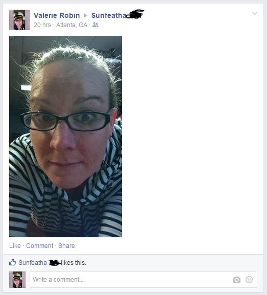
Nicole_Innovation_2This pleased me so much, I decided to try the more invasive angle Feinberg gives us, by posting my own image on a friend’s feed, with no comment. I chose a friend who is a little strange in his own rite. He snapchats me ‘work selfies’ regularly, so I knew he wouldn’t be very freaked out by my random selfies on his page.

I was right. I began with something simple, and he was not phased:

Sunfeather_1 So I went in a little closer. Still unphased:

Sunfeather_2

But then he responded a way I didn’t expect, though perhaps I should have. My friend, Sunfeather chose to hit me back with a similar idea, one I chose to engage (I got his permission to use these images, by the way):

Sunfeather_3

In the end, I’m still processing what this kind of play means for innovation. It certainly means something, though. It means connection. It means minimalism. It means that something interesting and unexpected is happening.

THIS process of innovation-play seems to be a mix of audience and user interactivity with the technology, but it doesn’t actually change the use of tech in any way, that I can tell. Or perhaps we are on a social precipice with this sort of Facebook ‘hack’ – or perhaps we are doing nothing at all…


Christmas Gift Vines

This week, we collect again for the first of another semester that is certain to fly by so quickly we’ll all be surprised by the end of it. It’s been nice seeing familiar faces, having meetings to catch up on old projects, and to look forward to new – exciting – work to come.

This week, I am deciding not to write about any SIF project, because we have only been back for two days, and there is little to examine. However, largely due to my experience with the SIF program last year, I was inspired to show my thanks for Christmas gifts in what could easily be classified as an ‘innovative’ way.

Meet – my Christmas Gift Vines:

I made my first vine in November for Hybrid Pedagogy’s most recent installment of DigiWrimo, as part of a ‘getting to know me’ challenge. Making a vine is actually quite easy – the bulk of the work is done using your phone. After I made my first vine, I knew I needed to experiment to see what else I could do. So after I started using the Christmas gifts I was fortunate enough to get this year, I decided to start piecing together vines to show what I was doing with my gifts. 

The mustard is an inside joke from my friend, and the cookbook is from my mother. I have since sent both parties my vines through text, and Facebook, which means they are also ‘publicly’ shared with my Facebook friends. They’ve had pretty good reception, but so far I seem to be the only person absolutely tickled by my own idea. I may need to take this one back to the lab for re-evaluation. 

End of Semester

If you read my last blog entry, you know that we were planning a party/meeting to finish off the very first semester of our wonderful SIF program. It went off really well – there was so much food, we could have fed the people across the hall too!

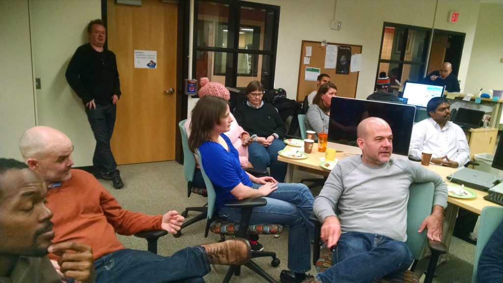
Look at this amazing spread!!

Look at this amazing spread!!

As people trickled in, we waited to have the ‘meeting’ portion, and everyone ate in rounds. Whoever made that bean dip — you’re my hero.

Eventually, I asked Roxanne to put an interactive video made using Captivate 7 which featured our own Will Kerr building a box fort. Having sufficiently embarrassed Will, we opened the floor for people to ask any questions about the upcoming semester, and to show off projects they have been working on.

Our audience is not only captivated by presentations, they are also a very good looking bunch of smart people.

Our audience is not only captivated by presentations, they are also a very good looking bunch of smart people.

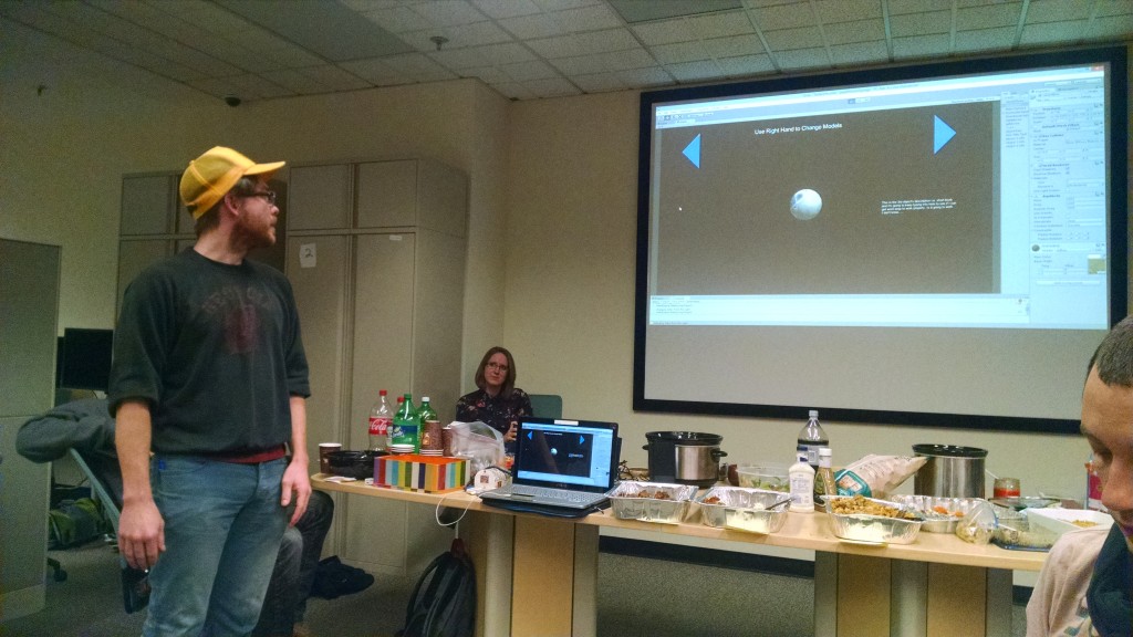
Robert Bryant blew us all away with his project wherein he has been creating digital models of 3D objects using Agisoft. He set up his computer and showed us how to interact with digital objects by waving your hand in front of a little device that reminded me a lot of the way the Wii system works.

Behold the Digital Ball

Behold the Digital Ball

We also got to watch several videos made by Thomas, Babacar, Ameer, Ryan and others that showcased the work they’ve been doing to promote Hybrid Pedagogy courses here at GSU. And we got to see another interactive video Roxanne and Ameer made for the science department which shows a hilarious young man named Kory making mistakes while using the Vacufuge Plus machine.

In all, the meeting was fun and informative. Even though I’ve been working to collect everyone’s accomplishments and achievements, I haven’t gotten to see all these projects yet in action.

Success.

Innovating by Hand

EquilNote_2014_12_02

Blog Experiment 2

Blog Experiment 3

Blog Experiment 4

All of the text above was imported in, which is why I couldn’t hyperlink Touchnote. This is the only bit I’ve typed, save the title. As you can see, the pen has several issues, not least that it buzzes quite loudly. For some reason, the receiver picked up my ‘smooth’ lines as dashed and dotted above (perhaps it was my large sleeve), and this blog entry took me 3-4 times longer than a regular entry usually does.

Perhaps I can tell I’m innovating when it takes a long time, but feels like play… maybe.

SIF: positivity, morale and accomplishments

This week, the SIF overlords contacted me and asked me to collect and catalog SIF accomplishments so far. As someone whose default setting is >excited with bouncy option – I am excited that I get to do this job.

And while it may seem a little early to start talking about accomplishments, I know that I’ve already learned enough to fill a whole brain noodle – and I’m hoping that others feel the same way. So I created a Google Forms survey to send out to everyone – and Joe, and Brennan already beta-tested it! That was so fast!

I’ve used Google  Forms before, but only as someone filling out the form. This time I got to make, not one, but TWO forms! I made one today for the beta test for the Tools Wiki, which I will send to a few of you in the next week or so, and one for SIF Accomplishments. The forms are really easy to make, and have a variety of options for users to answer – like multiple choice, scale, text, and so on. My favorite part though is that they have lots of themes to choose from that make the forms look a little more fun.

By the time you read this, you’ll probably have already filled out my form, and some of you may have already met with me. My hope is that by all of us thinking about the most positive and helpful aspects of SIFdom, we will be able to deliver an accurate picture of our accomplishments to the powers that be, as well as grow as a community of innovators.

And remember – if you’re having a bad SIF day, Zoe brings candy to the Exchange, Justin makes weird noises sometimes, and there’s always coffee in the common area.