Category Archives: Uncategorized

Blog 9-Personal Branding (Revised for Portfolio)

The Center of Professional Excellence rates being well dressed as number two an indicator of professional behavior. It is second only to “communication skills” according to a 2010. According to Forbes dressing well at work can not only enhance how you come across to other people, it can enhance how you come across to yourself. Respect and enthusiasm for how you look often translates into enthusiasm for the job itself, and better productivity can lead to better opportunities later on. There are very strong correlations between the price of the suit and how much it’s wearer makes a year.

download (3)

How we present ourselves most certainly depends on the context in which we are responding to.  From a social stand point I feel that for most people what we regard as “normal” dress for this function or that function is largely intuitive. Unless it is specified by the invite we have very little need be so specific about appearances; it therefore comes down to a matter of function whether that be comfort or warmth or anything else. We spend our entire lives, particularly as children, learning what to do and not to do and often our ques as adults are based upon that model. However, from a professional world standpoint the rules change drastically and are laden with a good deal more expectation. In part because, particularly for interviews, the employer has very little else to go on.

From a professional standpoint appearances can make or break someone.  Resumes are rather fixed in what they can tell an employer about a potential hire. Ultimately although it does come down to one’s personal skills on the job, how you come across as a person starts with your clothing. How you try and dress nice says a lot about your willingness to conform to the local culture and get fit in with co workers in part. It also says a lot about your personal initiative and ability to adapt. A good suit is not the end all, be all, but clothing and posture and language can all play massive parts in getting that job in the first place and getting ahead further along. Coming into a work place looking like last week’s laundry basket found under a bed will leave just as much of an impression as anything you have to say in that meeting. We’ve all heard that we shouldn’t judge by appearances. But whether we like it or not, whether we are even conscious of it or not, the judgement is there in the first 30 seconds or less; this goes back to childhood skills of watching and judging and absorbing the assumptions of those around us. Some things are just too deeply rooted into our culture to be easily rid of. In a very literal sense these things we form of the basis of judgement can be the difference between fire and hire, success and failure.

As far as I am concerned personally, I do not fuss overmuch about normal everyday wear, so making that extra effort with something that does matter, like an interview, is a bit nerve wracking. But there is a certain sense of satisfaction/ease to be had knowing that even if you screw something up you will look decent doing it. Do I think it is unfair that people can be judged and discounted by something other than their actual credibility? Yes, it is not very fair. But at the same time I understand the inherent logic behind it. If one can not take the time to look nice and be willing to go that extra step or two to make a presentation to someone else, one of two things has occurred: 1. They don’t actually care about the thing. In which case, why are they bothering to apply and why should you bother to hire. Or 2. They are careless, disregarding or lazy when it comes to their appearance, something that can be likely to translate into their work ethic. Dressing nicely usually does not take much and it is, in the end, really a display of initiative and positive-ness. The social world can be flexible, the professional one is not.

Sources:

Career Builder.com:  http://www.cnn.com/2011/09/16/living/workplace-professional-dress-cb/

Forbes.com: http://www.forbes.com/sites/davidkwilliams/2013/08/09/first-impressions-count-the-business-value-of-dressing-for-success/

http://www.forbes.com/sites/cherylsnappconner/2013/01/01/can-dressing-well-increase-your-income-in-2013/

Self Branding

How we present ourselves most certainly depends on the context in which we are responding to.  From a social stand point I feel that for most people what we regard as “normal” dress for this function or that function is largely intuitive. We spend our entire lives, particularly as children, learning what to do and not to do and often our ques as adults are based upon that model. However, from a professional world standpoint the rules change drastically and are laden with a good deal more expectation.

I do feel from a professional standpoint that appearances can make or break someone. Ultimately it does come down to one’s personal skills on the job and what they can contribute. A nice suit is not the end all, be all; they can still be horrible at their job. But clothing and posture and language can all play massive parts in getting that job in the first place and getting ahead further along. Coming into a work place looking like last week’s laundry basket found under a bed will leave just as much of an impression as anything you have to say in that meeting. We’ve all heard that we shouldn’t judge by appearances, but whether we like it or not, whether we are even conscious of it or not, the judgement is there in the first 30 seconds or less; this goes back to childhood skills of watching and judging and absorbing the assumptions of those around us. Some things are just too deeply rooted into our culture to be easily rid of.  

images (3)

As far as I am concerned personally, I do not fuss overmuch about normal everyday wear, so making that extra effort with something that does matter, like an interview, is a bit nerve wracking. But there is a certain sense of satisfaction/ease to be had knowing that even if you screw something up you will look decent doing it. Do I think it is unfair that people can be judged and discounted by something other than their actual credibility? Yes, it is not very fair. But at the same time I understand the inherent logic behind it. If one can not take the time to look nice and be willing to go that extra step or two to make a presentation to someone else, one of two things has occurred: 1. They don’t actually care about the thing. In which case, why are they bothering to apply and why should you bother to hire. Or 2. They are careless, disregarding or lazy when it comes to their appearance, something that can be likely to translate into their work ethic. Dressing nicely usually does not take much and it is, in the end, really a display of initiative and positive-ness. The social world can be flexible, the professional one is not.

download (3)

Blog #11: Personal Branding Situation and the way technology is continuously changing us

The workplace is changing every single year. But lets take a look at how the workplace was ten years ago…

We barely used technology (i.e. iphones, computers, ipads, powerpoints, prezis, webinars, emails) ten years ago. It was more face to face communication than ever. Take a look at the baby boomers compared to Generation X  (Ashe-Edmunds). Generation X takes more advantage in technology nowadays than the baby boomers. The reason? The world is changing, the workplace is changing fast everyday. Generation X grasps social media faster than baby boomers. For example, on you resume you could have social media skills listed as your top priority because your just that great at it. Furthermore, imagine the forty five year old you are completing against to gain that job. You realize that you must have more social media skills than “this guy” over there. You have the advantage in the company because you are up to date on tech “stuff”. But is this fair? I think not.

Forty five year olds should have the same chance as a graduate fresh out of college. I feel that employees should level the playing field for everyone, meaning, that social media should be taught upon on when hired. Not everyone has supreme social media skills, it is a taught skilled.

On the other hand, how is the workplace changing? Have we gotten lazy enough to rely on technology most of the time? In Sam Ashe-Edmunds article, he talks about how companies use telecommuting and technology use has affected people’s lives and will continue until we do not even have to attend work pretty soon. Telecommuting has a been a hot commodity for a while. We use it to work from home, or to attend meetings. Look at how technology has changed for employers. Not too long ago…we use to have blackberries. Remember those? Now, most companies have Iphones or Samsung phones for their employees because it provides more functionality than the blackberry did.

Group of business people walking towards cameracourtesy of: http://www.desummarize.com/apples-oranges-workplace/

So, how do employers view you based on how you dress? Many companies have different stand points on this. For example, Adult Swim require that you do not dress up everyday. You can wear casual clothes to work because you are expressing yourself, your everyday wear. Now, if you worked at a law company or a government building, then your clothes would be different. You would look much like the people above in the picture. But what else do you see in the picture? Are most of them attractive? The answer is yes because most employers view you based on looks. Its true folks. It is like a bad case of whos hot or not in high school. The more attractive someone is (especially woman) than the more likely that other clients will buy into that person and invest in the company. Not fair? I totally agree with you.

So, what else do you see in this picture?  You can respond in the comments below.

Source

Ashe-Edmunds, Sam. “How has the workplace changed?” 21 Nov, 2014. Web. <http://work.chron.com/workplace-changed-12823.html>

What You Need To Know About Technical Communication

'We really need to get on-message about out responsive reciprocal concepts, on-message.'

Image gotten from cartoonstock.com

According to the Society for Technical Communication, technical communication is a field that includes any form of communication that exhibits one or more of the following characteristics:

  • Communicating about technical or specialized topics, such as computer applications, medical procedures, or environmental regulations.
  • Communicating by using technology, such as web pages, help files, or social media sites.
  • Providing instructions about how to do something, regardless of how technical the task is or even if technology is used to create or distribute that communication.

For me, technical communication is is a field that focuses on providing information to users who need assistance in order to define a specific goal. It enables them to find specific information on using products, completing tasks, operating equipment, and completing other types of activities.

Technical communication is valuable to everyone because it makes information more useable and accessible to those who need it.  For examples, software instructions help users be more successful on their own, improving how easily those products gain acceptance into the marketplace and reducing costs to support them. Medical instructions help patients and care-providers manage a patient’s treatment, improving the health of the patient while reducing costs and risks associated with incorrect care.

“Defining Technical Communication.” Defining Technical Communication. Society for Technical Communication. Web. 10 Nov. 2014.


Technical Communication: A Definitive Meaning

Technical communication has interested me for several years; mainly due to the fact that my father has been writing technical documents for a living and it seems very interesting. With my college graduation looming, enrolling in this class has further increased my level of interest.  During this semester, I would not say that my preconceived idea of “technical communication” has changed; more so, I would say that my knowledge on the subject has expanded to a whole new level that certainly makes me appreciate its existence and those who shape it. Originally, I held a very simple understanding of technical communication; that it basically dealt with instruction manuals and scientific discourse.  Although still true, that is only a minor aspect in the intricate understanding of technical communication that I have amassed.

Technical communication is ever present in our society today: from instruction manuals to road signs to government contracts.  The absolute main goal of technical communication is to be explicit, efficient, user-accessible, and free of loose interpretations or connotations.  However, for this to occur, an incessant connection to the audience is necessary.  The extent to which an audience influences the course of technical communication is vast and complex.  The techniques, language, and design choices used in technical communication should benefit the audience, appeal to them in a way that keeps them interested yet properly informed.  This class has taught me many different examples of effective technical communication based on audience.  It has also introduced me to significant figures in determining the definition and purpose of technical communication.

Katherine T. Durack is a prominent figure in the technical communication field that has greatly influenced my understanding on the subject.  She highlights three principals of technical communication that coincide with the aspects I discussed above; which have expanded my knowledge in her journal article, “Gender, Technology, and the History of Technical Communication.”

  • Her first point states, “Technical writing exists within government and industry, as well as in the intersection between private and public spheres.”  This statement coincides with my point about technical writing being ever present in our society.


  • Her second point states, “Technical writing has a close relationship to technology.”  This statement coincides with my point that technical communication needs to be direct and user-accessible.  One of the main ways an audience receives information is through quick technology that is readily available for a majority of the population.  Technical communicators need to be aware of the most current technologies to make sure their audience receives their info in the most user friendly way.  Also, there are so many new programs for designing the most efficient technical communication and the most successful communicator will be up-to-date with these programs.


  • Her final point states, “Technical writing often seeks to make tacit knowledge explicit.”  Simple enough, this point coincides with my point that the communication needs to be simple yet accurate, easily understandable, and free of loose interpretations.

Source Cited:

Durack, Katherine T. (1997). Gender, Technology, and the History of Technical Communication. Technical Communication Quarterly, 6(3): 249-60.

Delivering Chills and Engaging Readers

whipple
Image displayed on the homepage of Ted’s blog.

I’ve always had a certain propensity towards the things that go bump in the night.  Maybe it was because of the countless summers I spent at sleep-away camp, swapping ghost stories around a dying fire; or maybe it was my father’s immense collection of HP Lovecraft that I was forbidden to read as a child (and, of course, read every chance I got).  Maybe it was just an innate fascination.  Whatever the reason, in the years since, my love for the horror genre has only grown.  And recently, it led me to the virtual world of “Creepypasta.”

Creepypasta—an unquantifiable forum in which both amateur and professional authors create and share scary stories, has deep roots in folklore and urban legends, and seems to hold Lovecraft to the highest possible esteem—has provided a complete overhaul of the methods in which we seek fear, and seek to fear instill fear in others.

With the advent of the technologic age, and the rise of digital communication media, word of mouth has given way to word of user, or website: “These days, instead of the campfire, we are gathered around the flickering light of our computer monitors” (Wiles).


The most successful Creepypastas, in both ratings and eliciting fear, are the lengthier ones, as they rely on time-tested and true rhetorical strategies that promote user engagement.  Drawing from Lovecraft’s 1927 definition of “weird” fiction, the authors of these long works know that, in order to keep the reader engaged, “A certain atmosphere of breathless and unexplainable dread of outer, unknown forces must be present; and there must be a hint, expressed with a seriousness and portentousness becoming its subject, of that most terrible conception of the human brain” (Wiles).

Two of the oldest and most respected long-form Creepypastas,  “Ted the Caver,” and “BEN Drowned” artfully demonstrate how to keep the reader engaged, and guarantee that they will see the work through to the end, both utilize the same rhetorical strategies: a format that breaks from the traditional narrative and fabricated multimedia evidence.

The tale of “Ted The Caver,” in which two amateur spelunkers excavate a virgin cave, and unwittingly wake a beast of unfathomable evil, is presented as a genuine blog, with the narrator (presumably, Ted himself) chronicling the events of the story in real-time posts.  “BEN Drowned,” the story of a young college student who unknowingly purchases a Majora’s Mask cartridge that is haunted by the malevolent spirit of a boy named Ben, is also written as blog post entries, each stamped in real time.


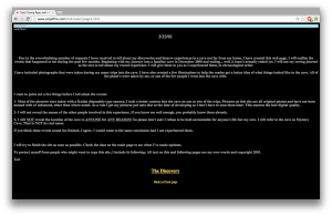
A screenshot of the first entry on the original "Ted The Caver" blog.
A screenshot of the first entry on the original “Ted The Caver” blog.

This format—a blog maintained by a clueless narrator—demands the continued interest and attention of the reader. With unnervingly realistic narrative voices and characters, the reader is constantly engaged, wondering if what they are reading is fact or fiction, pushing forward to see how the plot unravels.

In addition to format, both Creepypastas guarantee their readers’ attention throughout the duration of the piece by offering them some form of evidence, which acts as a validation for the readers’ continued commitment to the piece, a method for ensuring that they will continue reading, and a deeper level of meaning and context for the story itself.  In “Ted The Caver,” Ted shares photos of the cave, and their progress in excavating it.  “BEN Drowned” offers videos of the supposedly haunted section of the video game, complete with music and graphics that break from canon of the original game while still maintaining its integrity and validity.  These offerings are fascinating, lend credibility to the content, and help to keep the reader engaged.

Owing to the evolution of communication as a digital medium, keeping a reader engaged until the end of a long piece can prove difficult.  But by adapting to the changing rhetorical situation, such as the authors of “Ted the Caver,” and “BEN Drowned” have done with their nontraditional formats and multimedia integrations, it is not an impossible task.

An image of "B," the narrator's companion, taken from the original "Ted The Caver" blog.
An image of “B,” the narrator’s companion, taken from the original “Ted The Caver” blog.


WORKS CITED

Jadusable. “BEN Drowned.” Creepypasta Wiki. 7 Sept. 2010. Web. 30 Oct. 2014.

Wiles, Will.  “Creepypasta: With a flood of dark memes and viral horror stories, the internet is mapping the contours of modern fear.” Aeon. 20 Dec. 2013. Web. 30 Oct. 2014.


Welcome to the Page of Ted. Angelfire. 19 May 2001. Web. 30 Oct. 2014.

TL;DNR–Academic Copout


I honestly have very little to relate to in this post. I have never in my life posted TL:DNR on anything I have been asked to read in the entirety of my academic career. From a purely academic standpoint, baring expressed page limitations for assignments in which case professors or fellow students could be said to be within their rights to forego, I find this sentiment extremely rude and counterproductive. I think a more accurate term instead is TL;TB (Too Long, Too Boring); but if someone does not or cannot be bothered to engage with your work on some level, even if it means skimming until the very end, then they only have themselves to blame for their dissatisfaction in the end. The point of reading something, especially for someone else is to give them ideas about how they can improve. If you never read, how can you suggest meaningful improvements to make it more engaging if that is what it needs?

For myself, there have been several papers and assignments of others that were about as entertaining as watching paint dry as far as their overall style was concerned, but I still read enough to grasp what was important, so that I could make those suggestions. People who simply write out TL;DNR are shirking their responsibilities not only as readers but as critiques; it gives the impression not only that they are bored, but that they are lazy, unwilling to take the time to truly analyze and give voice to their objections; if they write something to that effect who is to say they read the piece at all in the first place?

untitled3

Good working relationships, no matter what the project require reciprocity. If I felt like my school readings were too long and dry could I simply put TL;DNR at the top of the page of every in class quiz over the material? Of course not. Doing such a thing would not would not only indicate failure in the general sense of making an excuse, it would also indicate an extreme lack of personal responsibility and initiative.

All this being said, the working world can be somewhat different, especially when it comes to advertisement. In this sense it is very much the business owner’s or agency’s responsibility to ensure short sweet and simple on every piece of ad or flyer. 1. Because it is an investment on their part and 2. There is no real concept of obligation in selling goods. Consumers do not have to buy your product, they have a choice and competition to go elsewhere to, thus the producer has the responsibility of making sure what time they have to spare is not wasted when it comes to reading your ad or finding out more information.

When to Cut It Down

I cannot count the times I have heard a fellow student, friend, co-work, or stranger on the street say, “This is too long!” when responding to content in a brochure, article, newspaper, etc, and decided the information is not important enough to read. In fact, I am ashamed to say, I have said this many times myself. Even while being guilty of this, I do take the position that it is the readers responsibility to engage and examine longer works; however, I do not see this as a legitimate reality. By this I mean it is not a reality for readers not only take responsibility, but also act upon that responsibility. The attention span of the overall public–being extremely short– seems to overrule the readers responsibility and forces the creator to chose to fight against the reality or succumb to it.

Creators now have to decided whether to have their composition viewed by concentrating the content and shorting the readable information, or “fighting the good fight” and publishing a longer work. It seems that the choice would be based off of the necessity the information and demographic of the intended audience. If the
information is vital to the public good or knowledge, the creator will have to take the attention span into consideration. For example, it would be virtually useless to publish a multiple page document, wordy brochure, or text heavy website for disseminating information about Ebola to the public. Though the information is seen as important and desired, it would not be absorb by the reader due to the lack of concentrated information. In this case, a simplified and direct format would be best for the dissemination, perhaps bullet points, short video, or images based information.

I have discovered a download from Google Chrome that will summarize long articles down to a few sentences automatically. I believe this reflects on the current generation. We are not only in need of fast delivery of information, we need the information condensed to such a degree so to absorb only the basic facts and move on to the next. Is the a positive characteristic or negative? Are we efficient and “hyper-productive, ” or are we missing a elements of information?  Does this have an affect on social skills and personal relationships?

Blog #9: tl;dr–Coping With Communication Overload

Any number of commentators have remarked on how the transition from print to digital media–by making it easier and cheaper than ever to produce and disseminate content–has resulted in what some people might call “communication overload.” Via our computers, our smartphones, and the screens that surround us as we make our way in the world, we are constantly bombarded with a barrage of multimedia messages.

Image “Short Attention Span” used here courtesy of a CC license by Sarah Mae on Flickr.

As Seth Godin describes it in a blog post titled, “Trapped by tl;dr,” we are drowning in an “internet tsunami,” and in order to avoid being swept away, we try to tread water by skimming the surface of all that communication:

TL;DR is internet talk for “too long; didn’t read”. It’s also a sad, dangerous symptom of the malfunctions caused by the internet tsunami. (Here’s a most ironic example of this paradox…)

The triathlete doesn’t look for the coldest bottle of water as she jogs by… she wants it fast and now. That mindset, of focusing merely on what’s fast, is now a common reaction to many online options. I think it works great for runners, not so well for learners.

There’s a checklist, punchline mentality that’s dangerous and easy to adopt. Enough with the build up, wrap this up, let me check it off, categorize it and quickly get to the next thing… c’mon, c’mon, too late, TL;DR…

Godin cautions against giving in to the tl;dr mindset, however:

Judging by length is foolish. TL;DR shows self-contempt, because you’re ignoring the useful in exchange for the short or the amusing. The media has responded to our demand by giving us a rising tide of ever shorter, ever more amusing wastes of time. Short lowers the bar, but it also makes it hard to deliver much.

He recommends instead that we “read incisively, curate, edit, choose [our] sources carefully, and in this way “[l]imit the inbound to what’s important, not what’s shiny or urgent or silly.”

In the absence of gatekeepers–such as newspaper and magazine editors, publishers, and the like–who used to control the flow of information by restricting access to the means of production and dissemination, Godin argues we have to become our own content “curators.”

Yet, where Godin places the responsibility squarely on the reader to engage in a meaningful way with longer-form content, some are stepping into the “curator” niche created by user demand for shorter, more concise communication. The website tldrlegal.com, for example, uses crowdsourcing to provide explanations of “software licenses in plain English,” for everything from Dropbox toTrueCrypt.

Posting: Group 1

Commenting: Group 2

Category: tl;dr

For this blog post, consider how digital communication media have changed not just how we compose, but also how we receive and process content. Think about whether and how the roles and responsibilities of content creators and content audiences may have evolved or may need to evolve in order to adapt to the new rhetorical context created by digital media. Use the questions below (or similar ones you create) as starting places when you craft your post:

  • Do readers have a responsibility to engage with longer content? If so, when and under what circumstances?
  • Does a content creator ignore significant aspects of the rhetorical situation when she crafts online content that risks a tl;dr response? Are there circumstances in which longer-form communication is still necessary, even in online contexts?
  • What are some rhetorical strategies that one can use to promote user engagement with longer-form content online, hopefully to avoid a tl;dr response?

In thinking about the relative responsibilities of creators and users in online rhetorical contexts, and how to optimize online communication, locate examples–both good and bad–to help illustrate your points about what works and what doesn’t. Use these examples a springboard for discussion; don’t just drop them in at the end.

In your Blog #9 post, you need to take a focused position about how understanding online rhetorical contexts can assist you in your technical communication process, rather than taking a scattered approach (which would happen if you simply wrote a few sentences in response to each question). Please carefully read and follow the guidelines and posting information for this blog. You can quote from additional articles you read as support for your position. You should include specific workplace examples to further support your argument. Make sure to document your sources, either by linking to them or including them in a bibliography at the end of your post.

Featured Image “Short Attention Span Hopscotch” by Janet Lackey on Flickr.

Blog #8: PowerPoint or People?

Boring PresentationPhoto courtesy of Envision Presentations

Overview

The problem with bad PowerPoint (PPT) presentations is the user’s application of poor design and implementation. If we choose to use PowerPoint as our medium, then I feel like we must be able to do the best with what we are given. Here, I explain why users are the problem and how to fix these problems. I will be making several references to Mike Markel’s Exploiting Verbal-Visual Synergy in Presentation Slides. Also, I will conclude by explaining how to be considerate of our pitch presentations in order to convey our messages and ideas successfully next week.

We Are the Problem
1332267643587_6720645

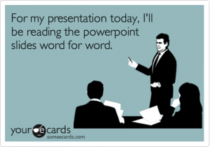
Photo courtesy of SomeEcards

An example of poor implementation and inappropriateness of use is the most common mistake that users/presenters make with PPT presentations: reading from the slides. As Chris Anderson stated in How to Give a Killer Presentation, “Don’t use a slide deck as a substitute for notes […] and don’t repeat out loud words that are on the slide.” If you look at a TED Talk in which the presenter uses a PPT (my favorite is My invention that made peace with lions), then you will notice that some things are better experienced visually with verbal comments and background information. The TED Talk video applies to Markel’s principle “Show what is best shown; say what is best said.”

My Problem

Although I argue that people are the problem, I think that space limitations of the medium are also a problem; however, there is a way around this. I have experienced space limitations in my PPT slides in my module presentation about modalities. For instance, I wanted to show the use of good spatial modes in a professional profile vs. the use of bad spatial modes in a different professional profile by providing examples of each one on the same slide. I wanted to have both pictures side-by-side so that I could verbally compare and contrast how different audiences would react; however, if I would have done that, then my audience (our class) would not have been able to see everything because the examples would have been too small.

My Solution

dnaSequencingStructure9

Photo courtesy of Center for BioMolecular Modeling

What I have learned is that whenever I feel like I have space limitations, I should use a diagram because it will allow me to eliminate visual clutter and highlight just what I need. The diagram above of an individual cell and its parts is a good example of drawing tools; it is an example of the tools that I should have applied to my module PPT presentation. As Markel explained, we should use one drawing or photo of our primary subject and use another to provide a close up of it; this way, “[we] would not have to worry about space limitations, poor figure-ground contrast, and visual clutter.”

Pitch Presentations

Obviously, the drawing tools that I have mentioned cannot best convey every PPT presentation’s purpose. So, here are a few things to consider when we are pitching our presentations to our clients this coming week:

  • Analyze the audience and purpose of your presentation.
  • Only use visuals when absolutely necessary; otherwise, they are distractions.
  • Do not simply slap words on the screen; otherwise, a handout may be a better medium (Markel).
  • Make fewer, better slides (i.e. less is more) (Markel).
  • Use the assertion-evidence structure when convincing your client that your product is the way to go: making a claim in the form of a brief sentence in the title section of the PPT slide and inserting a graphic that validates your claim in the main content area (Markel).
    Example of the assertion-evidence structure:cheetah3

Photo courtesy of Penn State University

Dr. Robin Wharton | 25 Park Place #2434 | Office Hours: M/W 9:30 to 10:30, T/Th 2:30 to 3:30