Don’t waste your time

“There’s too much noise, too much poorly written, overly written, defensively written and generally useless stuff cluttering your life.” Couldn’t have said it better myself. Texts that are too long distract the reader from important information, and far too often sway off subject. For this blog, I will propose that in certain cases long texts distract the reader and make it harder for the author to connect with his audience.

In article on learningenglishbetter.com, an author argues that some words are unnecessary because they “describe words whose meanings are clear.” An example of this could be: the tall building. Every building is tall we do not need the word tall to accurately describe a building, unless of course it is surrounded by buildings that are shorter than it and we need some sort of specificity in deciding which building. However, normally we conceive of every building as tall. So using the word tall to describe a building is unnecessary. Similarly, the addition of words to communication can worsen the ability you have to reach an audience. While in class yesterday I couldn’t help but notice that a fellow pupil of mine was using horrendously ambiguous vocabulary to describe a very simple idea, which is normally the case in most undergraduate course. The pupil used words including “voyeurism,” “existentialism,” etc. These words do not make the conversation any easier for the rest of the class to understand and using such a harsh vocabulary makes it harder for people to understand where you are coming from. The same can be said of using too many words. Say I ask you a question: “How is the weather today?” If you respond “Oh the cumulus clouds, and the propensity of the sun shine shooting downwards creates a beautiful serene landscape from which I can easily conclude that there is an omniscient creator whom serves his creations with the best intentions. Reflective of this sunshine, I can see myself wearing an outfit that would match the types of temperature and precipitation levels in a desirable, as well as, cute way,” then you are not communicating with me at all. I asked “how is the weather today?” not “what’s going on in that crazy head of yours?” Similarly, if I’m looking for a way to change a light bulb, and you begin giving me the ideology behind electronics, I’m not going to be too pleased. The problem with lengthy texts is that they often sway off topic, and start entertaining other ideas not relevant to what the author’s aim is. Similarly, lengthy texts are boring and more often then not waste the reader’s time. Of course this is only my opinion. But honestly, would you rather read the book or see the movie? If you choose the first, then you’re choosing it for some reason other than efficiency. If both of the following texts contained the same amount of information, which one would you read an 800-page novel or a 1 page description of the novel? You would be insane to pick the first.

As far as the internet goes people don’t want to read 100 page descriptions of a movie, or 25 page descriptions of directions to the nearest gas station. They want information that gets to the point and stays there. Think about it in this context, if you pulled over to the side of the street and asked for directions to the nearest gas station, because your gps died or something else happened leaving you to approach a complete stranger on the street. And the stranger proceeded to give you a 45 minute explanation, how would you feel? You would feel like your time had completely been wasted, and you should have never even tried to speak to a stranger on the side of the street. That’s how I feel with most of the readings I encounter. Get to the point already, I don’t have time to read this 400 page book that has no specific aim and just arbitrarily moves from subject to subject. Instead, give me the summary and 3 days of my life back.


http://learnenglishbetter.com/content/index.php/all-articles/71-unnecessary-words

http://sethgodin.typepad.com/seths_blog/2014/01/the-fatal-arrogance-of-tldr.html

10 reasons why we should all be reading more (you won’t believe what they are!)

The problem with the sudden influx of easily digestible information and the rise of the phrase TL;DR is a multi-faceted problem that cannot be easily solved. In my opinion, many authors on the internet tend to use a whole bunch of completely and totally unnecessary words in their posts in order to sound like they are actually really very smart. Or perhaps they are trying to fulfill a secret word-count quota that only they know about. In fact, this very paragraph could be edited to somewhere between a third or a half of its current length. With technical communication, wordy documents are especially grating since the real object of technical writing is to convey meaning in the most direct way possible. Many poorly written articles on the web are simply too long and deserve the retort TL;DR.

The flip side to this, however, is the unholy plague of listicles (an “article” in the form of a list) posing as real journalism. Seriously,stuff like this  is quickly filling the internet, making it harder and harder to find anything of actual value to read. Now, I know what you all are thinking..”this old codger needs to get hip to the new and the now, we are young and we are leaving dusty old print media and anything over 140 characters in the dust.”  I would caution against such a brash philosophy. Are there any scientific studies that show people who read entire books regularly are way smarter than people who read tweets and status updates all day? Probably, but I don’t need to reference any of them to tell you that that statement is 100% correct. (please note that the internet is awful and I hate everything. After a quick google search of “Do smarter people read more?,” the first twenty results were listicles. If you need information to be crunched into a list so that you can digest it, you should go back to preschool where your mommy and daddy will also cut your pb&j into triangles and remove the crust for you as well.

I can provide real data too, not just snarky conjecture. Apparently, all this googling and wikisurfing is changing how our brains process and store information. Instead of keeping all those interesting tidbits of “knowledge” in your memory, your brain creates a database entry point instead. What this means is that your brain does not remember the information that you went to look for. Instead, it remembers where you went to look for it.

The solution is simple yet also probably impossible. Everyone needs to set a higher standard for what they are willing to read. Buzzfeed isn’t rotting your mind, but it is wasting your time on, at best sub-par entertainment, when you could be doing literally anything else. As the famous philosopher, Drake said, “You only live once.” So why not make the best of our lives and strive to challenge ourselves intellectually and creatively every single day?


Sources used

http://sethgodin.typepad.com/seths_blog/2014/01/the-fatal-arrogance-of-tldr.html
http://www.buzzfeed.com/bricesander/celebrity-fashion-lines-you-totally-forgot-abou-wn2y

http://www.nytimes.com/2011/07/15/health/15memory.html

http://en.wikipedia.org/wiki/Wikipedia_talk:Too_long;_didn%27t_read#GFDL.3F.3F.3F


Delivering Chills and Engaging Readers


I’ve always had a certain propensity towards the things that go bump in the night.  Maybe it was because of the countless summers I spent at sleep-away camp, swapping ghost stories around a dying fire; or maybe it was my father’s immense collection of HP Lovecraft that I was forbidden to read as a child (and, of course, read every chance I got).  Whatever the reason, in the years since, my love for the horror genre has only grown.  And recently, it led me to the virtual world of “Creepypasta.”

whipple

Image displayed on the homepage of Ted’s blog.

Creepypasta, an unquantifiable forum in which both amateur and professional authors create and share scary stories, has deep roots in folklore and urban legends, and seems to hold Lovecraft to the highest possible esteem, has provided a complete overhaul of the methods in which we seek fear, and seek to fear others.  With the advent of the technologic age, and the rise of digital communication media, word of mouth has given way to word of user, or website: “These days, instead of the campfire, we are gathered around the flickering light of our computer monitors” (Wiles).

The most successful creepypastas, in both ratings and eliciting fear, are the lengthier ones, as they rely on time-tested and true rhetorical strategies that promote user engagement.  Drawing from Lovecraft’s 1927 definition of “weird” fiction, the authors of these long works know that, in order to keep the reader engaged, “A certain atmosphere of breathless and unexplainable dread of outer, unknown forces must be present; and there must be a hint, expressed with a seriousness and portentousness becoming its subject, of that most terrible conception of the human brain” (Wiles).

Two of the oldest and most respected long-form Creepypastas, “Ted the Caver,” and “BEN Drowned” keep the reader engaged, and guarantee that they will see the work through to the end, both utilize the same rhetorical strategies: a format that breaks from the traditional narrative and fabricated multimedia evidence.

The tale of “Ted The Caver,” in which two amateur spelunkers excavate a virgin cave, and unwittingly wake a beast of unfathomable evil, is presented as a genuine blog, with the narrator (presumably, Ted himself) chronicling the events of the story in real-time posts.  “BEN Drowned,” the story of a young college student who unknowingly purchases a “Majora’s Mask” cartridge that is haunted by the malevolent spirit of a boy named Ben, is also written as blog post entries, each stamped in real time.

This format—a blog maintained by a clueless narrator—demands the continued interest and attention of the reader. With unnervingly realistic narrative voices and characters, the reader is constantly engaged, wondering if what they are reading is fact or fiction, pushing forward to see how the plot unravels.

In addition to format, both Creepypastas guarantee their readers’ attention throughout the duration of the piece by offering them some form of evidence, which acts as a validation for the readers’ continued commitment to the piece, a method for ensuring that they will continue reading, and a deeper level of meaning and context for the story itself.  In “Ted The Caver,” Ted shares photos of the cave, and their progress in excavating it.  “BEN Drowned” offers videos of the supposedly haunted section of the video game, complete with music and graphics that break from canon of the original game while still maintaining its integrity and validity.  These offerings are fascinating, lend credibility to the content, and help to keep the reader engaged.

A video embedded in the original “BEN Drowned” post.

Owing to the evolution of communication as a digital medium, keeping a reader engaged until the end of a long piece can prove difficult.  But by adapting to the changing rhetorical situation, such as the authors of “Ted the Caver,” and “BEN Drowned” have done with their nontraditional formats and multimedia integrations, it is not an impossible task.


WORKS CITED

Jadusable. “BEN Drowned.” Creepypasta Wiki. 7 Sept. 2010. Web. 30 Oct. 2014.

Wiles, Will.  “Creepypasta: With a flood of dark memes and viral horror stories, the internet is mapping the contours of modern fear.” Aeon. 20 Dec. 2013. Web. 30 Oct. 2014.


Welcome to the Page of Ted. Angelfire. 19 May 2001. Web. 30 Oct. 2014.

Blog #9: Communication “A Full Time Job”

overloadforblog


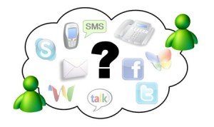
When is too much….too much? In this day and age, technology has basically overruled our lives. Sometimes it feels like a full time job when responding back to everyday messages on multiple devices. When was the last time you had a quiet dinner with your family without cell phones ringing or the television blaring in the background? How many devices do you have to check Facebook or Twitter on? If I had to guess, then it would be about three to four devices. So, how does this relate to communication overload?

Imagine reading a email sent from your boss with information stating what he wants in a new memo for you to write about for the next big project coming up. Along with that, he wants you to research the company’s Facebook and Twitter accounts for information to be updated as well. On top of that, you get an email CC’d with your name on it from your coworkers about the upcoming project that the boss wants and what information they should be researching. Feel overwhelmed yet? Also lets consider, that this is ongoing all day with emails going back to back plus phone calls and texts. Take a big breath!!! Theres a solution.

Responsibility. I bet you going huh?? How does that relate to the problem? Lets define it deeper….

“Look at the word responsibility – “responseability” – the ability to choose your response” (Glei 2014).

Get the picture now? It is your ability to choose your response when it comes down to emails, texts, and/or calls. It is your responsibility to how much you retain, but it also depends on the content creator. Going back to the above example….”Does the email contain information important to you?” Lets say you got a email that is five paragraphs long from a coworker. Are you really going to read all that? Probably not when you have other projects going on. You pick and choose what is important throughout the email and write back on what you retained.

In the article “Stop the Insanity: How to Crush Communication Overload”, Glei writes four steps that can crush communication. Its a matter of information retained from a single source. I find it fascinating on how communication and technology affects us. globally. Almost everyone communicates on two or more devices. I am guilty of that. I use my iPhone and iPad to communicate through texts that are sent to either one. I also get my news from Facebook than a regular newspaper. It has really grown on this generation, and we have really forgotten on how to communicate with one another face to face. Think of communication as a full time job….but without pay, your basically doing it for free.

Sources Cited 

Image used: https://www.google.com/search?q=communication+overload&rlz=1C5CHFA_enUS503US503&espv=2&biw=1422&bih=683&source=lnms&tbm=isch&sa=X&ei=gw1RVIPvJ4GfgwT_iIPYAw&ved=0CAYQ_AUoAQ&dpr=0.9#facrc=_&imgdii=_&imgrc=GikErQ1rkciDJM%253A%3BiN7FHuPuS9_k8M%3Bhttp%253A%252F%252Fobelisk.si%252Fwp-content%252Fuploads%252F2010%252F07%252Foverload_s.jpg%3Bhttp%253A%252F%252Fobelisk.si%252Fblog%252Farchives%252F137%3B450%3B267

Glei, Jocelyn K. “Stop the Insanity: How to Crush Communication Overload.” 29 Oct 2014. Web <http://99u.com/articles/7002/stop-the-insanity-how-to-crush-communication-overload>


Blog #9: tl;dr–Coping With Communication Overload

Any number of commentators have remarked on how the transition from print to digital media–by making it easier and cheaper than ever to produce and disseminate content–has resulted in what some people might call “communication overload.” Via our computers, our smartphones, and the screens that surround us as we make our way in the world, we are constantly bombarded with a barrage of multimedia messages.

Image “Short Attention Span” used here courtesy of a CC license by Sarah Mae on Flickr.

As Seth Godin describes it in a blog post titled, “Trapped by tl;dr,” we are drowning in an “internet tsunami,” and in order to avoid being swept away, we try to tread water by skimming the surface of all that communication:

TL;DR is internet talk for “too long; didn’t read”. It’s also a sad, dangerous symptom of the malfunctions caused by the internet tsunami. (Here’s a most ironic example of this paradox…)

The triathlete doesn’t look for the coldest bottle of water as she jogs by… she wants it fast and now. That mindset, of focusing merely on what’s fast, is now a common reaction to many online options. I think it works great for runners, not so well for learners.

There’s a checklist, punchline mentality that’s dangerous and easy to adopt. Enough with the build up, wrap this up, let me check it off, categorize it and quickly get to the next thing… c’mon, c’mon, too late, TL;DR…

Godin cautions against giving in to the tl;dr mindset, however:

Judging by length is foolish. TL;DR shows self-contempt, because you’re ignoring the useful in exchange for the short or the amusing. The media has responded to our demand by giving us a rising tide of ever shorter, ever more amusing wastes of time. Short lowers the bar, but it also makes it hard to deliver much.

He recommends instead that we “read incisively, curate, edit, choose [our] sources carefully, and in this way “[l]imit the inbound to what’s important, not what’s shiny or urgent or silly.”

In the absence of gatekeepers–such as newspaper and magazine editors, publishers, and the like–who used to control the flow of information by restricting access to the means of production and dissemination, Godin argues we have to become our own content “curators.”

Yet, where Godin places the responsibility squarely on the reader to engage in a meaningful way with longer-form content, some are stepping into the “curator” niche created by user demand for shorter, more concise communication. The website tldrlegal.com, for example, uses crowdsourcing to provide explanations of “software licenses in plain English,” for everything from Dropbox toTrueCrypt.

Posting: Group 1

Commenting: Group 2

Category: tl;dr

For this blog post, consider how digital communication media have changed not just how we compose, but also how we receive and process content. Think about whether and how the roles and responsibilities of content creators and content audiences may have evolved or may need to evolve in order to adapt to the new rhetorical context created by digital media. Use the questions below (or similar ones you create) as starting places when you craft your post:

  • Do readers have a responsibility to engage with longer content? If so, when and under what circumstances?
  • Does a content creator ignore significant aspects of the rhetorical situation when she crafts online content that risks a tl;dr response? Are there circumstances in which longer-form communication is still necessary, even in online contexts?
  • What are some rhetorical strategies that one can use to promote user engagement with longer-form content online, hopefully to avoid a tl;dr response?

In thinking about the relative responsibilities of creators and users in online rhetorical contexts, and how to optimize online communication, locate examples–both good and bad–to help illustrate your points about what works and what doesn’t. Use these examples a springboard for discussion; don’t just drop them in at the end.

In your Blog #9 post, you need to take a focused position about how understanding online rhetorical contexts can assist you in your technical communication process, rather than taking a scattered approach (which would happen if you simply wrote a few sentences in response to each question). Please carefully read and follow the guidelines and posting information for this blog. You can quote from additional articles you read as support for your position. You should include specific workplace examples to further support your argument. Make sure to document your sources, either by linking to them or including them in a bibliography at the end of your post.

Featured Image “Short Attention Span Hopscotch” by Janet Lackey on Flickr.

The Good and The Bad of the Powerpoint

I’ve learned to use powerpoint over the years and really liked it mostly because of how easy it was to use. It makes a great tool for businesses and for teachers. Being able to customize a presentation to suit your specific needs with various design templates and themes is an additional reason why I’ve always liked it. I must say the powerpoint is still my favorite go to when trying to make a quick visual presentation to accompany my talk. However, there are several features that bother me, poor font choices and colors that makes the slides hardly readable against the background color. When a presenter has nothing but text and no graphics, it makes it really boring having to sit through the presentation. According to Russell, one should be able to keep the audience interested by including pictures and graphics that reflect the content of a presentation.

pp2

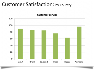
You can easily change this typical bar chart slide into a more simple and visual pleasing powerpoint slide as seen belowpp1

The second slide makes it so readable and it’s also much easier to understand the key point – that Australia leads the world in this study.

In addition to the bad aspects of the powerpoint, presenters have relied so heavily on the application that they forget to present. They write all the content for the presentation on the slides and read off their presentations word for word forgetting their audiences could have easily read the slides on their own without showing up. Also, using too many transitions or sounds can be very distracting to the audience. A presentation should be fluid at all time while still maintaining the audiences interest.

Presenters should always try to make their message memorable and not rely too much on the slides for structure. They need to learn how to communicate verbally and rely less on the visuals. The powerpoint has the potential to be a really good tool but when it is abused and used wrongly it easily becomes a replacement for the presenter and not a reinforcement.

Sources

Photos Courtesy of http://executivespeechcoach.blogspot.com/2013/01/save-us-from-ugly-powerpoint-slides.htm

Russell Wendy, PowerPoint Presentations The Good, The Bad, and The Ugly. http://presentationsoft.about.com/od/powerpoint101/a/good_bad_ugly_3.htm

Blog #8:

From the first day you step into a classroom until the day you retire from a career, you are bombarded with hundreds of thousands of PowerPoint slides. Teachers love them, professionals utilize them, students are forced to create them. Some are good, some are bad, some are hard to even look at. It is clear why PowerPoint is such a popular presentation tool: it is extremely user friendly and comes pre-installed on most computers. The question is, why are most of the PowerPoint presentations we are forced to sit through in life so terrible? Some critics blame the tool itself, but I disagree. I think the real problem is that most of the people who use PowerPoint lack the keen eye for design that any visual presentation requires.

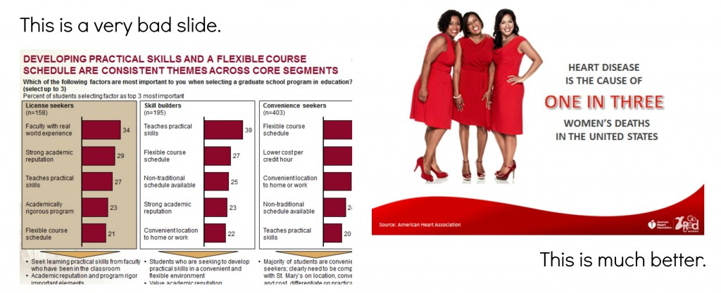
I think of it this way: If I were to try, right now, to make a flyer for a band, it would look just plain awful. I am not creative, I don’t understand which colors go well together, and I can’t choose fonts to save my life. From this, you can conclude that I would also be bad at making a poster, a website, a t-shirt design or anything else you would find in a graphic designer’s portfolio. So… Why would I think I could make a stunning PowerPoint? Like any presentation, PowerPoint utilizes color, font, layout, and design. If these elements are not done well, the PowerPoint will not be aesthetically pleasing. Here is one example of a good vs. a bad PowerPoint slide:

http://www.jenthorson.com/wp-content/uploads/2013/07/Good-slide-bad-slide-1024×417.jpg

Notice how the first slide is too crowded, there are way too many words, and your eye doesn’t know where to look. The slide on the right is clean, the message is clear, and the image is relevant. I can see this when the two are put side-by-side, but it is much harder to take a blank slide and make it into something great!

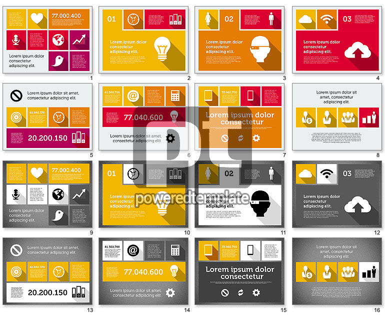
Here is another example of a successful PowerPoint presentation:

http://i.poweredtemplates.com/i/dg/01/947/technology-presentation-flat-design-powerpoint.jpg

This PowerPoint has bold colors, interesting layouts, and clean and easy to read slides. Unfortunately, I could never design a presentation like this one, and I think many people are in the same boat as me. No matter how I try, I just don’t have that eye for design.

At the end of the day, after I’ve tried and failed to make a beautiful presentation, I can’t blame Microsoft. I think the fault lies with the users. Anything that is meant to present information in a creative way (magazine, flyer, billboard, commercial, etc.) practically requires an artist for it to turn out well, and PowerPoint is no different. Microsoft supplies themes and layouts, but these are too basic to allow for a truly stand out presentation. This may be the reason that Prezi has become such a popular tool. It requires users to put even less thought into the design of the presentation. Just pick a theme and fill it with your information. This way, even those of us with no creativity whatsoever can have an aesthetically pleasing presentation.

In conclusion, I think that too many people use PowerPoint without taking the time to learn about what they are doing, slapping a graph and some words onto a slide and calling it a day. Since so many schools require students to create PowerPoint and other presentations, students could likely benefit from a basic design class in middle or high school. This may not completely solve the problem, but I think it would be a step in the right direction!

PowerPoint vs. The PowerPoint Designer

In our modern, highly technologically advanced society, does Microsoft PowerPoint still stand a chance as an effective method for professional presentation?

In my opinion, yes it does!

More specifically, I think the issue here is whether PowerPoint is naturally incapable of adapting to the times or is the designer of the presentation lacking the necessary skills to create an effective presentation utilizing appropriate design choices and styles.

In my opinion, the issue with PowerPoint falls on the designer and his/her ability to create an effective professional presentation.  Many times throughout my high school and college career, I have been a victim of slow, confusing PowerPoint presentations, whose slides are overrun with either images, texts, or an obnoxious mix of the two.  Unfortunately, many people do not take the time to focus on the effects their PowerPoint presentation will have on the audience.  Often, the designer will focus on aspects that please only him/her during the construction period, such as applying unnecessary background colors or typing paragraph notes that will only be read verbatim come presentation day.

The purpose of your PowerPoint presentation is to aid in whatever point you plan to make to your audience.  The text and language used in your slides should be short, preferably in some bullet list form and consisting of key words.  Your audience is there to listen and learn something new, not read the information on the slide or listen to what is already in plain sight.  Images should also be used as an aid to enhance what the presenter is discussing.  The designer should avoid unnecessary decoration or  over-stretched images as a background for your slide.  Graphs and charts are encouraged to appease those in the audience who prefer visual learning.  However, these graphs should be relevant and laid out in a nice, organized fashion.  The colors used to highlight these charts and graphs should be minimal in use. According to Sarah Jacobsson Purewal, the presentation designer should “stick with two or three — not six or seven — and use them consistently.”  

Half of the problem stems from  people being unaware of the wide range of functions PowerPoint has to offer.  The other half is that PowerPoint does need to update a little bit to offer more current methods of presenting.  However, blogger Christopher Maloney offers an insight into the new and improved PowerPoint 2013 in his post titled, “PowerPoint 2013: Presentation is Everything”.  He discusses the new improvements to the most recent version of the program, primarily the “eight newly designed themes” so that “variants have complete control over all elements of the presentation’s design — colors, fonts, effects, layouts, text properties, paragraph properties, design elements, and photos and textures.”

With such improvements, it is only possible for PowerPoint to become more prevalent in professional presentations, both in school and the workforce.

Sources Cited

Microsoft. (2012). The New PowerPoint. http://blogs.office.com/2012/08/09/the-new-powerpoint/

Purewal, Jacobsson Sarah. (September 20, 2010). The World’s Worst PowerPoint Presentations.  http://www.cio.com/article/2415027/enterprise-software/the-world-s-worst-powerpoint-presentations.html


Blog #8: PowerPoint or People?

Boring PresentationPhoto courtesy of Envision Presentations

Overview

The problem with bad PowerPoint (PPT) presentations is the user’s application of poor design and implementation. If we choose to use PowerPoint as our medium, then I feel like we must be able to do the best with what we are given. Here, I explain why users are the problem and how to fix these problems. I will be making several references to Mike Markel’s Exploiting Verbal-Visual Synergy in Presentation Slides. Also, I will conclude by explaining how to be considerate of our pitch presentations in order to convey our messages and ideas successfully next week.

We Are the Problem
1332267643587_6720645

Photo courtesy of SomeEcards

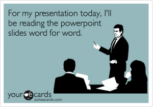
An example of poor implementation and inappropriateness of use is the most common mistake that users/presenters make with PPT presentations: reading from the slides. As Chris Anderson stated in How to Give a Killer Presentation, “Don’t use a slide deck as a substitute for notes […] and don’t repeat out loud words that are on the slide.” If you look at a TED Talk in which the presenter uses a PPT (my favorite is My invention that made peace with lions), then you will notice that some things are better experienced visually with verbal comments and background information. The TED Talk video applies to Markel’s principle “Show what is best shown; say what is best said.”

My Problem

Although I argue that people are the problem, I think that space limitations of the medium are also a problem; however, there is a way around this. I have experienced space limitations in my PPT slides in my module presentation about modalities. For instance, I wanted to show the use of good spatial modes in a professional profile vs. the use of bad spatial modes in a different professional profile by providing examples of each one on the same slide. I wanted to have both pictures side-by-side so that I could verbally compare and contrast how different audiences would react; however, if I would have done that, then my audience (our class) would not have been able to see everything because the examples would have been too small.

My Solution

dnaSequencingStructure9

Photo courtesy of Center for BioMolecular Modeling

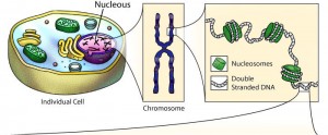
What I have learned is that whenever I feel like I have space limitations, I should use a diagram because it will allow me to eliminate visual clutter and highlight just what I need. The diagram above of an individual cell and its parts is a good example of drawing tools; it is an example of the tools that I should have applied to my module PPT presentation. As Markel explained, we should use one drawing or photo of our primary subject and use another to provide a close up of it; this way, “[we] would not have to worry about space limitations, poor figure-ground contrast, and visual clutter.”

Pitch Presentations

Obviously, the drawing tools that I have mentioned cannot best convey every PPT presentation’s purpose. So, here are a few things to consider when we are pitching our presentations to our clients this coming week:

  • Analyze the audience and purpose of your presentation.
  • Only use visuals when absolutely necessary; otherwise, they are distractions.
  • Do not simply slap words on the screen; otherwise, a handout may be a better medium (Markel).
  • Make fewer, better slides (i.e. less is more) (Markel).
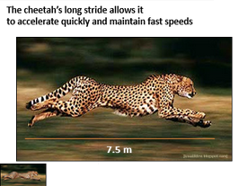
  • Use the assertion-evidence structure when convincing your client that your product is the way to go: making a claim in the form of a brief sentence in the title section of the PPT slide and inserting a graphic that validates your claim in the main content area (Markel).
    Example of the assertion-evidence structure:cheetah3

Photo courtesy of Penn State University

Prezi is the new PowerPoint

I believe that PowerPoints used to be a pretty decent form of media back in the 90’s and early 2000’s as a way to teach or give information to an audience. However, PowerPoints had 2 categories that I believe killed them: the overly dull and dry ones that bore the viewers to sleep and the super animated ones with every single possible animated special effect that make it impossible to concentrate on the actual concept of what’s being presented.

For example, this presentation uploaded by Javed Iqbal onto SlideShare.net is a simple presentation uploaded from Powerpoint, and it pains me to even look at the simple template, which really dumbs things down, offering little opportunity for creativity.

I believe that the newer trend, Prezi offers an easier method of maintaining creativity while still getting the information through. The transitions are much smoother, and the opportunity to embed different links and videos into the presentation without having to stop and open each individual link. Furthermore, the ability to include multimodal layers without having to go through the trouble of adding it individually as an option to each slide makes it easier on the presenter  keep an easy flow to the actual presentation.

Personally, I find Prezi to be more user friendly than Powerpoint. With Powerpoint, I always found myself fumbling for the right buttons, and the right balance between creativity and presenting the information concisely and clearly. For instance in my latest editing Prezi, I was able to easily embed the music to play in the background. The preplanned layout allows me to make minor adjustments while keeping to a general format, but the background styles allow me to spice it up a bit.

Furthermore, Prezi’s formatting encourages you to use it for a variety of purposes, not just strictly academic, but fun as well, like this one connecting Cell Regeneration to Doctor Who regenerations. Not only was it easy to embed videos and music, but the searchable Google Images make it easier than saving and uploading individual photos. Also, it has the benefit of being online, which makes it transferable via a link instead of trying to e-mail it and getting a message saying it is too big to upload!


Sources:

http://www.slideshare.net/JavedIqbal15/presentation-on-effective-teaching

http://prezi.com/fikgikx_-zfg/its-time-to-say-goodbye-to-turning-tables/

http://prezi.com/ubozwwssx7zh/dr-who-and-cell-regeneration/

Dr. Robin Wharton | 25 Park Place #2434 | Office Hours: M/W 9:30 to 10:30, T/Th 2:30 to 3:30