I’ve learned to use powerpoint over the years and really liked it mostly because of how easy it was to use. It makes a great tool for businesses and for teachers. Being able to customize a presentation to suit your specific needs with various design templates and themes is an additional reason why I’ve always liked it. I must say the powerpoint is still my favorite go to when trying to make a quick visual presentation to accompany my talk. However, there are several features that bother me, poor font choices and colors that makes the slides hardly readable against the background color. When a presenter has nothing but text and no graphics, it makes it really boring having to sit through the presentation. According to Russell, one should be able to keep the audience interested by including pictures and graphics that reflect the content of a presentation.
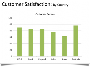
You can easily change this typical bar chart slide into a more simple and visual pleasing powerpoint slide as seen below
The second slide makes it so readable and it’s also much easier to understand the key point – that Australia leads the world in this study.
In addition to the bad aspects of the powerpoint, presenters have relied so heavily on the application that they forget to present. They write all the content for the presentation on the slides and read off their presentations word for word forgetting their audiences could have easily read the slides on their own without showing up. Also, using too many transitions or sounds can be very distracting to the audience. A presentation should be fluid at all time while still maintaining the audiences interest.
Presenters should always try to make their message memorable and not rely too much on the slides for structure. They need to learn how to communicate verbally and rely less on the visuals. The powerpoint has the potential to be a really good tool but when it is abused and used wrongly it easily becomes a replacement for the presenter and not a reinforcement.
Sources
Photos Courtesy of http://executivespeechcoach.blogspot.com/2013/01/save-us-from-ugly-powerpoint-slides.htm
Russell Wendy, PowerPoint Presentations The Good, The Bad, and The Ugly. http://presentationsoft.about.com/od/powerpoint101/a/good_bad_ugly_3.htm

I agree. A lot of people use PowerPoint as a crutch. People seem to hate PowerPoints because they have sat through too many that were too poorly done. PowerPoint is a presentation tool that people should not read of off but include enough text for the audience to use as a reference or headings in their notes. When presenters read of off slides or cram them with too much information, the audience is no longer interested in the presenter, but is busy trying to read or copy down what is written on the slide.
And, as you mentioned, people not only abuse but misuse PowerPoint. You brought up a good point that PowerPoint gives the user so much freedom in regards to font choice, layout, clip art, sound effects, etc., but the downside is the user often does not know how to properly coordinate all of those elements.
a
I definitely agree with you. It isn’t really the software’s fault when it’s misused. PowerPoint is actually pretty versatile, but a lot of times, I feel like people rely on it too heavily (i.e. reading their presentation directly from the PowerPoint instead of using it as a visual aid) and also, I feel like a lot of people aren’t really familiar enough with the features to make a presentation that’s aesthetically appealing (like the infographic instead of the bar graph). A lot of times, people can actually get away with just using templates, so it’s not like it’s hard to use the software. Referring back to the original post, I don’t think it’s even the software, I really think it’s just the users. Sure, the earlier versions of it (up until 2003) were pretty basic and bland, but the newer versions of it have so many templates and features that can be used to create better visuals.