Often we present statistical data not as exclusively the numbers themselves, but as a visualization of those numbers—as charts or graphs or tables or even pictures—giving the reader or viewer a better way to understand the meaning or impact of the information. The goal in visualization of data is clarity of meaning, though it takes awareness and care not to distort or obscure the information. Of course, as viewers and users of graphical representations, we also need to curb our natural impulse to find charts, graphs, and elaborate visualizations to be convincing just because of their form. But, regardless of the potential drawbacks, visualizations can be excellent communication tools, and there are many great examples; here I share two from the nineteenth century that can still inform us today and give us ideas for our new digital tools.
One famous 19th century example is the map John Snow created to show the pattern of deaths in a London cholera epidemic. He discovered that largest number of deaths were of people drinking from a certain well on Broad Street and correctly confirmed that the disease was spread through water. For more information about the cholera outbreak and Snow’s work see the article where I got the above information.
Here’s his map, the visualization of the complicated problem he was trying to solve.

“Snow-cholera-map-1” by John Snow. Published by C.F. Cheffins, Lith, Southhampton Buildings, London, England, 1854 in Snow, John. On the Mode of Communication of Cholera, 2nd Ed, John Churchill, New Burlington Street, London, England, 1855.
(This image was originally from en.wikipedia; description page is/was here.
Image copied from
http://matrix.msu.edu/~johnsnow/images/online_companion/chapter_images/fig12-5.jpg). Licensed under Public domain via Wikimedia Commons.

* * *
Here’s a web site with 10 classic scientific maps, including Snow’s.
* * *
It’s an art and a science to represent information graphically, whether with digital tools or with pen and paper. I once went to Presenting Data and Information, a one-day course taught by Edward Tufte, a statistician and political scientist who is an emeritus professor from Yale 1; it was an eye-opening experience that transformed how I thought about the graphical information I saw every day. If you haven’t had the chance to go to his course, I highly recommend it—part of the fee includes four of his books on graphical information design: The Visual Display of Quantitative Information, Envisioning Information, Visual Explanations, and Beautiful Evidence. 1. biographical information from Tufte’s web site.
One graphic that Tufte sells as a poster and describes as “[p]robably the best statistical graphic ever drawn” is a chart done by Minard in the 19th century showing Napoleon’s troop strength during his invasion of Russia.
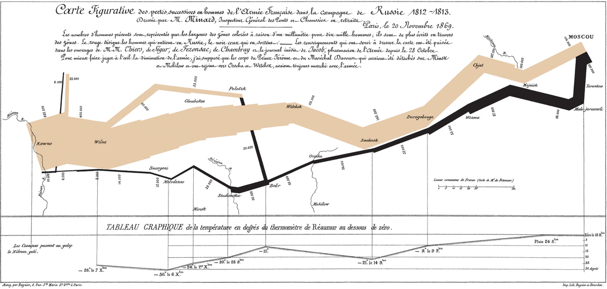
Charles Minard (1781-1870) – see upload log. Licensed under Public domain via Wikimedia Commons.

Once I examined it and understood the meaning of the swath of tan beginning thick as Napoleon’s army moved toward Moscow, and then as a black band in retreat during the winter, diminishing to almost a mere pencil line, I could feel viscerally the horror of war.
* * *
Check out Edward Tufte’s web site and his blog, ET Notebooks, in which he posts information and responds to questions.
* * *
To close this post, I leave you with Michael Friendly’s collection of graphics that flat out lie: The Lie Factor. (Friendly is a professor at York University and chair of the graduate program in Quantitative Methods; his web site is entitled, Data Visualization: Looking back, going forward.)
Happy viewing and designing,
Amanda Gable