Magazine Issues

I have been writing a bit about Edge Magazine here on my blog, as it is my major SIF project this year. Despite the fact that I have been an editor at Hybrid Pedagogy for over 3 years, starting a new editing process is quite the puzzle.

There is a lot to think about as we get the journal off the ground. Most of what our team is wading through involves one big question: What?

What is our edge?

The biggest question for any publication is this. What is our edge? Who are our audience(s)? Who are we speaking to and why? After several meetings discussing what Edge is for, what it accomplishes, and what it focuses on, we have decided that Edge will be a culture and arts focused multimedia magazine that uses Atlanta as its unifying theme. It will be different than Discovery in that its articles will be shorter, more causal, mostly multimedia driven, with new articles released often. It will be different than The Signal in that it is not a Newspaper that reports, but rather a magazine that has featured undergraduate work.

What is the argument we are making with these articles overall which will set the stage and aesthetic for the magazine?

As Edge begins to develop and take on shape, the hope here is that our argument will become clear to our readers. Of course, our first argument is “Undergraduate work at GSU matters.” And our second argument is “Undergraduate work here at GSU is really cool, innovative, and edgy.” These arguments will be obvious as the first articles go live next Fall. Ultimately though, the answer to this question is a wait-and-see process depending largely on the submissions we get, and the voice the collective students create as we show the world what we can do here at Georgia State.

What is going to make people want to return to read about more work that students are doing at GSU?

This question is also a wait-and-see question as we develop the aesthetic of the magazine. At the moment, if you click the link at the top of this entry, you will see that the magazine is a skeleton with some test posts and a repeat of the same class project that we have been playing with. But as we begin to work on our first submissions (we already have one lined up!), the look and feel of the magazine will begin to take on a polished shape. We do know that the magazine will feature videos, audio recordings, galleries of stills, links out to student work that exists live on the web, and combinations of all these things. It will have the ability to take student work that is exciting and interesting already, and make it more visually appealing for outside readers.

This means, that the student work featured here did not stop at the professor’s desk, but will be published for the world to see, which adds a whole new layer of meaning to student projects on, and off, campus. For a faculty audience, getting to see what students are working on in their courses should be a good reason to keep coming back. And for students, looking at some of the great projects other students have worked on should also be enticing. For readers outside day-to-day life in the University, reading Edge should be a great way to see what students are up to at GSU, and to know that their tax dollars, donations, and moral support are making some waves here in Atlanta.

Much of the above may seem somewhat ambitious, but without lofty ambitions, we don’t move up. Much of the shaping of Edge will be a waiting game, and much of it will shape itself through the process of building. It’s an exciting time to be a student at Georgia State University, and the hope is that Edge will be a beacon that readers can follow in order to discover what wonderful ideas, skills, and initiative students bring forward.

Edge Website Prototype

In moving ahead in the process of getting Edge magazine off the ground, Nathan Sharratt and I took some time to develop a prototype using sites.gsu.

After much consideration, and thanks to Nathan’s artist’s eye, we decided to try out the theme called Hueman – a cute portmanteau smashing together color and people. The theme has a lot of affordances with menu bars, sidebars can be moved (for example), and with scrolling posts. It favors media and can be formatted in several ways that may end up working out really well for what Edge becomes.

One of our hopes is to feature student designed banner images containing their interpretations of our project name, ‘Edge.’ Below, you can see a banner that Nathan created in just a few moments. The name of the magazine is prominent, with a cute tagline I invented on the fly. The prominent design can be replaced easily with a student designed banner.

Edge-Banner-prototype

What’s more, we plan to archive all featured student images in an archive so they are searchable by students and future employers that may wish to see what students have produced. Further, we can replace and move around any of the menus you see in the image above. We can alter the colors, and re-arrange the sidebars.

There is only a small portion of the sidebars visible in the image above, but if you look below, you will see lower down on the same page, which features both left and right sidebars (one with a blue header, and one with a green header), and the post scroller.

front-page-scroll-tester

Nearly every aspect of these sidebars can be altered, including content, color, and position. But what is exciting to me, is the scroller in the middle, which is currently featuring a video. Nathan pulled a video from an art installation he did and put it up on the Edge site, just to see how it would look. The scroller displays a thumbnail, and can be played right in-site. It also features text area below, and can be made to pop-out. We can insert still images, audio, video, and so on. But we did find that if there is no featured image, this area remains ‘blank,’ which you will see if you go to the website in the next week or so: sites.gsu.edu/edge.

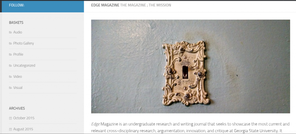
One of the pages I have worked on from the beginning is the missions statement page. It turns out that writing a missions statement is very tricky. Word choice matters VERY much because our audience will be quite diverse, and I need to make sure  our mission statement points only to potentially positive missions. Below is the top part of the missions statement.

Mission-statement-page

You can see the image that I have chosen as a placement image. Ideally, I will feature something that takes place on GSU campus, but I haven’t yet come up with the right idea that will portray ‘mission statement for our magazine.’ Below the image, you can see the beginning of the mission statement. And to the left, you can see that on this page, we experimented with a single sidebar, and chose what goes on it. For now, we are using the term ‘baskets’ instead of categories, because we use that word a lot in meetings, and I thought it would make some of us giggle.

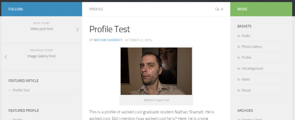
Featuring particular posts profiles on Edge has also been a popular topic in meetings, so Nathan and I decided to create a test profile, which can be navigated to from the front page (if you look above to the second image). Below, you can see that Nathan created his own profile as a test piece.

Profile Test

The page is a static page and can be archived, categorized, and featured on the front page, as needed. As you can see, we have moved the menu options around in the sidebar, which demonstrates all the menu options available in the theme without having to hack it.

Overall, we’re pretty excited to see our first project prototypes go up on the site. We plan to build one of each medium that the theme allows, and try to do a few cross-media pieces to, to show what the website might be like when it officially launches next Fall.

In the meantime, stay tuned for more developments on Edge and feel free to leave comments below with suggestions, problems, or thoughts.