Student Work Collection

The last thing I did for the Student Innovation Fellowship on-site was co-host a couple of faculty workshops with Brennan Collins designed to get faculty interested in creating digital portfolios specifically designed to collect outstanding student work in a central location.

Since then, some of my tech-minded gears have really been turning. What would the university atmosphere be like if all instructors collected student work to be showcased on their personal portfolios?

If you visit the link above to Brennan Collins’s portfolio, you will see a very simple page that is a basic list of the student work. Brennan has collected this work over several semesters, and we are using it as a jumping off point for the first projects we may showcase on Edge Magazine. If you scroll through, you will see videos, PDFs with visuals, Prezis, and other media that students have used to present for Brennan’s course. This leaves open possibilities for Brennan to provide examples of his work above and beyond the usual documentation instructors provide such as assignment sheets or student evaluations (say, if Brennan were looking for another job, for example).

This kind of portfolio, it is important to point out, is different than a digital teaching portfolio. With a simple Google search, I found several examples of basic teaching portfolios on the open web. Below is a screenshot from an elementary school teachers’ home page.

example dig-port

As you can see, Stephanie Ladner has several sections, including her teaching philosophy, and a project she sponsors. But she does not collect student work. Of course, at this level, that would likely be a violation, given that she works with children who cannot give their permission for public display of their work. I am however, using Miss Ladner’s portfolio as an illustration.

Now imagine if all the instructors at GSU had simple portfolios like Brennan’s. Not only could instructors use this kind of portfolio for future career prospects, but they could use student examples to mentor new colleagues, to display what kind of student work comes out of their department, or to contribute to school-wide projects like Edge. And these are just three ideas I am coming up  with on my own. With more heads involved, I’m confident there would be so many wonderful uses for excellent student projects like the ones Brennan’s page features.

In order to promote the idea of digital portfolios showcasing, Brennan and I have hosted two workshops on the idea, and they have gone rather well. The instructors we have worked with are interested, and willing to spread the word. If the idea catches on and other instructors are also willing to collect outstanding student work, GSU could set the standard for this kind of sharing. With student permission, of course.

Digital Portfolio Workshop

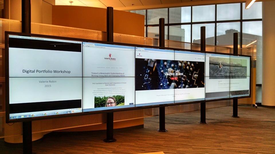
Yesterday, I delivered a 1 hour workshop on building a digital portfolio. 11 people showed up, but three of them were Will, Taylor and Heidi, so I’m not sure 11 is cheating or not. I WAS excited to see them there – don’t get me wrong.

The Interact Wall in CURVE in action

The Interact Wall in CURVE in action

Overall, the workshop was well received, though it felt a lot more like a class than a workshop. I spent the first 30 minutes talking through points which covered online presence, types of hosting, available apps, and potential content. I was really hoping people would have their own attempts at digital portfolios to share — but I think that might be a different kind of workshop all together.

We had a variety of people with different levels of knowledge in the group though – which I was really hoping for. Two people from career services showed up and provided some helpful tips, and a student from the art department had some really great questions about presenting an art-forward portfolio as opposed to the professional job-forward portfolio I have designed for myself.

If I do this again, which I might since many of you expressed interest, but couldn’t make the date/time, I would probably find other examples of portfolios online – both successful and unsuccessful and we would have a discussion about what works and what doesn’t. At this point, I’m unsure whether I focused too much on design, or not enough. I tend to forget that even though most of us spend an astonishing amount of time online, we often don’t soak up how the design works. Design, at this moment in Web 2.0 history, is minimalist with lots of white space, only little splashes of color, and lacking anything too flashy. This kind of design may be becoming naturalized for many users so that not only is the interface of the operating system invisible, but the very design of the site is also invisible. In fact, this is what we’re going for when we design (most of the time), so that means the design aesthetic is successful. But this then becomes problematic for people that don’t work in tech to break into this seemingly opaque world of design.

My overall aim was to make building a digital portfolio seem like a relatively easy, approachable task for people new to the idea. I was quite surprised to find that no one in the audience had a portfolio of their own – not even an attempt at one. So I decided to talk to that point and highlight the ease of the WYSYWG and the fact that my content was quite limited in terms of the way I showcase myself in a general way that could appeal to many kinds of potential employers.

If you have a desire to see this workshop and couldn’t make it – please leave me a comment below and we’ll see if I can’t get another one scheduled.

Building Digital Portfolios

I will be holding a workshop on digital portfolios Monday March 30th, at 1PM in the CURVE.

The workshop is for both students and faculty. If you are a student, you may want to come to see what kinds of options are available for you to create your own digital presence. If you are a faculty member, you can come for the same reason, OR to get tips on how you might teach the digital portfolio. I will be presenting a few versions of my own portfolio, and then we will be discussing ways to present ourselves, and sharing new tools and tips together.

In order to prepare for this workshop, I had to do a lot of research and a LOT of building. I want to be able to showcase a few of the major sites where portfolios can be hosted, both free, and at low cost. I learned an incredible amount about web building and design. I’ve picked up new coding tricks, and learned how to embed a Google Doc, though Google has some of their own bugs to work out concerning that.

Let me show you some examples of how different portfolios can look (this also serves as a sneak peak at my workshop):

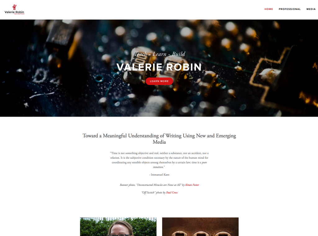
Below is my Squarespace website. I own the domain, vrobinphd.com and I have been working on this for quite some time. This is my permanent portfolio, and the one I give to potential employers and promote on my social media.

Squarespace

Screen Shot 2015-03-11 at 12.17.42 PM

As you can see from this front page, the design is sleek, and professional looking, with a lot of white space, which is what the trend for design is right now. Squarespace is a WYSIWYG (what you see is what you get), but it also has options for coding, so you aren’t always limited to the template parameters. For example, I was able to drop an embedded Google Doc in as my CV, using the code function. This took some experimentation (and Googling), as I assumed the embed function would do it – and this turned out to be not the case. Unfortunately, this cool red button you see in the header, is not something I can code or manipulate to make it show up on other pages. So while I can manipulate much of the template, I can’t control all of it. Also – it is important to note that buying into Squarespace allows me to create my own logo with tagline. You can’t see the little red robot well here, but you will see it on other portfolios below.


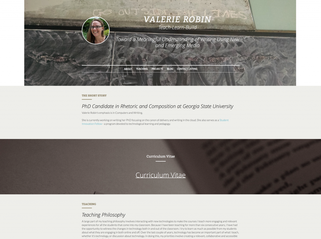
This next one I made on a website called strikingly.com which I learned about from an article in the Chronicle of Higher Education called “How to Curate Your Digital Identity as an Academic.”

Screen Shot 2015-03-11 at 12.18.26 PM

Strikingly is ONLY a WYSIWYG drag and drop application, and it only allows you to have one page. This page however, can be as long as you could ever want it to be. So instead of your visitors clicking to find content on new pages, they just scroll to each section. Strikingly allows you to upload backgrounds to enhance certain sections, and provides lots of neat, attractive buttons to place along the way for people to click on to email you, or visit a project you’re working on outside this site. It’s really simple, so it will be great for people who can’t code, or just want easy maintenance.


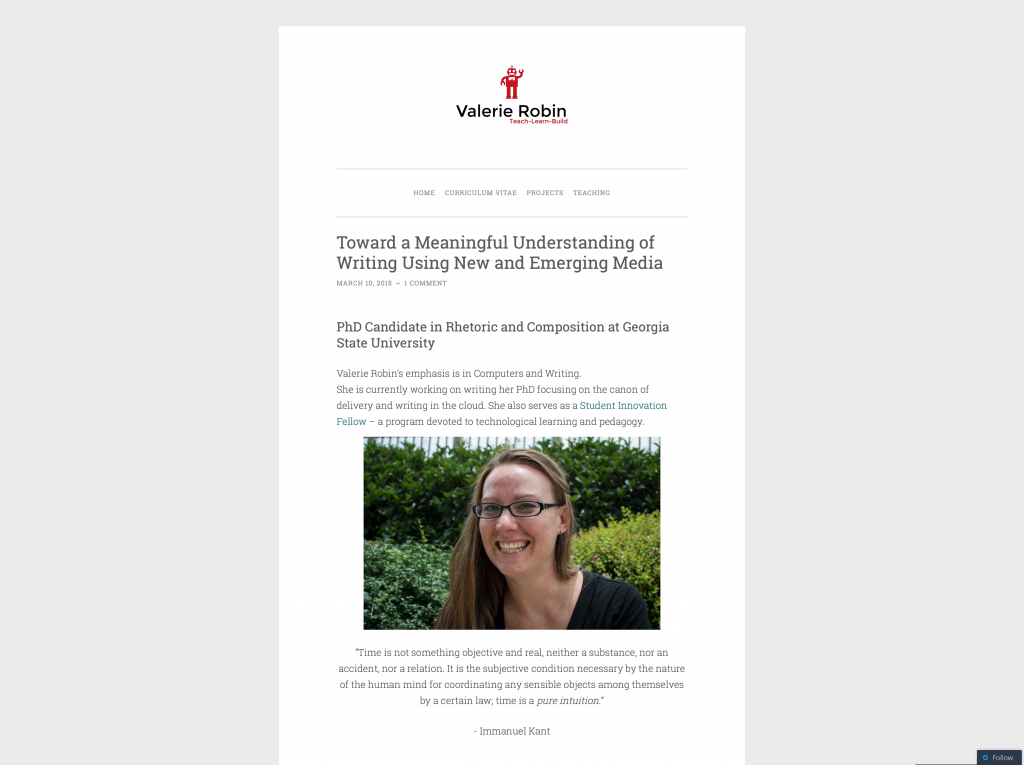
The last one I have to show you here is from wordpress.com which is on a template/theme called ‘pen scratch.’

Screen Shot 2015-03-11 at 12.18.51 PM

I chose a theme that looks clean and has a lot of white space to stay in the theme I have going among these portfolios I’ve made. This one is currently in heaviest build mode, but creating new pages, and showcasing my content has been very easy. WordPress is both a WYSIWYG and has coding capabilities you can use to manipulate both theme and content. I have learned a LOT about themes from working on the Tools Wiki project, including how much each theme can make or break the look of your site. I may find out as I continue to build that ‘pen scratch’ does not, in fact, work for my portfolio, and it could look COMPLETELY different by the time I give the workshop – this is one of the things we’ll cover in the workshop, actually. For now, you can see it largely works well, and there’s my cool Squarespace robot up at the top.


It’s been really fun hanging out at the Exchange researching, and building, and saying, “pssst, does this look stupid?” to other SIFs that hang out in the Exchange with me. I’m really excited I get to give the workshop, but I’m MORE excited about all the invaluable things I’ve learned in the process.

If you find yourself in need of portfolio help, please let me know and I’ll be happy to put my two cents in.