In moving ahead in the process of getting Edge magazine off the ground, Nathan Sharratt and I took some time to develop a prototype using sites.gsu.
After much consideration, and thanks to Nathan’s artist’s eye, we decided to try out the theme called Hueman – a cute portmanteau smashing together color and people. The theme has a lot of affordances with menu bars, sidebars can be moved (for example), and with scrolling posts. It favors media and can be formatted in several ways that may end up working out really well for what Edge becomes.
One of our hopes is to feature student designed banner images containing their interpretations of our project name, ‘Edge.’ Below, you can see a banner that Nathan created in just a few moments. The name of the magazine is prominent, with a cute tagline I invented on the fly. The prominent design can be replaced easily with a student designed banner.
What’s more, we plan to archive all featured student images in an archive so they are searchable by students and future employers that may wish to see what students have produced. Further, we can replace and move around any of the menus you see in the image above. We can alter the colors, and re-arrange the sidebars.
There is only a small portion of the sidebars visible in the image above, but if you look below, you will see lower down on the same page, which features both left and right sidebars (one with a blue header, and one with a green header), and the post scroller.
Nearly every aspect of these sidebars can be altered, including content, color, and position. But what is exciting to me, is the scroller in the middle, which is currently featuring a video. Nathan pulled a video from an art installation he did and put it up on the Edge site, just to see how it would look. The scroller displays a thumbnail, and can be played right in-site. It also features text area below, and can be made to pop-out. We can insert still images, audio, video, and so on. But we did find that if there is no featured image, this area remains ‘blank,’ which you will see if you go to the website in the next week or so: sites.gsu.edu/edge.
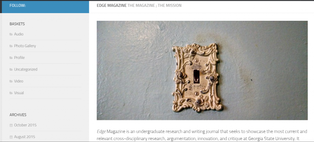
One of the pages I have worked on from the beginning is the missions statement page. It turns out that writing a missions statement is very tricky. Word choice matters VERY much because our audience will be quite diverse, and I need to make sure our mission statement points only to potentially positive missions. Below is the top part of the missions statement.
You can see the image that I have chosen as a placement image. Ideally, I will feature something that takes place on GSU campus, but I haven’t yet come up with the right idea that will portray ‘mission statement for our magazine.’ Below the image, you can see the beginning of the mission statement. And to the left, you can see that on this page, we experimented with a single sidebar, and chose what goes on it. For now, we are using the term ‘baskets’ instead of categories, because we use that word a lot in meetings, and I thought it would make some of us giggle.
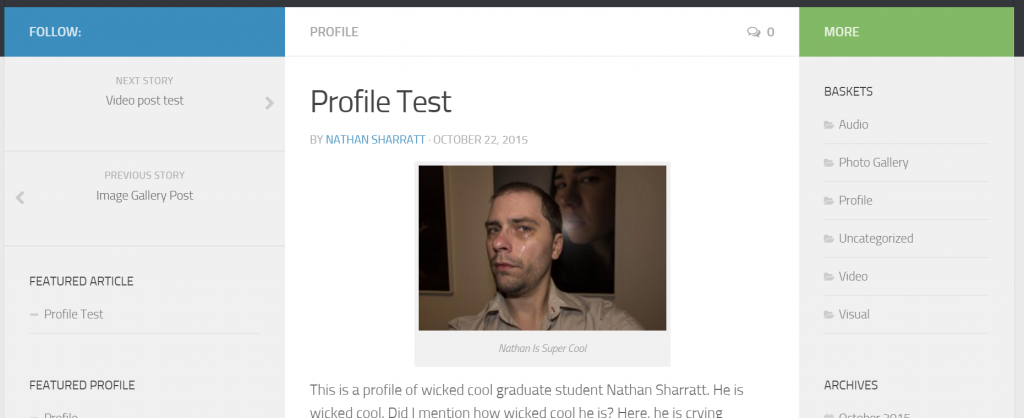
Featuring particular posts profiles on Edge has also been a popular topic in meetings, so Nathan and I decided to create a test profile, which can be navigated to from the front page (if you look above to the second image). Below, you can see that Nathan created his own profile as a test piece.
The page is a static page and can be archived, categorized, and featured on the front page, as needed. As you can see, we have moved the menu options around in the sidebar, which demonstrates all the menu options available in the theme without having to hack it.
Overall, we’re pretty excited to see our first project prototypes go up on the site. We plan to build one of each medium that the theme allows, and try to do a few cross-media pieces to, to show what the website might be like when it officially launches next Fall.
In the meantime, stay tuned for more developments on Edge and feel free to leave comments below with suggestions, problems, or thoughts.


This is so cool. Can’t wait to see it online!
I hope I can make something just as cool as that with the Tools Wiki site -_-
Excuse me while I hit my head repeatedly on a wall.
We’ll get there. One day. We’ll get there.
Creating a user-friendly interface is critical for engaging users, as effective design can significantly enhance information perception and improve the overall user experience. In my experience with Antonovich interior Design, I realized the importance of having professional support. They offer a wide range of services, from concept development to project execution, focusing on every detail. Their personalized approach allows for the creation of unique spaces that meet client requirements, while access to premium materials adds a touch of luxury. Each project impresses with its elegance and style.
Stress and anxiety often accompany students when preparing for exams or large projects. I think it’s especially important at times like these to be able to get support from online experts who can take some of that pressure off. Personally, I found Professional Resource very helpful when I was looking for professional help writing a literature review. Thanks to the online dissertation help literature review, I received a detailed and high-quality review, which greatly facilitated the implementation of my project. This support allows you to focus on other important aspects of your studies and reduce stress.