Over the last two weeks, I have been on campus visits. The campus visit is the last stage of the interview process for those of us staying in academia once we get our terminal degree. One of the steps in the campus visit interview (one of my interviews lasted for 21 hours over 2 days to give you a sense of scope), was to give a scholarly presentation on my own work.
One of my main aims was to use a presentation software that would look clean, and be something that most of the faculty I knew would be present for my presentation had not yet seen a lot. After some research and one trial with a timeline software, I chose VisMe.
Below is a mostly final draft of my presentation. If it works properly, you can push play, or click through it to view it.
The process of using VisMe was interesting, particularly since I didn’t *notice* that it is still in beta when I began. In fact, despite the very clearly noted ‘beta’ attached to the logo, I still missed it, all the way until I was frustrated with the build process.
What I DO like about VisMe is the clean minimalist design that is really in at the moment. Each template has a library of pages the user can choose from in order to built a well rounded presentation. The designs are built already to give the user a sense of how a presentation could look, depending on what the presentation material is covering.
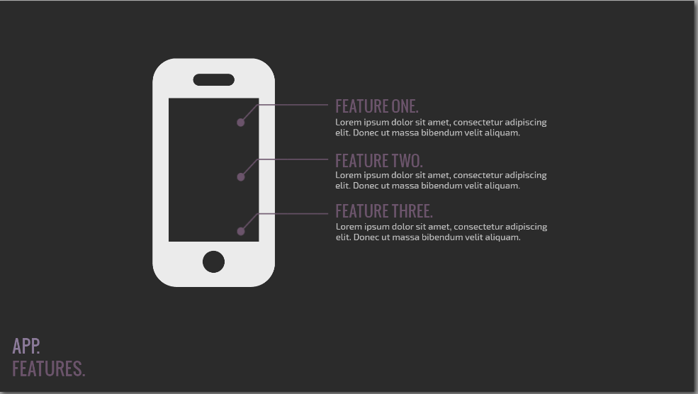
And even though the pages are built for you – here is an example:
You are not required to keep the page this way. As you can see, I altered the template page a lot to fit my needs.
As a user, I am able to completely revamp any aspect of any slide that I choose. But I found the template to be a really great guide as a first time user. The end product turned out beautiful, and I was complimented on how clean it looked.
Because VisMe is in beta, it still has a lot of bugs. Among these bugs are the incredible difficulty involved in clicking on text I have created in a text box. Once I created text, and aligned it with other objects, if I found a typo, or wanted to edit, I had to drag the text box away, and then click vigorously and hope that I might somehow land my cursor in the magical spot that would then select the text I wanted to edit. If my apartment neighbors didn’t think I was crazy already, they surely do now. Frustration.
And then of course there are the mystery issues that come with all software. For example, I published my test presentation to see what options would appear once I published. The library of slides disappeared. I had to completely start my presentation over. Of course it turned out better, as many of you have probably experienced for yourselves. But… this problem has only happened one time. I published the above presentation, and none of the same problems persist. Face to palm – I’m feeling a little gaslighted.
The last problem I want to address is that once an animation is applied to text, it cannot be fully deleted. It CAN be altered, but not completely deleted and this led to more frustration and yelling on my part. Because of this issue, I ended up downloading each slide (a publishing feature) and putting the whole thing inside a power point presentation – animation problem solved.
Probably the most interesting part of VisMe is that it exists in the cloud. Since I only played with the free version, I had no access to the cloud editing and sharing capability, but it exists. Of course, my presentation exists in the cloud, and is clearly hosted above that way, which is a viable and relevant part of cloud computing. But in order to access sharing features, I need to pay the monthly business fee, which is not feasible for a scholar who might use this once or twice a year. But knowing it exists is relevant to many of the arguments I am currently making about the work of composing in the cloud – so I may dip back in here for further exploration.
Until then – give it a try if you are in the mood to learn something new that is improving as the company grows.


