 Photo courtesy of Envision Presentations
Overview
The problem with bad PowerPoint (PPT) presentations is the user’s application of poor design and implementation. If we choose to use PowerPoint as our medium, then I feel like we must be able to do the best with what we are given. Here, I explain why users are the problem and how to fix these problems. I will be making several references to Mike Markel’s Exploiting Verbal-Visual Synergy in Presentation Slides. Also, I will conclude by explaining how to be considerate of our pitch presentations in order to convey our messages and ideas successfully next week.
We Are the Problem

Photo courtesy of SomeEcards
An example of poor implementation and inappropriateness of use is the most common mistake that users/presenters make with PPT presentations: reading from the slides. As Chris Anderson stated in How to Give a Killer Presentation, “Don’t use a slide deck as a substitute for notes […] and don’t repeat out loud words that are on the slide.” If you look at a TED Talk in which the presenter uses a PPT (my favorite is My invention that made peace with lions), then you will notice that some things are better experienced visually with verbal comments and background information. The TED Talk video applies to Markel’s principle “Show what is best shown; say what is best said.”
My Problem
Although I argue that people are the problem, I think that space limitations of the medium are also a problem; however, there is a way around this. I have experienced space limitations in my PPT slides in my module presentation about modalities. For instance, I wanted to show the use of good spatial modes in a professional profile vs. the use of bad spatial modes in a different professional profile by providing examples of each one on the same slide. I wanted to have both pictures side-by-side so that I could verbally compare and contrast how different audiences would react; however, if I would have done that, then my audience (our class) would not have been able to see everything because the examples would have been too small.
My Solution
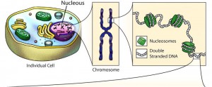
Photo courtesy of Center for BioMolecular Modeling
What I have learned is that whenever I feel like I have space limitations, I should use a diagram because it will allow me to eliminate visual clutter and highlight just what I need. The diagram above of an individual cell and its parts is a good example of drawing tools; it is an example of the tools that I should have applied to my module PPT presentation. As Markel explained, we should use one drawing or photo of our primary subject and use another to provide a close up of it; this way, “[we] would not have to worry about space limitations, poor figure-ground contrast, and visual clutter.”
Pitch Presentations
Obviously, the drawing tools that I have mentioned cannot best convey every PPT presentation’s purpose. So, here are a few things to consider when we are pitching our presentations to our clients this coming week:
- Analyze the audience and purpose of your presentation.
- Only use visuals when absolutely necessary; otherwise, they are distractions.
- Do not simply slap words on the screen; otherwise, a handout may be a better medium (Markel).
- Make fewer, better slides (i.e. less is more) (Markel).
- Use the assertion-evidence structure when convincing your client that your product is the way to go: making a claim in the form of a brief sentence in the title section of the PPT slide and inserting a graphic that validates your claim in the main content area (Markel).
Example of the assertion-evidence structure:
Photo courtesy of Penn State University
