Blog #8: PowerPoint — Bad tool or bad design?

More than a decade ago, John Schwartz asked in a New York Times article, “Is there anything so deadening to the soul as a PowerPoint presentation?” That negative view has been reinforced and extended by Edward Tufte in his monograph, The cognitive style of PowerPoint: pitching out corrupts within, in which he castigates PowerPoint as a medium for presentation. And we’ve probably all seen too many really, really bad PowerPoint slides.

The question, though, is whether the problem is inherent in the medium and technology, as Tufte maintains, or is the problem the result of poor design design and implementation? Continue reading Blog #8: PowerPoint — Bad tool or bad design?

Blog #7: Are you reading me??

blog7As I think about all the direction signs I have seen, it made me wonder who really pays attention to all of them. Do you really pay attention to them while driving? Especially the ones that are overhead on the highways warning you about “texting and driving” or “7-10 minutes on I-75/85”? I know that I do not, and that it takes about a second for me to glance and keep going. The same goes for instruction manuals. Have you thoroughly read one lately? When I look over one, all I see are a bunch of words. It is very difficult for me to follow one for “setting up a computer”.

The most likely person to read instructions step-by-step would be women. Women tend to like step-by-step processes rather than men. From my previous experiences, I usually tend to read something first before setting it up. However, when my fiancé tries to set something up, most likely he did not read. It also reflects different cultures as well. For Americans, about half of us will read signs or instructions. For Asian-Americans or Hispanic-Americans, we see signs misinterpret because of their culture.

Now onto the good stuff! So why are signs or instructions never read?? Here are some pointers:

  • fear of looking foolish
  • fear of being taken advantage of
  • fear of failure
  • and fear of losing image

(source:Hibbard 2014)

It’s just the way humans are. For example, I misjudge instructions given to me at work. I tend to figure it out before reading it carefully or asking a manager about it. It is just the way I am. Heres another example: how to set up your PS4. My PS4 came with two instruction manual. One was a simple version, giving you one worded sentences per number. The second one was a booklet on how to set it up. Which one did you think I picked?? If you guessed simple version, then you are correct! It is a dilemma between reading or figuring out what you are doing. I would rather read first before figuring it out. What about you? Overall, the way that information is distributed out to people is a matter of reading and understanding what he or she is doing. Take the time to read!

Source cited

Hibbard, Catherine. Addressing resistance to change in policy and procedure writing.http://cypressmedia.net/articles/article/28/addressing_resistance_to_change_in_policy_and_procedure_writing

Blog 7: Obsolete

I think it can be fairly safe to say that technical communication as far as instruction manuals and other forms of directions are concerned are largely victims of mass production. On a personal front, I cannot remember the last time I read an instruction manual for anything; in fact the closest thing I can recollect is when I was trying to help assemble a piece of IKEA furniture and even then it was mostly just to double check things. I do not think there is any real way to make technical communication more effective in the sense that more people will pick up an instruction manual and use it for what it is for and the root of that lies, in part, with culture. In the West, many of the things we use that are complicated enough to require some sort of instruction like a car or a computer are so ubiquitous across the board the manuals are mostly redundant.   Every one recognizes a power button symbol, all keyboards have the same letters in the same positions, all Macs or Windows come pre-installed with certain programs that are, for the most part, updates of the previous computer’s and are rarely that wildly different.

download


The goal of technical communication is ultimately to make processes easier and information more permeable and it has been accomplished by replacing the large blocks of texts and accompanying commentary with pictographs that gain acceptance as “universal” symbols. Text can still be very important under certain circumstances but far less has proved to be more.  There is a cultural perception in America especially that emphasizes new things coming on the market should be better, faster and above all EASIER to use than what was previous. Furniture is pre-assembled or very nearly, something like 38% of toddlers and babies under the age of two are able to use Ipads and tablets, proving you do not need to be able to read to figure out technology. As we saw in one of the module presentations info-graphs are gaining increasing importance in conveying information and unlike, for example brochures, they are not given to the exclusive category of advertisment and brevity for the sake of enticement.

Cars are another example and are much the same case. Because every vehicle has certain standard feature placement (such as radio, which side the turn signal is on vs. the windshield wipers etc.) there is not an urgent enough need for the most part to read the owners manual every time one gets a new car, the basic aspects of being able  to drive are what most people care about most of the time. I feel like the perception of men never reading directions is just as it is: a stereo-type; it is in fact common to both genders to ignore guides when they are confident in what they are using or have seen done before because complication makes it less appealing to buy and use.

Sources:

http://www.nydailynews.com/news/national/toddlers-risk-tech-experts-study-shows-soars-article-1.1747694

Post #7: The Importance of First Impressions

First Impressions

The adversity to being on the receiving end of new technical communication may lie in the quality of the technical communication produced. It takes viewers only 1/20th of a second to judge whether or not a website is worthy of their viewership (site). The first impressions formed when end users initially see the product helps determine whether they will even bother to read it. Even if the document is a set of instructions, they will consider it a waste of their time if they are against the rhetorical situation the creator had in mind and if the design choices are poor.


Rhetorical Situation

A poor first impression will be formed by the reader if he does not approve of the purpose of the content or is not an intended audience member.  A poor purpose could be “to inform the user on how to properly sweep a floor”; someone who buys a broom will probably not read any instructions that come with it because they feel that the instructions are unnecessary. A user might think he already has enough background information to begin using a product or can easily figure it out, and may not consider himself an intended audience for the instructions.


Design Choices

The visual mode is probably the most important mode to consider when discussing the end user’s potential first impression of verbal instructions because they will view the way the document is put together before they begin reading it. It is important to not overuse emphasis and contrast, and to optimally use organization, alignment, and proximity. Using emphasis, by highlighting or bolding words, by listing and bulleting items, etc., is helpful to catch the reader’s eye, but overdoing it will distract and confuse them. This goes for using contrast, which emphasizes through juxtaposing size and color, as well. Organization, alignment, and proximity affect how comfortable the reader feels looking at the document. If there is no obviously planned out arrangement of the paragraphs, sentences and pictures, the reader will feel uncomfortable having to create their own path to follow.


Take for example this still from a website.

dumbwebsite

My first impression of the webpage is very poor and I feel I could probably infect my laptop with a virus if I clicked on anything. The design choices of the webpage easily carry over to what should not be done for visual and design aspects of instructional material.


  1. Emphasis: The emphasis is mostly placed on titles, such as “Atwater Politics” and “Weblog”, however, the reader is unable to make a connection to its importance and why it received this level of significance.
  2. Contrast: The color contrast of blue text against a white screen strains the eyes.
  3. Organization: There is very little organization.  Instead of being able to follow a conventional path, such as heading -> paragraph, the viewer must create their own path, meaninglessly going from unrelated box to unrelated box.
  4. Alignment: The rectangular boxes, such as the ones labeled “Democratic News” and “Intelligence” are neatly aligned with each other; however, each box contains wildly different content and styles.
  5. Proximity: There is simply too much on the page. There are too many pictures too close together, the text is small and scrunched, and each rectangular box of information is cramped between two others.

set of instructions


Here is an example of well down technical communication.

  1. Dual coding is used to make sure the end user can easily understand what is happening in each step.
  2. The visual content is grouped together, not spread out all over the document, and all of the pictures that relate to a single step are aligned neatly under the text for that step. This organizational style shows the relationship between the text and the pictures, allowing the consumer to make more connection quicker about what needs to be done and how.
  3. The individual steps are emphasized by a larger font for the numbers and through the use of green font. These two markers clearly indicate where each steps begins.
  4. The contrast between the sizes of the steps numbers, the text of the instructions, and the helper text labeling objects clearly shows what each objective, in what order they should be accomplished, and what information is needed to accomplish the text.


These ease of use of this document can be readily ascertained by the end used and will encourage him to consider reading the instructions. With simple, easy to use, instructions that provide the right amount of information, technical communicators can encourage to properly use their products.


Arola, Kristin; Sheppard, Jennifer; and Ball, Cheryl. Writer/Designer: A Guide to Making Multimodal Projects. (2014). Bedford/St. Martin. 6, 20- 37.

Johnson-Eilola, Johndan and Selber, Stuarta. Solving Problems in Technical Communication. Chicago: The University of Chicago Press. 388-391.

Audience Resistance: Death, Injury, and The Grand Canyon

The danger posed by hiking trails and other similar outdoor activities is often overlooked; and each year, countless hikers, mountaineers, and other adventurers are lost to the perils of the wilderness. These individuals are often highly experienced in whatever activity they pursue, and have a specialized disciplinary knowledge of the outdoors, and the necessary skills to complete any undertaking.  The majority of these deaths and injuries are the result of carelessly overlooking posted warning signs.

Take, for example, the Bright Angel Trail.  This extremely strenuous and challenging trail begins at the North Rim of the Grand Canyon and descends 4,380 feet (nearly 4/5’s of a mile) over the course of 9.5 miles to the Bright Angel Campground, at the bottom of the canyon.  There are countless signs at the trailhead proclaiming the dangers of the trail, especially to the inexperienced hiker, that have been there since the park’s opening in 1908.  But despite this, nearly 700 people have lost their lives while hiking The Grand Canyon.

warning

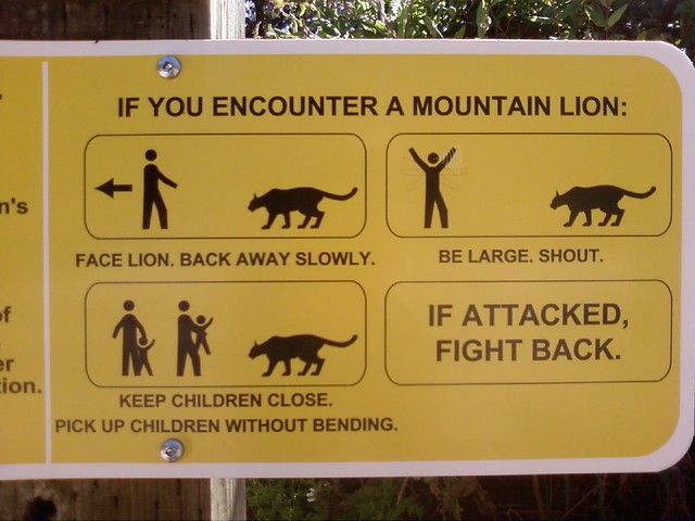
As pictured, the signs clearly outline the precautions and necessary measures that must be taken to guarantee a safe trip down and back up—staying rested, well-nourished and hydrated, avoiding activity during the sunniest times of the day, and rationing supplies, time and energy.  The signs even advise that a round-trip hike on the trail cannot be completed in a single day.  But signs at the trailhead are not the only warning:  Every ranger, employee, or veteran of the trail will give the same advice of caution and discretion to any potential Bright Angel dreamer.

These deaths, and the thousands of injuries that are suffered each year, may appear to be in a completely different realm of existence than technical communication, but they share a vast amount of common ground.  Communication design can help explain the social and cultural factors that lead to audience resistance in similar circumstances.

In order to hike the Bright Angel Trail—and many of the other trails in the canyon—hikers must obtain a special permit.  As I learned from my own experiences hiking these trails, this permit is not so much a way for hiking hopefuls to prove or demonstrate their skills or wilderness proficiency, but more a system for keeping track of who enters the canyon and who exits—you must check in at a designated ranger station with your permit before embarking, and again upon completion.  If a hiker does not return for check out after a predetermined amount of time, authorities are alerted and a search begins.

But this knowledge is not necessarily communicated to a hiker before they embark, so the permit often lends itself to a tangible type of proof of their ability and dexterity, rather than its true purpose: a catalog of intentions and information.  Therefore, when a hiker obtains a permit, they tend to assume that they have received some sort of approval for their journey, and feel no obligation to pay any attention to warnings.  In the name of sticking to the status quo, and fulfilling their cultural distinctions as a permitted-hiker, they resist processing—let alone taking—any cautionary advice.  This poor communication design helps to account for the scores of overly ambitious hikers that never return to the top of the canyon.

A round-trip hike that spans nearly 20 miles, with a near 2-mile elevation change is not for the faint of heart.  Most of the individuals who decide to tackle the Bright Angel Trail condition for months beforehand, and come with adequate expectations and preparations.  But, more importantly, they heed any warnings they encounter.  The nearly 700 lives lost cannot be merely chalked up to a failure to read the signs, but it does make one wonder—would the number be just as high with a more effective communication design?


Cole, Cyndy. “Canyon deaths: 685 and counting.” Arizona Daily Sun 6 May 2012: Web. 9 Oct. 2014.


“Grand Canyon/Bright Angel Trail.” National Park Service,n.d. Web. 9 Oct. 2014.


Haff, Gordon. “Warning sign. Bright Angel Trail, Grand Canyon.” Flickr. 2 Dec. 2012. Web. 9 Oct. 2014.

Blog #7: Audience Resistance

Men never stop to ask for directions. Engineers never read the instruction manual. All manuals are boring. How do such social stereotypes get started? Do such stereotypes have any truth to them?

What do you see as reasons people (or at least some people) are resistant to instructions? What kinds of things can effective writers and designers do to counter such resistance? Use the Hibbard article as well as Solving Problems in Technical Communication and Writer/Designer as a jumping off point for your discussion. You can, of course, use additional resources, but use the material in our textbooks about users and audiences and the Hibbard article as a minimum.

Posting: Group 1

Commenting: Group 2

Category: Audience Resistance

For this blog post, consider how social and cultural factors influence rhetorical context in ways that even the best technical communication expert may not be able to control for. Think, too, about what you’ve learned so far about what makes for “good” technical communication and “bad” technical communication, and how these criteria might vary with context. Use the questions below (or similar ones you create) as starting places when you craft your post:

  • What sort of person always reads the instructions first?
  • How do social expectations about masculinity and femininity influence how men and women respond to instruction sets?
  • Are people with specialized disciplinary knowledge (doctors, engineers, lawyers, scientists) more or less likely to read instructions? Why?
  • In what ways can communication design compensate for social and cultural factors that lead to audience resistance?

In thinking about how “good” and “bad” technical communication responds to or accounts for (or fails to respond to or account for) potential audience resistance, you might locate two examples to incorporate into your discussion (not just dropped in at the end, but incorporated and discussed). Locate an example of really bad instructions; take an excerpt for your post to analyze what’s wrong and ways the problems could be corrected. Also locate an example of good instructions; likewise, take an excerpt for your post to analyze what’s particularly effective.

In your Blog #7 post, you need to take a focused position about how understanding audience resistance can assist you in your technical communication process, rather than taking a scattered approach (which would happen if you simply wrote a few sentences in response to each question). Please carefully read and follow the guidelines and posting information for this blog. You can quote from additional articles you read as support for your position. You should include specific workplace examples to further support your argument. Make sure to document your sources.

Reference
Hibbard, Catherine. Addressing resistance to change in policy and procedure writing. http://cypressmedia.net/articles/article/28/addressing_resistance_to_change_in_policy_and_procedure_writing

Featured Image: “Direction Board” by halfrain on Flickr

Do you understand me?

plain-english

Picture gotten from  http://blog-de-traduccion.trustedtranslations.com

Spot the Difference

If you don’t believe the difference plain language can make, take a look at this example from a Public Health Service brochure. The Department of Health and Human Services revised a six-page article on Losing Weight Safely to create a single brochure with a message that’s much easier to follow.

Wordy

The Dietary Guidelines for Americans recommends a half-hour or more of moderate physical activity on most days, preferably every day. The activity can include brisk walking, calisthenics, home care, gardening, moderate sports exercise, and dancing.

Clear

Do at least 30 minutes of exercise, like brisk walking, most days of the week.

By tweaking the statement above, the writer has successfully been able to identify the point he is trying to make by putting the most important point at the beginning, using common easily understood words, and short sentences which will most likely hold the audiences’ attention longer.

If I had a dollar for every time someone asked me to repeat myself after asking a question like “would that be all for you?”, I would have a jar filled with money. I can assure you that while I don’t particularly use any “big” words when having a conversation with someone, there is always a possibility for them to have difficulties understanding me. This is why writing or speaking in plain language has been something I continuously do because it works for me and the other person also, it saves me from having to repeat myself three times  or more. Writing in particular makes it easy to get a message across more quickly and increases the chance the information will be understood without using unnecessary words.

Plain writing helps audiences from different scopes of life to be able to grasp the meaning behind the words of a communicator. It would be much harder for someone who has no background knowledge of science or mathematics to understand what Newton’s Law of Gravity states but I bet when you say the words “what goes up must come down” he immediately grasps the concept behind the law as something he has heard before. I believe the plain style of writing does have benefits for technical writing students.  Because it can help us to apply the principles of plain language in our work, and helps us to understand better than anyone how plain language can improve communication throughout society.

 FDA U.S Food and Drug Administration. 18 Apr. 2013. Web. 4 Oct. 2014. <http://www.fda.gov/AboutFDA/PlainLanguage/ucm331958.htm>.

Blog #6 Plain Language is a Necessity

The use of plain language in public discourse that is published by the government is vital for a society to function as a democracy. As the Center for Plain Language mentions, plain language is a civil right. In order for citizens to effectively participate in government, they must be able to comprehend the information presented. The Plain Writing Act of 2010 is vital, because its purpose is “to improve the effectiveness and accountability of Federal agencies to the public by promoting clear Government communication that the public can understand and use.” It is useless for the government to publish information that the public cannot comprehend; it is a waste of time and resources.

The Plain Writing Act of 2010 is important, because the government publications that are used by American citizens ought to be clear enough for the average citizen to understand. According to the National Center for Education Statistics, the average reading level for American adults is between the 8th and 9th grade level. For Americans older than 65, nearly 2 out of 5 read below a grade 5 level, and about 20 percent of Americans are “functionally illiterate” meaning that they cannot read most newspapers. The statistics are proof that the use of plain language is absolutely necessary when the audience is the average American.

However, I don’t support the use of plain language in all technical communication. For example, if the audience is mainly educated professionals and others who understand complex syntax, then plain language is not necessary. In other words, determining whether or not to implement plain language to technical communication depends on who the audience is.

Personally, I have found the use of plain language in tax documents very helpful with filing my taxes. Instead of paying a tax expert to fill out the forms, I was able to use the publications provided by the IRS to understand the forms. I have also been able to use the publications to file taxes for my family and friends. The publications implement plain language by organizing the information in a coherent way that is easy to follow, and the text is clear and concise. Thanks to this, I have saved hundreds of dollars for myself and others by filing the taxes myself.

A critique of using plain language may be that information is lost when it is condensed and translated into simple terminology. However, if used effectively, plain language does not result in a loss of information. It can save time and money by reducing misunderstandings and it can help people locate information more easily. Most importantly, it helps the information reach more people.

I have provided an example below to demonstrate the use of plain language in IRS Form CP 2000.

BEFORE

AFTER

Sources:

The Literacy Problem

Plain Language Association International

The Plain Writing Act of 2010

Plainlanguage.gov


Blog Post #6: Plain Language

Throughout my college English career, the one main issue that has plagued many of my reports and papers is my tendency to be redundant and use unnecessary words, usually to sound smarter or fill up empty spaces on a Microsoft Word document.  While my underlying intentions may sometimes work, my ultimate goal is to become the best writer I can be and this can only be accomplished by mastering clear, cohesive, and direct methods of writing.

As a technical writer, it is absolutely imperative that the writer learn and master a means of translating difficult, job-specific vernacular to be understood by people of all levels of literacy and education.  In fact, Public Law 111-274 states that “this Act is to improve the effectiveness and accountability of Federal agencies to the public by promoting clear Government communication that the public can understand and use.”  With such a wide range of levels in literacy and education in our country, many people would be lost or confused.  A simple step-by-step guide to setting up your sound system could potentially be seen as another language should the discourse be difficult or highly technical.  Even something that may seem simple and easily understandable to one could be quite the opposite for another.

While in school at Valdosta State University, I took a creative writing class for a semester.  I enjoyed that class because our teacher was very smart and creative and she allowed us to indulge in any topics as long as they followed the assignment.  Many times I found myself writing about soccer because it is something I am very familiar with and have many experiences that I could discuss.  I remember writing a paper about my experience playing soccer overseas and how I was able to get involved in such an adventure.  I wrote about the selection process and how competitive it was to even be selected for a roster spot.  I felt confident about the paper and was hoping to receive high marks for my attention to detail and creative imagery.

However, upon receiving my paper back, I noticed red marks signaling areas for revision dotted all over my work.   The main issue after reading each comment was my failure to explain exactly what was meant by each stage that I went through to finally achieve a spot to play overseas.  The intricate soccer lingo had failed to capture the attention of my professor, who was confused on several points and could not grasp the significance of my paper because of it.  Although only a minute issue and clearly not government related, this opened my eyes to the importance of plain language and the ability to make technical jargon more understandable for the common person.  Without a more clear approach, people could become lost and lose focus on the ultimate goal the specific paper or report is trying to give.

Source Cited

http://www.gpo.gov/fdsys/pkg/PLAW-111publ274/pdf/PLAW-111publ274.pdf

Don’t Let Plain Language Get the Best of You

This article does not attempt to expose biases, unfairness, or deceptions associated with language in political campaigns, polls, or ballots. Unfairness is both legal and customary in campaign and ballot language. This article does examine an interesting use of plain language.

The Fall 2012 Elections in Georgia put many voters in conflict with their own opinions. In the Metro Atlanta counties, we were trying to wrap our heads around the Traffic Referendum, but there was also a charter school amendment up for vote. Previously, the Georgia Supreme Court decided that the state commission responsible for the approval of new charter schools was unconstitutional because the commission overrode local school boards and governments. Voters were to decide whether or not the state should be allowed to approve new charter charter schools. The language of the ballot and the polls that preceded the ballot was so plain in this case that the ballot question failed to communicate the implication of a “yes” or “no” vote.

The ballot question:

“Shall the constitution of Georgia be amended to allow state or local approval of public charter schools upon the request of local communities?”

YES! Of course! But what does that mean?

To vote yes meant that voters, whether or not they knew it, would disagree with the Georgia Supreme Court ruling and permit the state commission in question to continue approving new charter schools despite local disapproval. To vote “no,” voters would agree with the court decision and give their local school boards more voice in the approval process of new charter schools. Voting “no” did not, however, mean an end to charter schools. The language of the ballot question made it seem that way, so that anyone who would call themselves proponents of education or progressive education laws would likely vote “yes.” In this scenario, the plainness of the language served more as a “primer” for a vote rather than an effort to clarify the meaning of a legislative proposal to the general public.

To quote Wayne Washington of The Atlanta Journal Constitution, “Opponents say the wording falsely implies that local boards and the state can’t already approve charter applications. Roberts said supporters wanted to make sure voters knew the commission would not diminish local boards’ authority.”

If we reword the ballot question, the language can create an entirely different effect on the reader:

“Shall the constitution of Georgia be amended so as to decrease funding for local public schools and allocate more for new charter schools?”

This phrasing is just as plain and it concerns the same legislation, but it suggests for voters to vote “no” and disagree with the legislation. This phrasing and the original are quite biased and pointed, but they share the same dangerous quality—plainness.

After seeing how the plain language in this ballot question worked, we can conclude that it served not to clarify, but to obscure something from the readers/users of the ballot. Whether you voted “yes” or “no” for this amendment, you should be able to recognize how this use of plain language deviated from our understanding of plain language as something that should help people of different literacy levels understand government policy.

Even though the federal law concerning plain language requires that “[our regulatory system] must ensure that regulations are accessible, consistent, written in plain language, and easy to understand,” we are still subject to deviations in language where this law holds no sway, such as ballot questions in state elections.

http://www.plainlanguage.gov/plLaw/index.cfm

http://www.ajc.com/news/news/charter-schools-vote-a-primer/nSdMB/

http://www.wsbtv.com/news/news/local/poll-47-ga-voters-support-charter-school-amendment/nSpf3/

Dr. Robin Wharton | 25 Park Place #2434 | Office Hours: M/W 9:30 to 10:30, T/Th 2:30 to 3:30