click this image
On April 17th, I began observing Atlanta’s official website. I began studying the site at 10 pm and ended my observation at 11 pm. When observing this site the first thing that caught my eye was the background of the homepage. The homepage offers a night view of downtown Atlanta. The title of the homepage reads “City of Atlanta”. The first two words are in white while the word “Atlanta” is in silver. This seems to bring some type of attraction to the homepage.
The color of the texts are blue and they are easy to read on a white background of the different pages. Included on the homepage is the different tabs that informs people of business, tourists, or people who may move to Atlanta, about the city. Some of the tabs read ” Government” , “Visitors”, and “Doing Business”. Below the tabs are slideshows of community news with a small area with a message from the mayor. There is also a slide a slide of links that lead to information about the “Atlanta PD (police department” , “City council”, etc. At the bottom of the home page there is a calendar for press releases and meetings/upcoming events.
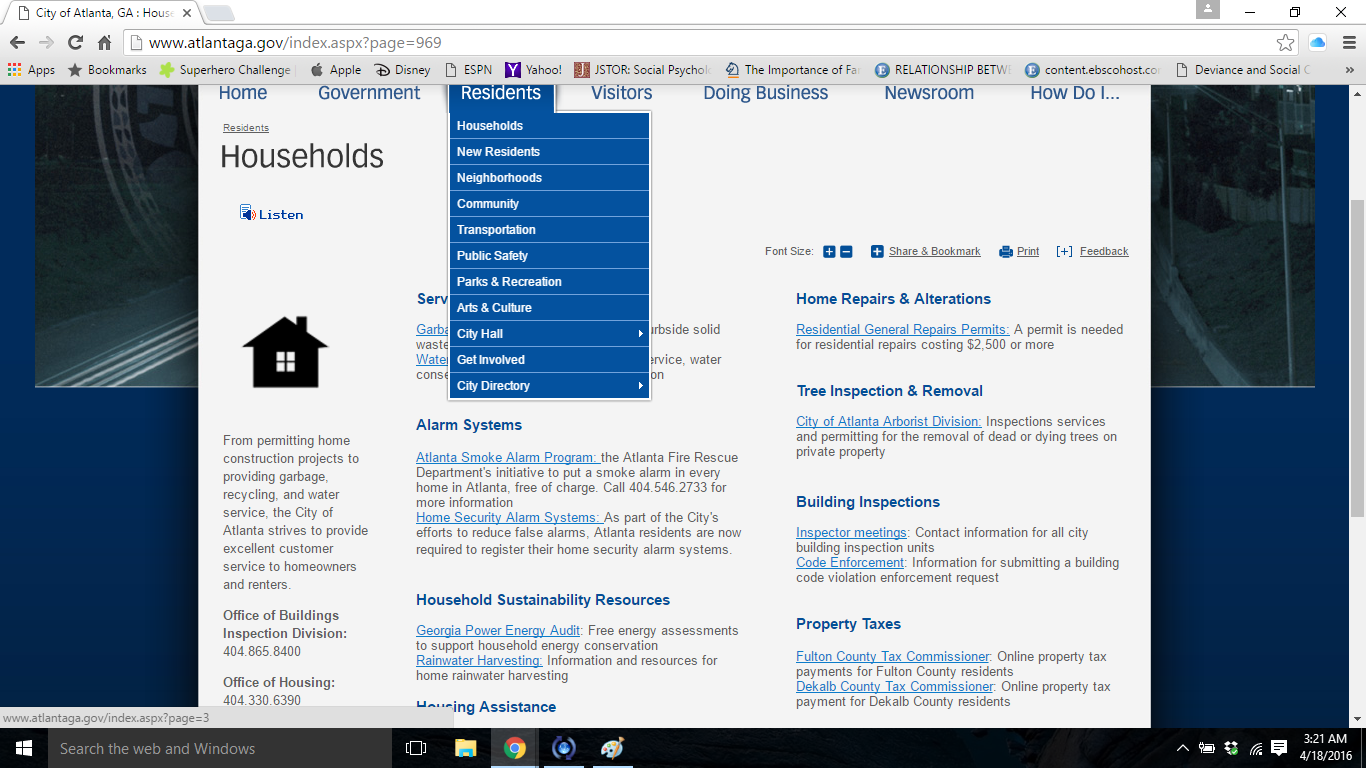
After observing the homepage, I began to navigate through the tab. The navigation for this site was easy. The tabs include sections and in these sections are links to information about the tab. For example, under the “Residents” tab regarding the household section there are links that give the researcher more information about the particular section. This website constantly displays this method rather than the page on the website being just about that tab or section like a traditional website.
The website does not include very many photos. Majority of the images are drawn out. It seems that if there were more realistic pictures especially of people interacting; the website would seem more attractive. An example of the sketched images in under the “Visitors” tab under the “Transportation” section. Once you click on either of the links attached to the images, there’s another page which includes the images and a small caption.
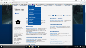
This photo shows how there aren’t descriptions for the tabs and how the pages aren’t just about the tabs seen on the home page. These pages lead to other links.
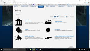
This photo includes a screenshot of the tab “Visitors” that offers different things to do and different ways to get around. The purpose of the screenshot is to show how the images may not be so attractive to the someone who may just be visiting. The pictures show no human or animal interactions.
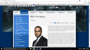
This is a screen shot of the page consisting of “Government” related links. This photo also includes information on the mayor in Atlanta. The different sections under the “Government” tab, include sub sections. An example is shown in the photo under “Mayor’s office”

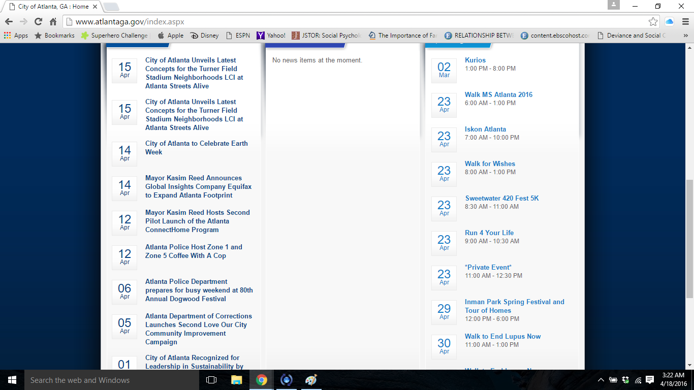
Here’s another screenshot of the homepage. Here is a clear list of upcoming events/ meetings and press releases. The color and font of the text seems very easy to read.
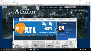
This is a screenshot of the homepage. This is also the overall look for the official website of Atlanta
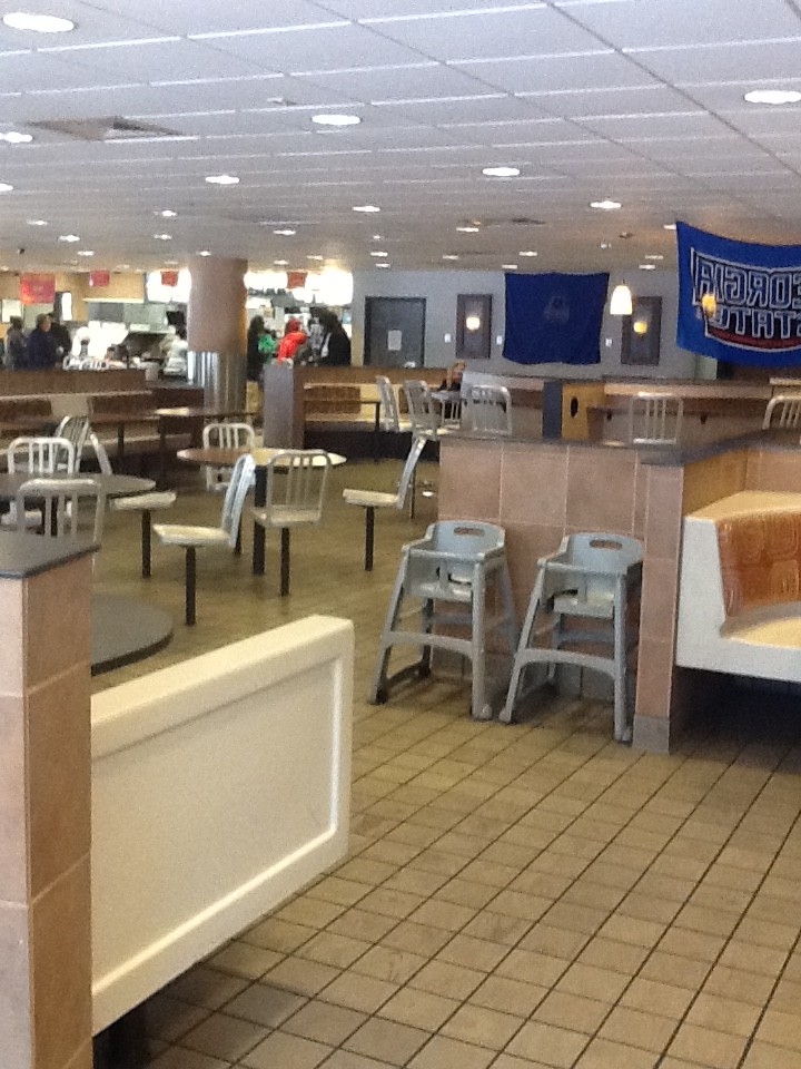
This is a photo of the lounge. I took this photo to show the color scheme of the McDonald’s. The design does not seem very attractive.

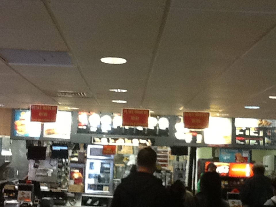
This where the customers stand to order their food and then wait. The signs to the right of the photo read “Place order here” and the sign to the right says “Please wait here.” (I apologize for the photo not being being very clear and the signs being hard to read) I took a snapshot of this because I found the design very interesting. It gives the environment some sort of organization. I have yet to see this in any McDonald’s I’ve went into. Also, notice in this photo how the ceiling inside the building doesn’t sit very high.

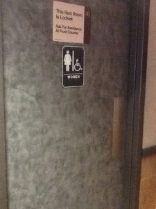
 There restrooms in this McDonald’s is not unisex, but they are both handicap accessible. While in the environment it seemed as if the sign attached to the entrance of the restroom was untrue. I saw people enter and exit as they pleased. After speaking with a worker, she informed me that this only applies at 10 until closing. According to the worker, this is to keep out people who may be homeless and want to loiter.

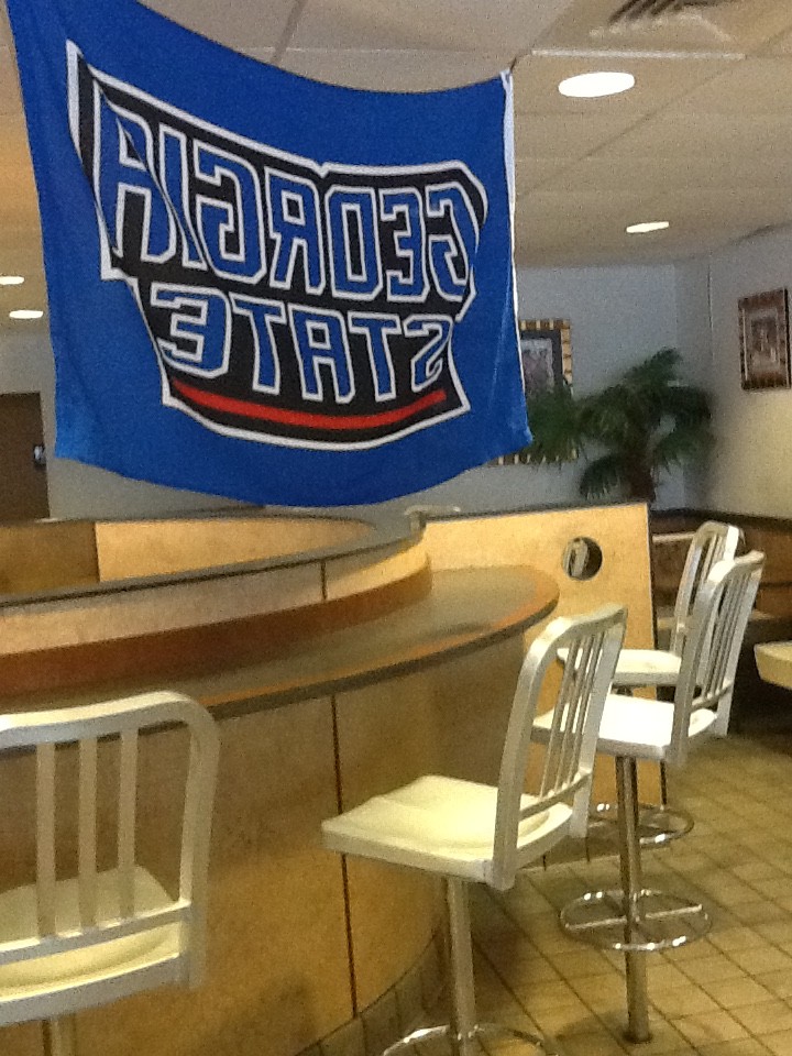
This is a photo of one of the many Georgia State posters located in the Grady hospital McDonald’s. I took this photo, because it seemed to me that this McDonald’s may not be connected with just Grady, but Georgia State University also. This McDonald’s also offers at 10% discount to all Georgia State students and staff.