Continuing to work on 3D Atlanta, I have been continuing to organize all of our research about Atlanta for the convenience of both the research and the modeling side. We decided that we needed to create an intermediary between the two groups so the modeling side can take pictures and information from the research side to put into the 3D models they create. As of now, we are solely building the foundation of a temporary intermediary until we find a better program for our means. As mentioned in my last post, we started by organizing the research (pictures and facts) in an Excel spreadsheet by separating the research into layers by decade and color coding each as seen below.
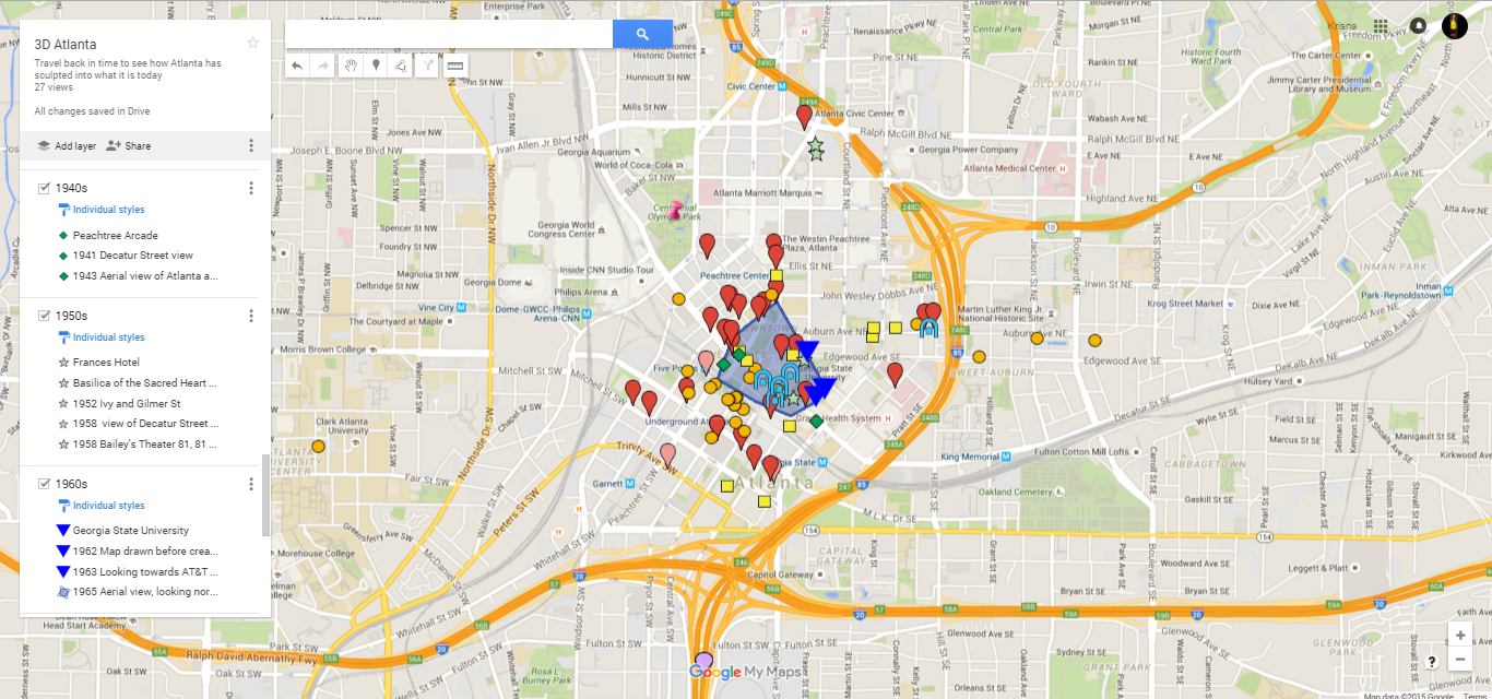
The spreadsheet is split into 7 sections as shown above, with the last section connecting the research to the MyMaps created. If the box for that section is in green, then it is added to the MyMaps. If it is in yellow, there is missing information for that point, and if it is in blue, then the location point is an approximate. Below shows the pinpoints of the research on a MyMaps in Google Maps that are color coded to match the layers created from the spreadsheet.
Each layer in the map represents a decade, and each point is color coded to represent places from that decade as the following:
 = 1800s & early 1900s
 = 1920s
 = 1930s
-
 = 1940s
  = 1950s
 = 1960s
 = 1970s
 = 1980s
-
 = 1990s
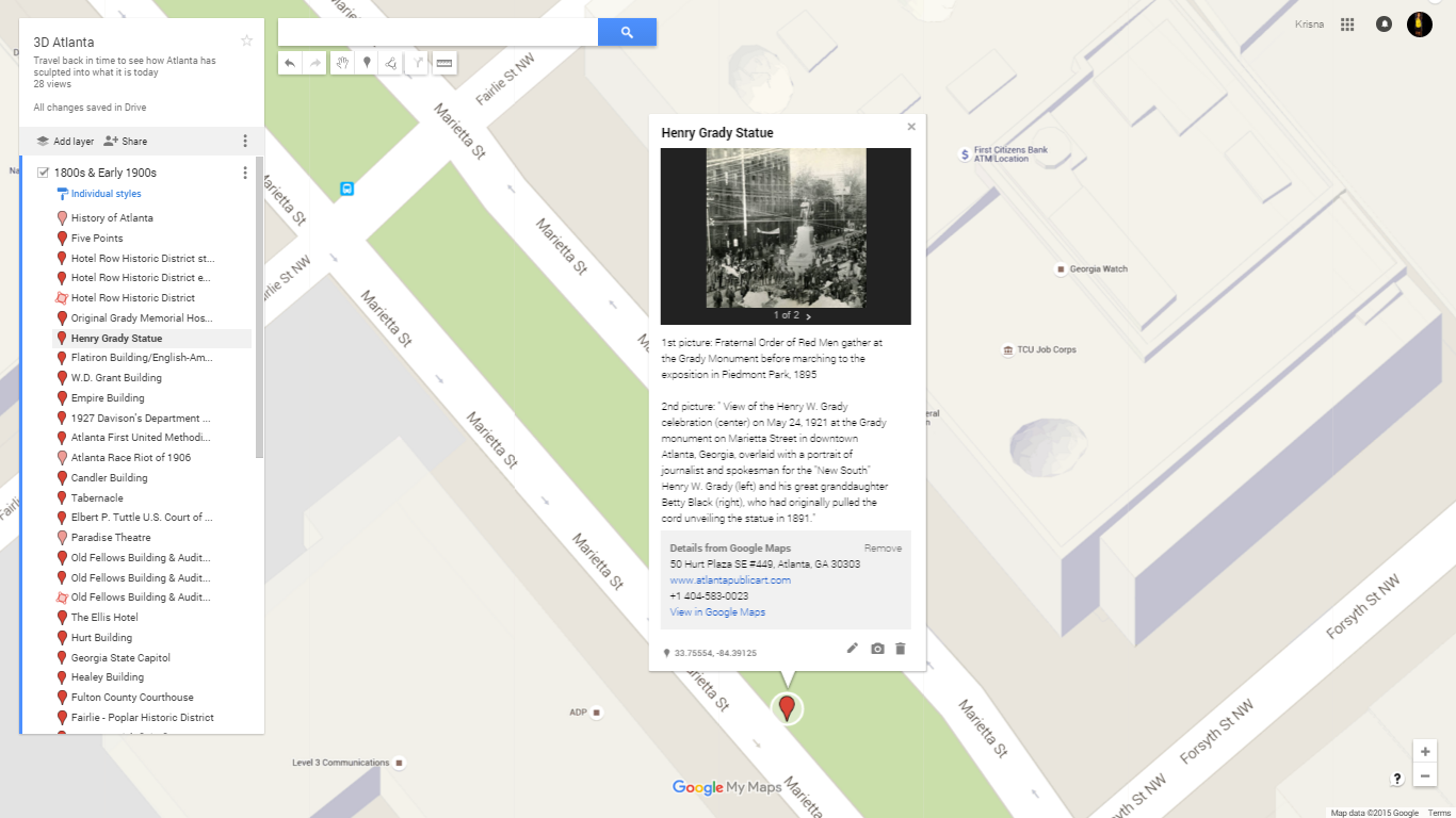
Each pinpoint contains the information and the exact/approximate location from the research of places done in Atlanta done by the research side. Here is a picture to show the information found on a pinpoint from the late 1800s.
We are using both the Excel spreadsheet and the Google MyMaps as an intermediary where the modeling side can take the findings of the research side to place into their 3D models. The research side tells their stories about Atlanta, which the modeling side brings to life with their models of each location.
This is just a snippet of what the research side has been working on. Stay tuned for updates.
Til next time,
Krisna


