During the Spring 2016 semester, I started a physics education project with Dr. Thoms of the Physics Department at GSU. I wrote a blog about it that can be found here. In that blog, I outlined the project and what Dr. Thoms and I are setting out to do.
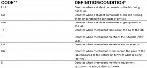
We have recently completed the rubric that will be used to categorize the student responses of the 2211k physics lab. It includes 21 different codes that cover about 90% of the comments the student made. That 10% includes stray comments that did not really fit into any of the codes’ guidelines.
For example, a student could say something along the lines of “The lab was better than my chemistry lab.” or “The lab was difficult at first, but it got easier as the semester went by.”. We denoted these comments with a positive or negative “O”. Although they might be helpful, there were not enough comments like these that justified creating a whole new code. Keeping the number of codes to a minimum while still encompassing the vast majority of the comments is the goal because that creates a tight, efficient rubric.
Here is a sample of the rubric.
Every code was carefully defined so that it could include as many comments while still making sense to an outsider using the rubric for the first time. Here is an example of the process of making the rubric. The code “QD” denotes when the quality or difficulty of the questions/directions in the lab, quizzes, and/or tutorials were addressed. This code was initially broken up into four different codes. Two of those codes were for comments on the difficulty of the labs and tutorials/pre-lab and another two for the quality of the directions of the labs and tutorials/prelabs. These four codes became too divisive. Being so specific in the code was useful at first because it allowed me to understand what I was working with, but this rubric is supposed to be as universal as possible. Meaning, I should be able to use it for the analysis of the 2212k labs also. Therefore, I shrunk those four codes to “QD” so that trends in improvements or regressions can be seen more easily.
The next step after creating the rubric is to use the code to see how the students’ thoughts on the lab changed after the re-write. To do this, we will make a line graph that is based on the percentages of how often each code was used. If in the Spring of 2014 (the old labs), 10% of students stated that the labs were confusingly written, but only 6% of the students stated the same thing in the Spring of 2015 (new labs), then that would be a positive take away from the analysis. Comments such as these would be denoted with the code “QD- “.
The analysis will be done from many different angles so that all possible improvements and regressions are noted. Because all the codes are separated by a positive (+) or negative (-) annotation, there will be a separate graph for each of them. Given that there are 21 codes, the graphs might even need to be done in batches of 5-7 codes in order to avoid confusion.
After the graphs are done, the true analysis can be completed, and we might be able to see how much the re-writes helped the lab. I say “might” because there is always a chance that no significant data is found. This is, of course, always a possibility with research. If I am fortunate, there will be clear results that allow Dr. Thoms and I to move on with the project and present the findings at conferences and perhaps even write a paper on it. As soon as there is something new worth presenting to the readers of the SIF blog, I will update the project here.


