Since the beginning of SIF, I’ve been on the Tobacco Ebook project. I have learned iBooks Author layout and design techniques, which has completely reoriented my thinking about how design works, and increased my attention to detail by… a lot.
This week, I got moved from layout and table building within iBooks Author to recreating charts in a program called Tableau. Tableau can create really clean-looking, beautiful line graphs, bar graphs, and many other types of graphs and charts, like pie charts :). But it’s not easy. First, the data in the spreadsheets the book writers provided us with must be formatted in a way that Tableau ‘likes,’ which is a feat all on its own. If the data isn’t formatted properly, nothing works. Then, the chart has so many formatting options, its enough to make any beginner’s head spin.
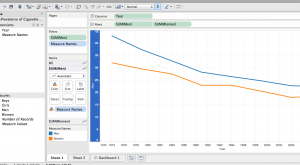
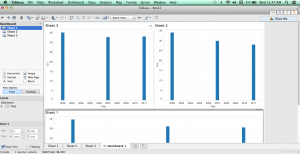
Here are two screen shots of graphs I’ve been working with that I can’t seem to get to combine – one line graph and one bar graph:
The good news is that once I figure out how to make the graphs function the way I like, they are actually pretty easy to make and turn out well. Thankfully, Will knows how to do most of it and is helping me figure out the trickier aspects. Phew!
Valerie


