Status: Doctor

Yesterday I became a doctor.

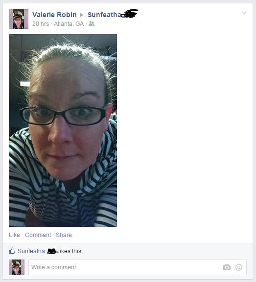
I went and celebrated with a few friends who are also highly educated, and I admit, it felt a bit like this:

And so this is my final official blog as a Student Innovation Fellow, but I do plan to continue keeping a blog chronicling my journey through a tech world as a Humanities student at https://valerievisual.wordpress.com/ – which admittedly needs a revamp, and a cleanup before I start to use it again. That is not, however, the focus of this entry.

The point of this entry is to detail the status of my life as a doctor at this point in my journey.

Yesterday, my committee signed my paperwork.

My dissertation is titled: The Value of Scholarly Writing: A Temporal-Material Rhetorical Analysis of Google Documents

It analyzes how interactive writing software (IWS) like Google Documents serve to forefront functions of interactivity between writers, and by doing so, reshape and create Western values surrounding the academic writing process that are uniquely post-industrial. The whole thing aligns rather well with the work we do as Student Innovation Fellows, and a lot of my work as a SIF informed some of my theory and analysis.

My work as a Computers and Composition scholar has been validated over and over again in my SIF work. I have worked with cloud computing for nearly two years, theorizing how it alters users perception of time and space, and right when I am feeling like I might be saying nothing new, a SIF colleague who I respect very highly made the following statement, “Whenever I’m working on a Google Doc, I always want to save, and you don’t have to in the cloud. I don’t know if I’m ever going to get used to that.” I realized that if this colleague is still not used to the save features of cloud software, then I must be saying something fresh.

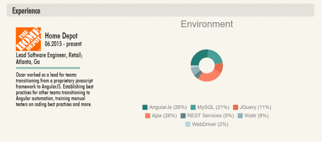
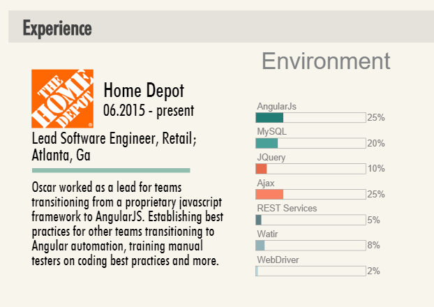
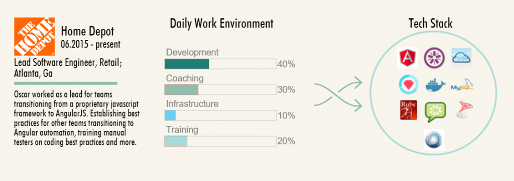
And again, when I learned how much fun it is to make simple data into visualizations, as I did for Marni Davis, and when I turned Oscar Rieken’s resume into an infographic, a whole new world of seeing opened up to me. I look at information much differently now, thanks to my projects. This factored in to the way I analyzed the features of Google Documents within my dissertation pages.

Working as a SIF also gave me the opportunity to leave the usual spaces of Humanities PhD life and peek inside the Information Technology world. The links between coding and composition have astounded me. As I began to teach  myself HTML and CSS, I began to understand the grammar and syntax behind coding reflect that of natural languages. Not only that, but I am beginning to see the barriers online that fall down as I learn to code, similar to the barriers that fall as we enter discourses. For example, without knowing anything about the language of law, anyone would be completely lost in a court, even if everyone is speaking English.

A problem does remain that the market is stretched thin, and finding a job is difficult for any PhD student. I find comfort in knowing that even the best and brightest students often don’t land jobs their first year on the academic market (a market that is so complicated and unlike any business market, it is difficult to explain it to anyone not involved in the process). What I do have is the experience I have gained during the Student Innovation Fellowship. Unfortunately, I lack the know-how to market these skills in a way that makes sense.

As I explore my options, I am learning about jobs that I had never heard of, skills I didn’t know existed, and a whole new world of technology that is related to my current research. No matter what I end up doing next, I am certain that it will be as interesting as the work I have done as a Student Innovation Fellow – and if I’m lucky – it’ll be even more so.

Infographic Resume

I have been on the job market since September.

The academic job market takes just short of forever, and is a HUGE commitment. As a result, I have become curious about other job markets and how they work. I essentially know exactly nothing about how to get a job outside academia, despite training for a PhD for the last 5 years. Correction. I knew nothing about the market ‘out there.’

In this blog, I take an industry professional’s resume, and turn it into a cute, easy to read infographic using picktochart, a mostly free online drag and drop application that creates a platform on which you can build an infographic.

What is an infographic?

Customer Magnetism explains it really well, with pictures. Pictures are essential to infographics, as ‘graphic’ is the central part to displaying the ‘info’.

So when Oscar Rieken, Lead Software Engineer and All-Around Awesome Person, asked if I could make his resume into and infographic, I said, “Of course I can. Just tell me what you want featured, and what colors you want.” And we were off. I even got his permission to write about it here!

After we established the rough parameters for what he wanted his resume to display, I set to work making different visualizations that we could choose from.

Programming Languages Beta

The above shows the way we decided to display Oscar’s skills, after one or two trials with other charts. Each bar displays languages he knows and the level, (1-5) at which he places himself in experience, with 5 being “nothing left to learn.”

We decided this way, on a basic blue/green color scheme that we used consistently all the way through the infographic.

All of Oscar’s Skills, AND Tools are displayed this way.

Next, and perhaps the most difficult, was deciding how best to display his work experience. Here are some trials we played with:

Experience-visual-sample-1

Here, we can see Oscar’s current place of employment, and the skills/tools he uses most at this position. But the circular chart is very difficult to read, and the key is bulky and strange.

Experience-visual-sample-2

Next I tried displaying them on a similar chart that would visually match his skills and tools above. It looked better, but still didn’t necessarily warrant a display in an infographic.

Home-depot-visualization-2

I asked him to split his skills and tools up into the way he spends his typical day. Oscar created a spreadsheet for me with data that indicated that, in his current job, he spends 40% of his day in development, 30% in coaching, and so on. Using powerpoint, I arranged his skills and tools by logo, and put them into a ‘tech stack’ inside a container, which here, is a circle. In earlier jobs, I used the shapes of the states and countries he worked in, which worked to meet Oscar’s visual tastes.

Thoughtworks-Brazil-Tech-Stack


Here, you can see the skills and tools Oscar used when he worked in Brazil. Creating the graphic was incredibly easy, and I just used some simple formatting in PowerPoint to create a .jpg that I could then upload to piktochart and insert into the infographic.

It took a lot of work, and a fair amount of consulting to get this the way Oscar wanted. But eventually we completed it, and he was quite happy with it, especially after I added the little robots as accents. Oscar is really into robots.

Below, is the infographic in its entirety (with full permission).

VisMe Experiment

Over the last two weeks, I have been on campus visits. The campus visit is the last stage of the interview process for those of us staying in academia once we get our terminal degree. One of the steps in the campus visit interview (one of my interviews lasted for 21 hours over 2 days to give you a sense of scope), was to give a scholarly presentation on my own work.

One of my main aims was to use a presentation software that would look clean, and be something that most of the faculty I knew would be present for my presentation had not yet seen a lot. After some research and one trial with a timeline software, I chose VisMe.

Below is a mostly final draft of my presentation. If it works properly, you can push play, or click through it to view it.

The process of using VisMe was interesting, particularly since I didn’t *notice* that it is still in beta when I began. In fact, despite the very clearly noted ‘beta’ attached to the logo, I still missed it, all the way until I was frustrated with the build process.

VisMe-beta-marked

What I DO like about VisMe is the clean minimalist design that is really in at the moment. Each template has a library of pages the user can choose from in order to built a well rounded presentation. The designs are built already to give the user a sense of how a presentation could look, depending on what the presentation material is covering.

And even though the pages are built for you – here is an example:

VisMe-sample-page

You are not required to keep the page this way. As you can see, I altered the template page a lot to fit my needs.

Visme-sample-page-2

As a user, I am able to completely revamp any aspect of any slide that I choose. But I found the template to be a really great guide as a first time user. The end product turned out beautiful, and I was complimented on how clean it looked.

Because VisMe is in beta, it still has a lot of bugs. Among these bugs are the incredible difficulty involved in clicking on text I have created in a text box. Once I created text, and aligned it with other objects, if I found a typo, or wanted to edit, I had to drag the text box away, and then click vigorously and hope that I might somehow land my cursor in the magical spot that would then select the text I wanted to edit. If my apartment neighbors didn’t think I was crazy already, they surely do now. Frustration.

And then of course there are the mystery issues that come with all software. For example, I published my test presentation to see what options would appear once I published. The library of slides disappeared. I had to completely start my presentation over. Of course it turned out better, as many of you have probably experienced for yourselves. But… this problem has only happened one time. I published the above presentation, and none of the same problems persist. Face to palm – I’m feeling a little gaslighted.

The last problem I want to address is that once an animation is applied to text, it cannot be fully deleted. It CAN be altered, but not completely deleted and this led to more frustration and yelling on my part. Because of this issue, I ended up downloading each slide (a publishing feature) and putting the whole thing inside a power point presentation – animation problem solved.

Probably the most interesting part of VisMe is that it exists in the cloud. Since I only played with the free version, I had no access to the cloud editing and sharing capability, but it exists. Of course, my presentation exists in the cloud, and is clearly hosted above that way, which is a viable and relevant part of cloud computing. But in order to access sharing features, I need to pay the monthly business fee, which is not feasible for a scholar who might use this once or twice a year. But knowing it exists is relevant to many of the arguments I am currently making about the work of composing in the cloud – so I may dip back in here for further exploration.

Until then – give it a try if you are in the mood to learn something new that is improving as the company grows.


Student Work Collection

The last thing I did for the Student Innovation Fellowship on-site was co-host a couple of faculty workshops with Brennan Collins designed to get faculty interested in creating digital portfolios specifically designed to collect outstanding student work in a central location.

Since then, some of my tech-minded gears have really been turning. What would the university atmosphere be like if all instructors collected student work to be showcased on their personal portfolios?

If you visit the link above to Brennan Collins’s portfolio, you will see a very simple page that is a basic list of the student work. Brennan has collected this work over several semesters, and we are using it as a jumping off point for the first projects we may showcase on Edge Magazine. If you scroll through, you will see videos, PDFs with visuals, Prezis, and other media that students have used to present for Brennan’s course. This leaves open possibilities for Brennan to provide examples of his work above and beyond the usual documentation instructors provide such as assignment sheets or student evaluations (say, if Brennan were looking for another job, for example).

This kind of portfolio, it is important to point out, is different than a digital teaching portfolio. With a simple Google search, I found several examples of basic teaching portfolios on the open web. Below is a screenshot from an elementary school teachers’ home page.

example dig-port

As you can see, Stephanie Ladner has several sections, including her teaching philosophy, and a project she sponsors. But she does not collect student work. Of course, at this level, that would likely be a violation, given that she works with children who cannot give their permission for public display of their work. I am however, using Miss Ladner’s portfolio as an illustration.

Now imagine if all the instructors at GSU had simple portfolios like Brennan’s. Not only could instructors use this kind of portfolio for future career prospects, but they could use student examples to mentor new colleagues, to display what kind of student work comes out of their department, or to contribute to school-wide projects like Edge. And these are just three ideas I am coming up  with on my own. With more heads involved, I’m confident there would be so many wonderful uses for excellent student projects like the ones Brennan’s page features.

In order to promote the idea of digital portfolios showcasing, Brennan and I have hosted two workshops on the idea, and they have gone rather well. The instructors we have worked with are interested, and willing to spread the word. If the idea catches on and other instructors are also willing to collect outstanding student work, GSU could set the standard for this kind of sharing. With student permission, of course.

Edge Magazine in Development

Maybe you’ve heard the buzz, and maybe you haven’t:

Edge Magazine is coming to Georgia State University next Fall.

What is Edge Magazine?

Edge is an undergraduate project and research magazine/journal hybrid. It will be a fully online publication that encourages interesting multimedia presentations of excellent undergraduate work done in and out of class.

Why Edge?

You may have heard that GSU already has an undergraduate research journal called Discovery.

Discovery Journal Banner

Discovery features only Honors student work and is a much more traditional approach to research that Edge intends to be. We hope to be a more interactive take on the undergraduate research journal.


Edge is not DiscoveryEdge is its own entity – it’s own experiment. Edge is Edge.

What’s up with the name? 

We chose the name Edge for several reasons:

  • In an attempt to make sure we are, in fact, a little ‘edgy’ in terms of what a journal could be, Edge seemed like the logical choice for a name.
  • We want to be on the cutting edge of what a research journal can be.
  • Sometimes, when we come to the edge of something, a cliff, an idea, a sidewalk, it seems that nothing further can be done. We want to be that ‘further’. We want to do what research journals have not yet done. We want to go there. Over that edge.
Taken from http://fiqixirsi.com/most-beautiful-landscape-photos-of-norway/

Taken from http://fiqixirsi.com/most-beautiful-landscape-photos-of-norway/

Who is our audience? 

Edge will be outward facing, so that anyone with an internet connection may experience it. It will not be kept behind a paywall. It will not be limited to GSU students’ eyes only. If you contribute to Edge, your parents, your friends, your uncle Jack in Sarasota will have access to your work.

This means our audience will be anyone who is interested in experiencing the amazing work that is coming out of Georgia State University today. These are people who are interested in knowing what is happening at GSU. They are people who are interested in experiment, innovation, and ideas.

What is the vision?

There is no link to Edge as I write this entry today. This is because we are still in vision mode. I have drawn up plans for the amount of labor we will eventually need, and plans for the editorial process.

We are in the stage where we get to build the ideal. And that ideal is currently to create a multimedia journal/magazine hybrid that is accessible and fun for the audience to read, while maintaining a cutting-edge format where authors may attempt to showcase their research and project work in ways that research journals haven’t ever before.

You might see multi-layered work with lots of hyperlinks and videos. Or you might see text with audio spliced in and an image or two. Or you may see something unexpected that I can’t envision enough to explain yet.

What’s next?

We are excited about the possibilities of this project and are attempting to set the groundwork for an exciting launch during the next school year. In the meantime, we need to construct an infrastructure capable of maintaining a website that is actually on the edge of content that comes from a research university and showcases the work that undergraduates are capable of.

At the moment, we’re cobbling together ideas from a bunch of brains that are as capable as they are brilliant, in order to launch the skeleton of a website which will be both malleable and  fluid in its ability to be molded to fit the content we receive.

We are preparing with images, banners, video capability, lots of other great art, and some really wonderful content that will hopefully be interesting and surprising.

Birch_Ave_Mural

Here is one of the images I captured for the image archive to enhance content with provoking images.


As we come up with a logo, a basic site, and more solid visions, I will be updating you here, hopefully with more images. Stay tuned.

Defining Innovation with Fun and Creepiness

This week I’ve been working at outlining a paper exploring the definition of innovation, and how I am applying that to the DALN booth at the upcoming CCCC’s conference in Tampa Florida. What that means, is that I’ve spent even more time than usual researching this illusive word – chasing it down like the Hobbit to my Ring-Wraith.

I’ve read that Everett Rogers defines innovation as ““an idea, practice, or object that is perceived as new by an individual or another unit of adoption” (2003), which gets at the idea that ‘innovation’ has very much to do with audience perception.

Erin Frost, in a journal called Computers and Composition writes about student innovation as “the key to the development and vitality of technology” as users. Yet Frost never actually defines ‘innovation’ for her audience.

This is not unusual.

This same week, A friend on Facebook shared out an article that was so entertaining, I cried a little laughing at it:

The Creepiest Things You Can Do on Faceboook

The author leads us through a photo narrative about how she ‘messes’ with some friends for her own amusement.

Some might call this ‘hacking’ Facebook = using an application for something other than its intended use.

To me, this is innovation.

Interestingly though, Ashley Feinberg, the author of the article above, does not define her work as innovative, but it is. It MUST be. I say this because she is finding a new way to get people to laugh. She is finding a new way to entertain herself and others in a way that is unexpected, and minimalistic. I’m not sure exactly what it is about innovation that, to me, intrinsically points to minimalism, but it does – today, it does.

Fascinated by this ‘innovation,’ as I see it, I tried it on a couple of my own friends – to see what would happen.

The first experiment might be my favorite:

Nicole_InnovationAnd to my pleasant surprise, a few more people chimed in to my (hilarious) post:

Nicole_Innovation_2This pleased me so much, I decided to try the more invasive angle Feinberg gives us, by posting my own image on a friend’s feed, with no comment. I chose a friend who is a little strange in his own rite. He snapchats me ‘work selfies’ regularly, so I knew he wouldn’t be very freaked out by my random selfies on his page.

I was right. I began with something simple, and he was not phased:

Sunfeather_1 So I went in a little closer. Still unphased:

Sunfeather_2

But then he responded a way I didn’t expect, though perhaps I should have. My friend, Sunfeather chose to hit me back with a similar idea, one I chose to engage (I got his permission to use these images, by the way):

Sunfeather_3

In the end, I’m still processing what this kind of play means for innovation. It certainly means something, though. It means connection. It means minimalism. It means that something interesting and unexpected is happening.

THIS process of innovation-play seems to be a mix of audience and user interactivity with the technology, but it doesn’t actually change the use of tech in any way, that I can tell. Or perhaps we are on a social precipice with this sort of Facebook ‘hack’ – or perhaps we are doing nothing at all…


Christmas Gift Vines

This week, we collect again for the first of another semester that is certain to fly by so quickly we’ll all be surprised by the end of it. It’s been nice seeing familiar faces, having meetings to catch up on old projects, and to look forward to new – exciting – work to come.

This week, I am deciding not to write about any SIF project, because we have only been back for two days, and there is little to examine. However, largely due to my experience with the SIF program last year, I was inspired to show my thanks for Christmas gifts in what could easily be classified as an ‘innovative’ way.

Meet – my Christmas Gift Vines:

I made my first vine in November for Hybrid Pedagogy’s most recent installment of DigiWrimo, as part of a ‘getting to know me’ challenge. Making a vine is actually quite easy – the bulk of the work is done using your phone. After I made my first vine, I knew I needed to experiment to see what else I could do. So after I started using the Christmas gifts I was fortunate enough to get this year, I decided to start piecing together vines to show what I was doing with my gifts. 

The mustard is an inside joke from my friend, and the cookbook is from my mother. I have since sent both parties my vines through text, and Facebook, which means they are also ‘publicly’ shared with my Facebook friends. They’ve had pretty good reception, but so far I seem to be the only person absolutely tickled by my own idea. I may need to take this one back to the lab for re-evaluation. 

Paddock – Adventures at Fry’s Electronics

Over break, I made a trip to Fry’s Electronics. It started out as an innocent trip to help my mother find rewriteable discs for her job. It turned into something else entirely.

After being mildly verbally attacked by a salesman after I told him I strongly dislike Windows 8, I told him I didn’t, in fact, need any help with the monitor I was getting my fingerprints on, and walked away, nearly crashing into a stack of boxes containing something called “SMK Paddock 10 V2.” The picture on the box was of a desktop stand for an iPad.

“Eureka!” I actually said out loud, and took a box out of the strategically stacked pyramid of rhomboidal boxes. Just like in a bad sitcom, the entire forward half of the stack came sliding apart, distributing oddly shaped boxes left and right in front of me. Avoiding the disapproving look of the salesman who loves Windows 8, I went to find a different salesman to show him what I did. And to as if he could open one of the boxes for me. The young man obliged, and didn’t even chastise me for my mishap.

This is what was inside:

Paddock_Front

Paddock_BackAs you can see, a person could put their iPad in there, and there are adapters and plug-ins involved for various activities one might want to do with an iPad. For example, if I were collecting video interviews for a project like Digital Archive of Literacy Narratives, I could put my iPad into this device, and it works just like a tripod, except on a desktop. Additionally, the head swivels, and the whole iPad rests on a speaker, which also acts like a charger, or so the specs say on Amazon.

I’m not sure exactly how this contributes to my working definition of ‘innovation,’ but if I go with the idea that we are trying to collect narratives in a new way, then this qualifies.

And I accept.


End of Semester

If you read my last blog entry, you know that we were planning a party/meeting to finish off the very first semester of our wonderful SIF program. It went off really well – there was so much food, we could have fed the people across the hall too!

Look at this amazing spread!!

Look at this amazing spread!!

As people trickled in, we waited to have the ‘meeting’ portion, and everyone ate in rounds. Whoever made that bean dip — you’re my hero.

Eventually, I asked Roxanne to put an interactive video made using Captivate 7 which featured our own Will Kerr building a box fort. Having sufficiently embarrassed Will, we opened the floor for people to ask any questions about the upcoming semester, and to show off projects they have been working on.

Our audience is not only captivated by presentations, they are also a very good looking bunch of smart people.

Our audience is not only captivated by presentations, they are also a very good looking bunch of smart people.

Robert Bryant blew us all away with his project wherein he has been creating digital models of 3D objects using Agisoft. He set up his computer and showed us how to interact with digital objects by waving your hand in front of a little device that reminded me a lot of the way the Wii system works.

Behold the Digital Ball

Behold the Digital Ball

We also got to watch several videos made by Thomas, Babacar, Ameer, Ryan and others that showcased the work they’ve been doing to promote Hybrid Pedagogy courses here at GSU. And we got to see another interactive video Roxanne and Ameer made for the science department which shows a hilarious young man named Kory making mistakes while using the Vacufuge Plus machine.

In all, the meeting was fun and informative. Even though I’ve been working to collect everyone’s accomplishments and achievements, I haven’t gotten to see all these projects yet in action.

Success.

Party in a Pinch

I sold my soul to Google a while ago.

I think it’s for this reason that the tasks I perform using Google products almost never feel terrifically ‘innovative,’ but as I wade through a dissertation wherein I analyze Google, I’m beginning to think that the way I use Google IS innovative – even to me.

As the end of the first ever semester of the first ever cohort of Student Innovation Fellows (SIFs) comes to a close, I wasn’t about to let it go down without a party. And also holidays. So I mean really – party.

Lucky for me – Justin was willing to let me plan the party – as long as I understood that the budget is exactly $0. Done. Easy.

I executed all my party planning via Google = I created an invitation (okay, so I used Publisher which I eventually converted into a PDF after Justin said, “I had no idea Publisher was still a thing”), which I linked to a Google spreadsheet and a Google form.

Here is a link to my invitation:

Partay!!

As you can see – we’re going the potluck route – and let’s be real: these SIFs are not only smart and savvy – they can cook. Hallelujah.

We have an editable Google Spreadsheet so people can contribute to said potluck – and I am quite excited about this upcoming gathering. I’m a grad student. Food is pretty much all I care about.

AND – because I wasn’t sure where people would be at with the idea of a cute little gift exchange, I used a Google Form to ask whether or not people would like to have a gift exchange.

I have loads of response forms and data to indicate that this will go off without a hitch. And all it took was a few clicks, and some key strokes. That’s… innovation.

Absolutely no paper was exchanged or harmed in the planning of this party. The budget remained at exactly $0 – and we’re still having a party.

Thank you Google. Treat my soul well, please.