Immigration to Atlanta: Historical Data Visualization

This week before Spring Break, I was fortunate enough to get put on a new project coming out of the History Department. Working with Dr. Marni Davis, a team of SIFs and I are helping Marni to organize, visualize, and present her data on immigrants to Atlanta. We are beginning with data in the late 1800’s, and working up to the present. Currently, we have a lot of data up to about 1930, which is what I have been working with.

To begin, Marni supplied us with a spreadsheet of data with about 1600 entries on immigrants. These entries have data points such as name, birthdate, port entry city, date of immigration into Atlanta, date of naturalization, country of origin, address in Atlanta when applying for citizenship, and so on. Because I have experience with Tableau (a program which can produce beautiful data visualizations), Marni asked me to take some of this data and create charts that we could put up on her new GSU sites website dedicated to the Immigrants ATL project.

To begin, I decided to try and create a bit of a story that showed very simple data. For example, in the first figure, I show the m/f immigration difference, where you can see that men immigrated to Atlanta 100x more than women in this period.

Immigrant-Gender-1

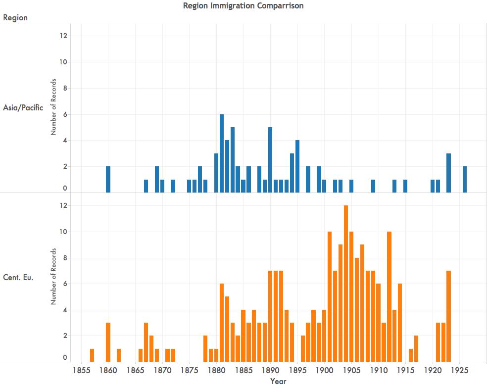
In the next figure, you can see a comparison between when Asian/Pacific peoples were immigrating into Atlanta, versus when Central Europeans were. Additionally, you can see that there were far more Central Europeans immigrating to Atlanta than there were Asians.

Region Immigration Comparison

The visualizations are really wonderful in that they make the data much easier to mentally process and compare, and they will be easy to present in any venue. Further, we can arrange any data visualization into a kind of story that we want the data to tell.

Currently we are working to create more graphs like you see above, but also to incorporate some maps that show data such as average age of immigrants into Atlanta from various regions, countries, and cities.

While these visualizations are gorgeous, and not difficult to make, there are some issues that arise to complicate matters. For example, there is not a year of entry for absolutely every immigrant to Atlanta. In order to create the graphs, I have to omit whole people who may only be missing one piece of data. Further, I learned the hard way, that Tableau does not read the formulas that we make in Excel. I had a lot of loading issues and eventually found that Tableau is set up to do my computing. After several hours of trying to load, visiting the Tableau sub-reddit, and doing a lot of Googling, that I could subtract the Immigration year from the Naturalization year right in the graph.

Next, we are going to build out more visualizations, meet with the rest of the team to see what they are working on, and hopefully create a really robust and face-smackingly wonderful set of data that Marni can present in any venue easily as she works to collect and manage all this data.

Magazine Issues

I have been writing a bit about Edge Magazine here on my blog, as it is my major SIF project this year. Despite the fact that I have been an editor at Hybrid Pedagogy for over 3 years, starting a new editing process is quite the puzzle.

There is a lot to think about as we get the journal off the ground. Most of what our team is wading through involves one big question: What?

What is our edge?

The biggest question for any publication is this. What is our edge? Who are our audience(s)? Who are we speaking to and why? After several meetings discussing what Edge is for, what it accomplishes, and what it focuses on, we have decided that Edge will be a culture and arts focused multimedia magazine that uses Atlanta as its unifying theme. It will be different than Discovery in that its articles will be shorter, more causal, mostly multimedia driven, with new articles released often. It will be different than The Signal in that it is not a Newspaper that reports, but rather a magazine that has featured undergraduate work.

What is the argument we are making with these articles overall which will set the stage and aesthetic for the magazine?

As Edge begins to develop and take on shape, the hope here is that our argument will become clear to our readers. Of course, our first argument is “Undergraduate work at GSU matters.” And our second argument is “Undergraduate work here at GSU is really cool, innovative, and edgy.” These arguments will be obvious as the first articles go live next Fall. Ultimately though, the answer to this question is a wait-and-see process depending largely on the submissions we get, and the voice the collective students create as we show the world what we can do here at Georgia State.

What is going to make people want to return to read about more work that students are doing at GSU?

This question is also a wait-and-see question as we develop the aesthetic of the magazine. At the moment, if you click the link at the top of this entry, you will see that the magazine is a skeleton with some test posts and a repeat of the same class project that we have been playing with. But as we begin to work on our first submissions (we already have one lined up!), the look and feel of the magazine will begin to take on a polished shape. We do know that the magazine will feature videos, audio recordings, galleries of stills, links out to student work that exists live on the web, and combinations of all these things. It will have the ability to take student work that is exciting and interesting already, and make it more visually appealing for outside readers.

This means, that the student work featured here did not stop at the professor’s desk, but will be published for the world to see, which adds a whole new layer of meaning to student projects on, and off, campus. For a faculty audience, getting to see what students are working on in their courses should be a good reason to keep coming back. And for students, looking at some of the great projects other students have worked on should also be enticing. For readers outside day-to-day life in the University, reading Edge should be a great way to see what students are up to at GSU, and to know that their tax dollars, donations, and moral support are making some waves here in Atlanta.

Much of the above may seem somewhat ambitious, but without lofty ambitions, we don’t move up. Much of the shaping of Edge will be a waiting game, and much of it will shape itself through the process of building. It’s an exciting time to be a student at Georgia State University, and the hope is that Edge will be a beacon that readers can follow in order to discover what wonderful ideas, skills, and initiative students bring forward.

First Digital Pedagogy Meetup of the School Year

Today I attended the first Digital Pedagogy Meetup (DigPed Meetup) of the 2015-2016 school year. Hosted, by The Atlanta Connected Learning collegial network of university faculty and staff in the Atlanta area, ATLCL hosts DigPed meetups one time a month which aims to create a social face-to-face forum where various members of facutly, staff, and graduate student instructors can share, and discover what is happening cross-university and cross-disciplinarily in the greater Atlanta area.

Each meeting is made up of two presentations, and discussions that occur during and after these presentations.

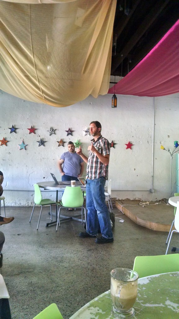
Today, Jeff Greene and Pete Rorabaugh at Kennesaw State University gave a talk titled “Reframing a Degree for a New Media Ecosphere” in which they detail their reframing of the writing BA in their newly restructured KSU department after the merger.

IMG_20150902_093246636_HDRJeff and Pete are teaching two courses, New Media I & II in which they teach a variety of composing skill that focus on content creation, interactivity and ownership. This kind of work is exciting, and necessary when we consider how quickly writing environments shift and change in today’s world where the digital is often emphasized.

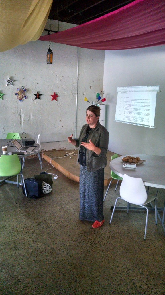
The second speaker was McKenna Rose at Emory, whose presentation was titled “Envisioning the Pechakucha: Strategies for Invention and Revision in the Literature Classroom.” McKenna explained her Pechakucha 20X20 assignment and showed a few examples of some of the work expected of her students.

IMG_20150902_101049413_HDRMcKenna explained some of her techniques and processes as she asked her students to create and present their projects. What I love about presentations like McKenna’s is the robust discussion about teaching strategies and ideas about what else could be done with this format – coming straight from the audience.

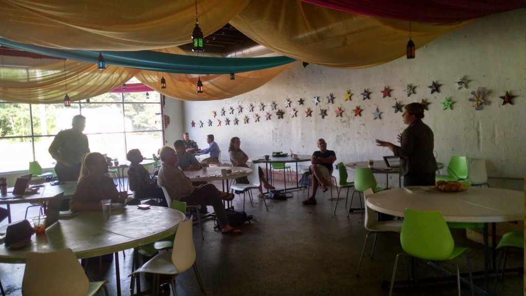
IMG_20150902_101146524_HDRDigPed is always a wonderful experience, and the audience is engaged and ready for discussion. If you haven’t yet been to a DigPed Meetup, and you’re in the Atlanta area, I strongly recommend you visit the atlcl.org website and find out when the next one is occurring.