Category Archives: Blog Project Prompts

Blog Post #7: Resistance is Futile

image courtesy of www.eworldtranslations.com

The difference between good instructions and bad (see the above photo) often boils down to whether or not the author has taken the time to really consider the audience. In the picture above, the instructions have clearly been translated, but poorly. The author clearly did not consider an English speaking audience while translating and editing those instructions. On the flip side, here is a set of easy to follow instructions from Wikihow.com on how to dance. The author of this wiki clearly has a good grasp on the audience. All of the pictures are easy to understand, and the instructions themselves are easy to follow and understand. Creating documents and instructions which are easily accessible to a broad range of people is very important for technical communication. A lot of times in instruction manuals, you have to flip through several pages of information that would be better suited at the end of the manual. “Early communication reduces later resistance,” says Hibbard in her article about change and resistance to policy/procedure writing.

One way to ensure the success and effectiveness of a manual or how to guide is to test it on people beforehand. This is known as the “feedback-driven model”(Ceraso 240). This will most likely require a lot of extra work and time depending on the complexity of the process you are trying to break down. For instance, “a manual for a complex product might require extensive usability testing”(Ceraso 240). Yet even testing to this degree will not solve all of your problems since d”developers cannot possibly anticipate all the needs, practices, and activities that users will find for technologies”(Ceraso 245). Yet this should not be something to fear. Technical writing will always have some way in which it can be improved upon. This should be looked at as a challenge: to try and create the most functional document for the correct audience.

Sources used:


http://cypressmedia.net/articles/article/28/addressing_resistance_to_change_in_policy_and_procedure_writing

Chapter 10 in “Solving Problems in Technical Communication.” How Can Technical Communicators Plan for Users by Antonio Ceraso


Blog Post #10 (Revisited for Portfolio Use Only)

Technical communication has interested me for several years; mainly due to supporting my father in the review of technical communication as part of his work.  Enrolling in this class has further increased my level of interest on the subject and has certainly made me appreciate its existence and those who shape it. Originally, I held a very simple understanding of technical communication; that it basically dealt with instruction manuals and scientific discourse.  Although still true, that is only a minor aspect in the intricate understanding of technical communication that I have amassed.

The most important aspect I learned this semester is understanding your audience.  The first step to successfully conveying a message is targeting an audience and catering to their needs.  If you fail to attract an audience and keep them attentive, your message has already failed.  I have also learned that technical communication is everywhere: from instruction manuals to road signs to government contracts.  An influential figure in the field of technical communication, Katherine T. Durack makes this observation about the subject in a study for Technical Communication Quarterly:

“Technical writing exists within government and industry, as well as in the intersection between private and public spheres…This action can originate in a variety of settings and for many purposes; such action may occur as part of one’s work for hire or arise from personal interaction with organizations.”

From these statements, it is clear that technical communication is relevant and available to assist with any number of tasks.  There will always be a need for knowledge and no matter the subject; technical communication will effectively convey it.  Furthermore, Durack looks to expand my understanding of technical communication with two more observations from her study.

Her following observation refers to the close relationship between technical communication and technology.  Since technical communication “exists to accomplish something” (Durack), it is logical to assume that technical communicators stay up-to-date on the latest technologies.  For example, a communicator looking to assist users in the installation of a new computer program must himself understand the program before instructing others.  Not only that, Durack states “as Wajcman points out, technology is more than just the latest computer hardware or software on the market.”  Technology also refers to the ways we move forward in life and continue surviving.  Any new technique or skill that benefits an individual is a form of technology and to educate others, technical communication is necessary.

technology

Durack’s last observation focuses on the importance of making “tacit knowledge explicit” in technical communication.  While this characteristic is no surprise, the different approaches to creating and presenting explicit knowledge was new and exciting to learn throughout the semester.  The various design choices including font size, font color, spacing, colors, images, and other aesthetic features greatly influence the effectiveness of technical communication.  These features need to appeal to the audience while keeping them interested yet properly informed.  Plain language should be applied when necessary to make the message clear for the audience.

Overall this class has taught me many different examples of effective technical communication based on audience. In addition, the complexity of technical communication has revealed itself through hands on work and from class readings, including those of Katherine T. Durack.  The small but important details that help harmonize effective technical communication, along with a strong audience connection, has given me a broader understanding and appreciation for technical communication.

Source Cited:

Durack, Katherine T. (1997). Gender, Technology, and the History of Technical Communication. Technical Communication Quarterly, 6(3): 249-60.


Blog #6 – “English, please” (The Power and Purpose of Plain Language)

Being technically inclined is a blessing and a curse; I’m able to troubleshoot my own issues with computers, but people sometimes ask for my help. It isn’t that the request for my help is a problem, but it irritates me to no end when I try to explain something in simple terms and it’s requested that I give directions “in English”. However, I understand the nature of the request. Plain language is vital when it comes to teaching a skill to people who lack fundamental knowledge about a specialized area within STEM.

A year or two ago, I was trying to teach my grandmother how to use a computer. I had to break everything down using simpler terms. She knew what I meant when I said she had to “click” an “icon”, but she didn’t know the names for things. She could grasp the concept of a “browser”, but she knew programs better as just that – programs. She knew each program was used for a different purpose, but she didn’t know them by name, as she doesn’t have much experience with computers. Plain language is especially helpful when explaining concepts marked by generational gaps (e.g. how to use a modern OS on a computer).

What I was saying earlier about being asked to use “English” when explaining how to troubleshoot an issue – that was something my aunt said to me when I visited her in Texas recently.  I’ve realized time and time again that it is absolutely crucial to use plain language with people who possess a basic understanding of computers. As a Computer Science major surrounded by technically inclined people, it’s easy to forget. People lose interest in what you’re talking about and get frustrated when you don’t use plain language. In the context of the general public, it is especially important to use plain language when speaking about STEM concepts because it serves to inform people in terms they understand. Now, there’s also a time and place for more technical/advanced terminology, but that is only with people who have an intermediate or advanced understanding of the topic you speak about.

Using plain language to explain computer science concepts to a beginner is extremely different from using plain language to explain the same concepts to say, a database administrator. Plain language, while helpful to beginners, can serve to irritate advanced users and also slow down the process of learning/teaching. If you are aware that a person understands the more advanced concepts of what you’re speaking about, then it’s important that you use vocabulary effectively in order to explain things in a reasonably succinct fashion.

I strongly agree that the author is responsible for using appropriate language when speaking to their audience. Before you even begin to write a piece, it is your responsibility, as the author, to know who your intended audience is. If you’re speaking to people who work within the same field, use the language you’d normally use. However, if you’re speaking to beginners or if there’s any doubt about who will see what you’ve written, use plain language! The audience bears the responsibility of asking questions when instructions are unclear.  Now, the author should write in a manner that enables the audience to understand what they’re talking about, but if uncommon/advanced terms or concepts are left undefined, then they might be doing more harm than help by leaving the audience in the dust, so to speak. The reader has the power to inform the author of the effectiveness of the piece. If there are any errors or if the piece lacks clarity, then the audience is able to inform the author and vicariously (through the author) ensure that future readers will be able to attain the understanding of the concepts that they seek to understand by reading the writer’s piece.

In conclusion:

  • Plain language makes STEM subjects more appealing to beginners because it makes it easier to understand them.
  • Plain language can work against a technical communicator because it can slow down communication between two people who are well-versed about the same subject.
  • It is the author’s responsibility to know their audience and it is the audience’s responsibility to inform the author of any flaws in the writing.

Blog #3 – Beyond the Resume / Using the Internet to Improve My Image

Currently, my online/professional identity is presented in a pretty generic format. I have a website set up with some basic information about myself that includes a link to my resume. Eventually, I’d like to create a video resume and a portfolio to show off what I’m capable of. Additionally, I’d like to revise my existing resume to be more interesting and also more specific.

Right now, my resume is pretty basic. It lists my job experience, the schools I’ve attended, and the organizations I was involved in during high school. I use a template that I found in the Microsoft Word template library; it forces all-caps for titles and the text is blue. I don’t feel like it really stands out. It would probably be in my best interest to create different resumes for different types of jobs; I’m not sure that it makes a good impression for potential employers to see I was working at a skating rink called “Fun Galaxy” at one point.

Hmm, yes, the smell of sweat masked by the smell of Lysol. Potential employers will definitely want to hear about this.

I think using a QR code would be wise for a more “modern” version of my resume; the code could be a link to my website, which, ideally would have  a portfolio showcasing different projects (i.e. code samples from programming classes, contributions to my high school’s yearbook, and some of the music I’ve made).

Scan it if you're feeling bold.
Scan it if you’re feeling bold.

Using a video resume would be beneficial because video is inherently multimodal and using this format would allow employers to get a glimpse at who I am, as well as how I present myself. Video allows applicants to showcase something that typed resumes can’t: their personality.

In the video below, a man uses video to inform and entertain viewers, in hopes of getting hired at Google.

Ultimately, I want to present myself as being multi-faceted, and I believe a video resume is probably the best way to accomplish this. I’d be able to show off my personality and also, since video is multi-modal, I could use the format to present brief snippets of non-written work from my portfolio (e.g. music).

In conclusion, I think my image would benefit from excluding irrelevant information about my prior work experience and using the internet to create a more interactive and multi-modal piece for employers to review.

Blog #2 – On Resume Ethics, Personal Identity

Due to the discriminatory process of sorting applications and the extremely competitive nature of the application process, I believe that it is completely justifiable for people to alter their identity and exaggerate their qualifications for the purpose of getting an interview.

Discrimination is still very real. Studies have been conducted to measure the correlation between ethnic names and callbacks for job applications. A lot of the time, people with more distinct, ethnic names won’t get callbacks, while people with more common names (e.g. “Caitlin” or “Cody”) will. Beyond race, there are gender-related issues that go beyond the binary. Women often tend to have trouble getting jobs in male-dominated fields, and it’s especially difficult for transfolk to get jobs pretty much anywhere. I don’t think it’s dishonest to alter your identity by using initials or even changing your name on the application. Hiring managers look at the names and use them to make assumptions about peoples’ identities.

Normally, peoples’ names might exclude them from the interview process entirely, but I’ve considered that their names might create expectations for the interview, if they are called to do one. For example, a transwoman named Jane might be called for an interview; the hiring managers will likely expect a ciswoman. Alternatively, if a Black man were to change his name from D’Angelo to Adrian on his application, the managers may be expecting a white man for the interview. Obviously, the managers are at fault for any prejudices they may have, but I feel like it’s worth considering that “resume ethics” aren’t the real issue here; it often tends to be the morals and expectations of those who conduct the interviews and look through the applications.

jobpost
Example of a job post with a long list of skills – applicants are likely to have a few of these, rather than all of them.

Additionally, the job market is extremely competitive. I have a lot of friends who are technical majors or work in a technical field and several of them have explained that when hiring managers are looking to fill a position, their listings are unrealistic. Oftentimes, HR departments post descriptions for what would be a perfect candidate for the job (e.g. “x years of experience with A-type programming”, “y years of experience with B-type programming”, “z years of experience with C-type programming”). The majority of the time, they wind up hiring someone who has some of the qualifications listed in the description.

I have a friend who never finished college and has a job that pays close to 100k a year. He works within a group that works for the Department of Defense. He taught himself some of the skills the job required, but for the most part, he was just very good at interviewing. He is probably the best example I can think of for why it should be okay to bend the conventions for writing a resume. He wasn’t truly qualified for the job, but he was proactive in teaching himself some of what he would need to know and becoming the best employee he possibly could become after getting the job. My understanding is that he came from a low-income family and worked his way up. Some may argue that more qualified people should have these positions “reserved” for them, and I don’t completely disagree, but I think that the people who make the effort to secure positions like this shouldn’t be excluded. I understand that this might be harmful to people who are totally qualified for certain positions and I have trouble justifying it when considering that. However, I feel that there should be preference given to people whose groups are underrepresented (as long as they are able to perform the job well), examples being women, racial minorities, and people of non-binary genders.

In conclusion, I defend the approach of stretching the truth to get an interview because it tends to yield workers who are ambitious and proactive, while also circumventing the biases of the people who review applications and resumes before interviewing applicants.


There is Beauty in Technical Communication (Revised)

32036-Everything-Has-Beauty

Technical communication is an art that combines technology, language, and aesthetics. It is not solely concerned about technical writing and utility. Technical communication, however, requires the use of principles and elements of design that contribute to creating aesthetic appeal. Aesthetics and technical communication are becoming intertwined, and for technical communication to be effective, it must be aesthetically pleasing. I will demonstrate the importance of aesthetics in technical communication by explaining the meaning of aesthetics. I will also demonstrate the use of aesthetics in technical communications, and finally, I will discuss the necessity of aesthetic appeal.

Introduction to Aesthetics

For something to be aesthetically pleasing, it doesn’t necessarily mean that it has to contain pretty pictures and color. What I am referring to is the organization of the information. Information must be organized in a way that is pleasing and easy for the audience to navigate. Sometimes, that organization includes color and images, but white space and font choices also contribute to the organization and aesthetic appeal of a document.

We find things aesthetically appealing when they create a sense of harmony, because harmony is pleasing to the eye and enjoyable to the audience. Harmony is important in technical communication because it engages the viewer, creates an inner sense of order, and creates a balance in the visual experience. If a document is not harmonious, then it can easily become too chaotic or boring. A lack of harmony can prevent the reader from being engaged.

Bad Use of Aesthetics in Technical Communication

However, aesthetics can make technical communication less effective when they are used incorrectly. If too much color or imagery is used, it can distract the reader from the actual information. The first example that comes to mind is the use of aesthetics in power-points. Power-points usually contain too many unnecessary images and incorrect use of visuals, making it difficult for the viewer to focus on the relevant information. My previous blog post provides additional information about bad use of aesthetics in Power-points. I have also provided examples of good and bad use of aesthetics in web design:

1. Bad use of aesthetics

This is an example of bad use of aesthetics because there is no harmony. The homepage is crowded with images that lack order and organization. There is too much use of color, especially high impact colors such as lime green and hot pink.

2. Good use of aesthetics

This example is similar to the one above because it contains images that link to other websites. However, this website is harmonious. The images are organized with an adequate amount of white space, making the website pleasing and easier to navigate.

Importance of Aesthetics

Aesthetic appeal is important in every aspect of technical communication, because a lack of aesthetic appeal hinders audience engagement. Aesthetics are becoming especially valuable in website design. With a million sites in existence and only a click away, websites have to use aesthetics to capture the short attention span of the audience. Once the they capture the attention of the audience, they have to find ways to use aesthetics to keep their attention.

Conclusion

Technical communication doesn’t always have to be entertaining or fun, but it must always be aesthetically pleasing. Utility and usability go hand in hand with aesthetics, because in order to meet the goals of utility and usability, certain aesthetic guidelines must be met.

Blog Post #9: Ways to avoid TL;DR

The transition from print to social media has drastically changed the role of the content creator and his/her duty in conveying an efficient yet thorough message to an audience.  The pressures of detailing a message with complex vernacular and thorough completeness has seemingly shifted to short definitive statements and highlighting of important material.  How do creators adapt to creating effective messages with minimal clutter?

Before the evolution of social media and technology, print media was the most reliable mode of communication for individuals and businesses alike. Although considered “outdated” and/or “boring” today, taking the time to read and understand a body of text allows the reader to become more engaged and understand the situation clearer.  According to the article “Print is Dead? Not so Fast”, on Forbes.com, the author states several reasons why print media is still relevant today.  However, although a majority of the reasons given are debatable, one solid point states “consumers are more engaged when reading printed material, unlike websites, which are often skimmed in as little as a 15 second visit.”  From this statement, it is possible to assume that since people were forced to read completely through texts during this time period, they possessed a higher level of literacy then many individuals do today.

Nonetheless, times have changed and technology and social media has evolved into the leading mode of communication in our modern society.  According to the article on Forbes.com, technology such as the internet allows for “cost effectiveness, exposure potential and convenience,” when it comes to marketing and advertising. But what does this mean for the content creators and audience?  Should readers be responsible for longer content or do creators ignore certain rhetorical aspects to accommodate all levels of literacy?  In my opinion, a mixture of both is necessary.

The incessant bombarding of multimedia messages through social media has led to a new mentality of faster is better when it comes to communication.  Social media outlets, such as Twitter and Facebook, allow users to access and view information at the click of a button or touch screen.  Instant deals, news, and/or other relevant information are available quickly and typically, in the palm of your hand.  There is no long text to read or pages to sift through. The hashtag aspect popular on Twitter is significant because it helps spread messages and awareness in rapid time and/or allows people to get up-to-date with the current information surrounding a topic.  According to an article by Jenny Doren and Laura Mandaro on the USA Today website, the recent Ferguson, MO decision sparked almost immediate protests across the nation, partly due to such hashtags as “#fergusondecision”, “#blacklivesmatter”, and “#justiceforMikeBrown”.  People immediately became aware of the decision and reactions simply by clicking on these tags.
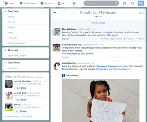
Ferguson hashtag

The work my father does as a proposal writer illustrates another example of completing efficient technical communication.  When dealing with more intricate and complex topics, longer text usually is necessary, but finding ways to limit the wordiness allow these texts to still be interesting and engaging.

bad technical writing imagetechnical writing image                       

                       Image A                                                          Image B

Image A above is an example of technical communication that could be improved.  It conveys a message through text but could potentially be more effective if broken down more and utilizes other multimodal aspects.  Image B is an example of technical communication that is more effective today. Understanding and executing ways of sequencing concepts in longer texts will allow the audience to be more interested and engaged.  Combining text with images, including graphs and tables, gives the work more flair and activity.  Concepts and ideas are broken down more so most people can better understand and comprehend the message.

Overall, this new era relies on quick yet efficient communication.  Long texts will always have a place, but it is up to the creator to find ways of making it engaging while maintaining the message it contains.  However, it is also up to the audience to be educated and should he/she wish to explore new endeavors, be responsible for taking the time to learn the ways.

Sources:

Jenny Doren, WFAA-Texas | Laura M, and Aro. “Ferguson Tweets, Hashtags Spike as Anger Rises.” USA Today. Gannett, 26 Nov. 2014. Web. 08 Dec. 2014.

“Print Is Dead? Not so Fast.” Forbes. Forbes Magazine, 28 June 2012. Web. 07 Dec. 2014.

“Technical Writing Examples – Google Search.” Technical Writing Examples – Google Search. N.p., n.d. Web. 10 Dec. 2014.


The Art Called Technical Communication

Communication_Image_Cloud-1024x666

The way we view technical communication have dramatically changed in the past few years. Thanks to the convergence of social media, advances in video technology and the ongoing transformation of print media which have changed the manner by which we create, transmit, receive and comprehend media communication.

Technical communication has helped us be able to identify the story or program purpose, design the message and use the appropriate communication medium for large, small-scale or individual audiences. It has enabled us to take advantage of aesthetics as we learn to communicate whether by learning how to create concise, informative messages for traditional and online print, video, audio, interactive or combinations of media formats.

Technical communication is a multimedia form of art in which we work with everything from linear text to hypertext, from static images to video, and we mix and match the form to make a creation. To me art is an experience we can get through one or more media. We see the beauty of technical communication from manuals included with products; the cover page of books written by our favorite authors, an instruction, to an explanation of a “how to do” video. What all of these have in common ranges from graphics, video, colors, and even fonts which come together to form unique ways to communicate to an audience.

A technical communicator may benefit from a good grasp of aesthetics to ensure the product is both usable and attractive. In various markets where the aesthetic is shaped by the technology, such as engineering, the technical communicator must be aware and able to adjust their presentation appropriately. We need to be aware of the audience and know what our audience responds to in terms of presentation and structure. How well we can speak to that audience depends on whether we have the skill in the appropriate domain and medium (Renteria). 

If there’s one thing we can all agree upon, it is the fact that art is about communication!

Renteria, Roger. “Resolved: Technical Communication IS Art | TechWhirl.” TechWhirl. 22 Oct. 2012. Web. 6 Dec. 2014.

There is Beauty in Technical Communication

For technical communication to be effective, it MUST be aesthetically pleasing. For something to be aesthetically pleasing, it doesn’t necessarily mean that it has to have pretty pictures and color. What I am referring to is the organization of the information. Information must be organized in a way that is pleasing and easy for the audience to navigate. Sometimes, that organization includes color and images, but white space and font choices also contribute to the organization and aesthetic appeal of a document.

We find things aesthetically appealing when they create a sense of harmony. Harmony is pleasing to the eye and enjoyable to the audience. Harmony is important in technical communication because it engages the viewer and it creates an inner sense of order, and a balance in the visual experience. If a document is not harmonious, then it can easily become chaotic or boring. A lack of harmony can prevent the reader from being engaged.

Aesthetic appeal is important in every aspect of technical communication, but especially in website design. With a million sites in existence and only a click away, websites have to use aesthetics to capture the short attention span of the audience. Once the they capture the attention of the audience, they have to find ways to use aesthetics to keep their attention.

Aesthetics can make technical communication less effective when they are used incorrectly. If too much color or imagery is used, it can distract the reader from the actual information. The first example that comes to mind is the use of aesthetics in power-points. Power-points usually contain too many unnecessary images and incorrect use of visuals, making it difficult for the viewer to focus on the relevant information.

Technical communication doesn’t always have to be entertaining or fun, but it must always be aesthetically pleasing. Utility and usability go hand in hand with aesthetics, because in order to meet the goals of utility and usability, certain aesthetic guidelines must be met.

Blog #12: Technical Communication and Aesthetics

The Oxford English Dictionary defines “aesthetics” as follows:

The philosophy of the beautiful or of art; a system of principles for the appreciation of the beautiful, etc.; the distinctive underlying principles of a work of art or a genre, the works of an artist, the arts of a culture, etc.

One of the central texts for this class is Writer/Designer. In their handbook Arola, Ball, and Sheppard present writing and composing texts as design processes. Design–whether one is creating texts, teapots, or telescopes–can imply both the creation of something that is uniquely suited to and useful for a particular purpose, as well as something that is aesthetically beautiful or attractive.

Now that you have a little more experience designing in a number of different technical communication genres,  you should have some ideas about the relationship between utility/usability and aesthetics in technical communication. Is effective technical communication–i.e., technical communication that is useful and usable–necessarily aesthetically pleasing or attractive as well? In what kinds of rhetorical situations does aesthetic appeal enhance the effectiveness of technical communication? In what kinds of rhetorical situations might aesthetic appeal detract from the effectiveness of technical communication? When should we care about creating technical communication that is beautiful, entertaining, fun, etc.? And when, if ever, are such concerns irrelevant to our primary goals of utility and usability?

To the extent that aesthetic concerns inform and shape technical communication processes, new digital technologies arguably facilitate the creation of artifacts that are well-designed in every sense. Indeed the New London Group, whose theory and pedagogy provide some of the foundations for the approach to composition described and encouraged in Writer/Designer, argue that multimodal composition most often involves “redesign” whereby “available designs” are remixed and repurposed, rather than the creation of something entirely new. Laser printers and the availability of templates, color-pickers, image filters, and programs such as InDesign, Publisher, and Scribus, arguably give amateur desktop publishers design and print capabilities once reserved for the most experienced and talented professionals.

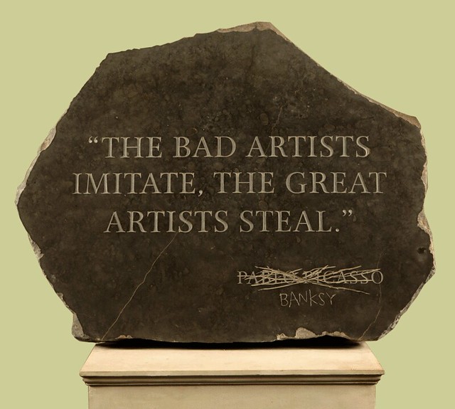
Given how technology has reconfigured the rhetorical situation, we might ask what role the creation of something truly “new” plays in contemporary technical communication? Is “novelty” or “originality” something for which technical communicators should strive, in what rhetorical situations? How do we define or redefine plagiarism in an environment where remixing and reuse are recognized as normal, even essential parts of the composition process? And if technology opens the possibility that even amateur efforts might meet “professional” aesthetic standards, one might ask the questions “who sets such standards?” and “why do they matter?”

“The Bad Artists Imitate, The Great Artists Steal by Banksy” via Duncan Hull on Flickr.

Posting: Group 2

Commenting: Group 1

Category: Aesthetics

What do you think? In your Blog #12 post, take a position about how aesthetics influence technical communication, and how new digital technologies may be affecting how aesthetics shape our understanding of “usability,” “utility,” and “effectiveness” as they apply to technical communication artifacts. As always, craft your response as a cohesive essay or argument, rather than a list of answers to the questions and topics outlined here. Please carefully read and follow the guidelines and posting information for this blog.

Featured Image Credit: IKEA by Missy S. on Flickr.