ZYBACZYNSKI, Veronica Maria. Urbanism. Architecture. Constructions / Urbanism. Arhitectura. Constructii , 2014, Vol. 5 Issue 4, p87-92, 6p. Publisher: National Research & Development Institute URBAN-INCERC.
This article puts an emphasis on the importance of preserving color and the effects that it has on the local environment with local color being the most important aspect. Green defines local color as “all sights, sounds, smells and tastes, impressions of space and time, physical meetings and social interactions that individual experiences in space”. Essentially local color distinguishes one city from the other giving each city its own identity. The factors that help in this process are historical, culture, technological & economical, and social factors. The older and more complex the city the more of an identity it will have. The author suggested that the identity of a city can be seen through various characteristics like the color of streets, buildings, traffic signs, vegetation, and vehicles. This article does a good job of exampling the identity of a place but it would of been more effective if Green had pictures to example what it is saying. The article also ties in perfectly with the research of the effects of color and lighting that I am currently researching, by showing how color can positively affect the exterior built environment of a particular place.

Hyodo, Jamie. Advances in Consumer Research. 2011, Vol. 39, p858-867. 10p. 6 Charts. , Database: Business Source Complete
The author begins by stating that color is clearly everywhere and depending on the variations in the color scheme it can have a different effect on a person’s mood. He then explains a very detailed experiment and calculation of the effect of color. Which emphasized that “cool colors lead to affective pleasure responses more strongly than the warm colors and warm colors lead to affective arousal responses more strongly than the cool colors.” The author then explains how the same color can mean something different to various cultures, genders, and races. But no matter the person’s background, in general, cool colors make people feel pleasure. And warm colors make people feel excitement. An example is then used to show how this happens, it’s exampled how stores and businesses use this to attract consumers. This article relates directly to the past source that I researched of the effects on color in the exterior built environment. This article did a wonderful job of exampling the different aspects of colors and its direct relation to mood, which connects to the research that I doing on color in a built environment.

Poore, Patricia. Old-House Interiors. Jun2012, Vol. 18 Issue 3, p58-61. 4p. , Database: MasterFILE Elite
The author focuses on the color schemes that people choose when they decide paint their homes. He gives a series of the do’s and don’ts in picking those colors. And suggests looking out for different aspects before picking the color scheme of a home. The most empathized suggestion is picking colors that blend well with the existing color scheme of the neighborhood so that it doesn’t clash. The author does a good job of explaining exactly how to choose between the various colors. The article also tells the person to consider 5 major elements with the color scheme, which are body, major trim, minor trim, sash, and accents. An array of pictures are used to show the reader exactly how to utilizes these five elements. These pictures capture many homes from different vantage points. Showing the color on the homes as well as the background of the homes. In all of these pictures the homes tie together perfectly with its background. This was well written and fully exampled the concept, of color and its effects on homes. This ties in hand in hand with the research that I am doing on color and relates directly to the two previous sources that I have annotated. It especially relates to the one that I did on the exterior built environment.
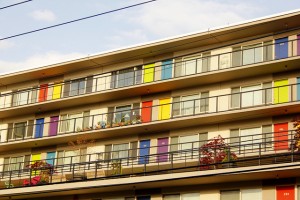
Lighting Research & Technology. May2015, Vol. 47 Issue 3, p301-315. 15p. 2 Black and White Photographs, 2 Diagrams, 5 Charts, 1 Graph.
The various authors of this article highlight the effect of outdoor light on judgement and emotion. There was an experiment held where various aspects were tested from facial expressions to reaction time. In the findings of the equation the subjects responded much better when there were good lighting verses when there was ok or low lighting. This is a credible source that is organized in a way that makes it easier for the reader to understand the complex experiment. The various charts and graphs help the reader understand the qualitative data and the pictures help the reader understand the quantitative data. I chose this source because I wanted to see the effect of lighting on a built environment. This article focuses on the exterior environment which will correspond well with the interior build environment. In my other research that I have done so for I have focused on color but realized that color and lighting tie hand and hand. I will do more research on lighting in the coming annotated biography’s.
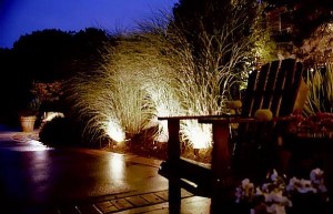
Lighting Research & Technology. Apr2015, Vol. 47 Issue 2, p192-209. 18p. 1 Color Photograph, 5 Charts, 4 Graphs.
The article focuses on how varied lightening conditions can contribute to the productivity in the workforce. There was an experiment held to see how lighting effects affect visual perceptions which in turn affect mood, alertness, and comfort. The experiment shows that brighter light/ mornings can make subjects more alert than duller light/ evenings. The one picture and nine charts help the reader to better understand the dense text. Though this is a great source the text which is somewhat boring in very drawn out. The author should of just went straight to point, which would have made for an easier read. I chose this source for the same reason I chose source four which was on exterior lighting effects. The reason being is I have focused on color and recently realized that color and lighten go hand in hand. All in all, this is a well written article that does an effective job of explaining the experiment.

Exchange (19460406); Nov/Dec2015, Issue 226, p40-43, 4p
The article talks about how environmental factors affect children’s stress levels in classrooms. It focuses on temperature and physical space, but the most interesting effect is lighting. The thing that sets this article apart from others, that I have researched, is that it suggests that instead of brightening classrooms, classrooms should be at mid lighting. The authors says that “Too much lighting can cause overstimulation and distraction, while dim lighting can cause headaches”. This article is good in the fact that it is easy to read and is less dense then other readings like the source from my fifth annotated biography. Though good the article still has its flaws, a major one is that the article could of gave more scientific information to back its findings, instead of just simply stating the facts. This would have made the article seem more valid. I choose this article because I wanted to understand the effects of light in classrooms and other spaces, and it gave me a great understanding of just that.

Jonker, Gerco. Colorful Living? 2006. Flicker, Zaandam.
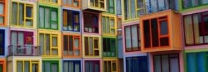
This is a picture of a colorful apartment building in Europe. Every color in the rainbow can be seen on each of the individual complexes. The built environment of this location is extremely colorful and interestingly constructed. The photographer Gerco captured this picture at a perfect time of the day when the sun was shining on the colors of the building. I choose this particular photo because it relates directly to my analysis of color in the built environment. This is perhaps the most extreme example of a splash of color in an exterior built environment because every inch of the building has color on it. Though this photo is great, there are a few small problems. If the picture were taken from a higher few looking down the viewer would be able to see more of the building as well as the exterior of the building. This photo relates directly to my other sources that I have read because they all have to do with color and lighting. On one of my previous annotated bibliographies, it talked about how color affects mood. When looking at this photo, it made me wonder what the residents of this apartment feel when the exit their buildings every day. Does it make them feel joy? Alternatively, are they annoyed by the color? All in all, this photo is great and made me question a lot and had me analyzing for some time.
Restaurant-Interior-Designs. Digital image. Designbuildideas. N.p., May 2013. Web. 17 Mar. 2016.
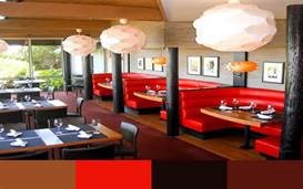
This is a picture of the inside a local restaurant in America. The picture captures the various colors in the restaurant. The lighting in this restaurant is very bright and flows through the entire restaurant. The color scheme of the restaurant is red, white, and different shades of brown. This particular color scheme makes the restaurant have a warm feeling. I chose this particular picture because it showed how color can affect the feeling and mood of an interior built environment. This photo doesn’t have any flaws. Because it was taking at a great time of day. And was taking from a great corner in the restaurant. This relates directly to many other annotated biographies that I have done in the past. Particular the one that I did on the effect of color and lighting in a classroom. It showed that a room with mid lighting and a good array of color can make students feel better and have a good mood. This proves that this restaurant that has good lighting and a good color scheme can make its customers have a good mood. In conclusion, this photo was a great one that portrayed the color and lighting in this particular photo.
Digital image. Thompson Turner Construction. N.p.,Web. 20 Mar. 16
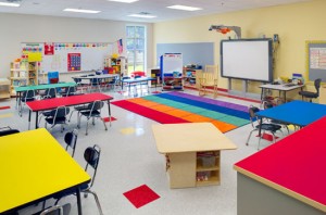
This is a photo shows a bright and colorful classroom. The classroom is also very spacious and modeled for little children. I choose this particular photo because it relates directly to lighting and color on interior built environments. The photographer captured the various bright colors of the rainbow. As well as the extremely bright lighting of the classroom. This photo refers directly to many of the past annotated biographies that I have done in the past. Two, in particular, the one on the effects of bright color on mood. Moreover, the on effects of brightness on a learning environment. The bright colors must make the students in the classroom jubilant and alert. From what I learned to form the brightness source the extreme brightness of this classroom can be bad for the students, giving the heads or making them tired. All in all the photographer did an excellent job of capturing the essence of the room.
Wedel, Michel,Pieters. Marketing Science. Jan/Feb2015, Vol. 34 Issue 1, p134-143.

This article focuses on the effect of color on an ad image. The authors conducted two experiments to see these exact effects. First the author conducts an experiment that manipulates the blur of a picture and its presence or absence of color in the ad image, during exposures that lasted 100 milliseconds (music). The experiment showed that blur didn’t affect the perception of the ad. The second study tried to see if color inversion of the background affected the perception of the ad. The experiment showed that it didn’t. These experiments provided that the color of the central object is more important than the background color. I choose this article because it relates to the built environment, in many built environments there are ads so that individuals can see. This article relates every source that I have accessed on and about color. From the sources that talk about color in mood to the ones that talk about in the built environment. Over all this particular source is a great one that completely examples its point. The only thing that could have been different was if the article itself had color in it to gets its point across.