I have been a member of the SIF family now for a little more than two months, so I guess it’s about time to go through all of my projects for this semester and give you updates on each.
1) Hybrid Pedagogy Promotional Videos
This project has been a straightforward one from the beginning. The general idea is to record a series of interviews with faculty members who are experienced with a teaching that blends online and offline (i.e. in-class) activities–in other words, hybrid teaching. For this, we have come up with a set of focused interview questions, and over the course of the first 6 weeks we have conducted various interviews with faculty members. We have been able to compile a great amount of material to work with. We are currently in the post-production phase of this project, or should I say the first stage of this project since we believe that promoting hybrid teaching should also be considered from the students’ perspectives. To that end, we are planning to conduct more interviews with students in the course of the next semester in order to balance the information we have so far received from faculty. I am currently in the process of learning Adobe Premiere Pro so that I am also able to help out with the post-production process.
2) Outreach and Documenting
Similar to the project above, this one is also clearly situated in the world of promotion. The basic premise of this project is to promote places at GSU where students have the opportunity to access, use, or check out technology devices. Find out more by reading this great post from my colleague, Amber. Granted, the GSU website already provides a great amount of information regarding those places, but we came to the realization that they didn’t really showcased these spaces “in action”. So, during our early group meetings we noted all of the technology sites that are currently available at GSU, and quickly honed in on the Digital Aquarium, the Aderhold Learning Lab, and the Exchange. For each space, we had planned to shoot short, 1-minute videos that highlighted less what these spaces offer, but more how students might be able to use available devices. Unfortunately, as this idea began to take shape, we learned that each of these spaces is going do undergo major design changes, so any video we recorded would have had a pretty short life span because they would have all featured each space in its current state. That caused us to go back to the drawing board. Now, we will be focusing solely on the new CURVE space in the library in order to give GSU faculty incentives to assign activities in their classes that would make their students come to CURVE.
3) 3D World and Gaming Environment
This project is quite unique. The basic idea is to virtually re-create a city-block in Atlanta, the one where Classroom South is located to be precise, and display how this block might have looked like in the 1930s. Check out this great post by my colleague, Robert, to learn more about the virtual environment we are creating. In addition, we are planning to populate that space with objects and characters that students can interact with and learn more about the history of Atlanta. Furthermore, we also hope to have writing students create narratives and stories that further help to shape this virtual environment. Throughout the first couple of weeks into this project, I have been mostly involved with trying to consult archival sources such as photographs and newspaper articles to help our production team design the space through a gaming engine called “Unity”. We have now, however, reached out to other teams at Emory, which have also been working on a similar mapping project in order to combine our resources and see how we can help one another. My responsibility now is to facilitate that discussion and further help adding content to the virtual environment.
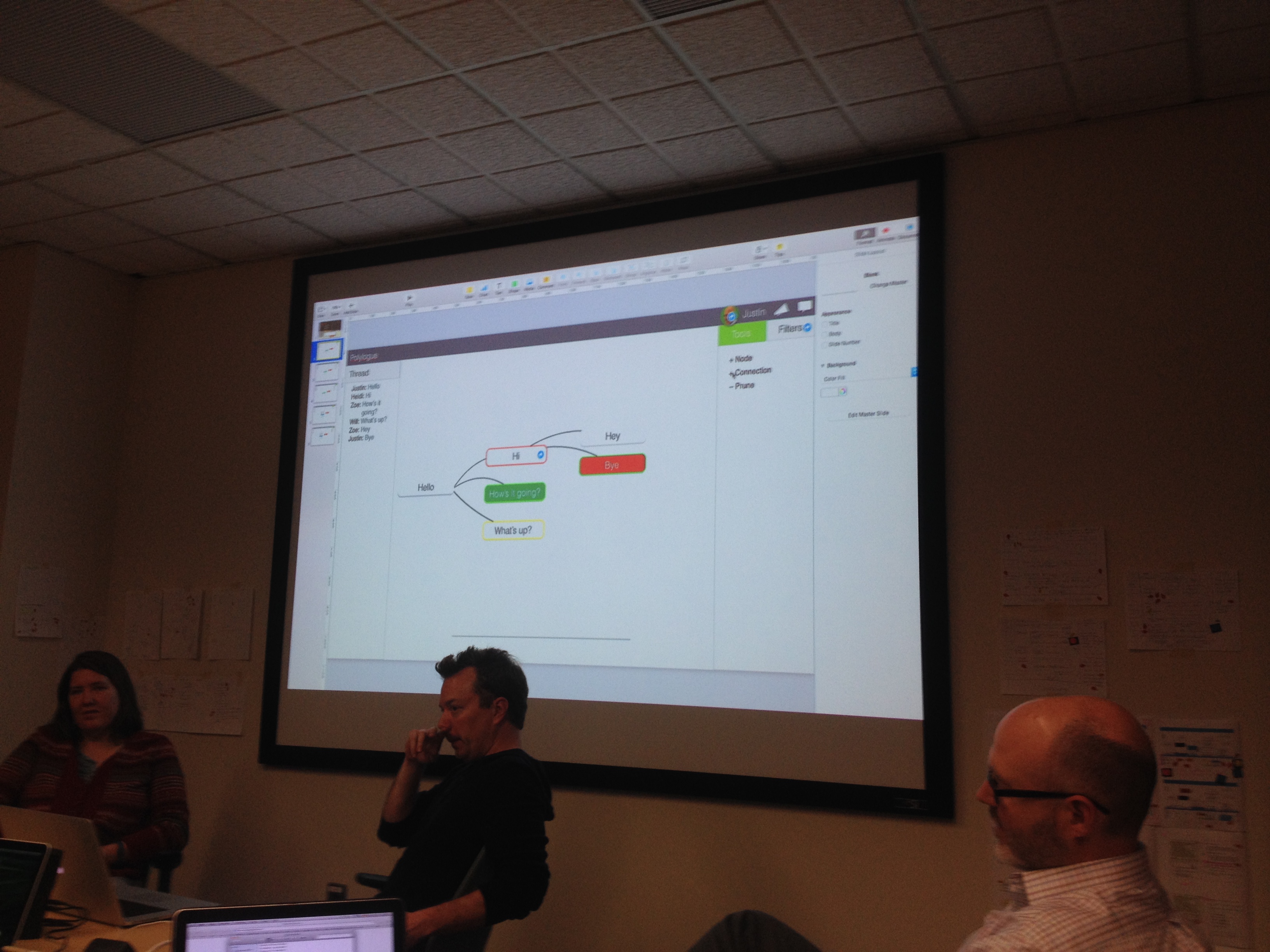
4) Deliberation Mapping Tool
For this project, we are currently in the conceptual design stage. To give you a general idea of what this project is about, I want to refer to this great post by my SIF colleague Nathan: “Deliberation Mapping – Shaping Online Discussion“. Over the course of the last two weeks, we had some great meeting sessions, to which Siva and Ram have wrote engaging blog posts: “Integration and Finalization!!!” and “Where is the big picture?” The situation we are presently dealing with is how the different ways a user participates in a deliberation are represented visually. Below are some impressions from today’s meeting:

Justin giving directions.
Figuring out participation parameters.
At this stage, our main goal is two-fold: we need to find ways of facilitating ease of use both for students and their instructors as well as to come up with ideas on how to avoid asynchronous deliberations of becoming messy from a visual perspective.
5) Data Visualization Workshop for Research Purposes:
This is a project that emerged in the course of October. At the beginning of the semester I had been tasked with a project to create a software tool that would help a researcher visualize vocal parameters such as volume, pitch, and timber. Fortunately, I have been able to help guide the researcher to various audio production programs and tools that already offer those kinds of visualizations. So, once that project was completed, I created the “data visualization workshop” project together with Justin and Joe. The basic premise is to offer innovative ways for students and researchers to evaluate research results that they retrieve from academic databases. Oftentimes, when we access the GSU library to search for sources, we type in keywords and receive long lists of results. What if we had a way to transport those results into a visual environment and easily identify how the search relates to, let’s say, publication venues, its use in research studies over time, the kinds of disciplines that do the most research on the search term, especially when it’s a topic that is oftentimes evaluated in interdisciplinary ways. Translating my findings into a workshop was the logical conclusion. However, in order to determine the kinds of programs that are necessary to visualize database research results, I first need to identify how to best export the search results from the database. In the course of the next week, I am planning to have meetings with database experts at the GSU library regarding this issue. Once I know what’s possible, I can move further with this project.
I feel very fortunate to be part of the SIF team. I have already learned a lot and I am eager to see how all of these projects will turn out. That’s all for now.
Cheers,
Thomas
