Following up with Nicole’s recent post

I’m writing this blog post as a follow up to Nicole’s “Innovation and Education” post that she published on October 13. What I particularly liked about her approach to tackling the concept of innovation is that it’s not certainly necessary to “reinvent the wheel” but to take into account as many perspectives as possible when attempting to create something new.

Following this line of thinking, being innovative can be seen as doing something else with knowledge and processes already available to us. In turn, it stresses the idea that innovation always comes from “somewhere”. In few cases, innovative ideas emerge our of nothing. What I have found quite helpful in applying this logic of “somewhere” is to subscribe to as many online outlets that relate to your interests. In my case this meant subscribing to the various Youtube channels of the conference series known as TED. Below is a list of channel links:

TED, TED-Ed, TEDMed, TEDFellowsTalks, TEDxYouthTEDxTalks.


For those of you who are not yet familiar with the organization, TED is a conference platform that works to share ideas worth spreading. This year marks its 20th anniversary with conference presentations that deal with a broad spectrum of topics and issues coming from the fields of technology, entertainment, art, education, business, and medicine. The organization curates most of those presentations on its various YouTube channel, thereby creating an impressive archive of information and knowledge. Tapping into this knowledge can really help generate ideas that we can consider innovative.

For example, this past summer I attended a TED conference in Berlin, Germany, where one of the presenters talked about a software application that helped visualize how TEDFellows were collaborating all over the world. The premise of the presentation was merely to show what the organization was doing and how the TEDFellows were fitting into the mix. Each fellow was represented as a colored dot and the collaboration between fellows was shown through curved colored lines that connected the dots. The size of each dot would, then, represent the extent to which each fellow would collaborate with others, i.e. the bigger the size the of dot, the more the fellow has been engaged in collaborative projects. Furthermore, a user could also select a fellow by clicking on the dot which would grey out most of the dots and lines and only leave those lines and dots colored that connected to the one selected.

I was blown away when I saw that. It made so much more sense than, let’s say, going through a traditional table layout and comparing mere numbers for each fellow with one another. With that software, the process of comparing relationships became a much more intuitive process. When I got back home, I went back to working on my research for my dissertation, and I started thinking: “There has to be a better of making sense of all the sources, concepts, and ideas that authors in my field of research are bringing to the table. And that’s when I thought back to that moment at TED, and I realized that visualizing research strands could be a very helpful way for me–and other researchers for that matter–to make sense of the huge amount of sources I am dealing with.

And so now I’m working towards finding easy accessible ways to get available software programs to do that very thing. Hopefully, this will all make its way into a workshop that I am going to give at GSU.

I will keep updating my progress regarding this project on the blog, but what the whole thing boils down to–echoing Nicole’s recent post–is that you don’t have to “reinvent the wheel” to do something innovative. Instead, what I suggest you do is to take advantage of what the Internet offers to all of us: access to a huge archive of knowledge. The TED channels I’ve linked above could serve as a great starting point. And if you find that TED actually interests you beyond advancing your knowledge, then I suggest you get in touch with TEDx organizers in your city. The are already a number of TEDx groups in the city of Atlanta, such as TEDxAtlanta and TEDxPeachtree, and also some affiliated with universities such as TEDxGeorgiaTech and TEDxEmory. Maybe it’s about time to thing about TEDxGeorgiaState?


Cheers,

Thomas
 

Let Me Visualize Your Words, and I’ll Tell You Who You Are

Consider the following everyday life situation: you’ve bought a defective item, and now you are discussing return policies with a customer service agent over the phone…then maybe you are not discussing return policies at all but you want to place an order over the phone. In any event, I dare you to ask yourself if you’ve ever wondered what the agent on the line might actually look like? I am sure that we’ve all done that at one point or the other, and I am also speculating that 9 out of 10 times our intuition would fail us and the agent on the other line doesn’t look anything like the image we crafted of him or her in our minds. Now, why might this be worth noting? The inference that we can draw is that there are certain cues embedded in the human voice which, when all we have is sound, motivate us to craft an idea of the speaker in our heads. Moreover, not only do we imagine physical attributes, we also equip the voice with certain characteristics that the speaker presumably has. Succinctly put, when we only have the sound of a voice available, we are often tempted to fill in the blanks of the speaker’s personality. And this leads us to the well-grounded assumption that the human voice is shaped by the relative relationship of various parameters such as

pitch, tone, timbre, rhythm, inflection, and emphasis among others,

which—during the act of listening—leave us with impressions about the speaker that go beyond content and context as well as the mere level of sound. The only problem is: the human voice is a fleeting thing, which makes it virtually impossible to measure and analyze the interplay between all of those parameters in real-time. Not so with pre-recorded speech, of course, which provides researchers with a potent avenue to capture and visualize the dynamic interplay of parameters that shape the human voice, and the way it is perceived.

To be honest, however, up until a week ago, that topic had never really crossed my mind. But then I had my first couple of SIF meetings, and I am now working on a project designed to find (better), more innovative ways of visualizing prerecorded voices along a set of specific parameters, enabling researchers to export parameter-related data for quantitative as well as qualitative analysis. How fascinating is that?!

I have put “better” in parentheses here for a reason because there are already quite a number of programs available that do just that.

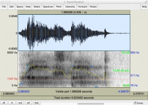
Rosebud

What you see above is a screenshot I have taken with the free software, Praat (click the link to download). Whit this little tool, one can not only record mono and stereo sounds, one can also load pre-recorded sounds in order to visualize a couple of the kinds of parameters that I’ve listed above. The sound I have chosen for this example is a word, and it’s probably one of the most enigmatic utterances in cinematic history: “Rosebud” from the movie Citizen Kane  (1941). The main character, Charles Foster Kane, utters this word with his last breath, and throughout the movie, audiences ponder not only the meaning of but also Kane’s relationship to the word. I don’t want to give away any spoilers because it’s such a great movie, but what I can reveal is that Kane is fond of what “Rosebud” refers to. Now, moving back to the image, what if there was a way to visualize vocal parameters in such a way as to draw relatively accurate inferences about the emotional quality of different types of utterances.

What we can visualize with Praat, first and foremost, is a waveform in the upper half, and the amplitudes here tell us something about the volume and the emphasis of the utterance. Where things become more interesting, however, is when we look at the lower half of the image. Here, we have access to visualization of certain sound-related parameters such as pitch (marked in blue) and intensity (marked in yellow). Applications like Praat are commonly used in the field of speech therapy.

Current research on sound visualization is trying to capture vocal expression on a quantitative as well as qualitative basis. Here is just one interesting paper on the topic in which the authors are “particularly interested in the paralingual (pich, rate, volume, quality, etc.), phonetic (sound content), and prosodic (rhythm, emphasis, and intonation) qualities of voice” (157): “Sonic Shapes: Visualizing Vocal Expression.”

And this is one of the projects that I’m going to work on this semester. Again, up until a week ago, those questions really hadn’t crossed my mind. But this is what it means to be a SIF fellow at Georgia State, I guess. Not only do you get to start working with a group of very smart people, you are also being confronted with new things, new questions, and new ways of seeing. And if all goes well, you eventually start looking for even newer and more exciting things yourself that you’re eager to share with others.

Speaking of sharing, I want to make it a habit of always ending a post with something worth checking out. So, if you haven’t seen Citizen Kane, yet, then by all means, do so!