Photo Credit~ Scatia Anderson
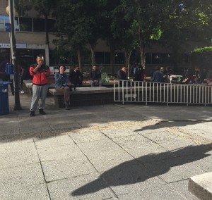
The design of the GSU quad discourages unity because it can divide different people by the different sections. For example: The ‘smokers” area. Due to the many risks and advertising of the no smoking movement in the U.S. many young people (ages 16-24) don’t smoke cigarettes. The ones that do have there own section in the quad. They post up or sit down by the the entrance of sparks hall which is located right of the entrance of Kell Hall. When you walk past you immediately get hit in the face with cigarette smoke. The smell is so intoxicating that I don’t even sit in the quad.

Photo Credit~Neil Brown
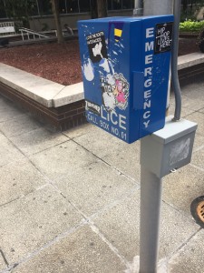
Another design of the GSU quad that discourages unity, the picture of the emergency call box on Neil’s blog. You have all these stickers covering up the emergency call box. A sticker is covering up the word police. That doesn’t show unity. Can you imagine if something was going down at the quad at night. Students wouldn’t t be able to identify where it is. The stickers shows that the students don’t care about the safety if there covering up what it is suppose to be very important. Especially since this campus is in the heart of downtown.
