All posts by Scatia Anderson

Final Project Reflection

I loved working with my group. Everybody had wonderful ideas and we in cooperated every idea in our website. We first stared out by establishing our audience. Who we really were showcasing our website to. After weeks of editing and composing we came to the conclusion that our audience will be students/millenniums.

Being behind a website takes a lot of work. Creating this website has helped me in the “technical area”. I feel like I have evolved a little in technology. We learned the different affordances and constraints of the different themes. Although Divi had many affordances on the back end we couldn’t see some of the settings on the front end.  So we decided to go to the Gridster-Lite because we could see the changes on the back end and the front. Through the editing (global and local changes to the blogs ) and composing was a real learning experience. I felt like i was a teacher. While I was editing, I was looking for thick description and multi-modality.

I have always loved this idea. It has also taught me how a scholarly blog should look like.I feel like the linguistic text through blog sites is really bringing something new to today’s age.

I would highly recommend the work for future editors. You get change to work with different people and hear their different opinions, you also get a chance to view others work and possibly make suggestions. I’m so glad I got this opportunity!!!
Legacies and Revolutions: Final Project Log

11/2/16-

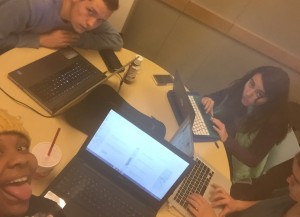
  • My group and I came up with the purpose of this blog which is as follows.
  • Purpose- In depth personal experiences at hot spots in Atlanta.
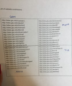
  • We split up the list of website contributors in fours.
Website Contributors for ENGL 1102 Classs
  • Came up with a theme. Our background is going to be a map.
  • We will also use Divi to design our website. 
  • Assigned Sam Wicker to the Group Log 

Time Spent: 1 hr 


11/4/16- Thoroughly read all my designated website authors. Found a couple of blog posts that I was interested in. 

Key Notes:

Time Spent: 1 hour and a half

11/6/16- Picked back off from where I left off.

Time Spent: 2 hours

11/9/16-

  • Changed our purpose-  To provide personal observations and reflections of built environments in Atlanta.
  • Established our Audience: Potential visitors to Atlanta or spaces in Atlanta new to visitors.
  • Came Up with a Thesis/message: i.e. The built environment of Atlanta connects people to a deep sense of history and people get to see Atlanta through the millenniums view. 
  • Reviewed the blogs we liked and didn’t like.
  • Came up with different categories for the blogs
  • Created a Google Doc and a new deadline: Wednesday November 6, 2016

11/16/16 –

  • Review Google Doc and look at Honor’s College blog posts.
  • Anna Rose sent email to the ENGL1102 students to see if they were interested.
  • http://sites.gsu.edu/ssharman1/2016/10/15/lantern-parade/
  • Underground Atlanta http://sites.gsu.edu/asnyder7/2016/09/22/pryor-street-sign/
  • Needs more description http://sites.gsu.edu/asnyder7/2016/09/27/dancing-bear-statue/
  • Needs more description http://sites.gsu.edu/asnyder7/2016/09/27/civil-war-era-lamp-post/
  • Needs Images http://sites.gsu.edu/nskinner2/2016/09/23/built-environment-description-1-historic-fourth-ward-park-history-and-design/
  • Interior of the Tabernacle add proper photo citations http://sites.gsu.edu/nbritton1/2016/09/25/artifact-1-art/
  • http://sites.gsu.edu/nbritton1/2016/09/25/artifact-2/
  • http://sites.gsu.edu/nbritton1/2016/09/25/artifact-3-exposed-walls/

Time Spent: 1 hr

11/17/16

  • Move photo and add citation http://sites.gsu.edu/hwhately1/2016/10/12/apex-museum-cultural-bed/
  • Add citation http://sites.gsu.edu/nbritton1/2016/10/16/147/
  • Added the Honor’s Blogs that I choose  to the Google Doc List.
  • I pitched the idea to categorize the blog post by via North, south, east, west or Midtown, Downtown, West side, east side, south
  • Highlighted the students from the google Doc who emailed Anna back.
  • Decided that we would start working on creating the website on Friday. November 17, 2016.
  • Emailed Prof.A on how to display the student’s work on the website

11/28/16-

  • Started editing the blogs that emailed us back.
  • Started working on the infrastructure of the website.

11/30/16

  • Continued to work on the infrastructure of the website.
  • Decided to change the theme to Gridster-Lite – Easier to use than Divi

12/1/16

  • Edited and added posts to the website.

12/2/16

  • Re-established our Audience to just students
  • Added content/ description for the different pages
  • Also added links and photos  under the pages for that certain category.
  • Added individual bios to the site of the creators


Quotes from “Possible Worlds: Henri Lefebvre and the Right to the City”

POSSIBLE WORLDS: HENRI LEFEBVRE AND THE RIGHT TO THE CITY.

“The first is easy for most: accept the inferno and become such a complete part of it that you no longer know it is there.” (para.1)

The meaning behind this quote is those people who dwell on certain things. The only way to help yourself is accept the situation and make the best out of it.

“For Lefebvre formal, legal rights are never God-given, nor are they natural rights that the framers of constitutions simply write down. Rather rights are always the outcome of political struggle.” (pg.146 para. 2)

This quote really stood out to me because I couldn’t agree more. The cost of reconciliation has to be the shed of a human sacrifice. In this case its political struggles. Meaning in order for things to get better or to have change someone or something has to give it a spark in the flame.

“The initiatives here are diverse, but in the main their goal is to argue that the right to the city should be seen as a human right, and that governments must honor that right and guarantee it for their citizens (Mayer, 2012).” (para.8)

I agree with this quote  But in my opinion I always feel like there will be some person or people who feels like the government is oppressing them and treating them unfairly. This issue will probably never be resolved.


Recognizing Campus Landscapes as Learning Spaces by Kathleen G Scholl and Gowri Betrabet Gulwadi


The new central campus of Cornell
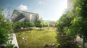
The new central campus of Cornell Tech University with a huge open space Source:Click Here

In the article, Scholl and Guwaldi focus on how American campuses are changing their landscapes to provide a more holistic learning environment to meet the needs of today’s college student.The article makes the claim that students who are enrolled at an open spaced campus tend to have a better learning experience compared to those in closed space campuses. Today’s universities are expected to look different compared to other places  and have better resources such as technology and more open spaces. The college experience is considered stressful and demanding and features such as a well -designed campus and connection of indoor and outdoor spaces influence student learning by refreshing functioning for attention drained students.

Scholl and Guwaldi go on to give a historical overview of traditional campuses,which we were located in rural areas and were secluded to ensure students were not distracted and devoted unlimited time to learning.In order to add quality to the campus environment and provide environmental benefits (such as limiting global warming),universities decided to integrate open spaces into green sections of the campus. In today’s age,college students get distracted and turn to their cellular devices,this allows them to text and be on Snapchat, Twitter, Facebook or other social media sites.However, the authors believe being outside helps them interact better with people,and focus more on their surroundings.

Scholl and Guwaldi believe that nature integration improves the attention span of students,study breaks taken within natural like settings help restore attention, and prepare the the student for the upcoming class.This in turn not only provides academic benefits but gives students a sense of community.Traditional campus indoor spaces provide the structured learning experience, however in order to create a dynamic learning environment,strengthen direct attention of students and encourage social interaction, a natural outdoor setting must be included in infrastructure as well.

Source: Recognizing Campus Landscapes as Learning Spaces Article

Annotation of “The Innovation Campus: Building Better Ideas” by Alexandra Lange


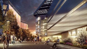
Rendering of the Bloomberg Center and the Tech Walk at Cornell Tech.
Rendering of the Bloomberg Center and the Tech Walk at Cornell Tech. Source:Click on the photo

The title of this article “Innovation Campus: Building better ideas” is the main idea of this article. She’s saying that the architecture of one’s building helps individuals create better.    

The author uses ethos to persuade her audience. Alexandra Lange is an architecture critic for Curbed. Her work has been in The Architect’s Newspaper, Design Observer, Metropolis, New York Magazine, and The New York Times. Architects/Designers and Universities may really consider her opinion of the new design for their campuses. Source: http://www.alexandralange.net/

 “In many of the new buildings, an industrial look prevails, along with an end to privacy.” Privacy is being free from being observed or disturbed by other people. I personally would hate not to have my own space where I can sit and concentrate.

“Though studies have shown that proximity and conversation can produce creative ideas, there’s little research on the designs needed to facilitate the process.” I agree with this part of the article. I believe having a face-to-face conversation is more effective. Having a one- on- one with someone encourages social interaction.

“There’s also much more to do with your hands than take notes in class:” This quote appeals to the hands-on learner. What if you’re not a hands-on type of learner? What if you prefer visual learning instead?

“Instead, there will be options so that people can choose how they like to work, from open-plan spaces by the windows, to a roof deck with a garden, to huddle rooms for groups of five or less.” This idea supports the thesis in the article, “Recognizing Campus Landscapes as Learning Spaces” by Scholl and Gulwadi.

“The experience will cost. A double goes for $6,830 for the academic year, a three person loft for $9,135.” The article states it so casually like that’s not a lot of money. That is insane! They really go too much in detail on how much tuition cost. I’m pretty sure it’s going to be extremely expensive. I feel like this colleges that will be built appeals to rich Ivy League kids.

“One thing about the building is it has no formal classrooms, and no faculty or staff offices,” If there are no offices, where would faculty and staff go when they have to put in grades or possibly need to talk to student privately?

“It is important to have a critical mass of women involved”… he said.’ I believe that men and women should be equal in all majors of higher education. There shouldn’t be a division between the sexes.

Source: Click here for the article

The design of the GSU “quad” discourages unity

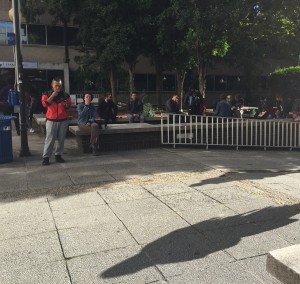
Smoker's Area in the Quad~ Close to entrance of Sparks Hall across from Classroom South Photo Credit~ Scatia Anderson
Smoker’s Area in the Quad~ Close to entrance of Sparks Hall across from Classroom South
Photo Credit~ Scatia Anderson

The design of the GSU quad discourages unity because it can divide different people  by the different sections. For example: The ‘smokers” area. Due to the many risks and advertising of the no smoking movement in the U.S. many young people (ages 16-24) don’t smoke cigarettes. The ones that do have there own section in the quad. They post up or sit down by the the entrance of sparks hall which is located right of the entrance of Kell Hall. When you walk past you immediately get hit in the face with cigarette smoke. The smell is so intoxicating that I don’t even sit in the quad.

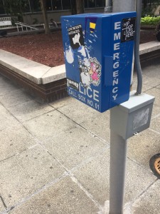
GSU Emergency Call Photo Credit~Neil Brown
GSU Emergency Call
Photo Credit~Neil Brown

Another design of the GSU quad that discourages unity, the picture of the emergency call box on Neil’s blog. You have all these stickers covering up the emergency call box.  A sticker is covering up the word police. That doesn’t show unity.  Can you imagine if something was going down at the quad at night. Students wouldn’t t be able to identify where it is. The stickers shows that the students don’t care about the safety if there covering up what it is suppose to be very important. Especially since this campus is in the heart of downtown.

Focused Built Environment: The Georgia Aquarium

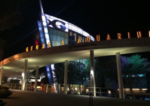
Photo Credit~ Scatia Anderson
Side View of Georgia Aquarium Photo Credit~ Scatia Anderson

On a very windy Saturday night I was walking to the Georgia Aquarium from the Southeast end of Baker Street. As I was approaching my site I could already see the illuminating lights of the building. The Georgia Aquarium is located on 225 Baker St NW, Atlanta, GA 30313.  The first thing that caught my eye of course were the lights from the building. The lights highlighted this giant blue G. Its structure was in the shape of a fish. The giant G is surrounded by this lighted transparent blue glass structure. On the side going past the giant G, the building has sharp pointed tip at the top. It looks like the mouth of a sword fish. I observed the big orange letters that spelled the Georgia Aquarium. They were sitting on top of a light grey oval- shaped structure. Located on the legs of the oval structure were light posts. Sitting on the light grey concrete were many dark grey concrete circle shaped plant pots that were holding this different plants. I also noticed that the Aquarium was being gated by rails that went around the entire building.

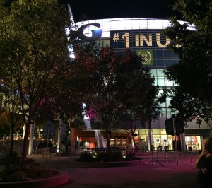
Front View of Georgia Aquarium Photo Credit~ Scatia Anderson
Front View of Georgia Aquarium Entrance 
Photo Credit~ Scatia Anderson

As I walked around to the front entrance of the Georgia Aquarium I noticed all these beautiful trees. They were placed into different sections of the open- spaced entrance. The trees were surrounded by a concrete curb to hold the plants in the place.  I also noticed that there was a directory for people who needed to buy tickets and who had already purchased the tickets. The lines were sectioned off by these retractable line dividers. If you look to the bottom right of the image you can see a caucasian lady smoking a cigarette.You can still the still see the emblem of the Georgia Aquarium, the giant G. The trees were blocking most of the transparent glass building. The banner on the right of the building was appealing to the aquarium’s ethos. The banner says “#1 in US”. I researched it and they stand corrected. The Georgia Aquarium is the biggest and the best aquarium in the United States.