Reading Summary #6

lead_large

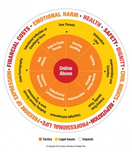
In the article, Better Online Living through Content Moderation, Melissa King argues that the use of content control features benefit users by lessening the chance of negative responses to harmful or insulting content that may be seen online. Some examples of these controls are content/trigger warnings, block and ignore functions, blocklists, and privacy options (King, lines 1-2). The reason for these privacy precautions is to stop users from seeing content that may trigger PTSD, an anxiety attack, or other negative feelings. King describes these as valid reasons and goes on to state that, “In fact, there is no such thing as an invalid reason: nobody should be required to read or listen to content if they do not want to” (King, lines 7-9).

Although content controls are a positive feature, there are some people that disagree. King allows readers to see these controls from the negative perspective, but provides a valid argument against opinions like these. Those who are against content controls often perceive users that utilize them as weak or over sensitive (King, lines 10-11). Situations in which users are being attacked or bothered by online aggressors are thought of as the victim’s problem instead of the antagonist’s doing. Others think these users should just toughen up and be less sensitive, which goes hand in hand with the Exposure Theory. This theory is designed to put a stop to anxiety by slowly exposing the subject to the source (King, lines 27-28). However, this theory does not come in handy when it comes to content controls. The Exposure Theory is all about controlled exposure; the Internet has no control over how often users are attacked or disturbed by the content on their screens.

Print

Another argument often made against content controls is that online harassment is not ‘real’ harassment and there is no actual threat (King, lines 44-45). Many think that pestering cannot cause PTSD. This disorder is usually associated with veterans, but King clarifies that, “…the fact is, threats of violence online can be a cause of PTSD in and of itself” (King, lines 48-49). King goes on to quote Caleb Lack, a clinical psychologist, who states that bullying has an impact on mental health and cyber bullying can have the same effect. Long time exposure to situations, such as online harassment, is threatening and can cause PTSD (King, lines 52-53). So, content controls play a large role in the prevention of these types of disorders.

Lastly, King touches on the subjects of blocklists and the frequency of online harassment being geared toward women. Blocklists are a more recent type of content control and were designed to try and eliminate users from being attacked by hate groups. Groups such as Gamergate use tactics to threaten users into silence (King, lines 80-81). From posting their personal information online to calling family members with threats, users need the protection of blocklists to eliminate this kind of distress. Women in ‘male-dominant’ professions are often targeted by hate groups and these sexist comments can lead to the development of PTSD (King, lines 93-96).

It is in instances such as these that content controls have no reason to be deprecated. It is in the victim’s best interest to utilize content controls to their advantage. King concludes that content controls are personally set and do not interfere with anyone else’s Internet freedom, other than the user that sets them. Telling people to ‘weather the storm’ when it comes to online abuse is ignorant and cannot be expected of everyone; users have the right to implement content controls and soften the blow of online attacks whenever need be (King, lines 130-133).

Work Cited

Melissa King. “Better Online Living through Content Moderation.” Magazine. Model View Culture, October 14, 2015. https://modelviewculture.com/pieces/better-online-living-through-content-moderation.

 

Reading Summary #5

colorwalk_2

The article, Color Walking, by Phia Bennin and Brendan McMullan focuses on an interesting experiment that illuminates the world of color and how people see it, or more so how they do not see it. Color is a part of our daily lives and if we are not careful, we can become numb to it. Teacher William Burroughs created color walking. Burroughs first introduced color walking to his student as a way to inspire them (Bennin and McMullan, lines 3-4). This simple activity has ended up inspiring the authors of this article and many others by opening their eyes to the world of color.

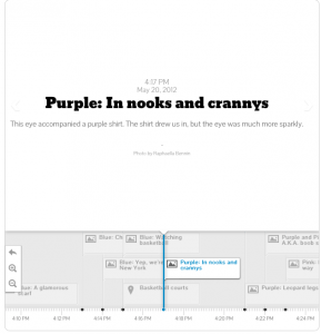
Color walking is simple: walk outside, pick a color, and follow that color by allowing your eyes to bounce from object to object (Bennin and McMullan, lines 5-7). On their advice on how to color walk, the authors note, “If you get lost, pick another color. If you get really lost, you’re on the right track” (Bennin and McMullan, line 22). In the article, readers follow the authors around the city of Manhattan as they feast their eyes upon the wonders of color: a blue scarf, blue at the basketball courts, a purple shirt, and hues of pink. The article provides photos and a timeline of their afternoon spent color walking (a screenshot of this is presented below). At the end of the experiment, the vividness and attention to color stayed in the minds of the authors, “We walked away seeing a world brimming over with colors” (Bennin and McMullan, lines 15-16).

Screen Shot 2016-03-09 at 9.41.34 PM

At the end of the article, advice is given on how readers can do their own color walk. Some things to avoid are stopping to run errands, or getting distracted with other things, such as a cell phone. Color walks are about focusing all attention on the world around you. When first choosing which color to follow, pick one that makes you excited. Maybe pick your favorite color, or maybe choose one that happens to catch your eye as you step outside (Bennin and McMullan, lines 19-21). Flexibility is also a major key to color walking; being able to change colors and not just limit your eyes to one. Color walks should be uninterrupted periods of time when all different colors in the built environment jump out at you; the authors call this “eye time”.

Overall, color walking is an experiment that everyone could learn a lot from. It is something that is not practiced by many, but it can benefit our minds and the way we see the world. Color is untouchable and sometimes it is just the way our eyes perceive certain things such as the color of a polar bear’s fur or the color of the sky. Although color is intangible, it affects our daily lives and can change the way we feel. Color walking is a reminder on how color is everywhere all the time. Like McMullan and Bennin say, taking just one hour dedicated to eye time opened their eyes to the world around them and after doing so the colors of their surroundings were imprinted in their brains.

Work Cited

McMullan, Phia Bennin / Brendan. “Color Walking.” Radiolab, June 29, 2012. http://www.radiolab.org/story/214709-color-walk/?utm_source=sharedUrl&utm_medium=metatag&utm_campaign=sharedUrl.


Reading Summary #4: “His and Hers: Designing for a Post-Gender Society”

women in suit

It has become apparent in recent years that the time upon us is one of gender transformation. Male and female roles are constantly being challenged, both culturally and scientifically. One of the groups who influences these changes are designers, which are who Suzanne Tick focuses on in her article: “His and Hers: Designing for a Post-Modern Society”. Designers are always up to date on the latest trends; it is their job after all. Instead of turning their heads to look the other way, some are helping to promote these changes (Tick, lines 4-6).

The fashion and design industry are predominantly shaped and run by men, however, as Tick puts it, “…recent events are pointing to a new wave of feminism” (line 13). A recent speech made by actress Emma Watson encouraged men to join to effort to promote gender equality. One of the places where these barriers are being shed is the workplace. With the whole globe attempting to be more “green” the designs in the workplace have swayed more towards a feminine taste in design. Tick gives examples such as more daylight, windows, softness in interiors, and an open floor plan (lines 20-22). It is changes such as these that are sparking designer’s attention to turn to their own work and make a change that caters to society.

Tick links the rapidly changes fashion industry to the confusion of gender roles in today’s world. She states that, “…androgyny has become commonplace,” androgyny meaning both masculine and feminine (Tick, line 29). With these changes occurring rapidly, designers have began to offer an alternative for those in the LGBT community. For example, masculine style has become more prominent in some lines of women’s clothing, like Alexander Wang. Some brands of makeup, such as Annemiek van der Beek, have designed makeup that is more desirable to the male customer. Designers cannot fail to embrace these changes when colleges and schools all over the nation are catering to them (Tick, lines 33-34).

Tick uses CEO of United Therapeutics, Martine Rothblatt, as a source of some great insight on the gender role changes. Rothblatt was originally born male; she transitioned in 1995. She defied social norms and became the highest paid female executive in the United States. Tick includes a quote in her article that really fit in with her message, “There are five billion people in the world and five billion unique sexual identities” (Rothblatt, The Apartheid of Sex). Tick goes on to write that some corporations have adopted these changes and have co-ed bathrooms to make all employees feel comfortable (lines 40-42). Creating reliable spaces where anybody can go to operate are an important step in the new movement going on around us.

In the world of fashion and design, vast changes are being made and it is a big step for our world today. In an industry that never stops developing to the latest trends, it is nice to see it evolving in a way that makes people from all walks of life feel welcome. Hopefully the action that has been made in the fashion world will trickle down to the rest of society and open people’s minds, and our culture will become one in which everyone can have their own individuality (Tick, lines 57-58).

Work Cited

Tick, Suzanne. “His & Hers: Designing for a Post-Gender Society – Metropolis Magazine – March 2015.” Metropolis. Accessed February 23, 2016. http://www.metropolismag.com/March-2015/His-or-Hers-Designing-for-a-Post-Gender-Society/.


Reading Summary #3: “Making Bathrooms More ‘Accommodating'”

ADA-Unisex-Family-Assisted-Sign-RRE-810_White_on_BahamaBlue_300


Emily Bazelon’s article, “Making Bathrooms More Accommodating”, points out the hypocrisy of accommodating certain people while refusing to do so for others when it comes to public restrooms. Are “public” restrooms really public if certain people are not allowed in? Bazelon focuses in on the transgender population and how it is seen as a social norm violation to enter a bathroom based on the gender they identify with, not what they were born as.

The article starts off by introducing the audience to the fact that bathroom signage is a sexual divider that we see everyday. These signs let us know which door is appropriate to enter. Bazelon thinks that it is absurd for a woman to wait in line when the men’s room next door is empty. Since the early 19th century, men and women have had separate bathroom facilities. This has been a social norm for so long that in today’s world it seems taboo to have unisex restrooms. One concern that the public has, which Bazelon touches on briefly, is sexual assault. Voters in Houston, Texas recently rejected an equal rights ordinance. The ordinance addressed preventing discrimination in housing, employment, and public spaces, but the opposing side focused specifically in on bathrooms. Bazelon writes, “They created ‘‘No Men in Women’s Bathrooms’’ T-shirts and a TV ad with sinister images of a man threatening a girl in the stalls, successfully playing on voters’ fears” (Bazelon, lines 19-20). The issue of equality in public restrooms only gets messier when it comes to the transgender population.

Bazelon’s article touches on several different issues dealing with the accommodation of public restrooms but her main focus is the right transgender people should have to enter the bathroom they feel most comfortable in. First off, the word accommodate means to be mindful of the needs of others and adjust to them. Or in harsher terms, accommodation can sometimes feel like stepping aside to make room for others, whether you like it or not (Bazelon, lines 47-48). People have trouble accommodating to a certain group’s needs, especially when they see it as outside of social norms. Bazelon elaborates by using several transgender rights issues that have come up in the school system. A transgender student at a high school in Illinois requested access to the women’s locker room; she is undergoing hormone treatment and has an ID that states she is female. The school rejected her request due to privacy issues and suggested she use a separate room down the hall. After the student’s family filed a civil rights complaint, the United States Department of Education stepped in and she was granted permission to use the women’s locker room with her female classmates (Bazelon, lines 28-40). Much like this girl’s want to fit in and share facilities with the gender to which she associates herself, women all over the world have become fond of “the ladies room”.

Women, and men alike, treat the bathroom as a sort of safe haven. Where they can go to chat and get away from the outside world. Just like everyone else, transgender men and women want to be a part of these social habits. Accommodate is a good word to use when it comes to public facilities, but it only covers the basics. For those with disabilities it means a bar next to the toilet, a button to open the door, or brail on the restroom sign (Bazelon, lines 119-121). But, when it comes to those that are transgender, the word “accommodate” just does not cover it. The changes needed to make transgender individuals feel comfortable and accepted are going to have to first start with a change in society’s mindset and heart. Overall, Bazelon presents thoughtful information that sparks the thought in reader’s minds that public restrooms really do not accommodate everyone, which is a concept overlooked by most, and it needs to change.

Work Cited


Bazelon, Emily. “Making Bathrooms More ‘Accommodating’ – The New York Times.” The New York Times Magazine, November 17, 2015. http://www.nytimes.com/2015/11/22/magazine/making-bathrooms-more-accommodating.html?_r=2.


Reading Summary #2: Tapestry of Space: Domestic Architecture and Underground Communities in Margaret Morton’s Photography of a Forgotten New York

Reading Summary #2

      Nersessova’s interpretations of Margret Morton’s photography depict one’s relationship to their home, and how essential it is for one’s survival and identity. Shelter is a key factor of life, and none are permanent, making it a very vulnerable space. Does your home reflect who you are as a person? Or is it just a place to lay your head after a long day? After reading this article, the universal answer to these questions seems unattainable because the term “home” is based upon one’s perception. The term homeless was quickly analyzed and disregarded in this article and substituted with “displaced”. Homelessness is not the condition of not having a home, because many displaced citizens call the comfy street corner their living room.

Along Margret’s travels, she stumbles upon a tunnel with only two entrances, pitch dark, and at first glance would be a “normal person’s” worst nightmare. However, a home is merely based upon one’s perception. Margret meets and photographs a man named Bernard. Bernard feels differently about the tunnels, “There’s a certain level of consciousness required of a man. And one can’t perfect that in functional society. You have to basically be separated and apart from it. And I guess that’s why I’m going through what I’m going through. I’ve been put into a hell of an environment to try to perfect this. But by the same token, it’s a perfect environment. It’s all about one’s focus and one’s will to be. And everything is challenging” (Morton 7). One man’s trash is another man’s treasure, and these dark and ominous caves allow Bernard the perfect conditions to reach the level of consciousness he craves and deems necessary. The functioning world does not allow a working man the time to stop and fathom the space that which these displaced men call home. We continue our stressful and endless endeavors in today’s ever competitive markets and look right past the continuous destruction and restrictions being placed upon the urban space. Mortan believes that homelessness could also be personal decision, refuge from a life they don not want a part of, freedom from the chains of a functioning world with no time for one’s self. In Contrary, there was another homeless man named Bob who also calls the tunnels his home. He feels safe in the caves, because the people who would be of harm to Bob ironically are afraid to enter the seemingly endless pit to nowhere. Bob states that it is a good place to find yourself, but also states that you can get lost and before you know it lose complete connection with society.

This article draws a fine line between the less fortunate and fortunate, not necessarily in a negative way but in a completely different way of thinking. The less fortunate grasp an understanding that “space adjusts and, at times, controls our reality, and in giving in to space psychologically, inhabitants can generate ideal environments” (Morton). These environments may seem horrid to a girl from the suburbs, but never facing this sort of controversy she cannot fully fathom the circumstances and just goes back to her own, functional way of living. Homeless people make do with what they have, and are in some cases simply trying to find peace in a very loud and demanding world.

51JTXDE1AZL


Works Cited

NERSESSOVA, IRINA. “Tapestry Of Space: Domestic Architecture And Underground Communities In Margaret Morton’s           Photography Of A Forgotten New York.” Disclosure 23 (2014): 26. Advanced Placement Source. Web. 24 Jan. 2016.

Reading Summary #1: Architectural Exclusion: Discrimination and Segregation Through Physical Design of the Built Environment

     Reading Summary #1

      The article Schindler writes about architectural exclusion analyzes how architecture can be overlooked as a means of discrimination and segregation and the ways in which this occurs in cities all across America. Schindler breaks down her article into five sections. The piece covers everything from how the built environment shapes human behavior, how architectural exclusion occurs, and how easily it is thrown aside by the population and even lawmakers.

The infrastructure of a city goes deeper than just the way it looks. In many urban areas a specific design is put in place to keep out people from certain walks of life. There are several examples of this. One actually takes place in the city of Atlanta. MARTA is the main form of public transportation throughout the city. However, the tracks of MARTA do not expand past certain areas outside the perimeter. There is a reason for this. The wealthier areas in the suburbs do not want MARTA to extend too far past the city, with the worry that the homeless or people of lower class will have a means to travel outside the urban walls (Schindler 1938). There are countless other examples of architectural exclusion such as bridges being just low enough so a public transportation bus cannot drive under or walls built between a poor area and a newly developed one. Schindler points out that these infrastructure decisions shape more than just the area; they shape our behavior (Schindler 1940).

Schindler suggests that some spaces have racial meaning (1950). This idea seems a bit illogical at first, but when though out the author makes an important point. The fact that a certain part of town is walled off because of social class gives law enforcement the idea that certain people do long belong on the wealthy side of that wall. Some spaces do not have safe pedestrian access for a reason (Schindler 1955). Those areas with no crosswalks or sidewalks are strategically placed. Often times, people hardly give thought to such aspects of a space, which leads to another one of Schindler’s main points: how architectural exclusion is so overlooked by lawmakers.

Architecture is not thought of as a way to separate social classes in a space. That is precisely why lawmakers do not often enforce disputes dealing with architectural exclusion. Even if these issues were recognized, the current law system is not equipped to address the damage the exclusion can do (Schindler 1934). An example that Schindler uses is racial zoning. In the early 1900’s racial zoning began by the cities passing ordinances keeping certain races, often those of color, from moving into predominantly white areas (Schindler 1975). These regulations can technically hold up in court, despite the obvious reason behind them. Thus, lawmakers often look past these types of rules, and there are no current laws to force them to deal with the issue.

Overall, Schindler’s article expresses how architecture can cause discrimination in the built environment. Architecture is used as a way to divide the community and keep out the “undesirables”. Schindler digs deeper to point out that architecture goes repeatedly unnoticed as a way to shape a space and alter the behavior of those who live in it. Architectural discrimination is all around us and although it may seem like just a bridge or a park bench, those structures often have ulterior motives that are too often overlooked.


Works Cited

SCHINDLER, SARAH. “Architectural Exclusion: Discrimination And Segregation Through Physical Design Of The Built Environment.” Yale Law Journal124.6 (2015): 1934-2024. Academic Search Complete. Web. 24 Jan. 2016.