
Here’s a video that showcases the basic structure of the website. The website is broken up into drop-down menus, a giant banner, and different sections. The main colors of the website are blue and white, which provide a calming effect. It appears minimalistic and is easy to navigate. No flashy colors, effects, or sounds.
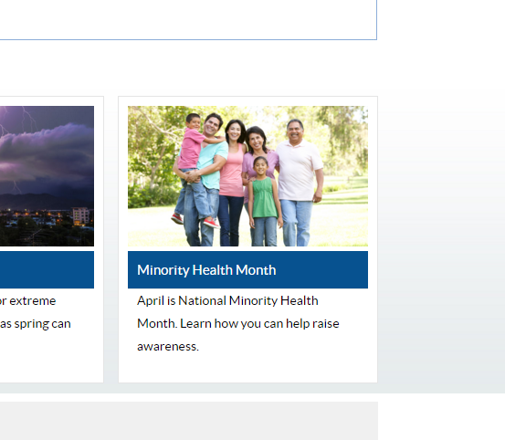 Here’s a picture of a family of non-whites outside, advertising National Minority Month. This gives me the impression that the CDC is interested in the health of minorities. To stretch it a little further, it seems to promote extended families as well.
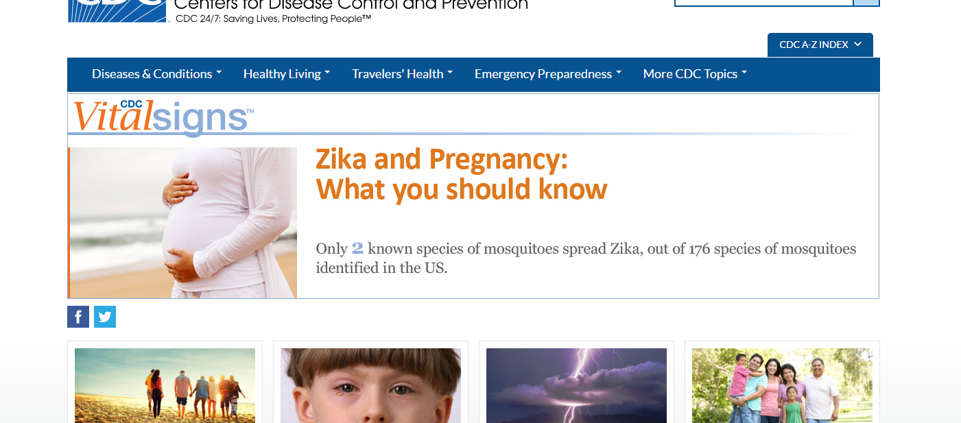 Here’s a picture of the main banner that is the center stage of the www.CDC.gov site. Easy to see and it features what I presume to be what the CDC believes is the most important. At the present moment that is the Zika virus and how it affects the unborn.
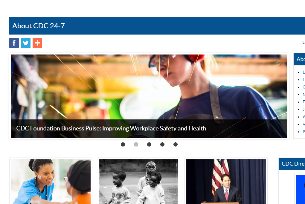
Here’s a picture of a white woman working on something while wearing protective goggles, earmuffs, and an apron with the caption “Improving Workplace Safety and Health”. This gives me the impression that the CDC is interested in appealing women from all different job occupations, even ones where they’re a very small minority.