The Built Environment and its Effects on Atlanta’s Traffic Congestion (Built Environment Analysis Final)

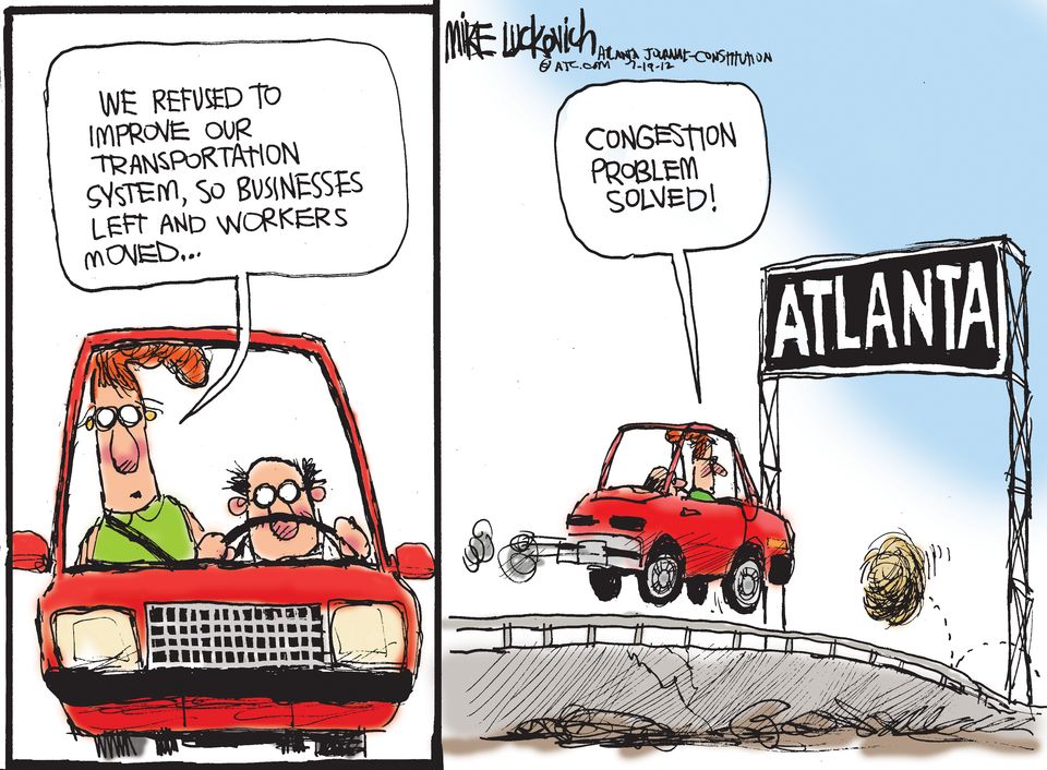
Atlanta, Georgia possesses higher amounts of traffic than cities like Boston, Massachusetts because the city’s built environment encourages it. City planners and policy makers must realize this and take steps towards changing what they can about the existing built environment to alleviate this problem as well as making sure their future designs account for the impact the built environment has on traffic; otherwise, the traffic in Atlanta will continue to disproportionately worsen as the population grows, bringing with it longer commutes and more pollution.
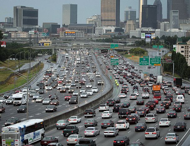
 

storm0622JG_01_FOCALYour typical day in Atlanta. source


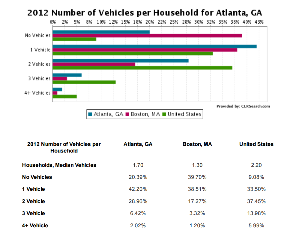
Before I describe what exactly it is about the built environment in Atlanta that encourages traffic, I’m going to present some facts about Atlanta in comparison to Boston. My goal with this comparison is to demonstrate that Atlanta indeed has a traffic problem and to provide some interesting differences between the two cities and raise some questions. In Atlanta the population density is about 3,360 people per square mile while Boston, Massachusetts has a population density of about 13,340 people per square mile. That’s a stark difference and under normal circumstances one would assume based on this information that Atlanta would have much less traffic congestion. Surprisingly, that is untrue. According to INRIX, a company interested in using technology and scientific analysis to improve traffic, the average number of hours wasted in traffic in Atlanta during 2015 was 59 versus 64 in Boston. Another interesting discrepancy between Atlanta and Boston is the number of people who own automobiles. In Atlanta 20.39% of the population owns no vehicle and 42.20% of the population owns one vehicle. On the other hand, 39.51% of Boston’s population owns no vehicle and 38.51% of the population owns one vehicle. Based on this data, there is a pretty sizable gap between the two cities as it pertains to owning a vehicle.


chart


The aforementioned information raises some interesting questions. Namely, why does Atlanta contain a disproportionately higher number of automobiles and similar traffic congestion levels despite having a much smaller population density compared to Boston? I believe there are multiple reasons and they all have to do with the built environments found in both cities. In no particular order, I’m specifically talking about the differences between the two built environments with respect to bike lanes, public transportation, walkability, and geographical size.

Regarding biking, public transit, and walking, Atlanta earned the respective scores 50, 44, and 46 out of 100 from the website walkscore. Comparatively, Boston earned the scores 70, 74, and 80. The algorithm behind the score is based on a number of factors. The score for biking considers the number of hills, length of bike lanes and their destinations, and number of commuters. The score for public transit considers how many options are available nearby, their type, and how many stops there are. Finally, the score for walking considers how long it takes for pedestrians to walk to amenities, intersection density, block length, and population density. According to the score chart for biking and public transit provided by walkscore, Atlanta is described as a place where “most errands require a car” and where there is  ”minimal bike infrastructure.” As for public transit, it is described as “good,” but just barely. If it had scored one point lower, then it would have been described as sparse.

With regards to geographic size, Atlanta is 134 square miles while Boston is 89.63 square miles. It’s also worth noting that most of Atlanta is land while half of Boston is water. And not only is Atlanta’s population density lower than Boston, its overall population is lower as well (447,841 versus 645,966). So when one combines all these facts together, one comes to realize that Atlanta is just a much more spread out city than Boston is. This combined with its relatively poor walkability, public transportation, and poor bike infrastructure make for a city that cries out for its citizens to buy and use a car. On the other hand, Boston is more condensed, has better walkability, public transportation, and bike infrastructure. Consequently, Boston is a city that doesn’t necessitate the use of automobiles, contributing to traffic. By just comparing Atlanta with Boston and applying logic one can come to the conclusion that in order to improve Atlanta’s traffic congestion, the city will need to change its built environment to better accommodate a no-car option. However, instead of relying on purely logic, in the next part of my paper I will try to provide some other evidence and examples of why this is.

It’s reasonable to assume that if a place possesses easily accessible bike lanes, then people will take advantage of them as a means to a destination instead of using a car. That’s precisely what a survey done by the Humphrey School of Public Affairs and the Department of Civil Engineering found. The school surveyed residents from three different neighbors in Minneapolis and discovered that 25 percent of them commuted by bike. However, the survey discovered something even more important: the respondents who lived closer to bike lanes were more likely to use a bike to commute. The take away from this is that if Atlanta were to increase the number of bike lanes, then more people would use bikes as opposed to using a car, reducing traffic. As I’ve established earlier with the score found on walkscore, compared to cities like Boston, Atlanta’s bike infrastructure is poor and it’s very likely to be one of the reasons why there is so much automobile usage and traffic in Atlanta.


tumblr_inline_nv5cjafYgl1qbg499_500


Again, even without evidence, it would be reasonable for a person to assume that the quality and abundance of public transit inside a city would affect car usage. That being said, the Texas A&M Transportation Institute creates a yearly report that describes the amount of traffic congestion there is in urban areas inside the United States. The report does this by recording the amount of hours people waste in traffic, the amount of fuel they burn, etc. The report also provides some strategies to combat traffic congestion. One of them being to improve public transportation, “Getting more productivity out of the existing road and public transportation systems is vital to reducing congestion and improving travel time reliability” (Texas A&M Transportation Institute, P 23). So it would seem that according to common sense and the Texas A&M Transportation Institute, Atlanta’s relatively high traffic condition is very likely caused in part by its mediocre public transportation.


Public-Transportation


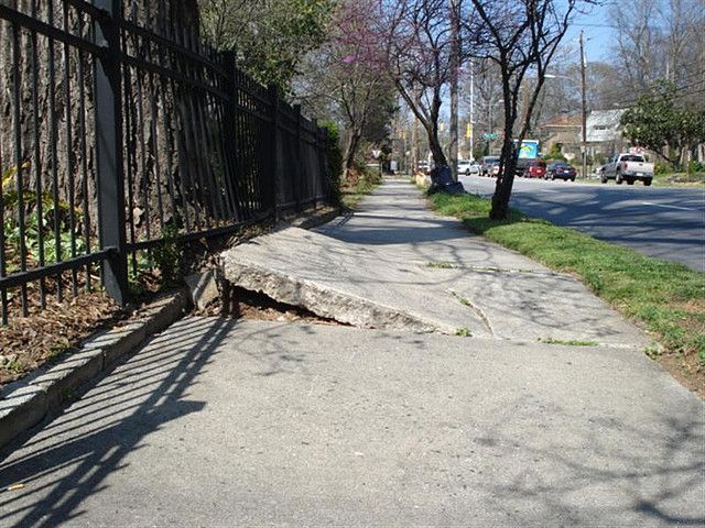
The walkability of a city seems to be something that’d affect whether or not one uses a car. After all, if a person could just walk to their destination without wasting money or time sitting in traffic, then why wouldn’t they? If you remembered, Atlanta received the unimpressive score of 46 out of 100 from www.walkscore.com. For Atlanta to improve its walkability, the city needs to become more “walkable”, according to this paper done by Western Riverside Council of Government titled Guide to Creating Walkable Communities. “A community is defined as “walkable” when a conscientious effort has been made by designers and planners to develop more pedestrian friendly streets, neighborhoods, and shopping areas in order to advocate walking instead of driving” (P 3). Unfortunately, it doesn’t appear as though Atlanta has followed this guideline. The sidewalks in Atlanta are crumbling, there are too many dangerous intersections, and everything is spread out so that walking is discouraged.


peds2

source


The built environment or to be more specific: the walkability, public transportation, and bike infrastructure of a city will affect whether or not people will use cars. And the more cars that are used the worse the traffic congestion will be. According to the data and expert opinion presented in this paper, traffic congestion is improved once these three aspects of the built environment are improved.  As I’ve pointed out previously, Atlanta is mediocre to poor in all of these aspects compared to cities like Boston. If the built environment isn’t taken into account when designing future portions of Atlanta—or if these three venues are not improved, then Atlanta will continue to be disproportionately worse off in traffic than many other cities. Some important questions to take away from this paper are why did the architects of Atlanta design the city in this way? And why is more not being done to improve it? The former may have been due to pure ignorance, although I doubt it; however, there is no excuse for the latter. I can’t help but think that there may be some sort of ulterior motive.


“Guide to Creating Walkable Communities.” (2012): 3. 9 May 2012. Web. 28 Apr. 2016. <http://www.wrcog.cog.ca.us/uploads/media_items/guide-to-walkable-communities.original.pdf>.

Atlanta City, Georgia. N.p.: US Census Bureau, n.d. QuickFacts. Web. 28 Apr. 2016. <http://www.census.gov/quickfacts/table/PST045215/1304000>.

Boston City, Massachusetts. N.p.: US Census Bureau, n.d. QuickFacts. Web. 28 Apr. 2016. <http://www.census.gov/quickfacts/table/PST045215/2507000>.

“INRIX 2015 Traffic Scorecard.” INRIX. INRIX, 2015. Web. 28 Apr. 2016. <http://inrix.com/scorecard/>.

“Atlanta, GA Number of Vehicles Per Household.” CLRSearch. CLRChoice, 2012. Web. 28 Apr. 2016. <http://www.clrsearch.com/Atlanta-Demographics/GA/Number-of-Vehicles-per-Household?compare=Boston%2C%2BMA>.

“Get Your Walk Score.” Walk Score. Walk Score, 2016. Web. 28 Apr. 2016. <http://www.walkscore.com/>.

“Boston, Massachusetts.” New World Encyclopedia. MediaWiki, 2013. Web. 28 Apr. 2016. <http://www.newworldencyclopedia.org/entry/Boston,_Massachusetts>.http://www.snagout.com/atlanta

Concluding Thoughts. 23. Texas A&M Transportation Institute. Texas A&M Transportation Institute, Aug. 2015. Web. 28 Apr. 2016. <http://d2dtl5nnlpfr0r.cloudfront.net/tti.tamu.edu/documents/mobility-scorecard-2015.pdf>.

Very Rough Draft

Atlanta, Georgia possesses higher amounts of traffic than Boston, Massachusetts because the cities built environment encourages it. City planners and policy makers must realize this and take steps towards changing what they can about the existing built environment to alleviate this problem as well as making sure their future designs account for the impact the built environment has on traffic; otherwise, the traffic in Atlanta will continue to disproportionately worsen as the population grows, bringing with it longer commutes and more pollution.

Before I describe what exactly it is about the built environment in Atlanta that encourages traffic, I’m going to present some facts about Atlanta in comparison to Boston. My goal with this comparison is to demonstrate that Atlanta indeed has a traffic problem and to provide some interesting differences between the two cities and raise some questions. In Atlanta the population density is about 3,360 people per square mile while Boston, Massachusetts has a population density of about 13,340 people per square mile. That’s a stark difference and under normal circumstances one would assume based on this information that Atlanta would have much less traffic congestion. Surprisingly, that is untrue. According to <insert>, the number of hours wasted in traffic in Atlanta during 2015 was 59 versus 64 in Boston. Another interesting discrepancy between Atlanta and Boston is the number of people who own automobiles. In Atlanta 20.39% of the population owns no vehicle and 42.20% of the population owns one vehicle. On the other hand, 39.51% of Boston’s population owns no vehicle and 38.51% of the population owns one vehicle. Based on this data, there is a pretty sizeable gap between the two cities as it pertains to owning a vehicle.

The aforementioned information raises some interesting questions. Namely, why does Atlanta contain a disproportionately higher number of automobiles and similar traffic congestion levels despite having a much smaller population density compared to Boston? I believe there are multiple reasons and they all have to do with the built environments found in both cities. In no particular order, I’m specifically talking about the differences between the two built environments with respect to bike lanes, public transportation, walkability, and urban sprawl.

Regarding biking, public transit, and walking, Atlanta earned the respective scores 50, 44, and 46 out of 100 from the website www.walkscore.com. Comparatively, Boston earned the scores 70, 74, and 80. The algorithm behind the score is based on a number of factors. The score for biking considers the number of hills, length of bike lanes and their destinations, and number of commuters. The score for public transit considers how many options are available nearby, their type, and how many stops there are. Finally, the score for walking considers how long it takes for pedestrians to walk to amenities, intersection density, block length, and population density. According to the score chart for biking and public transit provided by www.walkscore.com, Atlanta is described as a place where “most errands require a car” and where there is  ”minimal bike infrastructure.” As for public transit, it is described as “good,” but just barely. If it had scored one point lower, then it would have been described as sparse.

With regards to urban sprawl, Atlanta is 134 square miles while Boston is 89.63 square miles. It’s also worth noting that most of Atlanta is land while half of Boston is water. And not only is Atlanta’s population density lower than Boston, its overall population is lower as well. So when one combines all these facts together, one comes to realize that Atlanta is just a much more spread out city than Boston is. This combined with its relatively poor walkability, public transportation, and poor bike infrastructure make for a city that cries out for its citizens to buy and use a car. On the other hand, Boston is more condensed, has better walkability, public transportation, and bike infrastructure. Consequently, Boston is a city that doesn’t necessitate the use of automobiles, contributing to traffic. By just comparing Atlanta with Boston and applying logic one can come to the conclusion that in order to improve Atlanta’s traffic congestion, the city will need to change its built environment to better accommodate a no-car option. However, instead of relying on purely logic, in the next part of my paper I will try to provide some other evidence and examples of why this is.

It’s reasonable to assume that if a place possesses easily accessible bike lanes, then people will take advantage of them as a means to a destination instead of using a car. That’s precisely what a survey done by the Humphrey School of Public Affairs and the Department of Civil Engineering found. The school surveyed residents from three different neighbors in Minneapolis and discovered that 25 percent of them commuted by bike. However, the survey discovered something even more important: the respondents who lived closer to bike lanes were more likely to use a bike to commute. The take away from this is that if Atlanta were to increase the number of bike lanes, then more people would use bikes as opposed to using a car, reducing traffic. As I’ve established earlier with the score found on www.walkscore.com, compared to cities like Boston, Atlanta’s bike infrastructure is poor and it’s very likely to be one of the reasons why there is so much automobile usage and traffic in Atlanta.

Again, even without evidence, it would be reasonable for a person to assume that the quality and abundance of public transit inside a city would affect car usage. That being said, the Texas A&M Transportation Institute creates a yearly report that describes the amount of traffic congestion there is in urban areas inside the United States. The report does this by recording the amount of hours people waste in traffic, the amount of fuel they burn, etc. The report also provides some strategies to combat traffic congestion. One of them being to improve public transportation, “Getting more productivity out of the existing road and public transportation systems is vital to reducing congestion and improving travel time reliability.” So it would seem that according to common sense and the Texas A&M Transportation Institute, Atlanta’s relatively high traffic condition is very likely caused in part by its mediocre public transportation.

The walkability of a city seems to be something that’d affect whether or not one uses a car. After all, if a person could just walk to their destination without wasting money or time sitting in traffic, then why wouldn’t they? If you remembered, Atlanta received the unimpressive score of 46 out of 100 from www.walkscore.com. For Atlanta to improve its walkability, the city needs to become more “walkable”, according to this paper done by Western Riverside Council of Government titled Guide to Creating Walkable Communities. “A community is defined as “walkable” when a conscientious effort has been made by designers and planners to develop more pedestrian friendly streets, neighborhoods, and shopping areas in order to advocate walking instead of driving.” Unfortunately, it doesn’t appear as though Atlanta has followed this guideline. The sidewalks in Atlanta are crumbling,

The built environment or to be more specific: the walkability, public transportation, and bike infrastructure of a city will affect whether or not people will use cars. And the more cars that are used the worse the traffic congestion will be. According to the data and expert opinion presented in this paper, traffic congestion is improved once these three aspects of the built environment are improved.  As I’ve pointed out previously, Atlanta is mediocre to poor in all of these aspects compared to cities like Boston. If the built environment isn’t taken into account when designing future portions of Atlanta—or if these three venues are not improved, then Atlanta will continue to be disproportionately worse off in traffic than many other cities. Some important questions to take away from this paper are why did the architects of Atlanta design the city in this way? And why is more not being done to improve it? The former may have been due to pure ignorance, although I doubt it; however, there is no excuse for the latter. I can’t help but think that there may be some sort of ulterior motive.


“Guide to Creating Walkable Communities.” (2012): 3. 9 May 2012. Web. 28 Apr. 2016. <http://www.wrcog.cog.ca.us/uploads/media_items/guide-to-walkable-communities.original.pdf>.


http://www.census.gov/quickfacts/table/PST045215/1304000

http://www.census.gov/quickfacts/table/PST045215/2507000

http://inrix.com/scorecard/

http://www.clrsearch.com/Atlanta-Demographics/GA/Number-of-Vehicles-per-Household?compare=Boston%2C+MA

https://www.walkscore.com/

http://www.newworldencyclopedia.org/entry/Boston,_Massachusetts

http://www.snagout.com/atlanta

http://d2dtl5nnlpfr0r.cloudfront.net/tti.tamu.edu/documents/mobility-scorecard-2015.pdf


https://www.rand.org/pubs/research_briefs/RB9385.html

Downtown Connector (Exterior Built Environment Description)

The Downtown Connector (75/85) is an interstate that stretches seven miles from Langford Parkway interchange to Brookwood Interchange; and it was built in the late 40s or early 50s, according to the few sources I could find. It looks like a typical highway, but there are a few interesting things that I noticed. I observed and recorded the presence of some homeless people sleeping and apparently living underneath an overpass; they were tucked away in the upper corners, sleeping under blankets on slabs of concrete. Apparently, they’ve grown accustomed to sleeping underneath overpasses, despite the roar of cars rolling overhead, and the smell of gasoline and burnt rubber. I also observed and recorded lots of trash and even glass on the sidewalk underneath this particular overpass. The monochromatic grey color scheme of the concrete and metal coupled with the sight of dirt, lack of light, trash, and homeless people made this site very gloomy, unwelcoming, and imposing.

Under The Overpass (AVI video)

To clarify, I don’t mean to say I don’t like homeless people. I just feel sorry for them–and I realize that rests on the faulty pretense that they’re not happy. Regardless, things looked a little better once I stood side-by-side with the interstate, but not by much. But before I go into that, let me just say that it was a little difficult for me to reach the side of the interstate because of fences that in some cases had barbed wire. Luckily for me, I found a damaged part of a fence that allowed me to cross. The extra light did improve the atmosphere of the place, but it was overwritten by the sight of a two-directional seven-mile long slab of metal and concrete with cars racing down it towards home or work, conjuring in me ideas of monotony, boredom, and impersonality. To me it just looks like an ugly giant machine.

Next to The Downtown Connector (AVI video)

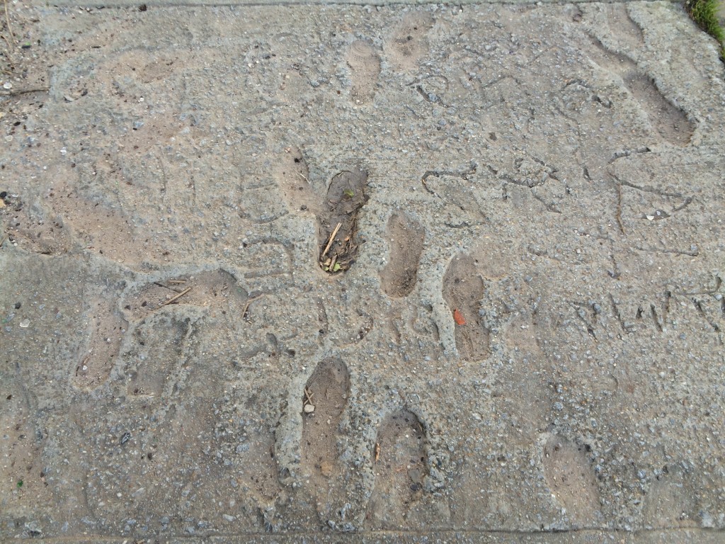
The only thing human about this site are the homeless, the graffiti, and the foot prints in the sidewalk. I see these people and artifacts wrestling with this machine. Despite the lifeless highway, there are some people who live underneath it. And despite the artificiality and durability of concrete, there are some who spray paint over it with human expression—or walk in it before it settles. I guess I’m not much of a city guy.

IMG_0374IMG_0394

Downtown Connector 75/85 Digital Records


Under The Overpass (video download)

Here is a 19-second AVI video of the underside of the Downtown Connector (75/85). Unsurprisingly, there is a lot of concrete and the overpass is wide. I saw a lot of trash on the sidewalk. And there were a few homeless people living in the upper corners of the underpass.

Next to The Downtown Connector (video download)

Here is a 34-second AVI video of the side of the Downtown Connector (75/85). It was noisy with the bustling of cars, and I would sometimes get a whiff of gasoline. The video also contains some graffiti, more trash, and a broken chain link fence that I  passed through. Don’t mind my babbling in the video. I thought my phone would be able to pick up my voice but I was wrong.


IMG_0372

(click to enlarge)

To get this picture of graffiti I had to climb up the slope of the overpass. It was taken at around 5:30 PM, so the sun was beginning to set, and its light accentuated the art. I’m not sure what it says but I think it looks neat. It serves as a nice contrast against the concrete.

IMG_0382

(click to enlarge)

This is another piece of graffiti I found near the overpass. It’s not as welcoming as the first piece, but I thought it was interesting that it was done on a fence. The person who drew it may have been making a statement against order, establishment, etc.

IMG_0394

(click to enlarge)

This is a picture of some foot prints and writing in the cement of a sidewalk near the Downtown Connector. I found this scene interesting for some same reason I found the aforementioned picture interesting. It can be seen as a statement against urban expansion, authority. Or it could have just been the mixture of  clumsy people not watching where they’re going and those who wanted a few of their words (or names) immortalized.

IMG_0378

(click to enlarge)

I took this picture to contrast all of the pictures I took of so-called insubordinate scenes. I found this sign near the footprints and as you can see it warns people that it is against the law to resell tickets (i.e. baseball) within 2,700 feet of Turner Field.

IMG_0386

(click to enlarge)

Here is a picture of some more graffiti on a street lamp near the Downtown Connector. There are also some stickers here that I don’t understand the meaning of. One of which is the head of man smoking a pipe, wearing a camo hat. Unlike the graffiti in my other pictures, I can actually read this one. It reads “mega”.