Interior BED: Depicting Downtown Atlanta’s McDonald’s
 On Friday at 12:20 PM until 1:20 PM, I sat and observed the interior design of the McDonald’s near Grady Hospital. This McDonald’s is located at 80 Butler St NE in downtown Atlanta, GA. At the start of the observation I noticed immediately the restaurant was an open space that seemed easy to navigate. The air smelled like an old mop. The restaurant has small rounded tables with three silver chairs surrounding it. The back of the seats had thick silver like bars.There was a black pole attached to the bottom of the seat that seems to keep the seats in place. This made the seats sit at least two feet high from the ground. The set of tables and chairs sat in the middle of the right side of the restaurant. Along side this sitting area was an area that contain what seemed like an island. This area also had silver seats that sat at least four feet high from the ground. The seats seemed as if they were made out of some time of metal. The seats didn’t feel as if they were made out of real metal. There were a set of booths located on the side of the round tables and behind the island like seats. The booths sit at what seems like a foot from the ground. They were tan with an orange square sticking out on the back of the seat. The square contained what looked like yellow spirals or swirls painted on it. The tables that sit in front of the seat were square and grey with small blue and red spots inside. The material of the booth seats seemed to be made out of some type of plastic that was hard and sturdy. There is a wall that separates the booths from other. The wall contained brown squares with tan lines that separated them. A number of the seats seemed to be located on the right side of the restaurant. There were six tables and twelve seats located on the left of the restaurant.
After observing the seating area, I noticed the design of the restaurant floor. The floor had had tan squares that looked like tiles. The brown squares contained black spots. The floor looks like this throughout the entire restaurant. There are small circles in the ceiling giving off some type of light. There seemed to be over 50 of these lights. There were three lamps with orange shades that hung from the ceiling. The sat directly about the customers’ tables. The lighting in the in the restaurant was dim and it gave off a depressing mood. The color of the walls were of neutral colors. The wall near the entrance was grey with small white lines that were kind of hard to see. The wall contained a pattern that looked checkerboard. The pictures on the wall were surrounded by a brown frame. There was a picture of black and orange circular objects. These objects looked like pebbles or rocks. There were also brown sticks that looked like branched from a tree. There was another grey wall with small circles the same as the wall. There weren’t any pictures on this wall. The proceeding wall was tan with a photo of silver and brown circular objects. It also contained some type of green plant,placed in a brown a brown woven basket.
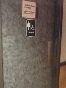
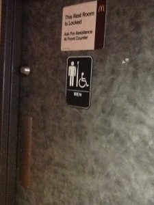
There posters about Georgia State University around the entire restaurant. There was some hanging from the ceiling, attached to the wall and the glass windows. There was also signs stating that Georgia State students, faculty, and staff would be able to receive a 10% discount. The restrooms were easy to find. There weren’t any that were unisex, but both restrooms were handicap accessible. The women’s restroom contained only 4 stalls and there were 3 sinks. The color scheme was different shades of brown. There was a sign on both restrooms that read “This bathroom is locked. Ask for assistance” , but the restrooms were not locked at the time of the investigation.
At 1:10 pm there were a total of 5 customers. There were 3 men and two women who look like they could possibly be in their late 20’s or early 30’s. One woman decided to dine in. At 1:13 PM 3 individuals who seemed to be around 15 or 16, walked in. The three men and woman were still waiting for their food at 1:17 PM. There were 3 different lines for the customers. There were signs that indicated that two of the lines were for the customers to place their orders and the other line was for you to wait for your food.


