DESCRIPTION: This topic of this meteorology event is Basic Meteorological Principles.
A TEAM OF UP TO: 2 APPROXIMATE TIME: 50 Minutes
EVENT PARAMETERS: Each student may bring one non-programmable calculator. Each team may bring
four 8.5” x 11” two-sided pages of notes containing information in any form from any source.
___________________________________________________________________________________________________________________________________
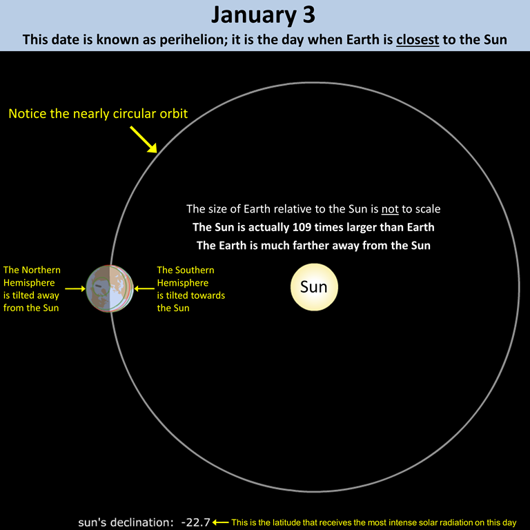
The images below show the position of the Earth relative to the Sun on two dates: January 3 and July 4. Since Earth’s orbit around the Sun is elliptical (yet nearly a perfect circle), Earth is closest to the Sun on January 3 and farthest from the Sun on July 4. The distance from the Earth to the Sun on January 3, which is known as perihelion, is 147,098,290 km. The distance from the Earth to the Sun on July 4, which is known as aphelion, is 152,098,232 km. therefore, there is only a 3.4% difference in Earth-Sun distance between perihelion and aphelion. Throw in the fact that aphelion occurs during the Northern Hemisphere summer and it becomes obvious that the changing distance from the Earth to the Sun is not the cause of seasons.
1. What hemisphere is tilted towards the Sun on June 21?
2. What hemisphere is tilted towards the Sun on December 21?
The graph below shows mean monthly temperatures at Aswan, Egypt. This town has the closest weather station to where the Tropic of Cancer intersects Lake_Nasser; it is only 70 km (43 mi) north of the Tropic of Cancer.
3. Is it the altitude of the Sun or the distance between the Earth and Sun that causes summer (June-August) temperatures to be 16°C (29°F) higher than winter (December-February) temperatures at Aswan, Egypt?
___________________________________________________________________________________________________________________________________
This section focuses on solar radiation at Miami, FL USA and Cleveland, OH USA. Click Miami&Cleveland to open the file in Google Earth. These two cities are at approximately the same longitude, but their latitudes are substantially different.
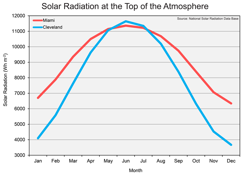
The figure below shows the typical solar radiation at the top of the atmosphere throughout the year at Miami and Cleveland. On the June Solstice (i.e., June 21), the noon altitude of the Sun is 88° at Miami’s latitude and is 72° at Cleveland’s latitude. The number of daylight hours is 13.8 hours at Miami’s latitude and 15.1 hours at Cleveland’s latitude.
4. What aspect of solar radiation causes Cleveland to have more solar radiation than Miami in June and July?
5. Cleveland is almost always warmer in June than in Decemer. Which statement best explains why?
a. the solar cycle causes the Sun to give off more heat energy in June and less heat energy in December, so the intensity of sunlight is greater in June
b. the shape of Earth’s orbital path around the Sun causes Earth to be closer to the Sun in June and farther away in December
c. the steady tilt of Earth’s axis causes the Northern Hemisphere to be oriented toward the Sun in June, so the surface of Earth (at the latitude of Cleveland) is a lot closer to the Sun in June than it is in December
d. the steady tilt of Earth’s axis causes the Northern Hemisphere to be oriented toward the Sun in June; as a result, the noon altitude of the Sun is maximized and Cleveland receives more energy from sunlight in June than it does in December
___________________________________________________________________________________________________________________________________
We live in the troposphere, and similar to the stratosphere, it is comprised of gases, particulates, and droplets. As can be seen in the comparison of the pie charts below, the major differences between the stratosphere and troposphere are the concentrations of ozone and water vapor: the stratosphere has much higher concentrations of ozone than does the troposphere, while the troposphere has much higher concentrations of water vapor than does the stratosphere.
6. What are the two most abundant gases in both the stratosphere and troposphere?
7. Is there more water vapor in the stratosphere or troposphere?
Run the animation below to see month-to-month changes in water vapor and focus on the area of highest water vapor concentration and how that area is distributed and moves across the globe during the course of the year.
8. Which region of Earth generally has the highest concentrations of water vapor?
9. How would you describe the movement of the area with the most water vapor over the course of a year?
Below is a simulation of the movement of various types of aerosols (i.e., particulates) from 17 August 2006 to 10 April 2007. The colors of the plumes correspond to the type of aerosols: red is mineral dust, green is aerosols from biomass burning, white is aerosols primarily from the burning of coal, and blue is sea salt. Without people on the planet, there would still be sea salt, wind-blown dust (e.g., Saharan dust), and some biomass burning (from lightning strikes). Unfortunately, human activities have greatly increased the amount of wind-blown dust and biomass-derived aerosols, and they have introduced aerosols from coal-burning (e.g., sulfate aerosols) into the atmosphere. The smallest particulates, and thus the ones most dangerous to human health, shown below are the green particulates (organic and black carbon) and white particulates (sulfates).
10. What is the general movement of aerosols in the middle latitudes?
a. east to west
b. west to east
c. south to north
d. north to south
11. Besides sea salt, what appears to be the dominant aerosol in the middle latitudes (e.g., 30° to 65°) of the Northern Hemisphere?
Now you are going to look at a Google™ Earth file that was created to show the changes in precipitation pH in different parts of the country from 1985 to 2012. Click on pH_1985-2014 to view this animation. Be sure to move the left-side tab on the time slider all the way to the right before starting the animation. If you do not, then the 2014 image will be the only that is shown.
12. What was the general trend from 1985 to 2014 in the size of the area with pH levels less than or equal to 4.5 (below which the environment is considered to be acidic)?
13. Across that entire time range, in what part of the country are the pH values the lowest?
a. the southwestern United States
b. the northwestern United States
c. the south-central United States
d. the eastern United States
14. Across that entire time range, in what part of the country are the pH values the highest?
a. the southeastern United States
b. the west coast of the United States
c. the midwestern United States
d. the northeastern United States
___________________________________________________________________________________________________________________________________
Click on the image below to see the weather maps for the two days with extreme pressure values.
15. What was Atlanta’s sea-level pressure (in mb) on 13 February 1981?
16. What type of pressure system was over Atlanta on 13 February 1981?
17. Which of the following was the relative humidity at Atlanta on 13 February 1981? The value is not on the map.
a. 5%
b. 41%
c. 75%
d. 90%
18. What was Atlanta’s sea-level pressure (in mb) on 28 March 1984?
19. What type of pressure system was over Atlanta on 28 March 1984?
20. Which of the following was the relative humidity at Atlanta on 28 March 1981? The value is not on the map.
a. 5%
b. 41%
c. 75%
d. 90%
21. Which of the following was Atlanta’s temperature at 7 A.M. on 30 March 1984? You have to forecast the temperature.
a. 12 °F
b. 40 °F
c. 62 °F
d. 81 °F
_______________________________________________________________________________________


