Agnes Scott College Website: Digital Built Environment Description
When logging onto the Agnes Scott College website, the first thing I notice is the photo header at the top of the home page. There is a total of six different pictures that alternate like a slide show. Each photo shows something different about Agnes Scott. The first photo is a picture of the Dalton Art Gallery and its showing|thinking exhibition. The second picture is about the 45th Annual Writing Festival. The third picture is about the story behind SUMMIT. The fourth picture is about the study abroad programs. The fifth picture is about Xinyao Li, a current student that was accepted in to the Math in Moscow program at the Independent University of Moscow. The last picture is Elizabeth Kiss, President of Agnes Scott, speaking on the importance of women’s education. Each picture has a button you can click on that links to a separate page with more information on each topic.
- Slide 1
- Slide 2
- Slide 3
- Screenshot of Slide 4; Photo credit: agnesscot.edu (click image to enlarge)
- Screenshot of Slide 5; Photo credit: agnesscott.edu (click image to enlarge)
- Screenshot of Slide 6; Photo credit: agnesscott.edu (click image to enlarge)
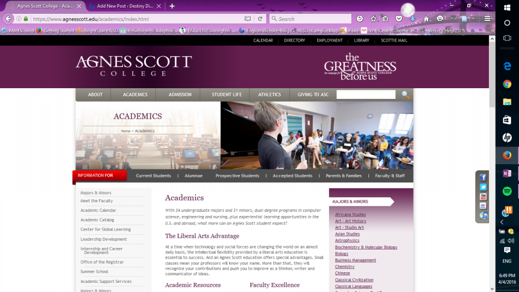
At the top of the home page, there is a menu with the tabs labeled “About”, “Academics”, “Admissions”, “Student Life”, “Athletics”, “Alumnae”, and “Giving”. When you click on the “Academics” tab, it takes you to the academics page. On the left side of the page there is a sidebar with a list of options that each link to separate pages. They provide information that students need about majors and minors, faculty, important dates, courses provided, support services, registration, and internships. On the right side, there is a list of the majors and minors Agnes Scott provides. Each item on the list links to a separate page, providing more information. Also, the title of the list, “Majors and Minors“, links to another page with the same list. As you scroll down the academics page there is information about academic resources, with subtitles linking to separate pages. There is also a “faculty excellence” section, along with “study abroad” and “internships” towards the bottom half of the page. The “study abroad” and “internships” sections have links to separate pages with more information. Below the main menu, there is a second menu above the “Academics” title. It has tabs labeled “Current Students”, “Alumnae”, “Prospective Students”, “Accepted Students”, “Parents & Families”, and “Faculty & Staff”. Each tab has a drop down menu with links to even more information specific to each category of people.
I notice that this page has the same color scheme as the home page. In fact, all of the other pages have to same color scheme. It is a combination of a somewhat dark purple and a grey, with white, purple, and grey words. The purple gives the site a feminine feel, which makes sense,because Agnes Scott is an all female college. The grey gives it a serious tone and, in my opinion, makes it look professional.
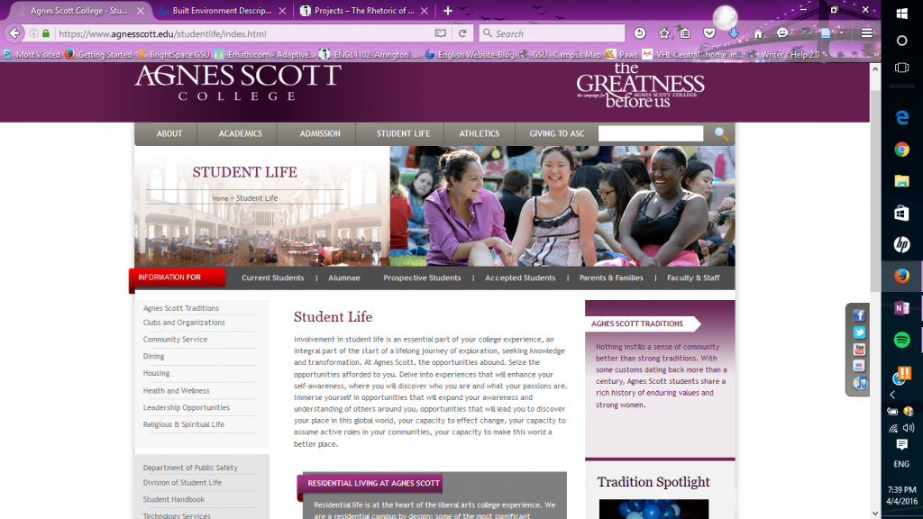
The main menu bar at the top of the page has a tab labeled “Student Life”. This takes you to the student life page. On this page there is information about student traditions, campus housing, dining, student organizations, community service and other resources provided for students. When you scroll down the page, there are three brief paragraphs labeled “community engagement“, “student support services“, and “leadership opportunities“, each linking to their own separate pages with more information on the topic. The second menu, as I mentioned earlier, remains right above the title of the page.
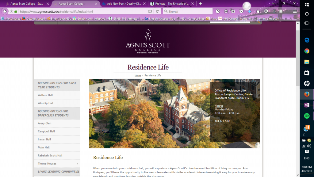
Going back to the menu on the left side of the student life page, there is an option labeled “housing”. When you click on this link, it takes you to the residence life page. On the left side of this page there is a list of options linking to separate pages. On this list there are two categories of housing, which is “first year students” and “upper class students”. According to the list, there are two residence halls for first year students and six for upperclassmen. Each residence hall on the list links to its own separate page with information about it. On the same sidebar, beneath the residence halls , there is a link to information about “living-learning communities” on campus. Under this, there is a list of links to more resources for students. At the bottom of the sidebar there is a link to FAQs and ways to connect with Agnes Scott College on social media, such as Facebook, Instagram, and Pinterest. In the upper middle of the page there is a brief overview of the housing on campus. Above this, there is a photo of some of the dorm buildings. On top of the photo, there is a text box with the location of the Residence Life Office, hours of operation, and its phone number. On this page, the second menu bar that I mentioned earlier is not visible.
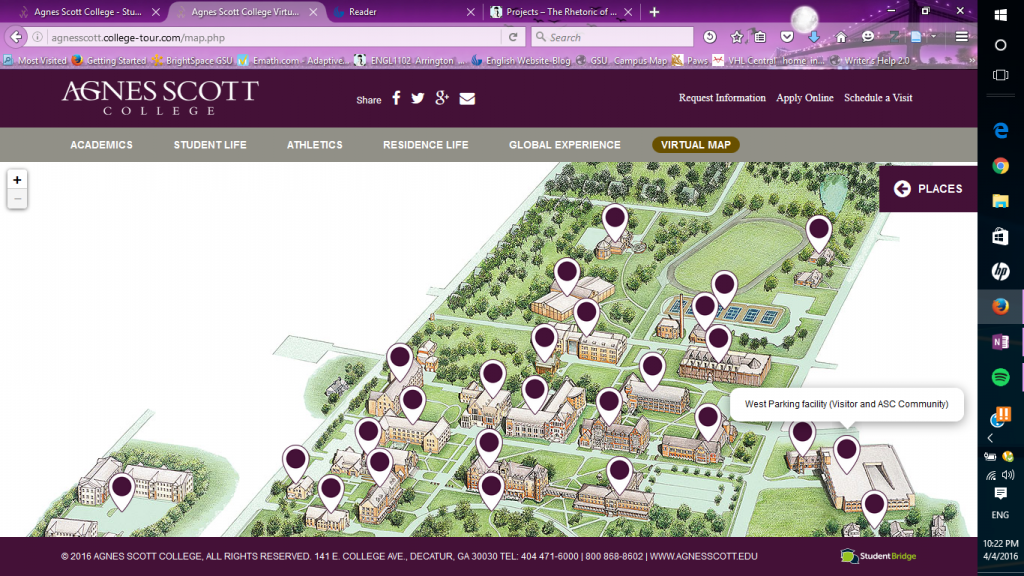
At the top of the home page on the main menu bar, there is a tab labeled “Admissions”. When you hover the mouse over this tab, there is a drop-down menu with a list of links. When you click on the link labeled “virtual tour”, it takes you to a page with another menu of options and locations to see on campus. In the lower right area of the menu there is an option labeled “virtual map”. This takes you to a virtual map of the entire Agnes Scott College campus. On the map, there are several purple dots, pinpointing various parts of the campus. When you click on a purple dot on the map, it causes a pop-up of a brief description of each location on the map and photo. Also in the upper right area of the map, there is a tab labeled “places”. When you click on the tab, a list of all of the place on the map. Clicking on each place on the list also brings up a brief description of that place along with a picture.
At the very bottom of every main page from the main menu bar, there are links to contact information. There are also links to information labeled “employment“, “maps & directions“, “event rentals“, “emergency information“,”accreditation & authorization“, “nondiscrimination“, and “privacy policy“. Underneath these links is copyright information, the address to the school and the phone number. Overall, in my opinion this site is very informative and useful to anyone that wants to know all about Agnes Scott College. I do not think there is any missing information!
The Rialto Center for the Arts
The Rialto Center for the Arts, located at 80 Forsyth St NW in Atlanta, and operated by Georgia State University, was first opened in 1916 and was originally a movie theater. In 1962, the building was torn down and rebuilt, staying open until 1989, when it was closed due to the economy. In 1994, the Rialto went under construction as was reopened in 1996 and is now run by Georgia State University.
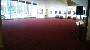
When I first walked into the lobby, the first thing that I noticed was the carpet (see below). It looked burgundy or red with curved lines that looked gold or yellow.
Based on the carpet, I assumed the rest of the lobby would be pretty elegant and nice looking.
I walked further into the lobby, towards the wall straight ahead of me sat in one of the chairs, observing the lobby. The main thing that heard was music playing. It sounded like jazz and it seemed like it was not near where I was. By looking around, I found out it was coming from a speaker on the other side of the lobby.
There was a lot of open space in the lobby on both sides. Most of the lighting was natural light from the windows. I did not see many people, maybe two. I figured it was not very busy around the time that I was there, which was 12 pm. I assumed the open space would be convenient for large crowds on the nights that there are shows.
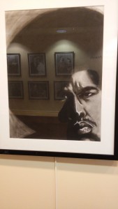
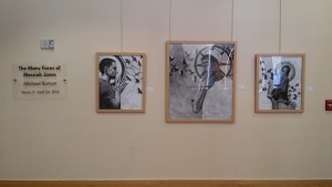
When I looked at the wall behind me I saw a collection of artwork called “The Many Faces of Messiah Jones” by Michael Roman. It was drawings in black and white. I assumed the black and white colors scheme was a theme throughout the collection. As I walked around the lobby, I noticed more drawings from the collections. There were even a few of them upstairs near the doors of the theater. These are some of the ones I saw on the first floor of the lobby:
- The name of the collection
- Here are more drawings on the other side of the lobby
Here are the drawings from the second floor:
Another thing that I saw on the first floor of the lobby was an area that looked like a history display for the Rialto. It was not visible when I first walked into the lobby. It was in the back of the lobby, hidden by the stairs leading up to the second floor. In this area, there were posters, pictures , and some artifacts. There were also a few chairs and a small table. I assumed it was for soemone to sit and look around at the walls of the area. One word that I kept seeing when I was looking at the display, was “Landmark”. It made me think that the atmosphere of the Rialto was supposed to kind of historical. The fact that I kept seeing this word made me feel like it was important. I also noticed that all of the people in the posters and pictures looked different. They seemed to be from different backgrounds and cultures. It very diverse, with not only race, but also gender. I thought that the display was interesting but it seemed like it was hidden because it was not visible to me when I first walked in.
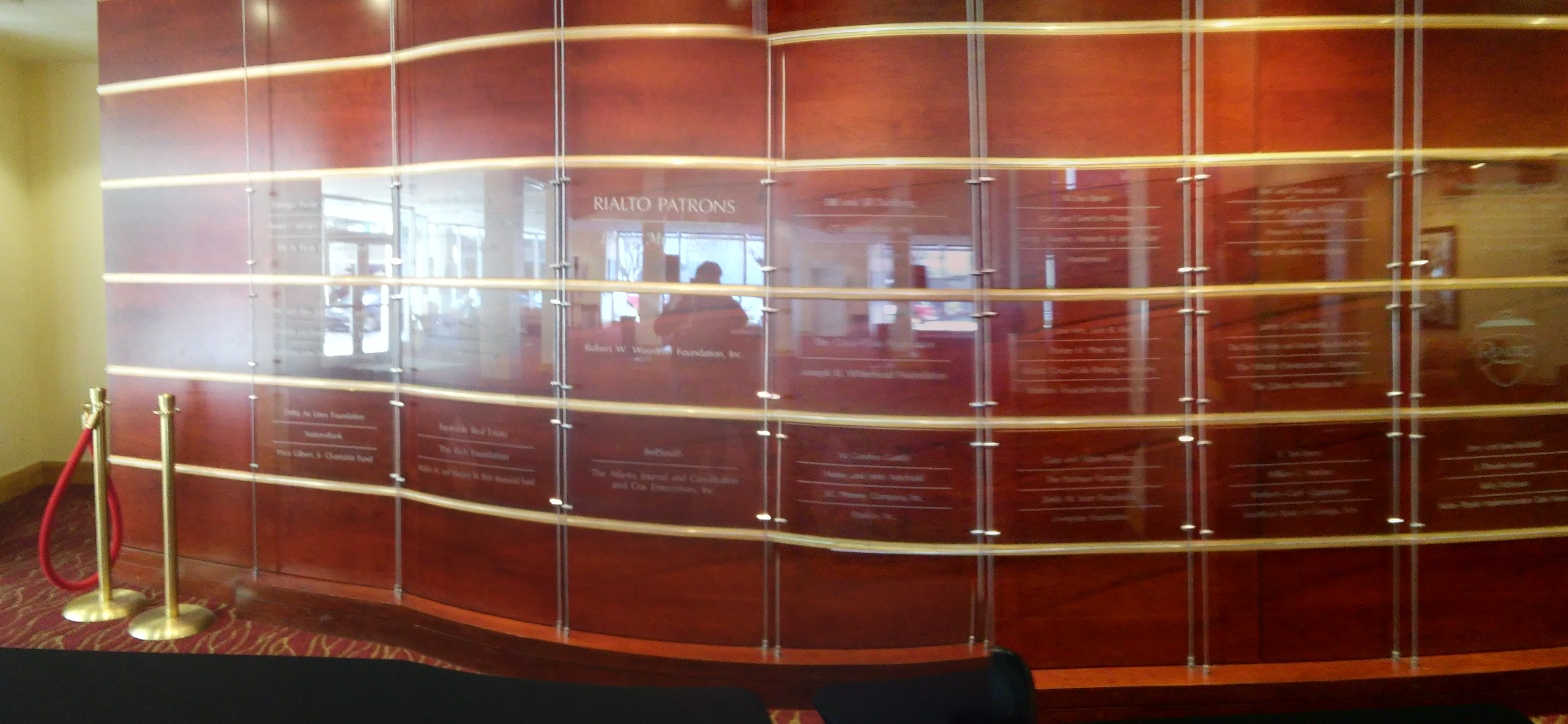
Near the front of the lobby on the right side, there was a curved wall, made out of wood, with glass panels on it. On the panels are the names of the Rialto Patrons. There were several names on the wall panels. Some of the names that were on a panel alone and some were shared with other names. I assumed that the names with their own panels donated the most to the Rialto. The wall was near the front of the lobby and visible as soon as I walked in. I assumed that the wall was important to the owners of the Rialto center and that they wanted to show appreciation to the patrons.

Woodruff Park: Built Environment Description
Woodruff Park, named after Robert W. Woodruff and located in the center of Downtown Atlanta, opened in 1973. It is a very well known place, used to host various events and everyday activities. In the park there is a playground, two fountains, an area to play chess and a pavilion. The interesting thing about the playground is that it is formed by the letters “ATL”, which looks pretty cool. It has a wooden look, various shades of brown, with a splash of color on the back and it fits well with the scenery around the park. Playground provides a safe place for kids to play. To ensure their safety, there is a sign near the playground that has rules for them to follow.
- Front
- Back
- Playground Rules Sign
The best thing about Woodruff Park is the scenery. What I believe contributes mostly to this is the two beautiful fountains. If you ever want to just sit back and enjoy the outdoors, the fountain is a good place to be. It is also great for taking photos, especially for tourists. There are tables and chairs nearby that allow people to sit and relax in the park. You can just close your eyes and listen to the sound of the water in the fountain or use the park as a calm and open place to get your work done, instead of staying inside.
Another feature of the park is the pavilion, where you will see people playing chess. When I was there observing the park, I noticed that area was the most crowded. It was full people and it was very loud and lively. After noticing this I realized that different areas of the park attract different types of people. Woodruff Park is a place for pretty much anyone of any age because it has many aspects that appeal to all types of people’s needs. I saw this for myself when I went there. In one area there was a family sitting together near the fountain and a kid at the playground. In another area, there was a guy jogging past the park and a guy doing what looked like a mix of aerobics and martial arts. People are also able to bring their pets to the park, as long as it is on a leash and they clean up after their pets. There was a sign in the park with this rule on it. Near the pavilion, there was a large group of older men talking and laughing.There are also homeless people in the park that hang out in that area. The pavilion seems to be the area that is crowded most of the time.
Overall, Woodruff Park is place for everyone and is a relaxing space. As long as the rules of the park are followed, everyone can enjoy themselves. With that being said,there is also a sign with the park rules and regulations. I have noticed that signs with rules on them is common artifact in the park.
While I was in the park, I decided to sit at one of the tables near the fountain. I felt really relaxed and peaceful. I sat there for about thirty minutes, observing that area, before I got up to walk around, and it felt like I was only there for five minutes. I was so relaxed that I lost track of time.I think I will go back to the park again another day.
All photos taken by: Destiny Dickens


