Agnes Scott vs Spelman: Do Their Websites Promote the Same Values?
Diversity
The home page of Agnes Scott and Spelman‘s websites are similar, but also different. They are similar because both have a slide show at the top, displaying current events or important event that happened at their school. The placement of these images on the home pages, implies that what these images portray is valued by each school. The difference between the two websites is the types of images displayed in each slide show on their home page. On the Agnes Scott slide show, each image with people in it is someone of a different race. This is an example of Agnes Scott’s promotion of diversity through their website.
- Screenshot of Slide 1 (New); Photo credit: agnesscott.edu (click image to enlarge)
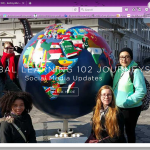
- Screenshot of Slide 4; Photo credit: agnesscot.edu (click image to enlarge)
- Screenshot of Slide 5; Photo credit: agnesscott.edu (click image to enlarge)
- Screenshot of Slide 6; Photo credit: agnesscott.edu (click image to enlarge)
The slide show on Spelman’s page is slightly different. I noticed that every person in each image appears to be African American. There is not much variety of race in the photos on the home page. Also in the background image of the home page there appears to be only African American women displayed. Unlike Agnes Scott, I notice that there are a few men in the images, but they also appear to be African American. The fact that Spelman is a historically black college is obvious based on the images in the slide show. There is a promotion of African American pride through their website’s home page.
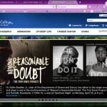
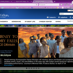
- Screenshot of Slide 2; Photo Credit: spelman.edu (click image to enlarge)
- Screenshot of Slide 1; Photo Credit: spelman.edu (click image to enlarge)
- Screenshot of Slide 4; Photo Credit: spelman.edu (click image to enlarge)
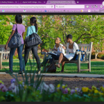
- Screenshot of Home Page Background Image; Photo credit: spelman.edu (click image to enlarge)
After observing and comparing the two slide shows, I concluded that Agnes Scott’s home page promotes more racial and cultural diversity, while Spelman promotes pride in black history. This is not to say that Spelman does not value diversity, but instead, it is just not being displayed when you first log onto to website. Another way to find out about diversity at each college is to look at the student demographics displayed on each website. When you look at the “About” pages of both Agnes Scott and Spelman, you will find links to their mission statements. On Agnes Scott’s “About” page there is the tab on the left side labeled “Mission”. On this page they have a detailed mission statement stating, “Agnes Scott College strives to be a just and inclusive community that expects honorable behavior, encourages spiritual inquiry and promotes respectful dialogue across differences.” This implies their support towards cultural and lifestyle differences. Further down this page, they have a list of values. On this list is “A commitment to an Appreciation of Diverse Cultures”. Underneath this, they have bullet point elaborating on what this means to them.
The fact that their mission and values have its own page, shows its importance to Agnes Scott. It also displays their pride in their mission and values because they made it easy for anyone viewing their site to find the page. Under Spelman’s Spelman’s “About Us” page page there is a tab on the side bar labeled “At a Glance”. On this page they have a detailed mission statement stating, “Spelman empowers the whole person to engage the many cultures of the world and inspires a commitment to positive social change.”
The fact that this is included in their mission statement shows its importance. Their mission statement is the first thing you see on the “At a Glance” page, implying its significance in the representation of Spelman. While their main focus is the empowerment of African American women, they still promote diversity by encouraging their students to “engage the many cultures of the world”, as stated in their mission statement. Both mission statements for these colleges promote a form of diversity and encourage students to explore the different cultures there are.
Women’s Empowerment
Both sites have curved edges on the drop down menus and sidebars. The drop down menus also have images in them. The curved edges make the site seem more feminine and appealing to its audience, which is supposed to be females.
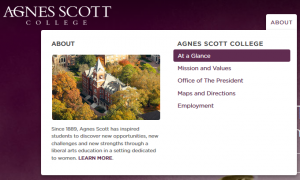
- Screen clipping of the drop down tab from Agnes Scott’s website; From: agnesscott.edu, Taken by Destiny Dickens (click image to enlarge)
- Screen clipping of the drop down tab from Spelman’s website; From: spelman.edu, Taken by Destiny Dickens (click image to enlarge)

Screen clipping of the drop down tab from Morehouse’s website; From: morehouse.edu, Taken by Destiny Dickens
When observing an all male college, such as Morehouse, the edges appear to be straight, giving that site a masculine look. There are no images in the drop down menus either. Both sites, Agnes Scott and Spelman, have a color scheme of a cool color, violet or blue, paired with white. The headers are the main color, violet for Agnes Scott and blue for Spelman, with white text on top of it. Theses color schemes both look bright, friendly, and feminine. In contrast, Morehouse’s website has the main colors, black and white, with burgundy or red accents. There is less bright colors and it looks serious or professional. The femininity shown in the design of Agnes Scott and Spelman’s sites imply that they were designed for the purpose of being visually pleasing to a female audience, therefore promoting feminine pride and women’s empowerment.
Along with femininity, both sites show their pride in women and their success, just in different ways. Under Agnes Scott’s “At a Glance” page there is a link on the side bar to a page labeled “Why a Women’s College?” On this page they discuss the positive outcomes of attending a women’s college and how empowering it is. This is another promotion of women’s empowerment at Agnes Scott College. Spelman’s website shows their pride in women’s success, with the placement of images on their pages. At the top of their “About Spelman” page there is an image of women in their graduation cap and gowns. There is also another image with women in their cap and gowns on the “Ranking and Awards” page. Their images promote the empowerment of women with pride in their success.

Group of students graduating from Spelman(c/o 2014); from the About Spelman page; Photo Credit: spelman.edu

Group of students graduating from Spelman (c/o 2015); from the Rankings and Awards page; Photo Credit: spelman.edu
Women’s Empowerment
This slide show above was at the top of the Agnes Scott College’s “The Greatness Before Us” campaign. As you can see in the photos, there are three women in each one, with a different quote on the slide. The one reoccurring thing on each photo is the appearance of the words “Great Women”. This repetition puts emphasis on the empowerment of women. Even at the the bottom of the page there is the quote, ” Great Women will lead us forward”. The women in each photo are all diverse with different races and even age differences. This shows their students that they are all “Great Women” regardless of their race or cultural background. The three photos represent the past, present, and future of Agnes Scott. Each group taking the role of leaders, during different times on the timeline, as seen with the dates going across the tops of each photo.
On this page there is a tab on the menu labeled “student excellence”. On this page they trying to raise money support students with scholarships and funding study abroad trips. Also on this page, there is the quote, “smart women set the world on fire”. This is a form of empowerment to their students to pursue their degree and it encourages them to become leaders of the world.

Screen clipping from the Student Excellence page of the Greatness Before Us campaign ; From: agnesscott.edu ; Taken by Destiny Dickens
>>Agnes Scott vs Spelman: Do Their Websites Prom…>
Racial and Cultural Diversity
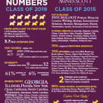
Links to PDF file of Agnes Scott College’s stats and numbers for class of 2015 & 2019; Photo credit: agnesscott.edu
Who Attends ASC?:
When you go to the Admissions page there is an option on the side bar labeled, “High School Students”. When you click on it, you will go to a page with information for applicants in high school. on the right side of the page there is a link that says “view stats and numbers from our most recent class”. This links to a PDF page with the student demographics. According to this document, “students come from 9 countries and 32 U.S. states and territories.
Also, 61% are students of color and 9% are international. This shows a large amount of diversity in the student body. The fact that access to this information is promoted on the page for prospective students, implies that this type of diversity is encouraged at Agnes Scott College.
Diverse Cultural Exposure:
On the home page, in the slide show, there is picture that links to information about “global learning”. This slide show is the first thing that is visible when logging onto the site. This marks its significance and the photos in the slide show must be important as well. This makes me assume that the global learning program is important to Agnes Scott. There is also a page on the website with information about the Center for Global Diversity and Inclusion. The page links to multiple pages, located in the sidebar, for more information about the different programs that are provided there and some of the policies at the college created to encourage diversity. This is an example of Agnes Scott’s promotion of diversity in race, culture, gender, sexual orientation, and religion, through its website.
Agnes Scott College Website: Digital Built Environment Description
When logging onto the Agnes Scott College website, the first thing I notice is the photo header at the top of the home page. There is a total of six different pictures that alternate like a slide show. Each photo shows something different about Agnes Scott. The first photo is a picture of the Dalton Art Gallery and its showing|thinking exhibition. The second picture is about the 45th Annual Writing Festival. The third picture is about the story behind SUMMIT. The fourth picture is about the study abroad programs. The fifth picture is about Xinyao Li, a current student that was accepted in to the Math in Moscow program at the Independent University of Moscow. The last picture is Elizabeth Kiss, President of Agnes Scott, speaking on the importance of women’s education. Each picture has a button you can click on that links to a separate page with more information on each topic.
- Slide 1
- Slide 2
- Slide 3
- Screenshot of Slide 4; Photo credit: agnesscot.edu (click image to enlarge)
- Screenshot of Slide 5; Photo credit: agnesscott.edu (click image to enlarge)
- Screenshot of Slide 6; Photo credit: agnesscott.edu (click image to enlarge)
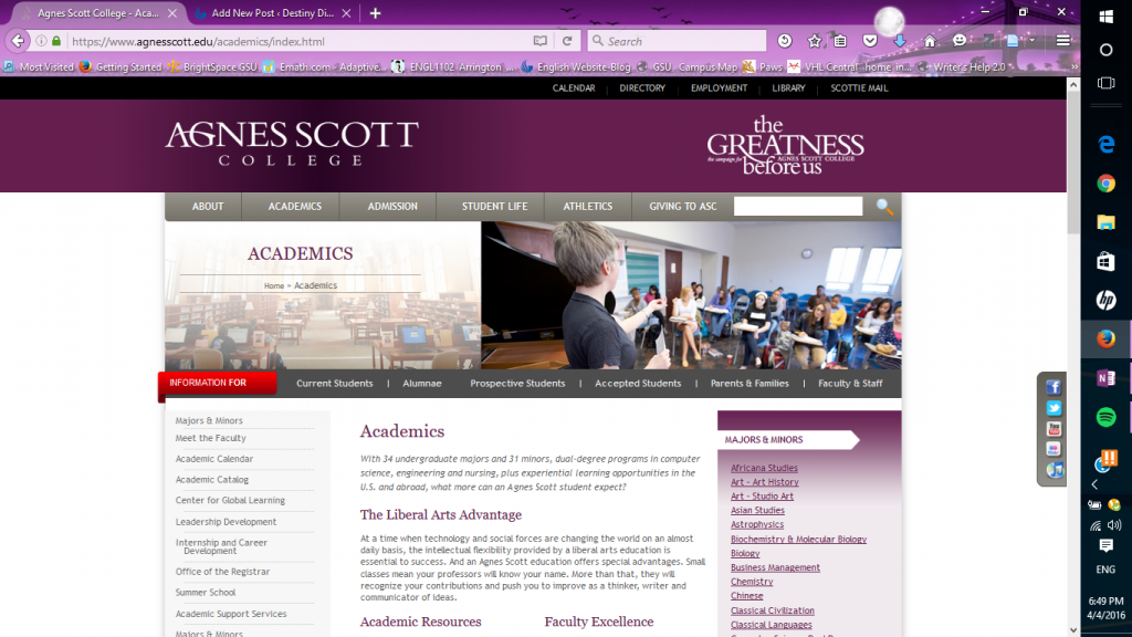
At the top of the home page, there is a menu with the tabs labeled “About”, “Academics”, “Admissions”, “Student Life”, “Athletics”, “Alumnae”, and “Giving”. When you click on the “Academics” tab, it takes you to the academics page. On the left side of the page there is a sidebar with a list of options that each link to separate pages. They provide information that students need about majors and minors, faculty, important dates, courses provided, support services, registration, and internships. On the right side, there is a list of the majors and minors Agnes Scott provides. Each item on the list links to a separate page, providing more information. Also, the title of the list, “Majors and Minors“, links to another page with the same list. As you scroll down the academics page there is information about academic resources, with subtitles linking to separate pages. There is also a “faculty excellence” section, along with “study abroad” and “internships” towards the bottom half of the page. The “study abroad” and “internships” sections have links to separate pages with more information. Below the main menu, there is a second menu above the “Academics” title. It has tabs labeled “Current Students”, “Alumnae”, “Prospective Students”, “Accepted Students”, “Parents & Families”, and “Faculty & Staff”. Each tab has a drop down menu with links to even more information specific to each category of people.
I notice that this page has the same color scheme as the home page. In fact, all of the other pages have to same color scheme. It is a combination of a somewhat dark purple and a grey, with white, purple, and grey words. The purple gives the site a feminine feel, which makes sense,because Agnes Scott is an all female college. The grey gives it a serious tone and, in my opinion, makes it look professional.
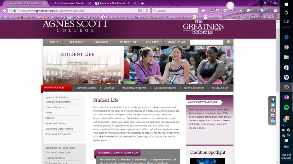
The main menu bar at the top of the page has a tab labeled “Student Life”. This takes you to the student life page. On this page there is information about student traditions, campus housing, dining, student organizations, community service and other resources provided for students. When you scroll down the page, there are three brief paragraphs labeled “community engagement“, “student support services“, and “leadership opportunities“, each linking to their own separate pages with more information on the topic. The second menu, as I mentioned earlier, remains right above the title of the page.
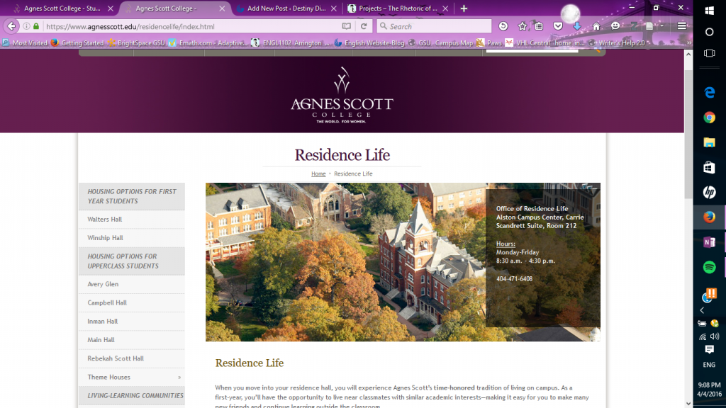
Going back to the menu on the left side of the student life page, there is an option labeled “housing”. When you click on this link, it takes you to the residence life page. On the left side of this page there is a list of options linking to separate pages. On this list there are two categories of housing, which is “first year students” and “upper class students”. According to the list, there are two residence halls for first year students and six for upperclassmen. Each residence hall on the list links to its own separate page with information about it. On the same sidebar, beneath the residence halls , there is a link to information about “living-learning communities” on campus. Under this, there is a list of links to more resources for students. At the bottom of the sidebar there is a link to FAQs and ways to connect with Agnes Scott College on social media, such as Facebook, Instagram, and Pinterest. In the upper middle of the page there is a brief overview of the housing on campus. Above this, there is a photo of some of the dorm buildings. On top of the photo, there is a text box with the location of the Residence Life Office, hours of operation, and its phone number. On this page, the second menu bar that I mentioned earlier is not visible.
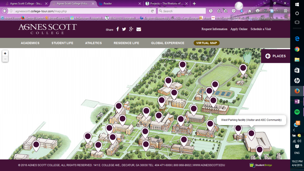
At the top of the home page on the main menu bar, there is a tab labeled “Admissions”. When you hover the mouse over this tab, there is a drop-down menu with a list of links. When you click on the link labeled “virtual tour”, it takes you to a page with another menu of options and locations to see on campus. In the lower right area of the menu there is an option labeled “virtual map”. This takes you to a virtual map of the entire Agnes Scott College campus. On the map, there are several purple dots, pinpointing various parts of the campus. When you click on a purple dot on the map, it causes a pop-up of a brief description of each location on the map and photo. Also in the upper right area of the map, there is a tab labeled “places”. When you click on the tab, a list of all of the place on the map. Clicking on each place on the list also brings up a brief description of that place along with a picture.
At the very bottom of every main page from the main menu bar, there are links to contact information. There are also links to information labeled “employment“, “maps & directions“, “event rentals“, “emergency information“,”accreditation & authorization“, “nondiscrimination“, and “privacy policy“. Underneath these links is copyright information, the address to the school and the phone number. Overall, in my opinion this site is very informative and useful to anyone that wants to know all about Agnes Scott College. I do not think there is any missing information!
Annotated Bibliography 10: Famous Places in Atlanta
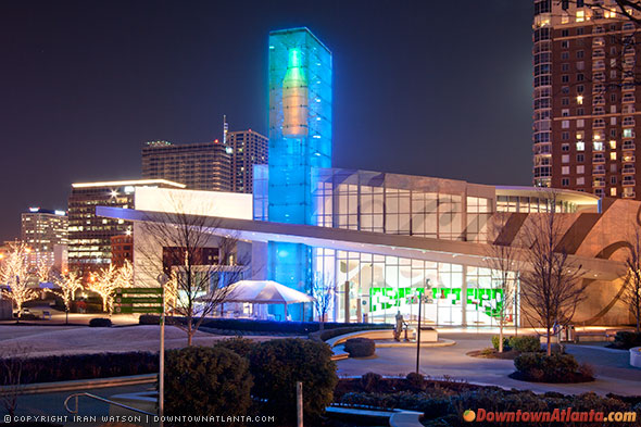
From downtownatlanta.com
Gailliard, Ticara. “Famous Places in Atlanta, GA.” Traveltips.usatoday.com. Demand Media, n.d. Web. 28 Mar. 2016.
In this article, “Famous Places in Atlanta, GA”, Ticara Gailliard discusses some of the main attractions in Atlanta. She names some of the most famous places in Atlanta, such as the Georgia Aquarium, World of Coca-Cola, the CNN Center, and the Martin Luther King Jr, National Historic Site. She also provides a brief summary of each place and what it offers. Below the article, there are links to buy tickets, get coupons, and see special offers for the sites she named in the article. The intended audience for this is tourists and it was written with the purpose of informing them about the different places they could go to when they visit the city of Atlanta. Based on the places being advertised in the article, the intended audience could be families. This article would be useful to someone doing research on how the built environment of Atlanta is advertised and what parts are shown to outsiders in different states. It would also be useful to someone looking for activities to do while visiting Atlanta. Also, someone could compare this article to the previous article called “Why Atlanta Is The Big American City You’ve Been Missing Out On” and see how they are different and alike in the representation of Atlanta, based on the style of the article and the places being advertised in each article.
Annotated Bibliography 9: “The Big American City”

Photo by Barry Williams via Getty Images
Ledbetter, Carly. “Why Atlanta Is The Big American City You’ve Been Missing Out On.” The Huffington Post. TheHuffingtonPost.com, 5 Apr. 2014. Web. 28 Mar. 2016.
In her article, “Why Atlanta Is The Big American City You’ve Been Missing Out On“, Carly Ledbetter, from Huffington Post, argues that Atlanta is “one of the most amazing cities in America”. She starts off by addressing some misconceptions that people may have when they think of this city and then she quickly dismisses them. Then rest of the article is her list of twenty things about Atlanta that make it an “amazing city”. These include things like the tourist attractions, popular restaurants, art, music, the sports team, and historical landmarks. She also provides a graphic of some sort for each reason on the list, whether it is a picture or a GIF. The intended audience for this article could be someone that has never been to Atlanta, tourists, and potential residents of Atlanta. Based on most of the reasons she provided, the intended audience could also be for people in the 15-25 age group. Her purpose is to inform, but also persuade someone that has never been Atlanta to come. This would be a helpful resource for someone that is doing research on how the city of Atlanta is portrayed and advertised in a digital built environment and what biases there are towards the city.
Annotated Bibliography 8 : “Stars Flock to Atlanta”

Panoramic from carrollmorgan.com
Severson, Kim. “Stars Flock to Atlanta, Reshaping a Center of Black Culture.” Nytimes.com. The New York Times Company, 25 Nov. 2011. Web. 27 Mar. 2016.
In her article “Stars Flock to Atlanta, Reshaping a Center of Black Culture”, Kim Severson, from The New York Times, claims that Atlanta “is emerging as an epicenter of the black glitterati”. To support her claim she begins with talking about the Soul Train Awards being hosted in the Fox Theater and how “a few years ago, the city probably would not have been able to pull off such a show”. She provides statements from Stephen Hill, an executive vice President for BET where he gives his opinion of Atlanta. He says that ” it’s so ripe with African American flavor and talent”. He also says “Atlanta is home to our core audience” and “Atlanta is our New York, our LA”.
Then Severson gives examples of successful black people in the industry who have homes or business in Atlanta such ass, Tyler Perry, Sean Combs, Ce L Green, Ludacris, and Gladys Knight.
She explains the Entertainment Industry Investment Act passed in 2008, “which gives qualified productions a 20 percent tax break” and “producers who embed the Georgia promotional logo in the titles or credits can take another 10 percent off the tax bill”.
Next, she discusses the “decade of migration of black [stars] from the North”. Some of the reasons behind this is cheaper living and lower production costs. Severson provides a statement from Warrington Hudlin, president of the Black Filmmaker Foundation in New York, where he claims that” Atlanta is becoming the black Hollywood” and that “because many black filmmakers are working on tighter budgets than white filmmakers, they need to save money and Georgia helps them do that”. Another benefit of them living in Atlanta is less paparazzi.
The intended audience for this article is people in the film industry. The purpose of her article is to convince them to consider Atlanta as a place to conduct their businesses and do movies in this city .It is also to inform them of some of the pros of living in Atlanta as a person in the film, television and entertainment industry.
This would be a helpful source for someone doing research on how the built environment of Atlanta influences certain races to live there based on the types of careers that they have and how much they are willing to spend to live here.
Annotated Bibliography 7: “Atlanta is the new Hollywood”
Moore, Christine. ““Atlanta Is the New Hollywood”: Influx of Film and TV Production Boosts Economy, Attracts Actors.” ArtsATL.com. N.p., 04 June 2013. Web. 27 Mar. 2016.
In her article, “Atlanta is the new Hollywood : Influx of film and TV production boosts economy, attracts actors”, Christine Moore, claims that Atlanta’s film industry is growing and becoming the new Hollywood.
She starts by giving a little bit of background about the careers of, Scott Poythress and Claire Bronson, two actors that are from the Atlanta area. She states that back in 2007, they moved from Decatur to Los Angles “in pursuit of more auditions, better roles, and bigger opportunities”. Two years later they moved back to the “metro Atlanta” area, and Moore tells why. She discusses how Atlanta became more inviting to people in the film and media production industry, due to the “well-publicized tax credits that Georgia started offering in 2008”. Then she explains how the tax credit works. When “movie, television, and digital entertainment companies” work and hire within the state of Georgia, they “can receive up to 30 percent in tax breaks “. She continues her article by discussing some of the “new local studios slated for construction” and “new major production facilities” in Atlanta. They include, “a 400,000-square-foot complex in Gwinnett County with 12 sound stages, to be built by Jacoby Development, and a 288-acre development in Fayette County by Pinewood Shepperton, the British studio that’s home to the James Bond franchise”.
Then she goes into talking about how the economy has benefited from the new facilities. According to the Georgia Film, Music & Digital Entertainment Office, “Georgia-based productions generated $3.1 billion for the state economy in fiscal 2012, up 29 percent from the year before”. She also talks about how Atlanta-based actors are benefited, because they do not have to leave town for work.
The intended audience for this article could be actors, film production companies, aspiring actors, film students, and anyone else in the film industry. This article will be helpful to someone doing research on the how the built environment of Atlanta affects the entertainment industry or how it benefits the economy. It could be useful to a film student in Atlanta with concerns about finding work after college or an aspiring actor in Atlanta who is trying to decide if they should relocate or stay in Atlanta.
Woodruff Park Fountain
This sound comes from the fountain, behind the “Robert W. Woodruff Park” sign. It was windy at the time this was recorded, so the sound of the wind is in the recording too.

Woodruff Park: Built Environment Description
Woodruff Park, named after Robert W. Woodruff and located in the center of Downtown Atlanta, opened in 1973. It is a very well known place, used to host various events and everyday activities. In the park there is a playground, two fountains, an area to play chess and a pavilion. The interesting thing about the playground is that it is formed by the letters “ATL”, which looks pretty cool. It has a wooden look, various shades of brown, with a splash of color on the back and it fits well with the scenery around the park. Playground provides a safe place for kids to play. To ensure their safety, there is a sign near the playground that has rules for them to follow.
- Front
- Back
- Playground Rules Sign
The best thing about Woodruff Park is the scenery. What I believe contributes mostly to this is the two beautiful fountains. If you ever want to just sit back and enjoy the outdoors, the fountain is a good place to be. It is also great for taking photos, especially for tourists. There are tables and chairs nearby that allow people to sit and relax in the park. You can just close your eyes and listen to the sound of the water in the fountain or use the park as a calm and open place to get your work done, instead of staying inside.
Another feature of the park is the pavilion, where you will see people playing chess. When I was there observing the park, I noticed that area was the most crowded. It was full people and it was very loud and lively. After noticing this I realized that different areas of the park attract different types of people. Woodruff Park is a place for pretty much anyone of any age because it has many aspects that appeal to all types of people’s needs. I saw this for myself when I went there. In one area there was a family sitting together near the fountain and a kid at the playground. In another area, there was a guy jogging past the park and a guy doing what looked like a mix of aerobics and martial arts. People are also able to bring their pets to the park, as long as it is on a leash and they clean up after their pets. There was a sign in the park with this rule on it. Near the pavilion, there was a large group of older men talking and laughing.There are also homeless people in the park that hang out in that area. The pavilion seems to be the area that is crowded most of the time.
Overall, Woodruff Park is place for everyone and is a relaxing space. As long as the rules of the park are followed, everyone can enjoy themselves. With that being said,there is also a sign with the park rules and regulations. I have noticed that signs with rules on them is common artifact in the park.
While I was in the park, I decided to sit at one of the tables near the fountain. I felt really relaxed and peaceful. I sat there for about thirty minutes, observing that area, before I got up to walk around, and it felt like I was only there for five minutes. I was so relaxed that I lost track of time.I think I will go back to the park again another day.
All photos taken by: Destiny Dickens

