Content Control Controversy : A Summary of Melissa King’s Article

shutterstock_203277604-500x375c

From: hellogiggles.com

In her article, “Better Online Living through Content Moderation”, Melissa King discuses the necessity of “content control features”, such as “block and ignore functions, content/trigger warnings, blocklists and privacy options”, on the internet and the “cultural opposition” against it. She explains that the these “tools” are helpful to “users [that] may suffer from PTSD and need to avoid topics and people that trigger their anxiety”. Kings argues that “nobody should be required to read or listen to content if they do not want to”.

She continues the article with talking about the oppositions raised against “content control”. The people against these “tools” retaliate by called the users of them “weak” and “too sensitive”. King suggests that the “opponents are creating a culture that pressures people to expose themselves to experiences far more catastrophic than they can handle” and that “it becomes entirely the victim’s problem when they are attacked online, no matter the situation, and they should ‘just deal with it'”. A common argument against “content control” is that the victims are just blowing things out of proportion and that “they should try being ‘less sensitive'”. King states that these arguments often result in an “informal parallel to Exposure Therapy”,  which is “a type of therapy designed to combat severe anxiety through gradual and controlled exposure to its source, to inure an individual to these triggers and lesson the disruptions they can cause”. When people are discussing “content control” they often misinterpret the concept of “Exposure Therapy” and they fail to realize that “without controlled exposure, someone suffering from PTSD is likely to have their trauma magnified rather than reduced when faced with the triggering content”.

As she goes on, she provides more arguments against “content control”, such as the “myth” that when someone is harassed online, it is “merely mean words said on the internet, with no real threat to the safety or their family”. Some people do no believe that this harassment can cause PTSD because “according to popular culture, this is something only veterans suffer”. King disagrees with this idea and argues that it actually can. To support her argument she uses Caleb Lack, a clinical psychologist and psychology professor who specializes in treating anxiety disorders, as a source. She provides a quote from him saying:

“Bullying has long been known to have a severe impact on mental health, particularly if the bullying is repeated and prolonged… So, given what we know about PTSD, and given what we know about the effects of bullying (cyber and otherwise) on mental health, I think it’s relatively safe to say that “Yes, you can ‘get’ PTSD from Twitter.” One needs to be careful, though, to be specific about this: it’s the bullying and harassment that could lead to PTSD or PTSD symptoms (as well as depression, increased suicidality, and so on), not anything inherent to Twitter itself.”

Then, King discusses hate groups that are known for discouraging victims from the use of “content control”. One example of this is Gamergate, a group that is ” notorious for doing everything in its power to threaten people into silence– from calling and threatening family members, to posting pictures of their targets’ homes and addresses online”. She also argues that women are one of the main “targets” to online harassment when they are in “male dominated” areas, such as “the tech industry of in video game culture”. Two women that can testify to this are “Zoe Quinn (a video game developer and co-founder of Crash Override) and Anita Sarkeesian (creator of the YouTube channel ‘Feminist Frequency’ and the video series ‘Tropes vs Women in Video Games'”. She concludes the article with the argument that “people should be allowed to set their own personal boundaries and disregarding those personal boundaries should be seen as disrespectful at best”.


Color Walking

Colouring_pencils

From: commons.wikimedia.org

In Phia Bennin and Bredan McMullan’s article, “Color Walking”, They explain William Burroughs’s creative tool he used “to inspire students”, called color walks. They give instructions on how to do a color walk. You simply walk out of your door and pick a color. Then follow that color “from object to object” wherever it leads you. They also talk about their own experience with color walk, switching from color to color. There is also a diagram showing where they went and what colors they saw. The end the article with a few tips on how to make sure your color walk is successful. The tips include: “give yourself and hour of uninterrupted time…follow the [color] that makes your heart go thump-thump, [and] if you get lost, pick another color. If you get really lost, you’re on the right track”.

Annotated Bibliography 6 : Unit Two

from https://theaterseatingturkey.wordpress.com

from https://theaterseatingturkey.wordpress.com

“Resources_IdeasInfo_typesandformsoftheatre.pdf.” Web. 20 Feb. 2016.

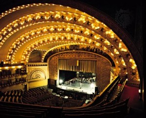
In their article, “Types and Forms of Theatre”, Theatre Projects Consultants, a group of specialists who build performance spaces, claim that, “There is no ideal size of a theatre [because] the scale of a theatre depends on the size of the staging required by the type of performance and the number of audience to be accommodated, with each variable influencing the other as they change.” To support their claim, they explain the different types of performance spaces and the purpose of each type. The types of spaces they describe are drama, music, opera, dance,multipurpose, worship, teaching, media interaction and entertainment. To further explain, they give detailed descriptions of each type and provide examples of these theaters from various cities. The purpose of this article is to explain the different types of theater set-ups and their purposes. It will be a useful source to someone that wants to know about how the function of a theater influences its design.

Annotated Bibliography 5: Unit Two

from

from http://www.britannica.com

“Theatre Design – The Goals of Theatre Design | Architecture.” Encyclopedia Britannica. N.p., n.d. Web. 19 Feb. 2016.

In their article, “Theatre Design – The Goals of Theatre Design”, the editors of Encyclopedia Britannica, a global educational publisher, they claim that “Theatre design is primarily concerned with enhancing the experience the audience can have at a performance [and] the specific architectural elements considered ideal for improving that experience will differ from culture to culture and sometimes even between subcultures within a given culture.” To support this claim, they describe two different categories of elements in a design, each being used for a different purpose. The two categories are “those that serve the aesthetics deemed appropriate for the art of theatre in a given culture, and those that optimize the experience of that art for the audience.” In the article they provide information on each of them, stating that “Those elements that serve the aesthetics of the art of theatre can involve everything from what the performers need to reach the artistic standards deemed proper before a performance starts to what they need to support the required amount of spectacle during performance, whether it be a bare stage or a stage with enormous movable sets and a spectacular array of props.” In contrast, “The elements that are most often discussed in terms of optimizing the experience had by the audience revolve around audience comfort”. Then they explain which areas of the theatre fit in each category. They state that, “those elements of a theatre’s design that serve primarily to optimize the experience of the audience are the house and the… ‘front-of-house’ facilities” and “those elements of the design of a theatre that serve primarily the aesthetics of theatre performance are the stage and the…backstage spaces”. They then describe each area in detail. The purpose of this article is to provide information on the purposes of theater design. This will be a useful source for someone that is interested in finding out why theaters are designed a certain way.

Annotated Bibliography 4: Unit Two

from http://sensingarchitecture.com

from http://sensingarchitecture.com


Lehman, Maria Lorena. “Take Note When Experiencing Theater Set Design.” Sensing Architecture ® Academy | Maria Lorena Lehman. N.p., 7 Dec. 2009. Web. 20 Feb. 2016.

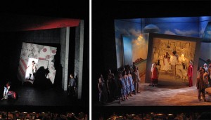
In her article, “Take Note When Experiencing Theater Set Design”, Maria Lehman, an architectural author, designer and educator, claims that “theater set design must work to create an experience with space, and often such theatrical experiences tap into so much more that just the visual sense.” To support her claim, she gives explains how the environment of the theater set is used to engage the audience in the show. In the article, Lehman states that ” a theater stage (say for a musical) can be perceived as a micro-environment in that it must accomplish a lot with a little amount of space.” She suggests architects to consider how the limited space of the stage affects the transitions in a performance. The purpose of this article is to raise encourage architects to “keep in mind how the set design experience really caters to the senses.” This would be a useful source to someone that is interested in learning about the importance of the set up of the stage in a theater and how the size of the stage affects the performance.

Midterm Reflection

from http://pastorstephen.tv

from http://pastorstephen.tv

When I first signed up for this class, I thought it was going to be  like the English class that I took last semester, but just more difficult. I thought that the entire semester we would just write a papers, do peer review, revise them, and turn in a final draft, because that was the type of writing that I was used to. The approach to writing in this class is actually more inspiring, because it allows me to be creative. There is not just one set format that I have to go by and that is what makes the difference in my writing. Doing my assignments as blog posts, makes the writing environment seem less strict and it gives me more freedom in my writing to express myself in the way that I want to do it. I like that I can add visuals to my posts, such as images and videos. A problem that I often find myself facing is having an image in my mind but not fully knowing how to make the person reading my work understand the image that I am trying to describe. With blog posts, it helps to be able to put a visual to what I am trying to explain.

There is also less pressure on me when I am posting and submitting my work because I know I have the opportunity to improve my work, based on the feedback I receive. In some of my English classes in the past, there were no second chances when it came to submitting work. The grade you received was the grade you had to keep and I never liked that policy. I have also been in classes where you turn in the paper and never see it again, with no feedback at all. I think that it is good to receive feedback and have that opportunity to better my writing, because nothing is ever perfect the first time. There is always room for improvement and I believe we should be given that second chance.

As a writer, I believe I am good at taking criticism and making improvements. I want to be able to do more revising my work in this class. That is one of the extra credit activities that I want to be able to do. The main reason why I am unable to submit revisions is , I am having trouble balancing the work for all of my other class combined with this class. In my other classes, I also write a lot, so it’s very time consuming to do some of the extra work sometimes,even though I want to. I think the reading quizzes are a good opportunity for me to earn the extra points because it takes less time. I have noticed that, I do not put enough time into some of the assignments for this class sometimes and that is something that I want to improve on, because I know that this class is just as important the other ones I have.

Now that I have done the assignments for unit one, I know what to expect, so I will try to complete the assignments way ahead of time before my other classes get in the way and things get hectic with my homework schedule. I am also going to work on my time management so that I can do more extra points activities, because they will be very helpful to my grade in this class and my writing skills.

Are Public Bathrooms Really ‘Accommodating’? : A Summary of Emily Bazelon’s Article

From motherjones.com

From motherjones.com


In Emily Bazelon’s article “Making Bathrooms More Accommodating”, she argues that public bathrooms should be more “accommodating” to fit the needs of all groups of people, and not just the socially constructed genders, male and female. She begins by giving insight on the struggles that transgender people have when they have to which restroom to enter. It is difficult for them because their only options are “Men” and “Women.” Bazelon states that if they enter and the people inside “think [they’ve] confused male and female and walked through the wrong door, [they] risk discomfort, or even real trouble.” She argues that this is because the gender categories which determine who can enter the restrooms are “fixed.” According to Bazelon, the idea of “mixing male and female anatomy in [multi-stall] bathrooms and locker rooms” is a touchy subject for a lot of people. In Houston,  a law that “protected against discrimination in housing and employment, [due to] race, age ,sexual orientation and gender identity” was voted against and given the nickname, the “bathroom ordinance”. The “opponents” of the law even made shirts with images of a man threatening a girl in the bathroom, in order to discourage people from supporting the law, by “playing on voters’ fears.”

To take her argument a step further, Bazelon provides a story of a transgender teenager, male to female, at a high school in Illinois, who was not allowed to change in the girls’ locker room because of privacy concerns”. Instead, she was sent down the hall to a separate room. Her parents brought a “civil rights complaint”, which resulted in the Department of Education asking the district to allow her to shower and change in the girls’ locker with her peers. They suggested a privacy curtain that she and any other girl could use. Bazelon uses this story as a example of how it is “tricky” for school districts to adjust certain policies to “accommodate” transgender teens.

She then adresses the term “accomodate” , which comes from the Latin word for “to make fitting.” She defines the ward accommodate as a means “to adapt, to bring into agreement or harmony, to furnish with something desired or needed, to favor or oblige.” She provides the negative and positive connotations of the word. The word “accommodation” implies a separation  between “the normal and the other.” In contrast, is also provides a “possibility of mutual give and take.”

Later in the article, she bring up the problem of women having to wait in long lines for an open stall, while men have urinals that “keep the line moving” for them. She also claims that this is not seen as an issue of accommodation because men are seen as the “norm.”

According to Bazelon, the root of the issue of transgender people not being allowed in the bathrooms is because of the belief in the “biology of chromosomes.” In actuality, the real thing that transgender people are after is a sense of belonging and fitting in. She concludes the article with talking about the different “self-contorting accommodations” they end up making to “belong” in the bathrooms. She quotes strategies from a guide provided by the Transgender Law Center. The first one is “Invisibility: Don’t speak or look at anyone.” The second strategy is called “Gender Proof”, which says that they should point of physical characteristics that will prove they belong. Bazelon puts emphasis on the word “belong”, claiming that it is a “basic human need we all share.”

Is It Gender Neutral? : A Summary of Susan Tick’s Article

From polarimagazine.com


According to Susan Tick’s article,“His & Hers: Designing for a Post-Gender Society”,  “today’s design landscape is deeply rooted in Modernism, a movement shaped by a predominately male perspective.” She argues for a change in this design to make it more “gender-neutral”. She suggests for designers to learn more about “society’s issues” and apply what they have learned to their designing process. An example of this is the design of the “workplace.” Today in the workplace, the “barriers and hierarchies” ,due to gender, are beginning to fade away. Women are taking more leadership roles in the workplace, challenging the “gender roles” that were once there. There is also the “new wave of feminism”  and the LGBT rights movement challenging this concept. Tick states that people are now “craving more softness in interiors, with the open plan, the influence of hospitality, and and emphasis on tactile and textural materials.” Then she argues that this would be the best time for designer to think about “how they incorporate gender sensitivity in to their work.”

After discussing the workplace, Tick explains the “human phenomenon” of “masculine and feminine definitions being switched and obscured.” Examples of this can be found in fashion, which “embraces” this idea. She provides an examples of this by talking about the “military look” of “Alexander Wang’s women’s coat from Fall 2015” and Annemiek van deer Beek’s make-up line for men.

Tick also argues that “Gender roles” cause “outward appearances” to be confusing. Although people are assigned a certain gender at birth, they are allowed to decide what gender they identify” as. In fact, there are some college with students refusing to put their gender down on forms because they don’t want to be “identified” as male or female. There are even middle school children doing the same. Some schools are okay with this, and Tick encourages designers to keep up with these “trends.” She said that the view of transgender people has changed and provides an example of this. According to Tick, Maritine Rothblatt, CEO of United Therapeutics became the “highest paid female executive in the United States even though she was born biologically a male.”

Towards the end of the article, Tick talks about some of the changes that have been made so far, like the “gender-neutral or unisex bathrooms” at Google and provides an example of a time where these types of bathrooms would have been useful. Her example was a case where a worker had a “gender-reassignment surgery” done over their break. Apparently, the coworkers were not okay with this person  using the bathrooms, because of   and She explains the importance of “making people feel accommodated”,not only in the bathrooms, but everywhere. This leads to the subject of Americans with disabilities and how they also experience a disadvantage, but Tick says that “gender issues” can not be handled to same way that their issues are handled, with “regulations and compliance.”It also will take time, considering “we are only at the very beginning with gender-neutral design.”

Woodruff Park Fountain

This sound comes from the fountain, behind the “Robert W. Woodruff Park” sign. It was windy at the time this was recorded, so the sound of the wind is in the recording too.

Woodruff Park: Built Environment Description

Woodruff Park, named after Robert W. Woodruff and located in the center of Downtown Atlanta, opened in 1973. It is a very well known place, used to host various events and everyday activities. In the park there is a playground, two fountains, an area to play chess and a pavilion. The interesting thing about the playground is that it is formed by the letters “ATL”, which looks pretty cool. It has a wooden look, various shades of brown, with a splash of color on the back and it fits well with the scenery around the park. Playground provides a safe place for kids to play. To ensure their safety, there is a sign near the playground that has rules for them to follow.

The best thing about Woodruff Park is the scenery. What I believe contributes mostly to this is the two beautiful fountains. If you ever want to just sit back and enjoy the outdoors, the fountain is a good place to be. It is also great for taking photos, especially for tourists. There are tables and chairs nearby that allow people to sit and relax in the park. You can just close your eyes and listen to the sound of the water in the fountain or use the park as a calm and open place to get your work done, instead of staying inside.

20160212_155856_Pano


Another feature of the park is the pavilion, where you will see people playing chess. When I was there observing the park, I noticed that area was the most crowded. It was full people and it was very loud and lively. After noticing this I realized that different areas of the park attract different types of people. Woodruff Park is a place for pretty much anyone of any age because it has many aspects that appeal to all types of people’s needs. I saw this for myself when I went there. In one area there was a family sitting together near the fountain and a kid at the playground. In another area, there was a guy jogging past the park and a guy doing what looked like a mix of aerobics and martial arts. People are also able to bring their pets to the park, as long as it is on a leash and they clean up after their pets. There was a sign in the park with this rule on it. Near the pavilion, there was a large group of older men talking and laughing.There are also homeless people in the park that hang out in that area. The pavilion seems to be  the area that is crowded most of the time.

Overall, Woodruff Park is place for everyone and is a relaxing space. As long as the rules of the park are followed, everyone can enjoy themselves. With that being said,there is also a sign with the park rules and regulations. I have noticed that signs with rules on them is common artifact in the park.

While I was in the park, I decided to sit at one of the tables near the fountain. I felt really relaxed and peaceful. I sat there for about thirty minutes, observing that area, before I got up to walk around, and it felt like I was only there for five minutes. I was so relaxed that I lost track of time.I think I will go back to the park again another day.

20160212_161530_Pano

All photos taken by: Destiny Dickens

1 2 3 4 5 6
Skip to toolbar