Diversity
The home page of Agnes Scott and Spelman‘s websites are similar, but also different. They are similar because both have a slide show at the top, displaying current events or important event that happened at their school. The placement of these images on the home pages, implies that what these images portray is valued by each school. The difference between the two websites is the types of images displayed in each slide show on their home page. On the Agnes Scott slide show, each image with people in it is someone of a different race. This is an example of Agnes Scott’s promotion of diversity through their website.
- Screenshot of Slide 1 (New); Photo credit: agnesscott.edu (click image to enlarge)
- Screenshot of Slide 4; Photo credit: agnesscot.edu (click image to enlarge)
- Screenshot of Slide 5; Photo credit: agnesscott.edu (click image to enlarge)
- Screenshot of Slide 6; Photo credit: agnesscott.edu (click image to enlarge)
The slide show on Spelman’s page is slightly different. I noticed that every person in each image appears to be African American. There is not much variety of race in the photos on the home page. Also in the background image of the home page there appears to be only African American women displayed. Unlike Agnes Scott, I notice that there are a few men in the images, but they also appear to be African American. The fact that Spelman is a historically black college is obvious based on the images in the slide show. There is a promotion of African American pride through their website’s home page.
- Screenshot of Slide 2; Photo Credit: spelman.edu (click image to enlarge)
- Screenshot of Slide 1; Photo Credit: spelman.edu (click image to enlarge)
- Screenshot of Slide 4; Photo Credit: spelman.edu (click image to enlarge)
- Screenshot of Home Page Background Image; Photo credit: spelman.edu (click image to enlarge)
After observing and comparing the two slide shows, I concluded that Agnes Scott’s home page promotes more racial and cultural diversity, while Spelman promotes pride in black history. This is not to say that Spelman does not value diversity, but instead, it is just not being displayed when you first log onto to website. Another way to find out about diversity at each college is to look at the student demographics displayed on each website. When you look at the “About” pages of both Agnes Scott and Spelman, you will find links to their mission statements. On Agnes Scott’s “About” page there is the tab on the left side labeled “Mission”. On this page they have a detailed mission statement stating, “Agnes Scott College strives to be a just and inclusive community that expects honorable behavior, encourages spiritual inquiry and promotes respectful dialogue across differences.” This implies their support towards cultural and lifestyle differences. Further down this page, they have a list of values. On this list is “A commitment to an Appreciation of Diverse Cultures”. Underneath this, they have bullet point elaborating on what this means to them.
The fact that their mission and values have its own page, shows its importance to Agnes Scott. It also displays their pride in their mission and values because they made it easy for anyone viewing their site to find the page. Under Spelman’s Spelman’s “About Us” page page there is a tab on the side bar labeled “At a Glance”. On this page they have a detailed mission statement stating, “Spelman empowers the whole person to engage the many cultures of the world and inspires a commitment to positive social change.”
The fact that this is included in their mission statement shows its importance. Their mission statement is the first thing you see on the “At a Glance” page, implying its significance in the representation of Spelman. While their main focus is the empowerment of African American women, they still promote diversity by encouraging their students to “engage the many cultures of the world”, as stated in their mission statement. Both mission statements for these colleges promote a form of diversity and encourage students to explore the different cultures there are.
Women’s Empowerment
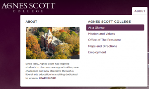
Both sites have curved edges on the drop down menus and sidebars. The drop down menus also have images in them. The curved edges make the site seem more feminine and appealing to its audience, which is supposed to be females.
- Screen clipping of the drop down tab from Agnes Scott’s website; From: agnesscott.edu, Taken by Destiny Dickens (click image to enlarge)
- Screen clipping of the drop down tab from Spelman’s website; From: spelman.edu, Taken by Destiny Dickens (click image to enlarge)

Screen clipping of the drop down tab from Morehouse’s website; From: morehouse.edu, Taken by Destiny Dickens
When observing an all male college, such as Morehouse, the edges appear to be straight, giving that site a masculine look. There are no images in the drop down menus either. Both sites, Agnes Scott and Spelman, have a color scheme of a cool color, violet or blue, paired with white. The headers are the main color, violet for Agnes Scott and blue for Spelman, with white text on top of it. Theses color schemes both look bright, friendly, and feminine. In contrast, Morehouse’s website has the main colors, black and white, with burgundy or red accents. There is less bright colors and it looks serious or professional. The femininity shown in the design of Agnes Scott and Spelman’s sites imply that they were designed for the purpose of being visually pleasing to a female audience, therefore promoting feminine pride and women’s empowerment.
Along with femininity, both sites show their pride in women and their success, just in different ways. Under Agnes Scott’s “At a Glance” page there is a link on the side bar to a page labeled “Why a Women’s College?” On this page they discuss the positive outcomes of attending a women’s college and how empowering it is. This is another promotion of women’s empowerment at Agnes Scott College. Spelman’s website shows their pride in women’s success, with the placement of images on their pages. At the top of their “About Spelman” page there is an image of women in their graduation cap and gowns. There is also another image with women in their cap and gowns on the “Ranking and Awards” page. Their images promote the empowerment of women with pride in their success.

Group of students graduating from Spelman(c/o 2014); from the About Spelman page; Photo Credit: spelman.edu

Group of students graduating from Spelman (c/o 2015); from the Rankings and Awards page; Photo Credit: spelman.edu

