Agnes Scott vs Spelman: Do Their Websites Promote the Same Values?
Diversity
The home page of Agnes Scott and Spelman‘s websites are similar, but also different. They are similar because both have a slide show at the top, displaying current events or important event that happened at their school. The placement of these images on the home pages, implies that what these images portray is valued by each school. The difference between the two websites is the types of images displayed in each slide show on their home page. On the Agnes Scott slide show, each image with people in it is someone of a different race. This is an example of Agnes Scott’s promotion of diversity through their website.
- Screenshot of Slide 1 (New); Photo credit: agnesscott.edu (click image to enlarge)
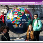
- Screenshot of Slide 4; Photo credit: agnesscot.edu (click image to enlarge)
- Screenshot of Slide 5; Photo credit: agnesscott.edu (click image to enlarge)
- Screenshot of Slide 6; Photo credit: agnesscott.edu (click image to enlarge)
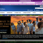
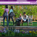
The slide show on Spelman’s page is slightly different. I noticed that every person in each image appears to be African American. There is not much variety of race in the photos on the home page. Also in the background image of the home page there appears to be only African American women displayed. Unlike Agnes Scott, I notice that there are a few men in the images, but they also appear to be African American. The fact that Spelman is a historically black college is obvious based on the images in the slide show. There is a promotion of African American pride through their website’s home page.
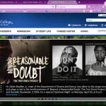
- Screenshot of Slide 2; Photo Credit: spelman.edu (click image to enlarge)
- Screenshot of Slide 1; Photo Credit: spelman.edu (click image to enlarge)
- Screenshot of Slide 4; Photo Credit: spelman.edu (click image to enlarge)
- Screenshot of Home Page Background Image; Photo credit: spelman.edu (click image to enlarge)
After observing and comparing the two slide shows, I concluded that Agnes Scott’s home page promotes more racial and cultural diversity, while Spelman promotes pride in black history. This is not to say that Spelman does not value diversity, but instead, it is just not being displayed when you first log onto to website. Another way to find out about diversity at each college is to look at the student demographics displayed on each website. When you look at the “About” pages of both Agnes Scott and Spelman, you will find links to their mission statements. On Agnes Scott’s “About” page there is the tab on the left side labeled “Mission”. On this page they have a detailed mission statement stating, “Agnes Scott College strives to be a just and inclusive community that expects honorable behavior, encourages spiritual inquiry and promotes respectful dialogue across differences.” This implies their support towards cultural and lifestyle differences. Further down this page, they have a list of values. On this list is “A commitment to an Appreciation of Diverse Cultures”. Underneath this, they have bullet point elaborating on what this means to them.
The fact that their mission and values have its own page, shows its importance to Agnes Scott. It also displays their pride in their mission and values because they made it easy for anyone viewing their site to find the page. Under Spelman’s Spelman’s “About Us” page page there is a tab on the side bar labeled “At a Glance”. On this page they have a detailed mission statement stating, “Spelman empowers the whole person to engage the many cultures of the world and inspires a commitment to positive social change.”
The fact that this is included in their mission statement shows its importance. Their mission statement is the first thing you see on the “At a Glance” page, implying its significance in the representation of Spelman. While their main focus is the empowerment of African American women, they still promote diversity by encouraging their students to “engage the many cultures of the world”, as stated in their mission statement. Both mission statements for these colleges promote a form of diversity and encourage students to explore the different cultures there are.
Women’s Empowerment
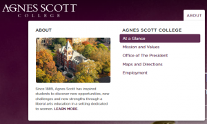
Both sites have curved edges on the drop down menus and sidebars. The drop down menus also have images in them. The curved edges make the site seem more feminine and appealing to its audience, which is supposed to be females.
- Screen clipping of the drop down tab from Agnes Scott’s website; From: agnesscott.edu, Taken by Destiny Dickens (click image to enlarge)
- Screen clipping of the drop down tab from Spelman’s website; From: spelman.edu, Taken by Destiny Dickens (click image to enlarge)

Screen clipping of the drop down tab from Morehouse’s website; From: morehouse.edu, Taken by Destiny Dickens
When observing an all male college, such as Morehouse, the edges appear to be straight, giving that site a masculine look. There are no images in the drop down menus either. Both sites, Agnes Scott and Spelman, have a color scheme of a cool color, violet or blue, paired with white. The headers are the main color, violet for Agnes Scott and blue for Spelman, with white text on top of it. Theses color schemes both look bright, friendly, and feminine. In contrast, Morehouse’s website has the main colors, black and white, with burgundy or red accents. There is less bright colors and it looks serious or professional. The femininity shown in the design of Agnes Scott and Spelman’s sites imply that they were designed for the purpose of being visually pleasing to a female audience, therefore promoting feminine pride and women’s empowerment.
Along with femininity, both sites show their pride in women and their success, just in different ways. Under Agnes Scott’s “At a Glance” page there is a link on the side bar to a page labeled “Why a Women’s College?” On this page they discuss the positive outcomes of attending a women’s college and how empowering it is. This is another promotion of women’s empowerment at Agnes Scott College. Spelman’s website shows their pride in women’s success, with the placement of images on their pages. At the top of their “About Spelman” page there is an image of women in their graduation cap and gowns. There is also another image with women in their cap and gowns on the “Ranking and Awards” page. Their images promote the empowerment of women with pride in their success.

Group of students graduating from Spelman(c/o 2014); from the About Spelman page; Photo Credit: spelman.edu

Group of students graduating from Spelman (c/o 2015); from the Rankings and Awards page; Photo Credit: spelman.edu
Women’s Empowerment
This slide show above was at the top of the Agnes Scott College’s “The Greatness Before Us” campaign. As you can see in the photos, there are three women in each one, with a different quote on the slide. The one reoccurring thing on each photo is the appearance of the words “Great Women”. This repetition puts emphasis on the empowerment of women. Even at the the bottom of the page there is the quote, ” Great Women will lead us forward”. The women in each photo are all diverse with different races and even age differences. This shows their students that they are all “Great Women” regardless of their race or cultural background. The three photos represent the past, present, and future of Agnes Scott. Each group taking the role of leaders, during different times on the timeline, as seen with the dates going across the tops of each photo.
On this page there is a tab on the menu labeled “student excellence”. On this page they trying to raise money support students with scholarships and funding study abroad trips. Also on this page, there is the quote, “smart women set the world on fire”. This is a form of empowerment to their students to pursue their degree and it encourages them to become leaders of the world.

Screen clipping from the Student Excellence page of the Greatness Before Us campaign ; From: agnesscott.edu ; Taken by Destiny Dickens
>>Agnes Scott vs Spelman: Do Their Websites Prom…>
Racial and Cultural Diversity
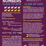
Links to PDF file of Agnes Scott College’s stats and numbers for class of 2015 & 2019; Photo credit: agnesscott.edu
Who Attends ASC?:
When you go to the Admissions page there is an option on the side bar labeled, “High School Students”. When you click on it, you will go to a page with information for applicants in high school. on the right side of the page there is a link that says “view stats and numbers from our most recent class”. This links to a PDF page with the student demographics. According to this document, “students come from 9 countries and 32 U.S. states and territories.
Also, 61% are students of color and 9% are international. This shows a large amount of diversity in the student body. The fact that access to this information is promoted on the page for prospective students, implies that this type of diversity is encouraged at Agnes Scott College.
Diverse Cultural Exposure:
On the home page, in the slide show, there is picture that links to information about “global learning”. This slide show is the first thing that is visible when logging onto the site. This marks its significance and the photos in the slide show must be important as well. This makes me assume that the global learning program is important to Agnes Scott. There is also a page on the website with information about the Center for Global Diversity and Inclusion. The page links to multiple pages, located in the sidebar, for more information about the different programs that are provided there and some of the policies at the college created to encourage diversity. This is an example of Agnes Scott’s promotion of diversity in race, culture, gender, sexual orientation, and religion, through its website.
Agnes Scott College Website: Digital Built Environment Description
When logging onto the Agnes Scott College website, the first thing I notice is the photo header at the top of the home page. There is a total of six different pictures that alternate like a slide show. Each photo shows something different about Agnes Scott. The first photo is a picture of the Dalton Art Gallery and its showing|thinking exhibition. The second picture is about the 45th Annual Writing Festival. The third picture is about the story behind SUMMIT. The fourth picture is about the study abroad programs. The fifth picture is about Xinyao Li, a current student that was accepted in to the Math in Moscow program at the Independent University of Moscow. The last picture is Elizabeth Kiss, President of Agnes Scott, speaking on the importance of women’s education. Each picture has a button you can click on that links to a separate page with more information on each topic.
- Slide 1
- Slide 2
- Slide 3
- Screenshot of Slide 4; Photo credit: agnesscot.edu (click image to enlarge)
- Screenshot of Slide 5; Photo credit: agnesscott.edu (click image to enlarge)
- Screenshot of Slide 6; Photo credit: agnesscott.edu (click image to enlarge)
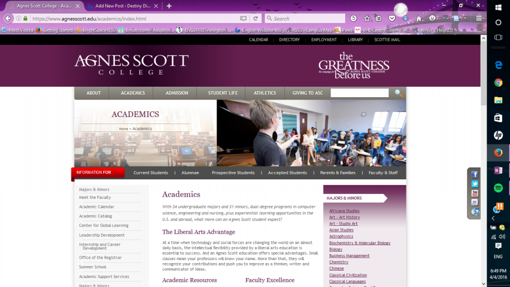
At the top of the home page, there is a menu with the tabs labeled “About”, “Academics”, “Admissions”, “Student Life”, “Athletics”, “Alumnae”, and “Giving”. When you click on the “Academics” tab, it takes you to the academics page. On the left side of the page there is a sidebar with a list of options that each link to separate pages. They provide information that students need about majors and minors, faculty, important dates, courses provided, support services, registration, and internships. On the right side, there is a list of the majors and minors Agnes Scott provides. Each item on the list links to a separate page, providing more information. Also, the title of the list, “Majors and Minors“, links to another page with the same list. As you scroll down the academics page there is information about academic resources, with subtitles linking to separate pages. There is also a “faculty excellence” section, along with “study abroad” and “internships” towards the bottom half of the page. The “study abroad” and “internships” sections have links to separate pages with more information. Below the main menu, there is a second menu above the “Academics” title. It has tabs labeled “Current Students”, “Alumnae”, “Prospective Students”, “Accepted Students”, “Parents & Families”, and “Faculty & Staff”. Each tab has a drop down menu with links to even more information specific to each category of people.
I notice that this page has the same color scheme as the home page. In fact, all of the other pages have to same color scheme. It is a combination of a somewhat dark purple and a grey, with white, purple, and grey words. The purple gives the site a feminine feel, which makes sense,because Agnes Scott is an all female college. The grey gives it a serious tone and, in my opinion, makes it look professional.
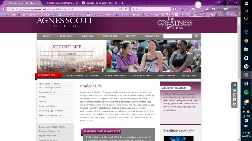
The main menu bar at the top of the page has a tab labeled “Student Life”. This takes you to the student life page. On this page there is information about student traditions, campus housing, dining, student organizations, community service and other resources provided for students. When you scroll down the page, there are three brief paragraphs labeled “community engagement“, “student support services“, and “leadership opportunities“, each linking to their own separate pages with more information on the topic. The second menu, as I mentioned earlier, remains right above the title of the page.
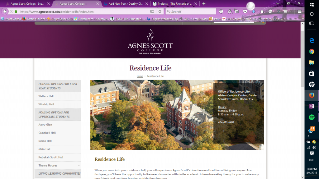
Going back to the menu on the left side of the student life page, there is an option labeled “housing”. When you click on this link, it takes you to the residence life page. On the left side of this page there is a list of options linking to separate pages. On this list there are two categories of housing, which is “first year students” and “upper class students”. According to the list, there are two residence halls for first year students and six for upperclassmen. Each residence hall on the list links to its own separate page with information about it. On the same sidebar, beneath the residence halls , there is a link to information about “living-learning communities” on campus. Under this, there is a list of links to more resources for students. At the bottom of the sidebar there is a link to FAQs and ways to connect with Agnes Scott College on social media, such as Facebook, Instagram, and Pinterest. In the upper middle of the page there is a brief overview of the housing on campus. Above this, there is a photo of some of the dorm buildings. On top of the photo, there is a text box with the location of the Residence Life Office, hours of operation, and its phone number. On this page, the second menu bar that I mentioned earlier is not visible.
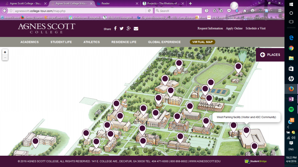
At the top of the home page on the main menu bar, there is a tab labeled “Admissions”. When you hover the mouse over this tab, there is a drop-down menu with a list of links. When you click on the link labeled “virtual tour”, it takes you to a page with another menu of options and locations to see on campus. In the lower right area of the menu there is an option labeled “virtual map”. This takes you to a virtual map of the entire Agnes Scott College campus. On the map, there are several purple dots, pinpointing various parts of the campus. When you click on a purple dot on the map, it causes a pop-up of a brief description of each location on the map and photo. Also in the upper right area of the map, there is a tab labeled “places”. When you click on the tab, a list of all of the place on the map. Clicking on each place on the list also brings up a brief description of that place along with a picture.
At the very bottom of every main page from the main menu bar, there are links to contact information. There are also links to information labeled “employment“, “maps & directions“, “event rentals“, “emergency information“,”accreditation & authorization“, “nondiscrimination“, and “privacy policy“. Underneath these links is copyright information, the address to the school and the phone number. Overall, in my opinion this site is very informative and useful to anyone that wants to know all about Agnes Scott College. I do not think there is any missing information!
Agnes Scott Virtual Map
This is a virtual map of Agnes Scott’s campus. It can be found by looking under the “admissions” tab and clicking on “virtual tour”. This links to a menu that has different aspects of the campus and there is an option on the menu that says “virtual map”.
Agnes Scott Residence Life
This is the residence life page. It it located under the “student life” tab where it says “housing”. On this page there is information for all of the residence halls located on campus. On the left side of the page there is a list of the residence halls. Each one on the list link to a separate page with more information.
Agnes Scott Student Life
This is the student life page. On the left side of the page there is a sidebar that provides links to information about student traditions, campus housing, dining, student organizations, community service and more. Each item on the list link to a separate page. When you scroll down, there is information about student support services, community engagement and leadership opportunities. Each section links to a separate page with more information on the topic.
Agnes Scott Academics
This is the academics page on the website. It provides information on majors and minors, registration, faculty and several other academic resources. On the left side of the page, there is a sidebar with links to all of this information. As you scroll down, you will see information about studying abroad and internships available. There are also links to more information about these topics. On the right side of the page, there is a list of the majors and minors offered to students. Each one on the list, links to a separate page for more information about the programs. You can also click on “majors and minors” and it links to a separate page with all of the majors and minors listed.
Agnes Scott Website Home Page Header
- Slide 1
- Slide 2
- Slide 3
- Screenshot of Slide 4; Photo credit: agnesscot.edu (click image to enlarge)
- Screenshot of Slide 5; Photo credit: agnesscott.edu (click image to enlarge)
- Screenshot of Slide 6; Photo credit: agnesscott.edu (click image to enlarge)
This is the slide show located at very top of the home page. It is the first thing you see when first log onto the site. The images display different aspects of the school and its success. Each image has a button the allows you to click and learn more information about what the image is displaying. The first image is Agnes Scott College’s Dalton Art Gallery. It is displaying its exhibition, “showing|thinking”. The next image links to information about the 45th Annual Writing Festival. The third image links to the information about SUMMIT. The fourth image links to information about the worldwide trips that students go on for “global learning. The firth image is a picture of Xinyoa Li, a current student. It links to her story about being able to study abroad in Moscow, Russia. She was accepted into the Math in Moscow program at the Independent University of Moscow. The final image links to a video of Elizabeth Kiss, president of Agnes Scott, speaking on the importance of women’s education.

