Biting The Hand That Feeds
Perhaps I’m biting the hand that feeds by writing this post, but the examples of “good flyers” we were shown in class really irked me. In this post I’ll try to filter my criticisms through the scope of Williams’ The Non-Designer’s Design & Type Books as much as possible.
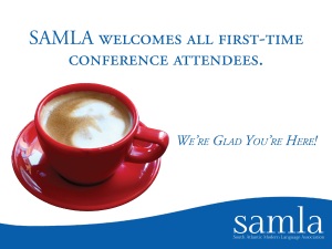
The font really bothered me in this flyer. As far as I can tell, there are two fonts being used, with two variations of each. “SAMLA welcomes all first-time conference attendees.” is written in a font using all caps. The portion of text below it uses the same font, but is italicized and in small caps. The SAMLA logo has “samla” written in lowercase with the acronym spelled out below it in title case. If repetition is as important of an element as Williams says, then it seems odd to me that this flyer has so much variation in font.
I’m assuming that “SAMLA welcomes all first-time conference attendees” is supposed to be the focus of the flyer, but the red coffee cup takes center stage here. The red of the coffee cup create contrast with the “SAMLA blue” (color code #085eab, if anybody wanted to know) used throughout the flyer, which is certainly not a bad thing, but the way it has been cropped is, dare I say, laughable. The jagged edges of the coffee cup are extremely noticeable next to the smooth edges of the text.
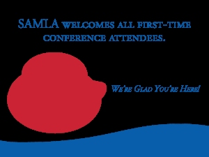
White space is also an issue in this flyer. The white space has a significant dominance over the flyer. As a good rule of thumb, try to design a document that has just as much white space as not-white space.* Below is a picture to illustrate how over-powering the white is in this flyer.
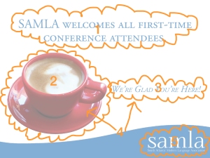
In regards to alignment and proximity, I don’t see a strong relationship between any of the elements in the flyer. I made a chart to aid me in my explanation.
1. This portion is centered. There’s also a weird amount of white space above it that isn’t reciprocated at the bottom of the flyer.
2. The coffee cup is thrown off to the left side of the image but it isn’t flush left. It looks like there’s an equal amount of white space above and below it, which is great, but its distance from 3 isn’t the same as from 1.
3. My criticism of this element is similar to my criticism of 2. It is off to the right of the image, but not flush right. If it was flush right it would line up with the SAMLA logo at the bottom (5).
4. I think you could consider 2 and 3 one single element because if you combined them, then that element would just centered, thus connecting 1 and 4. If this is the case their centers are aligned, but with their current composition I don’t think it really works.
5. The SAMLA logo is fine where it is except for the fact that it isn’t aligned with anything else on the flyer.
So the question arrises: how would I fix the flyer?
I would start with the font. One font for the whole flyer. I like Helvetica because I’m boring (see: minimalist) and it looks good on everything. I can’t think a situation where Helvetica isn’t an appropriate option. I understand that SAMLA is an organization that caters to people who are really into English so if Helvetica is out of the question, a serif font like Times New Roman (for digital and print) or Garamond (for print only) would arguably be more pleasing to the eye than either of the two fonts in the current flyer. They’re classic, used in a ton of books and publications, and are relevant to the event.
Next (maybe this should be first on my list) is the image of the coffee cup. It’s a great idea for an image because it appeals to the audience, but the fact that I can see the reflection of the coffee shop in the saucer bothers me a great deal. It’s on a white background, so the reflection defies logic in the context that it’s being used. To fix this problem, my first step would be to find an image of a coffee cup that’s better suited for this purpose. After that, I would be really precise when removing the background from the image to avoid sloppy edges.
For aligning the text, I would probably make everything right justified. It much easier for me to actually arrange elements in a photoshop document than to just talk about it. Sometimes better results come from experimentation.
I will post a revised flyer shortly.
*is there a technical term for this please help
I Already Told U That I’m A Minimalist
To reiterate, I really dislike this flyer.
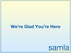
After a long internal debate about what would be the best way to revise it, I gave in to my minimalist tendencies and came up with this.
I know what you’re thinking. “Ha ha what the heck is this, Andrew?” It’s a deconstructed version of the original flyer.
I started by changing the font of the SAMLA logo. In my version “samla” is in Helvetica, with the acronym spelled out in Helvetica Light. I think it looks much cleaner and more professional than whatever font it was in before. I also removed the wave thing.
The coffee cup was originally intended to stay in the composition, but I decided it was unnecessary and the flyer actually looked better without an image. SAMLA is an organization that is interested in words. So I gave them words.
As you can see, I got rid of “SAMLA welcomes all first-time conference attendees.” It is redundant. Of course SAMLA welcomes all first-time conference attendees. And hopefully they welcome returning conference attendees as well. This sentence seemed superfluous to me.
So that leaves us with “We’re Glad You’re Here.” I think it gets the message across just fine. And in this context, it doesn’t discriminate against returning conference attendees. I removed the punctuation in the sentence as well because minimalism. It’s also centered.
Regarding color, I kept the “SAMLA blue” because it’s actually a nice color. I made the background a gradient. It’s opposite of the gradient used in the logo.
