The CURVEd Earth

When you’re trying to do serious data analysis, but you realize that you’re inside a dream within a dream…

Relevant links and information from the Mapzen Project Blog and the Wikipedia Commons.

I talked to Andrew Berens, one of the new SIFs here, and we discussed how to add a spatial relate the 3D Atlanta environment to the the real world for future applications such as holding your phone up on the actual street where the building was, but also more importantly having a specific relation of the maps from the Digital Collections, the Unity environment (which you view a broken version here! Please use FireFox, Chrome will not work currently.), and eventually to the research the research team has done.

What you’re looking at in the GIF is the Mercator Projection of a city (specifically Englewood, New Jersey).

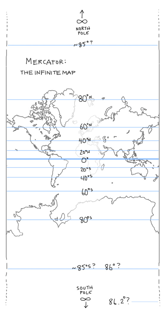
The map of the world (aka Earth) is wrapped around a cylinder to help us give a different version of the Mercator Projection. You see, Mercator is weird.
mercator

From the Mapzen blog

As you can see the poles are at infinity. Which makes it great for programmers like me which can discard without a care the poles (since no one really navigates there frequently), but it does provide some issues. Greenland is almost as big as Africa, Australia is bigger than the USA, and Antarctica takes up half the friggin planet. The reason why you would want the map around a cylinder is to decrease or at least make meaning of the Mercator projection on a big scale such as all of the continents.

The reason why the Mercator projection was made in the first place was to have all the continents one map for all to see in more or less their respective forms without doing weird stuff like splitting up the map into different parts.

However, if you zoom in on the inner globe to a scale such as a city inside of the cylindrical Mercator Projection, you get weird things going on.

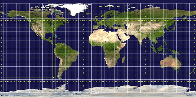
For the 3D Atlanta Project, we’ll probably do things in the Universal Transverse Mercator, or UTM for short, system. The main points why we’ll want to use this are:

  • The map projection is mostly uniform.

From Wikipedia Commons

  • Atlanta falls within about a very small space, allowing us to simultaneously depict the small scale of a city without huge projection issues.

  • We can use the UTM system in a small scale and say “five hundred and sixty thousand meters East”. You can do this in other map projections, but you can relate things to one another in small increments. “Classroom South is about 550 meters from Aderhold” is a pretty nice scale for computers. The smaller the scale of your grid, the smaller file size you’ll have to work with. (Better explanation here)

Having UTM in coordination with all of the other information will allow us to set a basis for the 3D Atlanta Project. By the end of the semester, we’ll be Oculus Rift ready! (and it won’t look broken anymore!) and we’ll add a lot of effects to it. We’ll also have talks/work on better enhancing the environment to fit our needs and then go back to allow for data analysis tools and other aspects of the project to be enhanced.

Until next time!

Future of 3D Atlanta

In the course of the 3D Atlanta Project, we have done some valuable things for both people who have seen the project and for ourselves.

We’ve learned about huge amounts of data, like from the Digital Collections site showing Fairlie and Poplar Streets or more recent documents like this Historical Survey from the Facilities website that give a wealth of information not only for the 3D Atlanta project, but for other projects around SIF as well.

Artist Rendering of what Fairlie-Popular might've looked like.
An Artist Rendering of the Fairlie Popular District in 1983.

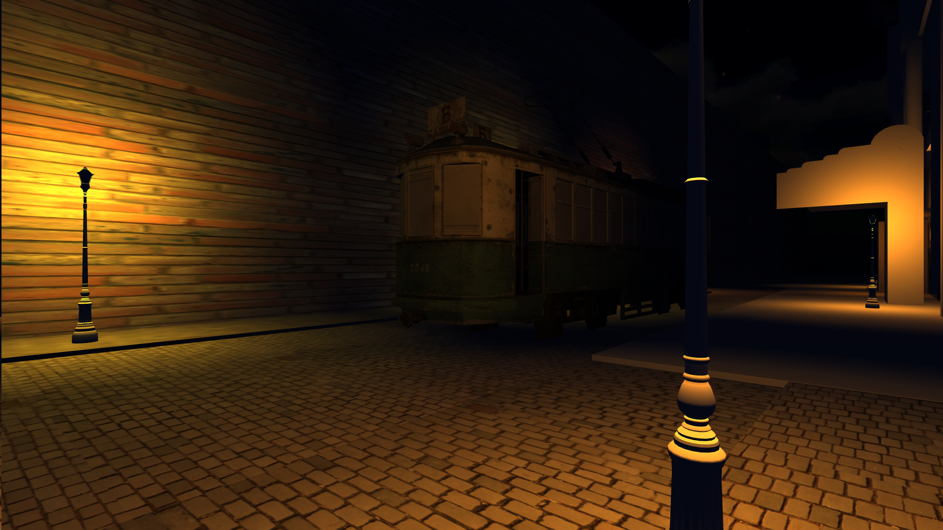
And just showing various pictures of the actual 3D environment is just enough to make people ooooohhh and ahhhh at what we have done.

car

Better lighting coming soon!

Better lighting coming soon!

But even then, we at the 3D Atlanta Project have hoped for more and for better. We want to expand beyond our bounds and tackle this project by hitting it head on.

This week, Brennan and Joe are away in Spain going to talks and meeting up with plenty of research teams, but they have emailed back some interesting plans for us. Brennan talked about focusing on the time element of the project, really see how things change in one place from each time period.

In some scientific papers I’ve read, this is called Diachronic Space. I’ve done a little research along Diachronic things, so I’ll make a blog post about it later, but basically it means to view things in one spatial reference in time. It is also used in reference to Linguistics as in people of a certain region at a certain time communicated with their fellow people in close proximity spoke the same language and maybe even create a dialect. Of course, some exceptions could be places like the Mediterranean Sea where evidence has shown that people spoke the same language with different jargon that still understood each other, but over time used maybe a single language like French or Arabic. And then over time, even French and Arabic or French and Arabic turned into another entire language!

But I’m getting a bit off track. More of that Diachronic stuff later. Right now, here is the progress on the 3D Atlanta Project.

  • Shakib, Megan, Priyanka, and I (all SIFs) have been working on our models over the last few weeks and learning Blender.
  • Priyanka and I are trying to texture this weekend to see if we can get something nice going in the Unity Environment. Megan and Shakib will continue building out.
  • The focus now is getting all the models imported to the project and then requesting more photos near our current location to the research team.
  • The final thing for this semester will be working on more models and getting them into the Unity Project to have a block ready for Oculus Rift.

No one said building a game would be easy. It’s definitely easier thanks to all our resources at the University.

But what if we wanted to build up more in less time? To really expand beyond our box models, yet still keep the aesthetics we want?

Here are my thoughts:

  • Bringing the research team into the 3D environment. What this means physically is making a Unity plugin to bring together the 3D and research teams together. It’ll work like the following:
    • The research team will continue to add things to an excel spreadsheet they’ve been working on with more parts to it. Currently, it just has a photo, name, year, and location of a building. We’ll add a LOT more elements.
      • A column for Did you know information, another one for relevant information in the Digital Collections of other documents, and other potential information will be put in the excel sheet.

      • The file will be scanned and turned into JSON (Basically another excel sheet but better) and will automatically populate the 3D environment with a dummy building in referenced space, user interaction elements for players to go an look at, and other relevant information, including other plugins.
      • I believe for the research team a workflow with their excel sheet, map of the entire area, and relevant information inputs could be modeled in some way like the devmap.io project as a web app.
    • I think that this Unity plugin will stand up the basis for that spatial relativity we’ve been looking for in the project, accomplish in speeding up our workflow, and also allowing for more space for expansion. Having each building as an object with its own attributes in the JSON allows for dynamic integration for other data and examples such as:
      • Custom timers for in-game events, possibly even a story for the game to be produced in the future.
      • Ryan wishes to add narratives to the project, and with the speedy workflow, will allow us to reach character modeling stage a little faster. Then we can add narratives to specific buildings or locations, even other audio files like jazz music automatically!
      • Definitely integrating huge data from Social Explorer and other relevant GIS projects directly into the Unity workflow. Seeing the change throughout time in significance. It would also allow for the Unity web player to be exported and allow for easy integration into the Atlanta Maps Project part of Atlanta Studies.
  • Showing the Diachronic medium Which means finding some resources to really show off the time periods, especially in terms of architecture.
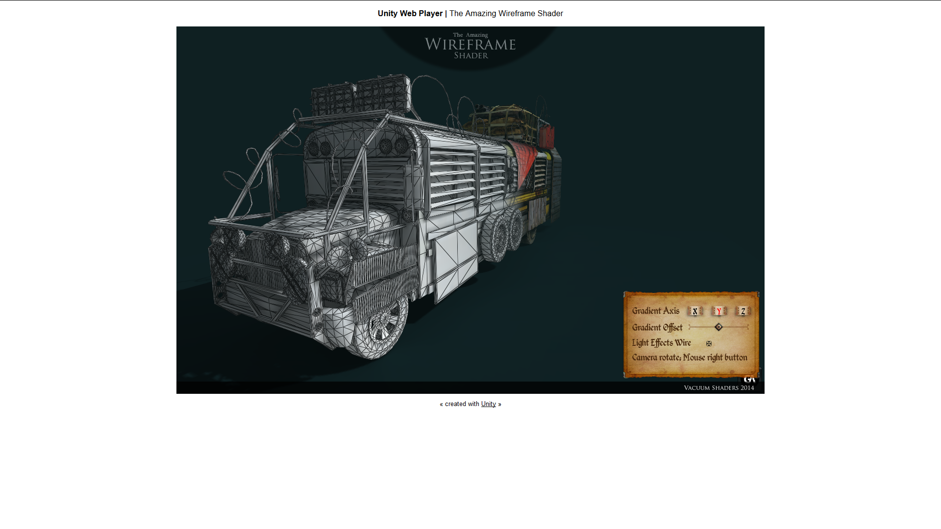
  • This would mean overlaying something like the Wireframe Renderer, and seeing the new present day building on top of the old demolished ones. Click the picture below to go to a live preview on what it could look like!
    Wireframe Shader

  • Overlaying the Social explorer data might be tricky, but since Unity uses OpenGL and WebGl, we could easily use those technologies or even Threejs to render cube images on top of the Social Explorer data. So the user could click a button to look at the whole city and select or import some Social Explorer data to see how the city changes in 3D space.
  • And finally, showing the progress of Atlanta with Procedural Generation of building structures will be very cool and make an impact. An idea that popped into my head was like we could go on the streetcar, select a time period to go to, and then go to that location by streetcar that gradually transforms into a MARTA bus, and then looking around you as the city changes like in Assassin’s Creed 3 (Gif shown below)

But those are some of my thoughts on the project. Can we do it is another question.

Well I have a 3D team consisting of 3 Computer Science majors and 1 Physics major with CS concentration, which is by far a very good team to teach and learn together, especially in the context of 3D space, a research team light years ahead of the 3D team, but are still looking for workflow tools, and then I have an army of both experienced and inexperienced coders that I could pitch this project to at PantherHackers—a large majority of whom would like to experience game design and development, and also other GSU projects that will be outsourced and worked on in CURVE.

I’m in over my head, that is for sure, but I think with enough pushes in the right places, the 3D project as well as all projects in CURVE can be facilitated better for benefit of the entire GSU community.

If you have questions about technical details, comments about specific parts of the project, or just fun questions to ask me, feel free to leave a comment below or talk to me at wmomen1@gsu.edu.

Learning by Action

Helllllooooooooooo World! I am back and better than ever.

This is not going to be my regularly scheduled blog post as I do normally before the end of the month, but I decided it wouldn’t hurt to get one out beforehand. I’ll still do my regular one however that is more detailed and project-oriented.

Sooooo some updates:

  • I got to go coding with Microsoft! Not only me, but also Ram , another SIF from last year! It was an awesome experience. We got to go tour Microsoft’s campus in Redmond, Washington and look at life around Microsoft. Primarily, however, we worked on a full week of coding for SCAMP or Simple Cloud Manager Project. It is a project to help Azure Cloud Service users and subscribers (such as Georgia State) to deploy fast, easy, and cost-effective resources to people who don’t need to learn behind the mechanisms of the cloud. So a teacher that needs a website can have one at the click of a button, a student project can go live in an instant, and multiple uses for scientific computing. Exciting stuff! However, it seems as if Microsoft took the initiative and decided to go closed-source on it and want to develop it by themselves, which is totally fine. I still have the code that I want to modify and understand once I learn C# from the 3D Atlanta Project. I got to learn a lot about the Cloud, networking, encryption, and programming at Microsoft, and using my newly-learned skills with….
  • … PantherHackers! I don’t want to make this a whole shpeel since this is my work blog (However, I’m thinking about having my own personal blog. ), but PantherHackers is a student organization that was created by the person with glasses standing next to me in the Microsoft article above, Caleb Lewis. We strive to offer the students of Georgia State a way to make their ideas become reality through the skill of coding and marketing their ideas to business and users. We hold a lot of our hack nights in the CURVE, so be sure to come check us out!
  • As of this year, I am also part of the newly formed CURVE advisory board! I’m the student representative for board. We’re having our first meeting this Thursday, but basically we regulate the policies , create new ideas, and establish relations of the CURVE space to the faculty and students of Georgia State University as well as the greater community of Atlanta, and by extension other academic institutions. You can check more on that in the annual report.

Well that about covers the highlights of the summer. I also went to Jekyll Island for my dad’s annual conference at the GAPPA (Georgia Association of Physical Plant Administrators) meeting. It was okay, but the sea wouldn’t let us in for swimming. 🙁 I also went to Gatlinburg, Tennessee over Labor Day, and my family discovered we loved hiking so much we’re trying to go to local Amicalola Falls one weekend. Next year we’ll try both Canada and New York, and maybe see if we can squeeze the Blue Ridge Mountains in there too (Highly recommended, Cheap-ish cabins and open wilderness).


For work related news, I got some exciting updates. For 3D Atlanta, we have old and new SIFs working together. I realized we need a framework to accomplish what we want to do, kind of like how we did for SCAMP. I’m thinking about making every building or object a literal object (in terms of code, technically it already is within the Unity Engine) and having its own JSON properties. This would allow the Research and 3D team to work together better. The research team could update their excel file, the file would be imported as JSON to Unity, Unity’s many JSON formatters like SimpleJSON would parse it, and then code would fire off events based on the JSON to create dummy buildings (or picture-created buildings ), UI for interactions (including Did you know? sections), and populate relevant artifacts from the Planning Atlanta Collection as well as Emory’s cool objects.

Sounds big? We’ll you’d be right it’s big. What you read is practically pseudocode for what should be a database-oriented project. Emory did something similar to this and we are contemplating that after we finish the Decatur Street, Ivy Avenue, Central Ave block whether we should focus more on quantity and not quality. I’m a aesthetic-type person, so the above is what I plan on trying to do through Unity whether through a plugin or some other means because I not only want the 3D project to go smoothly and efficiently, but I want it to look and interact alright too.

Right now, we are focused on getting Oculus-ready for our next demo. We’re gonna model like crazy and even ask other people, including classes here at GSU to help us model.

I’ll have more information on where 3D Atlanta is going, but I wrote a lot of text right now and just made this huge blog post for this reason:


Whaaaat?


Now I can play games and do work at the same time!

Hahahaha no, just kidding. In case you didn’t get it Blender is now on Steam, one of the most popular gaming communities. I’m using Steam so I can see how many hours I’ve logged into Blender. Pretty cool use for everyone to chat, stream, and collaborate on Blender for Steam.

Alright then, good stuff coming soon on the 3D project. Hope to see everyone in the rotation soon!

Undergrad Innovation

This week I was asked a question when coming up with elements for a project proposal for 3D Atlanta along with Krisna, Alex, Robert, and Dylan: “What has the 3D Atlanta project done for your undergraduate experience?” And while I tried to keep it short (not really) for the proposal, I realized just what this question was asking me.

You see, I tend to think of my progress in certain year frames. In 11th grade, I started learning Photoshop and basic design principles of drawing and illustrating. By 12th grade, I had a good knowledge of html. By last year, I had good knowledge of css and started working on Javascript stuff, as well as had a great knowledge of Python through my 2310 class. And now this year is all about execution and applying what I know, especially within 3D modal contexts for the 3D Atlanta project.

I find myself looking back and realizing how fast and far everything went. It seems like an exponential curve of innovation. I went from making boxes move on a screen to dealing with dynamic layers of interactive material. And now, thanks to 3D Atlanta and my math classes, I’m starting to look into stuff I thought I wouldn’t touch until the end of days as a college student. Things like projection matrices, raytracing, and other 3D concepts. I find myself reading papers from Disney research in zurich about complicated algorithms and equations that I can start to understand now. For pete’s sake, I’ve started reading and trying to understand Einstein’s field theory equations! It’s so mind boggling!

I’ll have to admit though, this process of learning does change some things. Practice becomes a lot harder due to the time it takes and the learning curves become steeper. This isn’t about drawing lines on a page to make squares anymore. One of the fundamental changes include what exactly I want to do now concerning my major. I’m definitely staying with Computer Science, and while I can do and learn how to do any programming, I would like to focus more on experimental computer science kind of like what the people at Disney Research do, but also study animation since I love the world of animating so much. But programming Maya scripts vs Graphics programming is a pretty big step in between, and I’d be stuck in the middle. If there’s something like becoming a computer science/animator thing, please let me know.

But I have no doubts that the SIF program has enabled me to do everything I dreamed of doing. Now I can start acting on the ideas that have been stuck in my head all these years. And I have you, fellow SIFers, to thank for that.

Thank You.

The Creeping Up Problem of Innovation

Hey guys!


We’re in the middle of February, but its still the new year! So…yeah…Happy New Year…

To business! Lots of stuff happening around CURVE. I’ve been dropping in on a few consultations to see what’s going on around the University and it seems that a lot of business majors are coming in talking about big data analytics, which is cool since we have loads of people in that department. Other than that though, there seems to be a good amount of people in there working on school projects and whatnot, myself included. I’m working on a math project right now dealing with audio algorithms and music, so looking forward to that in another blog post.

Anyways, the topic I want to talk about in this blog post is about…well getting ideas for projects in the first place. Yes, yes…most of us at CURVE get ecstatic about working on another project when we have 5 already under our belt, but it pays to keep an open mind.

I found this  website by Harvard University dealing with annotating, digital literacy, and multimedia. The website has a lot of different ways to enhance things like pedagogy, collaboration, and note-taking in the modern-day classroom by doing studies on these specific subjects.

They also provide a whole bunch of links to some very cool projects like VATIC which is an awesome video annotation tool. I suggested it to Mandy who was going to give a presentation to the CDC for studying the Beltline, but, in retrospect, I felt like if the CDC wanted to a deeper analysis of the Beltline, then they would be better suited to use Nvivo.

Anyhow, the Harvard website has research done for almost every type of media. Maps, 3D, images, video, text…it’s all there.


There is a problem however: any project mentioned under the Harvard website was made a long time ago and never returned to later.


I thought it was just laziness or something else that stops a project, but that doesn’t always seem to be the case.

Take Audacity for example. Audacity is one of the most widely used audio editing software on the Internet. It was built for people to use everywhere and for free. Audacity was so popular that students and teachers alike wished for better features and a more responsive interface. But it never got any of that. According to OpenHub, a website dedicated to tracking open-source software, Audacity only has about 6 contributors to it. Yes, yes…Audacity is free and not exactly a huge dev team getting paid millions to make the program, but usefulness and user popularity should’be protected it from utter abandonment right? (You could argue the Sourceforge incidents, but that is somewhat removed from the problem)

My point is that you’re seeing this problem occurring again and again all over the place. Innovative ideas, human-computer unities, and social congruency all gone within a few months.

Heck, you can say the same thing to social media. Sure, Facebook had a movement from the youth of America to the Moms of America, and while it is still active, most child to teenage youth say Facebook is on its way down. (And since Twitter, Instagram, Snapchat and what have you aren’t really strong alternatives, it leads me to believe that the next guy creating a social network within the same realm as Facebook in the past will get a loooooottt of money ;{ )

Well, I think we need to address this problem, because if we don’t, we may see ourselves heading down the same paths of countless other innovators before us.


Thanks for Reading!


Interactive Video

Hello fellow SIFers,

I know people have been wondering for a way to make videos more…fun? Yeah that’s the word. Because I don’t think many people want to sit through a video of someone talking about an event or idea. You also don’t want to make more work that is overtly complicated.

Sooooo I found a library that deals exactly with that. It’s called p5JS. It pretty much gives users the power to interact with video. You can view an example of it here.

p5JS is a spin off from Processing, which deals with accessing artists, coders, and other visual-relation fields together. It’s a broader scope than just dealing with interaction such as quizzes or tests. It encompasses a whole new idea of digital literacy by imploring the user to learn from mistakes and practice on skills they already learned in class.

So basically, it’s sort of returning to us 90s kids generation of primary learning. Video shows like Dora, or Sesame Street, or Blues Clues where learning through video meant waiting for user to make a suggested input and practice on that input throughout time with repetition.

I guess that method of learning through video got lost somewhere between elementary and middle school, but hey we can always do it with the next generation of kids.

On a related note, P5JS and Processing are both part of a wider gain of web technologies focusing on creating new ways for people to express things in the browser: HTML5.

I’ll talk about that in a later blog post, but for now I’m off to go play around with WebGL stuff.

Until next time, SIFers.


Etext problems, potential solutions, and your weird Data

Hey guys. Sooooooo imma go out of my realm for a second to talk about a popular topic around here in the SIF world: Etexts.

One of the major problems of languages today in terms of communicating is that weird letters don’t really translate into numbers really well. Granted, the English alphabet is recognized by computers all the time because, historically, English was the major language used by the people who helped advance computers back in the 40s or 50s when they really got rolling.

So that solves the problems of English somewhat, but all languages have to be encoded someway into the computer. 1s and 0s have to be included somewhere.

Somedays (when your really tired doing that “paper” last night when you were really partying out with your friends) you click on a regular MS word doc, but you right click and open in a regular text editor like Notepad and get this crap:

ä_ûø||¤âkì&¥!z’åd³’êP¥ÃÖük¾§š’PKoð„¬  PK  }\E  docProps/core.xmlmÝJÃ@FŸÀwXö>™FA$$é…è•‚ØV¼]f§ébö‡Ý©IßÞmÐ(ØËá;s˜ùšõdñI1ïZY•+)È¡×Æõ­Üm‹;)+§ÕàµòDI®»«C>ÒKô”J”‹\ª1´òÀj€„²*•™p9Üûhç1ö~¨žàzµºK¬´bga£üVj\”á‡Y h KŽTe¿,S´éâÂœü!­áS ‹èO¸ÐS2 8Žc9ÞÌh¾¿‚÷ç§Íüjaܹ*$Ù5k6<Pw¿{}{>ê|¬ØFe\î¶Ô§ª…v_PK ïÙ]ò œ PK  }\E  word/numbering.xmlíÝŽ£6†¯ ÷!åp&˜B¢ÍìAW[µUU»½ œ-2ì\CzÖžöÚz%uþ˜MB dmÞ#ì¼ñcëó0ïÞ‰ÂÞšñ,Hâ™AM£Çb/ñƒx93~ÿôñÁ5zYNcŸ†IÌfÆ ËŒ÷Oß½ÛL㔚3.úõDŠ8›FÞÌXåy: 2oÅ”š=&)‹Eã”áÍÅG¾D”.Ò/‰Ršó ò—ešŽqH“ÌŒ‚ÇÓCŠ‡(ðx’%‹|2M‹Àc‡Ã1‚×¹î>äCâ‹óÝœ…â’8[iv̵Í&WÇ$k™ˆuûmÒ:Wó9݈ç…û mî§<ñX–‰³öeFbÖx€ÛeD[8½æñN”Äeš­;Ε×~×><´]ªW!¯Ï” ëÜȾé9˜sÊ_.xž_ǧA-ŸeQyÁKC¶Iá­(Ϗ Â6ÂÄûÌüïi¼¦¥™ýe-;Ÿeòºä4z5iÖè›%æ™]~[Ñ”½f[þ¿l?ð¤H’1Ñy–sêå?Qïäӏ¾Êv]Âu(šq˜æîŒÌx.έi¸í4xÚe£òä¼C–ï[Dà’ö¥lú÷ï?Ëó?ydz![º§¿ðí!ˆ}Ѷ==3Æ–R7ÓEÀ³ü9ØþH†Ž¹í=(»óý¡8æ‹ÅH{è

And your like: “OMG I BROKE WORD!!! MY PROJECT IS RUINED!!!!11!11!!!!!!11!111”

Don’t worry about it, it just 7-bit ASCII.

To cope with the problem of natural language processing, a branch of machine learning (think artificial intelligence), computer scientists employ many different encodings to protect text or other media from becoming distorted.

The above first  lines in binary looks like this:

11000011101001000101111111000011101110111100001110111000011111000111110011000010101001001100001110100010011010111100001110101100

which translates to:

&#195;&#164;_&#195;&#187;&#195;&#184;||&#194;&#164;&#195;&#162;k&#195;&#

which are html characters your browser can detect and use for spacing, symbols, etc…

So there you have all your data, not alien symbols from another planet. Pretty cool right?

This binary data can be used for any type of media, and we can see this through 3D binary visualizations.

A PDF file.


32 bit Windows executable

(All posts from this tool called binwalk, Github repo containing code to make this visualization here)

Here’s a nice Ted Talk talking about binary visualizations here.

Currently, text encoding on etexts for tablets is not really standardized. Most of the laid-back app developers in the store just use zooming as a way of getting you around the document you’re trying to read, but it is very inefficent and makes for tired fingers. Others use an algorithm to help display text in the right way like as discussed in this video:

Some academic uses for text encoding come from LaTeX. I’m pretty sure it’s phased out now by MS’s new mathword thing that tries to do math equations on a document, but someone out there might use it.


Anyways, it opens a major problem for people who wish for broad acceptance for the use of etexts. You either have to make an algorithm that displays a certain font and then use it FOR ALL FONTS EVER MADE!!!!

Or you can low-brow it and use a zoom function.

There’s plenty more problems in the world of text, typography, and computers, and if you want more posts detailing this subject just leave a comment.

I suppose that is it for me today. I’ll be sure to check in next week. Last week was really busy. 😛

I leave you with these optional videos you can see I found very compelling. Well…I guess if you like listening to old people like your grandparents it is interesting.

 
The History of Typing and Setting of Text

Jailbreaking (not your phone) in the old days


Data Visualization in the Modern Browser

Hello all, got some good stuff to talk about this post.

My ThreeJS stuff is hitting off the roof now with more and more projects coming in from a lot of different places. So much in fact I can’t process it all. So I have decided to spearhead renewed energy into all this ThreeJS stuff. Originally, my plan was to add to it gradually, but I see that time is of essence to get my point across.

Well, enough about me.

It’s time for you guys to see what I’m doing.

First of all, I have been researching a lot of the potentials of ThreeJs and WebGL in general. WebGL is the standard of graphics in the browser. It’s the flip side of OpenGL, which is a larger library with more potential, especially for phones. Anyways, I’ve been looking at a lot of Google Talks and research stuff, which was all kind of exciting, but I could have done with a paper I could browse in 5 minutes vs a 20 minute video.

Anyways, I looked at this thing called ROME made with a lot of people and some Google employees. It’s a movie that interprets a lot of content in just a browser. Pretty amazing interactive music video. Click here to see it.

Awesome visualization through shaders in WebGL as well as a little pick up from ThreeJS

Cool stuff. Also, I looked at a lot of cool data visualizations using just simple JS to make graphs and charts:

  • Polis is a nice way of getting huge feedback yet having planes of agreement and disagreement between people.
  • This  is by Information is Beautiful. The chart is referenced in a lot of Ted Talks and stuff.
  • A great way of delivering meaningful content, D23’s library is an awesome way to just get code and input your own values to get awesome data.
  • Deeptime is a really nice interactive piece. It shows history throughout time and provides visual cues for people to read about. Wish every textbook was like this.

However, one of my favorite websites using Javascript and ThreeJS in general is UniversLabs  They did some cool stuff with the Python Programming language and the 3D program Maya. Stuff of dreams it is.

Hopefully, I’ll be able to develop upon this tech and make my own stuff.

However, right now I’m gonna just get through some projects and get the Tools Wiki into overdrive. I’m gonna do something special for Halloween at CURVE using Three.JS   😉

After that, I’m gonna try and do something like ROME where it’s a virtual movie in ThreeJS. I’m thinking this nice single by Imagine Dragons that they made for the League of Legends Championship. Google already has the cel-shading techniques down, but the light diffusion on those clouds is a whole nuther thing I’ll tell you that. Pretty cool if there were rays of lights coming out every which way that have some motion and character into them.

But until that time, I’ll sign off with one of the treasures of the Internet.

Enjoy 🙂

Gettin things rollin…

Cool, so we built our first “pre-viz” versions of the wiki, but it didn’t look like anything we wanted it to look like because the default wiki sandbox doesn’t have a css editing plugin. I tried other sandboxes, ways of editing a page, and even just straightforward code, but nothing really worked.

I did find this app for Google Chrome called Stylish: https://chrome.google.com/webstore/detail/stylish/fjnbnpbmkenffdnngjfgmeleoegfcffe?hl=en. Pretty cool. It enables you to add your own css stuff right into the app so any page you look at is customized to your liking. I used that and our css profile to make wikipedia look different and show our design.

Anyways, we decided to open a wikispace so that we could put in some content. We are not going to fiddle with it now, but we are creating separate blogs to try and create another brainstorm type thing. Once we figure out the how the info fits in to different slots, it’ll work out fine.

————————————————————————————-

Three.js page for the SIF Sharepoint website is up which is AW3SOM3. Now, people will be able to look at different,cool things that can be used for other purpose other than different, cool things that just look different or cool. :/

Anyways, it’s a big step in things for that little side project/fun time thing. I’m trying to be straight up on my goals and perspectives for that…”thing” because I don’t want it to be a project or something, but more as a thing where SIFs can just drop in and drop out to peruse some cool things.

However, I will continue to add on it during my free time.

————————————————————————————-

On an unrelated note, Joe asked me the other day to pull up some stuff using Three.js on the InteractWall last Friday and one of the people he was talking to wanted to see it in terms of social media.

While Three.js, WebGL, and Canvas have a lot of things in the social media perspective, there was one problem…Chrome did not want to display in 5760×1080 aka the InteractWall resolution.

I was questioning why the content of my thing was getting cut off until I realized that the screen resolution for Chrome was at its default monitor screen size.

So I’m proposing that we change the Chrome screen size from its default 1080x1920p to 5780x1080p. That way, people’s content won’t get cut off and there will be no repercussions to anyone or anything on the InteractWall. I’ll check it out sometime this week.

Also, I have been noticing that people who use the InteractWall or 4k workstation are having trouble uploading and resizing files, touch capacitive interfaces, and other stuff like that. So it might be time to “upgrade” the InteractWall. Now, when I mean upgrade, I mean just a few plugins to get our sore fingers rest from clicking so much. We shouldn’t have to teach people how to use the InteractWall. I mean tablet technology has gotten to the point that people can just turn on their tablet, press a couple apps, and read a book and whatever, but they should be able to do the same thing on the InteractWall without any worry.

As a lot of SIFers know, the last computer on the array of the InteractWall is used for display control and separation. We can bring the 4k screen to the InteractWall and back, separate multiple picture-in-picture frames, and just roundabout transformations on the screen. Most of this can be controlled by simple Windows Key shortcuts by pressing the Windows Key and an arrow button to max/min content or snap it to the extreme left or right. However, many people don’t know that shortcut, don’t have the time to open multiple files, and other crap they have to do while up there on their presentation. On top of that, Windows does not see the InteractWall as three separate distinct zones of screen or ever screens at all rather than just a huge display. That’s why we are there at CURVE giving customer support.

But what if we didn’t need all those things? What if people can just get all the files with their presentation, but not have to spend any money on clickers, presentation software, or give that awkward period of silence waiting for the person behind the computer click to the next piece of content? IT’S MADNESS!!!!!

Those are the sorts of questions a lot of people ask themselves while working with technology: how can I do things fast, cheap, and efficiently without clicking everything? Some answers are given like Prezi or Powerpoint where you can make a quick presentation given that you have the time and experience to do that, but what most people want is just a way to bring simple data onscreen without any of the middle-man stuff so that they can teach a class or get their idea across.

Why do you think people who work on just a board and a marker get their point across faster than those working with a multitude of technology? There have been studies done, and they all point to this type of logic in presentations. Most of what you see and hear in lecture halls is not on the screen, but the person teaching it.

Letting that creative, intuitive understanding of a person with years of experience should be allowed to come out pure into the classroom, conference, or whatever medium expressed in.

That’s the point of technology. Of innovation. Of CURVE.

To the tools

Yep. Tools wiki. Trying to get it up so far has been a pain, but we are working on it whenever we can.

The problems are that there are no real “local” availability wiki software that I can use and have complete control over while I use a “THEME” to try and create a meaningful site with information.

Yeah. THEME is in all caps because it literally took me a week to find out that Wikis aren’t built out of “Templates” but “THEMES”. :/

Whatever.

More stuff to come soon, but the team for the Tools Wiki is on the move as I write this.

______________________________________________________________

Justin recently started a sort of hybrid way of maintaining sites and workplaces for all the projects going around CURVE and the different departments. It’s set on not actually making CURVE a series of just cool projects, but instead trying to collaborate learning and working together in a space where everyone can contribute to the conversation.

And that’s what CURVE is all about honestly.

Whenever people come in and ask me about CURVE, I give them an answer about group work and technology, but in reality that’s not what it’s only about.

It’s about looking at things we don’t understand or know about and trying to make sense of it.

At least, that’s my take on it.

I have a lot to contribute to some of the other work going around in CURVE, and most of it probably has to do with coding. Therefore, I’ll get to exercise my coding brain a lot by the end of each and every week.

Cool stuff going on, looks like we are heading to blast-off with CURVE.