UX Case Study- Chinese Restaurant Mobile Website
By: Tingyu Zhang
Date: April 21, 2024
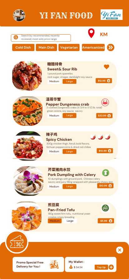
My Design-Wire Frame-Improved Food Mobile App:
Created via Canva
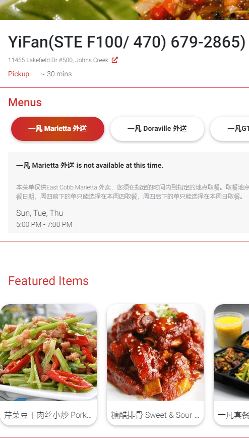
Old YiFan Food Mobile Website:
Project Background
Context
The purpose of this case study is to showcase how an old-fashioned and not user-friendly food mobile website was re-designed and developed as a completely user-centric and modern web application using contemporary design practices.
YiFan is a Chinese food restaurant nestled in the heart of Johns Creek in Atlanta that offers fusion cuisine. It offers a pick-up food ordering service through the website https://qmenu.us/#/yifan/menu/1645135062215.
I intended to test if this mobile website is accessible and user-friendly and lets Chinese users and a few American Chinese food lovers order meals from the food website on their mobile phones quickly and easily at their convenience.
Problem
The previous website was outdated and was not too easy to use. After I scanned the website and interviewed some Chinese customers who visit the online food ordering websites on a regular basis, these problems were also verified by Kai who has very insightful ideas about UX and can provide some innovative ideas about the user-friendliness of Chinese food ordering website, although she is a vegetarian and there are only a few vegetarian meals on the website.
Kai said, “The website isn’t that easy. The categories are really random. We’ll have to scroll all the way down to get to what we want. And even in the feature items, it’s really random and like you can have dinner or rice. You’re not able to click to get to a shortcut like click to go to seafood, click to go to meat, or click to go to vegetarian options. Also, it’s not a search function. The only thing you can do is to pick the location of where the menu is or what the menu is. The cart was okay. The navigation for that was pretty easy.”
Goals
- To build a new website with a completely new and modern design.
- To give users easy access to what they want at first sight such as the food name, description, price, and allergic items.
- To help the restaurant retain the trust of their clients and show that they actually care what customers want like coupon information and search history by adopting the new design.
- To help users save time by searching easily and by requiring less input.
Usability test:
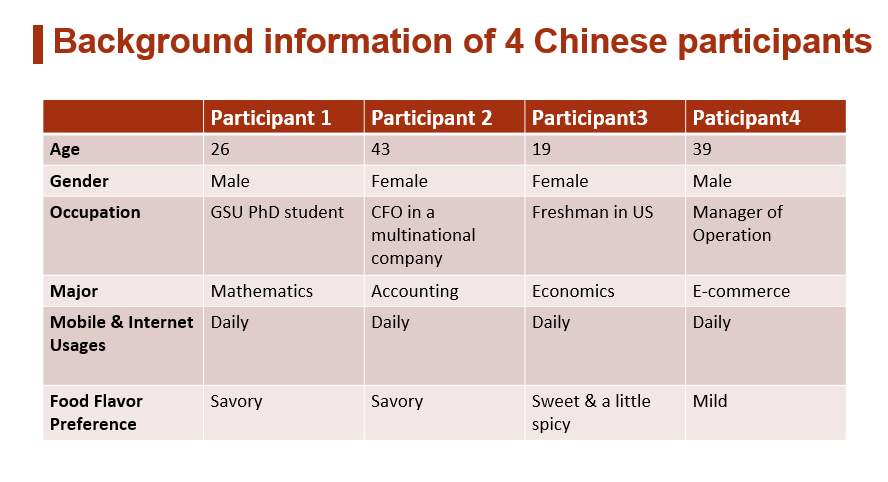
I recruited 4 participants to understand their user experience of ordering dishes for Chinese New Year on the original website and they all have some experience with ordering Chinese food via other online platforms. I recorded the process of how they ordered their favorite 5 dishes from the website and conducted face-to-face interviews with them using 15 questions in 20 minutes.
The participants included 1 friend, my husband,1 schoolmate at Georgia State University, and 1 student at Boston University.
- To truly understand the needs, behaviors, and motivations of the users I’m designing for, my research identified 2 pain points:
1). Ease of Use
2). Time
- I used Zoom & Tencent Meetings to record them how to use the website to order their favorite 5 dishes for the Lunar Chinese New Year’s Eve in 10 minutes!
- I conducted an online interview afterward to ask them 15 questions about the positives and negatives of using this food mobile website.
Before the usability test:
I told them these instructions clearly and asked them to think aloud while doing the tasks. The think-aloud technique was used to extract information about the users’ thought processes during the task.
“Please take 10 minutes to order your favorite 5 Chinese dishes for Lunar New Year’s Eve on this food ordering website. You need to log in to the website using the Chrome search engine on your laptop. But you need to click toggle device toolbar mode (Ctrl+Shift+M) so it can show the mobile menu mode on your laptop, as it is convenient for me to see how you click and scroll down the menu with the recorder. This is for my user experience research need instead of for commercial use.”
- You don’t have to go through the full process of buying them. Just order 5 dishes and put them in the shopping cart then cancel.
- When you browse the website, feel free to speak out loud about your positive or negative feelings towards any button, image, tag, or any other design element on the website, which will be helpful for my research.”
During the usability test:
| Task 1:
Go to the site Task 2: View the Menu Scroll down to the bottom of the main page to find the necessary information on the menu. |
| Task 3:
Find their favorite dishes Find the “menu category”, and choose 5 favorite dishes for Lunar New Year’s Eve. |
| Task 4:
Put dishes in the cart Put 5 dishes in the cart and click on “Check-out”. |
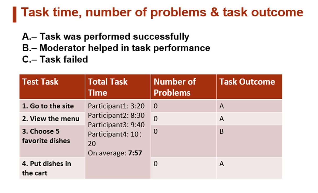
Task Time and Completion outcome:
The average task time of 4 participants, the number of problems per task on average, and the task completion of the 4 participants are described in the following table.
After finishing the task of ordering the dishes:
I evaluated the usability of the website by interviewing each of them with these questions and made a summary of their opinions.
Interview Questionnaire:
2 background questions +13 interview questions
Background questions:
- What is your preferred flavor (You could choose multiple options: Sweet, Spicy, Savory, Other)?
- How often do you order Chinese food online? (Options: Once a month, Once two weeks, Once a week, Twice a week, Three or Four Times a week, More than four times a week, or Others.)
A. Overall website aesthetic
- Do you think the main color of the food website is visually appealing?
- Do you think the fonts are big enough to see?
- Is each photo large enough to see?
- Do you think it is well-organized?
B. Item selection
- Could you tell from each title what the ingredients of the dish would be? How spicy, sweet, or savory it would be?
- How did you choose the dishes you chose? (Options: Image, Title, Description, Other.)
- Can you find your or your family member’s favorite dish quickly?
C.Checkout process
- Do you think it is easy for you to put the dishes in the cart and be ready to check out?
- What do you care about most in the checkout process?
D. Overall evaluation
- Could you rate it on a scale from 1 to 10? How much do you like the food delivery website?
- Do you think it is user-friendly?
- What challenges do you face in the ordering process? How does this make you feel?
- How do you think the website can be improved in web design and interaction?
Based on the usability test answers, the strengths of the website were:
- The website is somewhat easy to use and follow. The rating from 4 users on average is 6.8 which means it can meet basic users’ need for ordering dishes. (2 females give ratings of 8 and 8.8 respectively, while 2 males having experience with website setup give ratings of 5 and 5.5 respectively.)
- The color of the food website is generally visually appealing despite that the white background with red logos lacks innovation.
- It is very convenient for all the participants to put the dishes in the cart and click on the checkout button.
- Most of them can find their 5 favorite dishes on the website in 10 min, although 1 person uses more than 10 minutes and complains the menu lacks any vegetable dishes and ones for vegetarians and vegans.
The main problems of the website were:
- The website is not so easy to navigate and users cannot find dishes very quickly without the help of a moderator. On average, they need to spend 7 minutes and 57 seconds to find 5 dishes, because the users cannot find the grey “category” button on the bottom of the main page very easily.
- Some food titles are too complicated for most users (3/4) to comprehend because there are some very difficult and are Chinese words to recognize and pronounce like “燎” in the title of Stir-Fry Abalone with Asparagus.
- Some Chinese and English fonts are big enough to see but for some Chinese food descriptions are too small to read and the price tags are not obvious to see at all.
- Food pictures and Chinese/English fonts are not very placed in an orderly arrangement.
- Although the food description in the smaller fond helps to some extent, some information like the weight and size of the crabs is missing in Pepper Dungeness Crab. And not all the dish has detailed food descriptions. For instance, in Stir-Fry Abalone with Asparagus, there are no labels about the weight of the main ingredients of abalone and clients cannot know whether it is spicy or contains any allergic food ingredients.
- Some food photos are not large enough to see as they are not panoramic views of the food and most of them are not authentic food they made (just downloaded from other food websites.)
- Half of the participants say they cannot find their favorite dish so quickly due to a lack of searching tools and no clear category button on the website. So it is not so well-organized and user-friendly.
- In Featured Items, there are two repeated pictures of the rice.
Improvement needed for the food Mobile Web according to users’ feedback
- Add breaking up of appetizers (cold Chinese dishes), entrees (main dishes), side dishes, desserts, soup, salad, vegetarian food, vegan food, gluten-free, and halal food on a category on the top of the home page.
- Add distance between the pick-up spot and the client.
- Add on-site search and search filtering options like recommended dishes, recently viewed dishes, and most sold dishes!
- Change some Chinese food titles to easy ones without any complicated Chinese characters.
- Put Chinese and English fonts in two different rows to make them clearer and put the food pictures just on the left side below each tile.
- In terms of texts, only make the food name and the price bolder and obvious to see. The price should be in red rather than the package information as some users care about the prices of the dishes the most!
- Make detailed food ingredient descriptions clearer and show the weight, size, or number of the meat or seafood ingredients clearly. For instance, in Pepper Dungeness Crab, add descriptions about the weight and size of the crabs and add flavor descriptions to let users know whether it is spicy or contains any allergic food source.
- Invite some professional photographers to take delicate panoramic food photos made by YiFan restaurant to replace some fake ones from other food websites. Users may first pay attention to the food pictures and then to the titles as a picture is worth a thousand words. Make sure that the food images are real otherwise the dishes may disappoint the clients after being served. For instance, the Red Kidney Beans Chestnut& Stewed Duck Pot photo should have shown the full view of the duck. The image should have been more visually appealing taken by photographers who should have placed the dish on the beautiful tablecloth and used bright lighting. Clear and fantastic pictures can enhance clients’ appetite and help them to order the dishes more quickly. In addition, the first picture on the top of the menu should be a real photo of the fantastic restaurant environment of YiFan instead of a chicken picture from another restaurant.
- In Featured Items, delete repeated pictures of the rice and add more popular vegetable dishes.
- Add typical Chinese food like dumplings on the menu, because Chinese people have the custom of eating dumplings on Lunar New Year because the dumplings themselves look like money pouches and are said to represent fortune and prosperity in the coming year.
- Add coupon or discount information for the new user on the top of the menu to attract the first users.
- Add ratings next to the food title using the number from 1 to 5 or label how much percentage of people like it. Or add icons like Red Heart next to the dishes that are extremely popular as the users who see these tags may follow the trend to order the dishes.
- Add descriptions of flavor below the food titles (typical flavor: savory, spicy, sour, sweet).
Summary:
Its overall online Mobile Website UX performance is mediocre. It can meet basic needs for users to find the main meat dishes for pick up! However, they cannot choose their favorite dishes in a short time and cannot meet their diverse needs such as food choices for appetizers, vegetables, and dumplings for the festival. Their UX is especially thwarted by usability issues related to unclear and not panoramic food pictures, poor navigation categories, and no searching tools.
Personas
I used Claude.ai to create my personas for the pick-up Chinese food ordering service website and made some improvements to the outdated website.
1 Chinese client (19-year-old female freshman who is a picky eater)
Name: Meimei
Demographics:
19 years old
Female
Chinese international student
Freshman at Georgia Tech
Live in a campus dorm
Needs:
Quick and convenient meals that fit into her busy student schedule
Consistent, familiar flavors that appeal to her picky preferences
Easy ordering and fast pick-up options close to campus
Goals:
Find 2-3 go-to dishes she enjoys and can reliably reorder
Avoid veggies, spices, or ingredients that are too unfamiliar
Stick to affordable menu items that are filling but don’t break her budget
Pain points:
Feeling overwhelmed by large menus full of items she won’t try
Being unable to customize orders to her taste (e.g. no veggies)
Ordering something new that arrives but is unappetizing to her
1 Chinese client (a 25-year-old male worker who wants affordable dishes)
Name: Da Lee
Demographics:
25 years old
Male
Works as an accountant
Lives alone in an apartment complex
Needs:
Budget-friendly meal options under $15
Filling plates that satisfy hunger on a tight budget
Easy access to coupons and discounted combo plates
Goals:
Find affordable go-to orders for quick dinners after work
Maximize quantities and nutrients per dollar spent
Discover new low-cost dishes by experimenting with the menu
Pain points:
Menu items that seem overpriced for portion size
Missing out on deals or coupons due to disorganization
Treating himself to pricier plates once in a while but feeling guilty about it
1 American female client who loves to eat sweet and fried Chinese food.
Name: Amy Thompson
Demographics:
32 years old
Female
Works as a marketing manager
Lives alone downtown
Needs:
Quick access to Americanized Chinese dishes
Convenient ordering of her fried favorites
Options for sugary desserts and appetizers
Goals:
Satisfy cravings for bold, intense flavors
Discover new sweet, fried, or saucy menu items to try
Have meals delivered fast so she can relax after work
Pain Points:
Missing out on desserts or add-ons due to minimal menu browsing
Ordering dishes that are too spicy or intense for her comfort level
Finding:
Based on the analysis of the personas, I decided to add one category that is Americanized Chinese food on the top of the menu to suit the needs of some Americans who are fans of Chinese food. Americanized Chinese food like sweet and sour pork has been adapted to the American palate and often features dishes that are sweeter, saltier, and greasier than authentic Chinese cuisine. This is because it has been tailored to American taste preferences, which tend to favor bold, strong flavors.
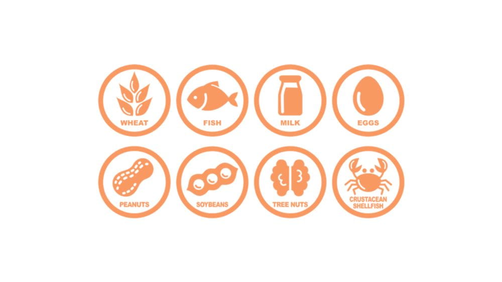
For the picky eater, I also add some food allergy icons as well as vegetarian or vegan icons beside the name of the dish. Food allergies and other types of food hypersensitivities affect millions of Americans and their families. Food allergies occur when the body’s immune system reacts to certain proteins in food. Food allergic reactions vary in severity from mild symptoms involving hives and lip swelling to severe, life-threatening symptoms, often called anaphylaxis, that may involve fatal respiratory problems and shock. While promising prevention and therapeutic strategies are being developed, food allergies currently cannot be cured. Early recognition and learning how to manage food allergies, including which foods to avoid, are important measures to prevent serious health consequences. To protect those with food allergies and other food hypersensitivities, the U.S. Food and Drug Administration (FDA) enforces regulations requiring companies to list ingredients on packaged foods and beverages. The FDA provides guidance to the food industry, consumers, and other stakeholders on the best ways to assess and manage allergen hazards in food. Congress passed the Food Allergen Labeling and Consumer Protection Act of 2004 (FALCPA). This law identified eight foods as major food allergens: milk, eggs, fish, Crustacean shellfish, tree nuts, peanuts, wheat, and soybeans. At the time of FALCPA’s passage, the eight major allergens accounted for 90 percent of food allergies. Therefore, it is highly recommended that we need to design a new website with food allergy icons. In the new website that shows pork dumplings with celery, I also use an icon of green celery to remind some picky eaters who may be allergic to celery.
The new website should also show this vegan icon to tell the clients which dish contains no animal products of any kind, dairy, eggs, or honey.
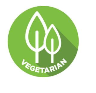
Also, it needs to show the vegetarian icon to tell the customers which dish contains no meat, fish, or poultry.
I hope you enjoy reading through my case study. I am into cooking Chinese food and designing this wireframe of food mobile website. If you want to discuss anything related to this project, please let me know. It would be wonderful to know your suggestions and opinions. Thank you so much for your valuable time.
Works Cited
Nutrition, Center for Food Safety and Applied. “Food Allergies.” U.S. Food And Drug Administration, 12 Apr. 2024, www.fda.gov/food/food-labeling-nutrition/food-allergies#:~:text=of%20imported%20products.-,Major%20Food%20Allergens,peanuts%2C%20wheat%2C%20and%20soybeans.
