Category Archives: Blog Project Prompts

Blog #8:

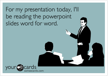
From the first day you step into a classroom until the day you retire from a career, you are bombarded with hundreds of thousands of PowerPoint slides. Teachers love them, professionals utilize them, students are forced to create them. Some are good, some are bad, some are hard to even look at. It is clear why PowerPoint is such a popular presentation tool: it is extremely user friendly and comes pre-installed on most computers. The question is, why are most of the PowerPoint presentations we are forced to sit through in life so terrible? Some critics blame the tool itself, but I disagree. I think the real problem is that most of the people who use PowerPoint lack the keen eye for design that any visual presentation requires.

I think of it this way: If I were to try, right now, to make a flyer for a band, it would look just plain awful. I am not creative, I don’t understand which colors go well together, and I can’t choose fonts to save my life. From this, you can conclude that I would also be bad at making a poster, a website, a t-shirt design or anything else you would find in a graphic designer’s portfolio. So… Why would I think I could make a stunning PowerPoint? Like any presentation, PowerPoint utilizes color, font, layout, and design. If these elements are not done well, the PowerPoint will not be aesthetically pleasing. Here is one example of a good vs. a bad PowerPoint slide:

http://www.jenthorson.com/wp-content/uploads/2013/07/Good-slide-bad-slide-1024×417.jpg

Notice how the first slide is too crowded, there are way too many words, and your eye doesn’t know where to look. The slide on the right is clean, the message is clear, and the image is relevant. I can see this when the two are put side-by-side, but it is much harder to take a blank slide and make it into something great!

Here is another example of a successful PowerPoint presentation:

http://i.poweredtemplates.com/i/dg/01/947/technology-presentation-flat-design-powerpoint.jpg

This PowerPoint has bold colors, interesting layouts, and clean and easy to read slides. Unfortunately, I could never design a presentation like this one, and I think many people are in the same boat as me. No matter how I try, I just don’t have that eye for design.

At the end of the day, after I’ve tried and failed to make a beautiful presentation, I can’t blame Microsoft. I think the fault lies with the users. Anything that is meant to present information in a creative way (magazine, flyer, billboard, commercial, etc.) practically requires an artist for it to turn out well, and PowerPoint is no different. Microsoft supplies themes and layouts, but these are too basic to allow for a truly stand out presentation. This may be the reason that Prezi has become such a popular tool. It requires users to put even less thought into the design of the presentation. Just pick a theme and fill it with your information. This way, even those of us with no creativity whatsoever can have an aesthetically pleasing presentation.

In conclusion, I think that too many people use PowerPoint without taking the time to learn about what they are doing, slapping a graph and some words onto a slide and calling it a day. Since so many schools require students to create PowerPoint and other presentations, students could likely benefit from a basic design class in middle or high school. This may not completely solve the problem, but I think it would be a step in the right direction!

PowerPoint vs. The PowerPoint Designer

In our modern, highly technologically advanced society, does Microsoft PowerPoint still stand a chance as an effective method for professional presentation?

In my opinion, yes it does!

More specifically, I think the issue here is whether PowerPoint is naturally incapable of adapting to the times or is the designer of the presentation lacking the necessary skills to create an effective presentation utilizing appropriate design choices and styles.

In my opinion, the issue with PowerPoint falls on the designer and his/her ability to create an effective professional presentation.  Many times throughout my high school and college career, I have been a victim of slow, confusing PowerPoint presentations, whose slides are overrun with either images, texts, or an obnoxious mix of the two.  Unfortunately, many people do not take the time to focus on the effects their PowerPoint presentation will have on the audience.  Often, the designer will focus on aspects that please only him/her during the construction period, such as applying unnecessary background colors or typing paragraph notes that will only be read verbatim come presentation day.

The purpose of your PowerPoint presentation is to aid in whatever point you plan to make to your audience.  The text and language used in your slides should be short, preferably in some bullet list form and consisting of key words.  Your audience is there to listen and learn something new, not read the information on the slide or listen to what is already in plain sight.  Images should also be used as an aid to enhance what the presenter is discussing.  The designer should avoid unnecessary decoration or  over-stretched images as a background for your slide.  Graphs and charts are encouraged to appease those in the audience who prefer visual learning.  However, these graphs should be relevant and laid out in a nice, organized fashion.  The colors used to highlight these charts and graphs should be minimal in use. According to Sarah Jacobsson Purewal, the presentation designer should “stick with two or three — not six or seven — and use them consistently.”  

Half of the problem stems from  people being unaware of the wide range of functions PowerPoint has to offer.  The other half is that PowerPoint does need to update a little bit to offer more current methods of presenting.  However, blogger Christopher Maloney offers an insight into the new and improved PowerPoint 2013 in his post titled, “PowerPoint 2013: Presentation is Everything”.  He discusses the new improvements to the most recent version of the program, primarily the “eight newly designed themes” so that “variants have complete control over all elements of the presentation’s design — colors, fonts, effects, layouts, text properties, paragraph properties, design elements, and photos and textures.”

With such improvements, it is only possible for PowerPoint to become more prevalent in professional presentations, both in school and the workforce.

Sources Cited

Microsoft. (2012). The New PowerPoint. http://blogs.office.com/2012/08/09/the-new-powerpoint/

Purewal, Jacobsson Sarah. (September 20, 2010). The World’s Worst PowerPoint Presentations.  http://www.cio.com/article/2415027/enterprise-software/the-world-s-worst-powerpoint-presentations.html


Blog #8: PowerPoint or People?

Boring PresentationPhoto courtesy of Envision Presentations

Overview

The problem with bad PowerPoint (PPT) presentations is the user’s application of poor design and implementation. If we choose to use PowerPoint as our medium, then I feel like we must be able to do the best with what we are given. Here, I explain why users are the problem and how to fix these problems. I will be making several references to Mike Markel’s Exploiting Verbal-Visual Synergy in Presentation Slides. Also, I will conclude by explaining how to be considerate of our pitch presentations in order to convey our messages and ideas successfully next week.

We Are the Problem
1332267643587_6720645

Photo courtesy of SomeEcards

An example of poor implementation and inappropriateness of use is the most common mistake that users/presenters make with PPT presentations: reading from the slides. As Chris Anderson stated in How to Give a Killer Presentation, “Don’t use a slide deck as a substitute for notes […] and don’t repeat out loud words that are on the slide.” If you look at a TED Talk in which the presenter uses a PPT (my favorite is My invention that made peace with lions), then you will notice that some things are better experienced visually with verbal comments and background information. The TED Talk video applies to Markel’s principle “Show what is best shown; say what is best said.”

My Problem

Although I argue that people are the problem, I think that space limitations of the medium are also a problem; however, there is a way around this. I have experienced space limitations in my PPT slides in my module presentation about modalities. For instance, I wanted to show the use of good spatial modes in a professional profile vs. the use of bad spatial modes in a different professional profile by providing examples of each one on the same slide. I wanted to have both pictures side-by-side so that I could verbally compare and contrast how different audiences would react; however, if I would have done that, then my audience (our class) would not have been able to see everything because the examples would have been too small.

My Solution

dnaSequencingStructure9

Photo courtesy of Center for BioMolecular Modeling

What I have learned is that whenever I feel like I have space limitations, I should use a diagram because it will allow me to eliminate visual clutter and highlight just what I need. The diagram above of an individual cell and its parts is a good example of drawing tools; it is an example of the tools that I should have applied to my module PPT presentation. As Markel explained, we should use one drawing or photo of our primary subject and use another to provide a close up of it; this way, “[we] would not have to worry about space limitations, poor figure-ground contrast, and visual clutter.”

Pitch Presentations

Obviously, the drawing tools that I have mentioned cannot best convey every PPT presentation’s purpose. So, here are a few things to consider when we are pitching our presentations to our clients this coming week:

  • Analyze the audience and purpose of your presentation.
  • Only use visuals when absolutely necessary; otherwise, they are distractions.
  • Do not simply slap words on the screen; otherwise, a handout may be a better medium (Markel).
  • Make fewer, better slides (i.e. less is more) (Markel).
  • Use the assertion-evidence structure when convincing your client that your product is the way to go: making a claim in the form of a brief sentence in the title section of the PPT slide and inserting a graphic that validates your claim in the main content area (Markel).
    Example of the assertion-evidence structure:cheetah3

Photo courtesy of Penn State University

Prezi is the new PowerPoint

I believe that PowerPoints used to be a pretty decent form of media back in the 90’s and early 2000’s as a way to teach or give information to an audience. However, PowerPoints had 2 categories that I believe killed them: the overly dull and dry ones that bore the viewers to sleep and the super animated ones with every single possible animated special effect that make it impossible to concentrate on the actual concept of what’s being presented.

For example, this presentation uploaded by Javed Iqbal onto SlideShare.net is a simple presentation uploaded from Powerpoint, and it pains me to even look at the simple template, which really dumbs things down, offering little opportunity for creativity.

I believe that the newer trend, Prezi offers an easier method of maintaining creativity while still getting the information through. The transitions are much smoother, and the opportunity to embed different links and videos into the presentation without having to stop and open each individual link. Furthermore, the ability to include multimodal layers without having to go through the trouble of adding it individually as an option to each slide makes it easier on the presenter  keep an easy flow to the actual presentation.

Personally, I find Prezi to be more user friendly than Powerpoint. With Powerpoint, I always found myself fumbling for the right buttons, and the right balance between creativity and presenting the information concisely and clearly. For instance in my latest editing Prezi, I was able to easily embed the music to play in the background. The preplanned layout allows me to make minor adjustments while keeping to a general format, but the background styles allow me to spice it up a bit.

Furthermore, Prezi’s formatting encourages you to use it for a variety of purposes, not just strictly academic, but fun as well, like this one connecting Cell Regeneration to Doctor Who regenerations. Not only was it easy to embed videos and music, but the searchable Google Images make it easier than saving and uploading individual photos. Also, it has the benefit of being online, which makes it transferable via a link instead of trying to e-mail it and getting a message saying it is too big to upload!


Sources:

http://www.slideshare.net/JavedIqbal15/presentation-on-effective-teaching

http://prezi.com/fikgikx_-zfg/its-time-to-say-goodbye-to-turning-tables/

http://prezi.com/ubozwwssx7zh/dr-who-and-cell-regeneration/

Blog #8: PowerPoint — Bad tool or bad design?

More than a decade ago, John Schwartz asked in a New York Times article, “Is there anything so deadening to the soul as a PowerPoint presentation?” That negative view has been reinforced and extended by Edward Tufte in his monograph, The cognitive style of PowerPoint: pitching out corrupts within, in which he castigates PowerPoint as a medium for presentation. And we’ve probably all seen too many really, really bad PowerPoint slides.

The question, though, is whether the problem is inherent in the medium and technology, as Tufte maintains, or is the problem the result of poor design design and implementation? Continue reading Blog #8: PowerPoint — Bad tool or bad design?

Blog #7: Are you reading me??

blog7As I think about all the direction signs I have seen, it made me wonder who really pays attention to all of them. Do you really pay attention to them while driving? Especially the ones that are overhead on the highways warning you about “texting and driving” or “7-10 minutes on I-75/85”? I know that I do not, and that it takes about a second for me to glance and keep going. The same goes for instruction manuals. Have you thoroughly read one lately? When I look over one, all I see are a bunch of words. It is very difficult for me to follow one for “setting up a computer”.

The most likely person to read instructions step-by-step would be women. Women tend to like step-by-step processes rather than men. From my previous experiences, I usually tend to read something first before setting it up. However, when my fiancé tries to set something up, most likely he did not read. It also reflects different cultures as well. For Americans, about half of us will read signs or instructions. For Asian-Americans or Hispanic-Americans, we see signs misinterpret because of their culture.

Now onto the good stuff! So why are signs or instructions never read?? Here are some pointers:

  • fear of looking foolish
  • fear of being taken advantage of
  • fear of failure
  • and fear of losing image

(source:Hibbard 2014)

It’s just the way humans are. For example, I misjudge instructions given to me at work. I tend to figure it out before reading it carefully or asking a manager about it. It is just the way I am. Heres another example: how to set up your PS4. My PS4 came with two instruction manual. One was a simple version, giving you one worded sentences per number. The second one was a booklet on how to set it up. Which one did you think I picked?? If you guessed simple version, then you are correct! It is a dilemma between reading or figuring out what you are doing. I would rather read first before figuring it out. What about you? Overall, the way that information is distributed out to people is a matter of reading and understanding what he or she is doing. Take the time to read!

Source cited

Hibbard, Catherine. Addressing resistance to change in policy and procedure writing.http://cypressmedia.net/articles/article/28/addressing_resistance_to_change_in_policy_and_procedure_writing

Blog 7: Obsolete

I think it can be fairly safe to say that technical communication as far as instruction manuals and other forms of directions are concerned are largely victims of mass production. On a personal front, I cannot remember the last time I read an instruction manual for anything; in fact the closest thing I can recollect is when I was trying to help assemble a piece of IKEA furniture and even then it was mostly just to double check things. I do not think there is any real way to make technical communication more effective in the sense that more people will pick up an instruction manual and use it for what it is for and the root of that lies, in part, with culture. In the West, many of the things we use that are complicated enough to require some sort of instruction like a car or a computer are so ubiquitous across the board the manuals are mostly redundant.   Every one recognizes a power button symbol, all keyboards have the same letters in the same positions, all Macs or Windows come pre-installed with certain programs that are, for the most part, updates of the previous computer’s and are rarely that wildly different.

download


The goal of technical communication is ultimately to make processes easier and information more permeable and it has been accomplished by replacing the large blocks of texts and accompanying commentary with pictographs that gain acceptance as “universal” symbols. Text can still be very important under certain circumstances but far less has proved to be more.  There is a cultural perception in America especially that emphasizes new things coming on the market should be better, faster and above all EASIER to use than what was previous. Furniture is pre-assembled or very nearly, something like 38% of toddlers and babies under the age of two are able to use Ipads and tablets, proving you do not need to be able to read to figure out technology. As we saw in one of the module presentations info-graphs are gaining increasing importance in conveying information and unlike, for example brochures, they are not given to the exclusive category of advertisment and brevity for the sake of enticement.

Cars are another example and are much the same case. Because every vehicle has certain standard feature placement (such as radio, which side the turn signal is on vs. the windshield wipers etc.) there is not an urgent enough need for the most part to read the owners manual every time one gets a new car, the basic aspects of being able  to drive are what most people care about most of the time. I feel like the perception of men never reading directions is just as it is: a stereo-type; it is in fact common to both genders to ignore guides when they are confident in what they are using or have seen done before because complication makes it less appealing to buy and use.

Sources:

http://www.nydailynews.com/news/national/toddlers-risk-tech-experts-study-shows-soars-article-1.1747694

Post #7: The Importance of First Impressions

First Impressions

The adversity to being on the receiving end of new technical communication may lie in the quality of the technical communication produced. It takes viewers only 1/20th of a second to judge whether or not a website is worthy of their viewership (site). The first impressions formed when end users initially see the product helps determine whether they will even bother to read it. Even if the document is a set of instructions, they will consider it a waste of their time if they are against the rhetorical situation the creator had in mind and if the design choices are poor.


Rhetorical Situation

A poor first impression will be formed by the reader if he does not approve of the purpose of the content or is not an intended audience member.  A poor purpose could be “to inform the user on how to properly sweep a floor”; someone who buys a broom will probably not read any instructions that come with it because they feel that the instructions are unnecessary. A user might think he already has enough background information to begin using a product or can easily figure it out, and may not consider himself an intended audience for the instructions.


Design Choices

The visual mode is probably the most important mode to consider when discussing the end user’s potential first impression of verbal instructions because they will view the way the document is put together before they begin reading it. It is important to not overuse emphasis and contrast, and to optimally use organization, alignment, and proximity. Using emphasis, by highlighting or bolding words, by listing and bulleting items, etc., is helpful to catch the reader’s eye, but overdoing it will distract and confuse them. This goes for using contrast, which emphasizes through juxtaposing size and color, as well. Organization, alignment, and proximity affect how comfortable the reader feels looking at the document. If there is no obviously planned out arrangement of the paragraphs, sentences and pictures, the reader will feel uncomfortable having to create their own path to follow.


Take for example this still from a website.

dumbwebsite

My first impression of the webpage is very poor and I feel I could probably infect my laptop with a virus if I clicked on anything. The design choices of the webpage easily carry over to what should not be done for visual and design aspects of instructional material.


  1. Emphasis: The emphasis is mostly placed on titles, such as “Atwater Politics” and “Weblog”, however, the reader is unable to make a connection to its importance and why it received this level of significance.
  2. Contrast: The color contrast of blue text against a white screen strains the eyes.
  3. Organization: There is very little organization.  Instead of being able to follow a conventional path, such as heading -> paragraph, the viewer must create their own path, meaninglessly going from unrelated box to unrelated box.
  4. Alignment: The rectangular boxes, such as the ones labeled “Democratic News” and “Intelligence” are neatly aligned with each other; however, each box contains wildly different content and styles.
  5. Proximity: There is simply too much on the page. There are too many pictures too close together, the text is small and scrunched, and each rectangular box of information is cramped between two others.

set of instructions


Here is an example of well down technical communication.

  1. Dual coding is used to make sure the end user can easily understand what is happening in each step.
  2. The visual content is grouped together, not spread out all over the document, and all of the pictures that relate to a single step are aligned neatly under the text for that step. This organizational style shows the relationship between the text and the pictures, allowing the consumer to make more connection quicker about what needs to be done and how.
  3. The individual steps are emphasized by a larger font for the numbers and through the use of green font. These two markers clearly indicate where each steps begins.
  4. The contrast between the sizes of the steps numbers, the text of the instructions, and the helper text labeling objects clearly shows what each objective, in what order they should be accomplished, and what information is needed to accomplish the text.


These ease of use of this document can be readily ascertained by the end used and will encourage him to consider reading the instructions. With simple, easy to use, instructions that provide the right amount of information, technical communicators can encourage to properly use their products.


Arola, Kristin; Sheppard, Jennifer; and Ball, Cheryl. Writer/Designer: A Guide to Making Multimodal Projects. (2014). Bedford/St. Martin. 6, 20- 37.

Johnson-Eilola, Johndan and Selber, Stuarta. Solving Problems in Technical Communication. Chicago: The University of Chicago Press. 388-391.

Audience Resistance: Death, Injury, and The Grand Canyon

The danger posed by hiking trails and other similar outdoor activities is often overlooked; and each year, countless hikers, mountaineers, and other adventurers are lost to the perils of the wilderness. These individuals are often highly experienced in whatever activity they pursue, and have a specialized disciplinary knowledge of the outdoors, and the necessary skills to complete any undertaking.  The majority of these deaths and injuries are the result of carelessly overlooking posted warning signs.

Take, for example, the Bright Angel Trail.  This extremely strenuous and challenging trail begins at the North Rim of the Grand Canyon and descends 4,380 feet (nearly 4/5’s of a mile) over the course of 9.5 miles to the Bright Angel Campground, at the bottom of the canyon.  There are countless signs at the trailhead proclaiming the dangers of the trail, especially to the inexperienced hiker, that have been there since the park’s opening in 1908.  But despite this, nearly 700 people have lost their lives while hiking The Grand Canyon.

warning

As pictured, the signs clearly outline the precautions and necessary measures that must be taken to guarantee a safe trip down and back up—staying rested, well-nourished and hydrated, avoiding activity during the sunniest times of the day, and rationing supplies, time and energy.  The signs even advise that a round-trip hike on the trail cannot be completed in a single day.  But signs at the trailhead are not the only warning:  Every ranger, employee, or veteran of the trail will give the same advice of caution and discretion to any potential Bright Angel dreamer.

These deaths, and the thousands of injuries that are suffered each year, may appear to be in a completely different realm of existence than technical communication, but they share a vast amount of common ground.  Communication design can help explain the social and cultural factors that lead to audience resistance in similar circumstances.

In order to hike the Bright Angel Trail—and many of the other trails in the canyon—hikers must obtain a special permit.  As I learned from my own experiences hiking these trails, this permit is not so much a way for hiking hopefuls to prove or demonstrate their skills or wilderness proficiency, but more a system for keeping track of who enters the canyon and who exits—you must check in at a designated ranger station with your permit before embarking, and again upon completion.  If a hiker does not return for check out after a predetermined amount of time, authorities are alerted and a search begins.

But this knowledge is not necessarily communicated to a hiker before they embark, so the permit often lends itself to a tangible type of proof of their ability and dexterity, rather than its true purpose: a catalog of intentions and information.  Therefore, when a hiker obtains a permit, they tend to assume that they have received some sort of approval for their journey, and feel no obligation to pay any attention to warnings.  In the name of sticking to the status quo, and fulfilling their cultural distinctions as a permitted-hiker, they resist processing—let alone taking—any cautionary advice.  This poor communication design helps to account for the scores of overly ambitious hikers that never return to the top of the canyon.

A round-trip hike that spans nearly 20 miles, with a near 2-mile elevation change is not for the faint of heart.  Most of the individuals who decide to tackle the Bright Angel Trail condition for months beforehand, and come with adequate expectations and preparations.  But, more importantly, they heed any warnings they encounter.  The nearly 700 lives lost cannot be merely chalked up to a failure to read the signs, but it does make one wonder—would the number be just as high with a more effective communication design?


Cole, Cyndy. “Canyon deaths: 685 and counting.” Arizona Daily Sun 6 May 2012: Web. 9 Oct. 2014.


“Grand Canyon/Bright Angel Trail.” National Park Service,n.d. Web. 9 Oct. 2014.


Haff, Gordon. “Warning sign. Bright Angel Trail, Grand Canyon.” Flickr. 2 Dec. 2012. Web. 9 Oct. 2014.

Blog #7: Audience Resistance

Men never stop to ask for directions. Engineers never read the instruction manual. All manuals are boring. How do such social stereotypes get started? Do such stereotypes have any truth to them?

What do you see as reasons people (or at least some people) are resistant to instructions? What kinds of things can effective writers and designers do to counter such resistance? Use the Hibbard article as well as Solving Problems in Technical Communication and Writer/Designer as a jumping off point for your discussion. You can, of course, use additional resources, but use the material in our textbooks about users and audiences and the Hibbard article as a minimum.

Posting: Group 1

Commenting: Group 2

Category: Audience Resistance

For this blog post, consider how social and cultural factors influence rhetorical context in ways that even the best technical communication expert may not be able to control for. Think, too, about what you’ve learned so far about what makes for “good” technical communication and “bad” technical communication, and how these criteria might vary with context. Use the questions below (or similar ones you create) as starting places when you craft your post:

  • What sort of person always reads the instructions first?
  • How do social expectations about masculinity and femininity influence how men and women respond to instruction sets?
  • Are people with specialized disciplinary knowledge (doctors, engineers, lawyers, scientists) more or less likely to read instructions? Why?
  • In what ways can communication design compensate for social and cultural factors that lead to audience resistance?

In thinking about how “good” and “bad” technical communication responds to or accounts for (or fails to respond to or account for) potential audience resistance, you might locate two examples to incorporate into your discussion (not just dropped in at the end, but incorporated and discussed). Locate an example of really bad instructions; take an excerpt for your post to analyze what’s wrong and ways the problems could be corrected. Also locate an example of good instructions; likewise, take an excerpt for your post to analyze what’s particularly effective.

In your Blog #7 post, you need to take a focused position about how understanding audience resistance can assist you in your technical communication process, rather than taking a scattered approach (which would happen if you simply wrote a few sentences in response to each question). Please carefully read and follow the guidelines and posting information for this blog. You can quote from additional articles you read as support for your position. You should include specific workplace examples to further support your argument. Make sure to document your sources.

Reference
Hibbard, Catherine. Addressing resistance to change in policy and procedure writing. http://cypressmedia.net/articles/article/28/addressing_resistance_to_change_in_policy_and_procedure_writing

Featured Image: “Direction Board” by halfrain on Flickr