As I mentioned last week, one of my main tasks as a SIF fellow is to help generate video segments, essentially small documentaries, for GSU’s hybrid U.S. History survey course. Over the last week, I have been learning Adobe Premier Pro, so that I can transform a-roll footage of historians talking with each other about important historic events and phenomena into more engaging film. One of the questions I have been mulling over as I have been leaning the mechanics of video editing is how to maximize the pedagogical value of the films we are making. There is a kind of tension, hopefully a creative one over the long term, between the teacher in me (I have taught non-hybrid versions of the course several times), who thinks above all in terms of exposing students to important material, and to the complexity of historical circumstance, and the novice film-maker who is under the understandable mandate of producing a video that students will actually watch. All of the complexities of the discussion, which is a kind of wonderful dialectical back and forth between two historians trying to make sense of a complicated era, are lost if the audience for the film isn’t listening while watching. So, Ameer and I have been grappling with this question of how to use video as an engagement point, not a distraction, to produce videos that are as meaty as the lectures they are intended to replace, but hopefully will hold the attention of students in a way that a simple video of a lecture is unlikely to do.
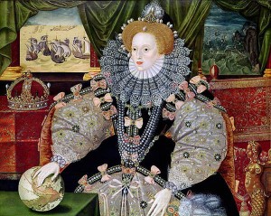
As we have started working through these issues, I have been thinking about the pedagogical use of images. I use images a lot in my classroom — my PowerPoints are essential composed of maps and images — I avoid text whenever possible because I have found that students tend to write down whatever words appear on a PowerPoint and think they have ‘learned’ whatever it is they need to know about that topic. Like many teachers, I have spent a fair amount of time choosing images for these slides, picking those that seem especially rich, historically significant, or include telling details that can open up historical understanding. For example, if I want to show them an image of Queen Elizabeth, I’ll use the so-called “Armada Portrait” — because of its background panels depicting the defeat of the Spanish Armada, the way Elizabeth’s hand rests on a globe showing the Americas, and with it her imperial aspirations, details that make it the perfect chose for my class and for the story about Elizabeth that my students need to learn.
Yet, as a PowerPoint slide, I imagine that few students ever really pick up on these details unless I specifically call them to their attention. Indeed, they may not even show up clearly on the projector screens, and thus the information I’d love them to see — and the habit it fosters of looking closely and paying attention to detail (one of the basic skills of a historian, and indeed of any kind of scholar) — are essentially lost opportunities.
I can get around this by occasionally pausing to consider detailed analysis of an image. For instance, we always do an exercise with John Gast’s American Progress, we I get students to break the painting into pieces and identify individual elements of the ideology of Western Expansion that the image contains. But, over the course of a semester, there are limited opportunities for this type of exercise.
This brings me back to the video project and one of the great advantages that it has over the lecture-power point combo. With video, we can use the camera to direct the eye, to linger on details, to zoom in, pan away, and otherwise provide a ‘reading’ of the image in a way that goes well beyond what I have seen anyone do with a power point.


wa your picture like a queen in the old century, love your perspective, keep writing